Category: User Research


Does Being Ethical Pay?

May 12th, 2008 — 12:00am

‘Companies spend huge amounts of money to be ‘socially responsible.’ Do consumers reward them for it? And how much?’ is the leader for a short piece titled Does Being Ethical Pay? just published in Sloan Management Review. The quick answer is “Yes”, so it’s worth reading further to learn the specific ways that ethicality plays into people’s spending decisions.

Here’s an excerpt:

In all of our tests, consumers were willing to pay a slight premium for the ethically made goods. But they went much further in the other direction: They would buy unethically made products only at a steep discount.

What’s more, consumer attitudes played a big part in shaping those results. People with high standards for corporate behavior rewarded the ethical companies with bigger premiums and punished the unethical ones with bigger discounts.

At least according to this research, being ethical is a necessary attribute for a product.

There are clear implications for product design: ethics should be on the table as a concern at all stages of product development, from ideation and concepting of new products, to the marketing and sales of finished products.

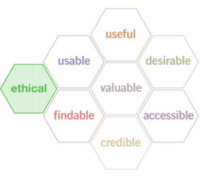
And these (limited, certainly not the final word) findings match with the idea of adding ethics to the set of important user experience qualities captured in Peter Morville’s UX Honeycomb.

The (Augmented) Ethical UX Honeycomb
ethical_small_honeycombbig.png
How are user experience designers taking the ethical qualities of their work into account?

Related posts:

Comment » | Ethics & Design, User Research

New Books: ‘Tagging’ and ‘Mental Models’

March 12th, 2008 — 12:00am

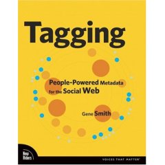
If you’re interested in tagging and social metadata, social bookmarking, or information management, be sure to check out Gene Smith’s Tagging: People-Powered Metadata for the Social Web recently published by from New Riders. I reviewed some of the early drafts of the book, and it’s come together very nicely.
tagging_cover.jpg
Tagging takes a very practical approach, and provides an ample set of examples in support of the insightful analysis. After an overview of tagging and its value, the book addresses tagging system design, tags in relation to traditional metadata and classification systems, and covers the user experience of creating and navigating tag clouds.

Gene likes to build things, so Tagging includes a chapter on technical design complete with suggested tools and tutorials for creating your own tagging apps.

All in all, Tagging is a worthy introduction to the subject, and a guide for deeper exploration.
While we’re talking books, kudos to Rosenfeld Media on the publication of their first book, Mental Models; Aligning Design Strategy with Human Behavior, by the very talented Indi Young!
mental-models-lg.gif
Mental Models is richly illustrated, filled with examples, lucid, and accompanied by a considerable amount of additional content from the Rosenfeld Media website.

Indi has considerable experience teaching others the techniques and methods behind creating insightful mental models for audiences and customers. Cognitive / frameworky methods can feel a bit heady at times (especially how-to’s on those methods), but Mental Models is straightforward reading throughout, and an eminently practical guide to using this important tool for user experience design and strategy.

Mental Models is available electronically as a .pdf for individual and group licenses, or in hard copy; it’s choose your own medium in action.

Comment » | Reading Room, Tag Clouds, User Experience (UX), User Research

Discovering User Goals / IR Goal Definitions

June 24th, 2006 — 12:00am

In an earlier post on creating Goal Based Information Retrieval Experiences, I offered a list of fundamental user goals that underlays needs and usage of four suggested information retrieval modes. In this post, I’ll share the approach employed to discover the fundamental goals of the users in our environment, with the aim of offering it as one way of understanding goals relevant for other types of environments and user experience architectures.

Since the root user goals we identified are potentially applicable to other environments and contexts, I’ll share the definitions behind the full set of root goals we discovered. Together, the approach and definitions should help demonstrate how capture a systematic and also holistic view of what users have need to accomplish when undertaking information retrieval tasks more complex than searching.

Finally, addressing the perspective of strategic design and user experience methodology, framing broad user goals well offers strong footing for addressing business perspectives, and engaging business audiences in productive discussions on the priority of capabilities and the functionality of the user experience.

Discovering Root Goals
Beginning with raw goals gathered via a mixed palette of discovery and user research (interviews, task analysis, contextual inquiry, or other qualitative insight methods) incorporated into the project, we first called out the different types or objects of information users identified.

Our starting lists of raw user goals or needs looked something like this (though it was considerably larger, and more varied):

  • Read operating guidelines
  • Review installation instructions
  • Scan technical support requests
  • Review technical specifications

Identifying the objects in this set is not difficult: technical specifications, operating guidelines, installation instructions, and support requests. The activity verbs are also easy to spot:

  • read
  • scan
  • review

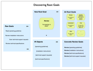
We then compared the activity verbs for similarity and differences, and refined these raw goals into a root goal of “review” that could apply to any of the objects users named.
Recombining the root goal with various objects yields a set of concrete goals:

  • Review operating guidelines
  • Review installation instructions
  • Review technical specifications
  • Review technical support requests

This approach is more art than science, but is systematic, and is independent of context and format.

Here’s an illustration of the process.

Discovering Root Goals
Final Root Goals For Our Environment
These are the definitions we established for the root goals we found for all our different types of users. [I haven’t included the objects of the goals, or the concrete goals.]

  • To Assess means to make a judgement or decision about, considering relevant factors
  • To Compare means to review the similarities and differences of two or more examples of the same type of thing by looking at them in detail
  • To Find means to learn the location and status of
  • To Identify means to distinguish by the use of specific criteria
  • To Locate means to become aware of where and how a thing may be found, and / or contacted. Locate and find are similar, so likely reflect differing but similar usages and contexts in the minds of users
  • To Monitor means to track the status and location of
  • To Obtain means to acquire and retain for other purposes
  • To Participate means to be present and recognized
  • To Review means to examine in detail
  • To Save means to store and keep
  • To See means to be presented with in a manner that makes assumed relationships or characteristics apparent
  • To Understand means to consider all available points of view or sources of information on a topic / item / situation, and formulate an opinion and frame of reference for one’s own purposes.

Some example concrete goals for an user experience that addresses travel planning could include:

  • Find hotels
  • Review hotel accommodations
  • Save travel itineraries
  • Compare vacation packages
  • See optional excursions offered by a hotel
  • Identify full-service or all-inclusive resorts
  • Locate the operators of scuba diving excursions
  • Monitor the price of airline tickets to Sardinia
  • Understand how to plan and purchase vacations
  • Assess the cost and value of a vacation package

Symmetry and Mental Models
We found the concept of a root goal insightful for helping to design user experience architectures because it is independent of particular user roles, information types, and usage contexts. Being root elements, they point at commonalities rather than differences, and so can help guide the definition of mental models that span user groups, or allow the reuse of an information architecture element such as a navigation component, task flow, or screen layout.

Building numerous concrete goals that are variations on a smaller set of common root goals allows the mental model for the environment to achieve a greater degree of consistency and predictability (we hope – we’ll see what the usability and evaluations bring back). This consistency helps further efforts toward symmetry throughout the information architecture. While most information architects unconsciously reach for symmetry in user experiences by designing repeated elements such as common labeling, rules for layout, and component systems of features and functionality – symmetry is something we should make more conscious efforts to encourage both within environments and across environments.

Speaking To the Business: Goal-based Prioritization of Capabilities and Functionality
With solid root goals and common information objects, it’s possible to build up a simple and consistent grammar that outlines the set of possible concrete goals across user types. This set of goals is a good basis for engaging business stakeholders in choosing the right set of priorities to guide design and build efforts. Systematically articulated goals allow business audiences a comfortable and neutral basis for prioritizing the capabilities the environment will offer users. Of course, choices of capability directly affect costs, effort levels, design and build timelines, and all the other tangible aspects of a user experience. Reference priorities can also help guide longer-term investment and strategy decisions.
Comment » | Information Architecture, User Experience (UX), User Research

Scatterplots As Page Shapes?

March 1st, 2006 — 12:00am

The February edition of Usability News reports on a usability study (Where’s the Search? Re-examining User Expectations of Web Objects) of user expectations for Web page layouts that contains a surprising but interesting visualization of page shapes, based on quantitative user research. (Note: I found the study via the UI Design Newsletter, from HFI.)

The study looks at users” expectations for the location of common web page components, such as site search and advertising. The authors find that expectations for page layouts are largely the same now, as compared to those found in an earlier study, Developing Schemas for the Location of Common Web Objects, conducted in 2001.

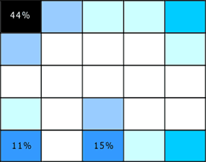
More interesting is the way the researchers report their results; visualizing them as heat map style grid plots for the expected location of each element vs. a blank grid. Here’s two examples, the first showing expected locations for ‘back to home’ links, the second for the ‘site search engine’.

Figure 1: Back to Home Link Location
backtohome.gif

Figure 2: Site Search Engine Location
sitesearch.gif

These heat maps look a lot like page shapes, expressed as scatterplots.

I like the combination of quantitative and qualitative perspectives at work in these page shapes rendered as scatterplots. I think it could allow for grounded discussion and interpretation of user feedback on design options, within a clear and simple structure that doesn’t require an HCI degree to appreciate. If I try it out, I’ll share the outcomes.

In a more traditional style of visualization, Eric Scheid found another another good example of page shapes a while back in Jonathon Boutelle’s posting on blog layouts called “Mullet”-style blog layout. Jonathon was advocating for a new default blog page shape that increases information density and scent, but hews closely to pre-existing expectations.

Figure 3: Typical Blog Page Shape
typical_small-thumb.jpg

Figure 4: Suggested Blog Page Shape
mullet_small.jpg
And that’s the last time I’m mentioning m.u.l.l.e.t.s this year, lest Google get the wrong idea about the subject matter of this blog :)

Comment » | Information Architecture, User Research

User Research = R&D

February 14th, 2006 — 12:00am

This weekend, some of my earlier posts discussing the user experience of Lotus Notes surfaced in the Notes community. Ed Brill – in a posting titled Mary Beth has been taking on the critics – referenced my mention of how the head of the Notes UI team was employing user research as a bridge to customers. Ed complimented the design team for reaching out to critics in public. This is a well-deserved pat on the back. Yet it falls short of recognizing the more important point that direct user research should be a basic component of any company’s overall strategy and planning for long term success (or survival).

Why? User research helps build customer relationships, further design efforts, and identify new business opportunities when applied across audiences (internal and external constituencies) and perspectives (marketing, sales, product development), and with an eye for needs beyond immediate feedback. This sort of engagement with customers of a software product (or any kind of product) should *not* be special or noteworthy – it should happen all the time. Continuously. I’m thinking of Jared Spool’s remarks during his keynote at UI10, to the effect that the user experience perspective is most successful when it it is a basic component of a company’s culture, and thus an assumed aspect of every initiative.

In fact, in a socially transparent, networked, and aware environment like the current FuturePresent, user research serves as a fundamental, indispensable form of research and development that companies and organizations must support as part of their portfolio of methods for seeking broad based environmental feedback (also here). I’ll go so far as to say that user research may move beyond the realm of essential corporate R&D, and qualify as genuine basic research.

BTW: maybe it’s just me, but isn’t it a bit ominous that the tag line for Notes 7 is “Innovate. Collaborate. Dominate.” ? Sounds like something the Borg might say if you asked them how to make breakfast…

Comment » | User Research

Don Norman, Bruce Sterling, The Attention Economy

January 17th, 2006 — 12:00am

Over at uiGarden.net Don Norman clarified some of his ideas regarding Activity Centered Design originally published in the summer of 2005.

I’d like to be comfortable saying that I’m with Don in spirit while disagreeing on some of the particulars, but I’ve read both the original essay and the clarifications twice, and the ideas and the messages are still too raw to support proper reactions or to fully digest. Maybe Don’s working on a new book, and this is interim thinking?

That might explain why the contrast between Norman’s two recent pieces and Bruce Sterling’s Shaping Things – which also is a sort of design philosophy / manifesto – is so dramatic. Halfway through Shaping Things, I’m left – as I usually am when reading Sterling’s work – feeling envious that I wasn’t gifted the same way.

Sterling is speaking at ETech, which this year focuses on The Attention Economy. No surprises with this matchup, given that Sterling’s devoted a whole book – Distraction – to some of the same ideas proponents of the Attention Economy advocate we use as references when designing the future.

Comment » | User Experience (UX), User Research

Building Channels To Customers With User Research

December 26th, 2005 — 12:00am

Proving that a well-developed sense of humor is required for success in product design — especially for Lotus Notes — Mary Beth Raven, who leads the design team for the next version of Lotus Notes, recently posted a rather funny comment in reply to my suggestion that the Notes Design team offer customers a choice of unpleasant but related user experience themes. She used this as the occasion to invite all members of the community of Notes to users to register as volunteers for usability testing.
I’ve made three postings to date specifically discussing the Notes user experience: Lotus Notes User Experience = Disease, Mental Models, Resilience, and Lotus Notes, and Better UI Tops Notes Users’ Wish Lists. I’m not sure which of these prompted Mary Beth to reach out, but I’m glad she did, because doing so is smart business on two levels. At the first level, Mary Beth plainly understands that while vocal critics may seem daunting to user experience designers, product managers, and business owners, engaging these critics in fact presents design teams with opportunities to build strong connections to users and gather valuable feedback at the same time. What better way is there to show the strategic value of user research?
I learned this at first hand while working on a redesign of the flagship web presence of a large software firm several years ago. Some of the most insightful and useful feedback on the strengths and weaknesses of the user experiences I was responsible for came from ‘disgruntled’ customers. The user research I was doing on site structures, navigation paths, and user goals established a channel that allowed unhappy (and happy) customers to communicate about a broad range of their experiences with PTC products and services in a more complete way than by simply buying a competing product, or renewing an existing software license.
Based on these and other experiences building user research programs, I suggest that product managers, user research leads, and user experience designers first collaborate to define a user research strategy, and then define and create a simple but effective user research infrastructure (like registration gateways to volunteer databases, community / program identifiers and incentives, contact management tools, specific personas that technical and customer support teams can learn to recognize and recruit at all stages of the customer lifecycle, etc.) that will support the creation of channels to users throughout the design cycle.
At the second level, it allows the Notes team to directly explore collaboration methods, products, and technologies related to the very competitive collaboration suite / integrated electronic workspace / office productivity markets in which IBM, Microsoft, and several other giant firms are looking to secure dominant positions in the new culture of collaboration. [Note: I’ve posted a few times on Microsoft products as well – Backwards Goals: MS Office Results Oriented UI, and Microsoft’s Philosophy On Information Architecture.]
Members of the community of Lotus Notes users can register as volunteers for usability tests during the design of the next version of Notes at this URL: https://www-10.lotus.com/ldd/usentry.nsf/register?openform.

Related posts:

Comment » | User Experience (UX), User Research

Who Says User Research Can’t Be Funny?

September 24th, 2005 — 12:00am

User Research can be so relentlessly earnest and purposeful that it gets to be a bit stifling. After a few dozen well-crafted personas work their way purposefully through a set of mildly challenging but inevitably successful scenarios for the tenth time in one week, a diligent user researcher is likely to be hungering for something a bit more satisfying; something akin to the persona, but more fully-rounded; something that conveys the ambiguous complexity of human character with honesty; something not only insightful, but consistently forthright across a multiplicity of aspects. Perhaps even something that is genuinely malapert.
Food Court Druids, Cherohonkees, And Other Creatures Unique to the Republic is that something. Written by Robert Lanham, it’s a hilarious collection of idiotypes – stereotypes outside the design world, personas within – couched as the outcome of serious scientific inquiry whose method is called idiosyncrology.
I advise reading with humility close at hand, since it’s likely you’ll find yourself inside, and it’s only fair to laugh at everyone if you’re included…

Here’s the description:
Lanham, author of The Hipster Handbook and creator and editor of the Web site www.freewilliamsburg.com, extends his anthropological examination of Americans beyond trendy Brooklyn neighborhoods to the entire country, where Yanknecks (“rebel-flag-waving rednecks who live outside the South”), Sigmund Fruits (“people who insist on telling you about their dreams”) and others have existed thus far without being formally studied by “idiosyncrologists” like Lanham and his team. Presented with the authoritative tone of a serious anthropological study, complete with an Idio Rank Scale that assesses the weirdness of each type, many of Lanham’s profiles are hilariously accurate descriptions of co-workers, family members, friends and other acquaintances that almost every American has encountered at some point in their lives. There are the Cornered Rabid Office Workers (CROWs), who “claim to be poets or playwrights” when discussing their work with strangers, “even if they just spent the last nine hours doing data entry on the McFlannery acquisition,” and Hexpatriates, Americans who decry everything about America yet never actually leave the country (and who “refer to the Loews multiplex at the mall as ‘the cinema’ and the Motel Six by Hardees as ‘the pensione”). Illustrations by Jeff Bechtel, depicting the fashion sense of Holidorks (people who wear holiday-themed clothing) and Skants (women with shapely butts who always wear spandex pants), enhance Lanham’s characterizations.

Related posts:

Comment » | Reading Room, User Research

Better UI Tops Notes Users’ Wish List

September 23rd, 2005 — 12:00am

But not the new features list for the next release. In a previous post Lotus Notes UI = Disease, I cited a SearchDomino.com article in which Ken Bisconti, IBM Lotus vice president of Workplace, portal and collaboration products, is quoted as saying “Through improvements such as contextual collaboration and support for composite apps, we’ve gone *above and beyond simple UI enhancement*”. [Emphasis mine.] Above and beyond? I think UI enhancement – which is often far from simple, especially when the existing user experience is fundamentally flawed – is exactly what Notes needs.
After watching software development first hand, I know that many Product Managers understand the importance of quality, design, and meeting users’ needs, but do not feel empowered to work against the pervasive featuritis that leads to unusable bloatware. Good product managers and designers often work for organizations or managers who remain blinded by standard practices and marketing driven perceptions of priority, and thus feel it’s impossible to step off the new functionality treadmill.
That is, unless they are armed with information that indicates to the contrary.
The article in Ken’s statement appears, Beyond Notes 7.0: IBM Lotus sketches ‘Hannover’ user experience, is dated June 14, 2005. Yet when digging it bit more, I discovered an earlier piece from May 9, 2005, titled Better UI tops Notes users’ wish list, in which the same author, Peter Blochner, reports on the results of an open request for Lotus Notes features made by Ed Brill(Brill heads the worldwide sales group for Notes, according to Blochner). In his review of user responses to Brill’s question, Blochner says, “the most requested feature was for an improved user interface for Notes.”
Simple UI enhancement is all that the users want, and they’ve said it themselves. Yet Notes is going way beyond this? Despite repeated and public requests for this from committed users (Ed Brill’s blog is a predominantly Notes-friendly forum) in their own voices, and in response to questions from your own team. Why not listen to them?
For reference, Blochner’s article is reproduced below:
By Peter Bochner
09 May 2005 | SearchDomino.com
IBM is already working on plans for the next major releases of Lotus Notes beyond 7.0. Last week, on May 3, visitors to the blog site of Ed Brill, who heads up worldwide sales for Lotus Notes and Domino, were asked, “If you could add one feature to Lotus Notes 7.x, what would it be?”
As of May 9, his question has garnered 184 comments, although many respondents circumvented the question’s one-feature limit by submitting multiple posts.
To kick off the thread, Brill provided his own request – multi-level undo – and that was reiterated by seven posters. However, the most requested feature was for an improved user interface for Notes. “It’s time to give the Notes client UI a much-needed facelift,” wrote one respondent. When people say Exchange is better than Notes, said another, “What they are saying is that the Outlook interface is . . .nicer than the [Notes] mail template. A top UI for the next release would top off a lot of end-user complaints.”
Only a handful of responses mentioned specific suggestions for improving the UI. One asked for “a first-class, richly configurable Welcome Panel that resembles a Web portal.” Another suggested UI improvements such as “more user-selectable columns in folders/views, having preferences all in one place, or rules that can act on documents already in the mail file.” Still another requested “a sexy modern mail template with a single UI in Notes and on the Web.”
Finally, one user said, “What would it be worth if every part of the Notes mail experience, which …is the Notes interface for the majority of users, from the toolbars to the icons to interaction and behavior, was consistent, modern, clean and inviting? There is no point in having the superior everything if it’s not appealing to look at.”
P.S. Brill has requested a moratorium on suggestions, because the thread is now so long it has become unwieldy.

Related posts:

Comment » | User Experience (UX), User Research

Common Findings of Social Informatics

June 23rd, 2005 — 12:00am

Found via via, orig­i­nat­ing in an arti­cle titled Social Infor­mat­ics: Overview, Prin­ci­ples and Oppor­tu­ni­ties from the ASIST Bul­letin spe­cial issue on Social Infor­mat­ics, which, inci­den­tally is one of those very inter­est­ing dis­ci­plines I don’t have enough time to keep up with, but that has much to offer prac­tic­ing infor­ma­tion archi­tects.
On com­put­er­i­za­tion, Sawyer says, “Com­put­er­i­za­tion, to para­phrase soci­ol­o­gist Bev­erly Bur­riss, is the imple­men­ta­tion of com­put­er­ized tech­nol­ogy and advanced infor­ma­tion sys­tems, in con­junc­tion with related socioe­co­nomic changes, lead­ing to a fun­da­men­tal restruc­tur­ing of many social orga­ni­za­tions and insti­tu­tions.“
Add in a client man­age­ment clause, and this is essen­tially my job descrip­tion as an archi­tect / designer / cre­ator of infor­ma­tion envi­ron­ments that solve busi­ness prob­lems. I don’t know Bur­riss’ work — does any­one else?
Directly address­ing the role of a con­structed prob­lem Sawyer says, “…social infor­mat­ics is problem-oriented. This work is defined by its inter­est in par­tic­u­lar issues and prob­lems with com­put­er­i­za­tion and not by its adher­ence to cer­tain the­o­ries or par­tic­u­lar meth­ods (as is oper­a­tions research).“
In what looks like a neatly phrased snap­shot of user research, Sawyer says, “The strong empir­i­cal basis of social infor­mat­ics work, how­ever, is com­bined with both method­olog­i­cal and the­o­ret­i­cal plu­ral­ity. Social infor­mat­ics work typ­i­cally includes an array of data col­lec­tion approaches, sophis­ti­cated large-scale analy­ses and com­plex con­cep­tu­al­iza­tions.“
Here’s a longer excerpt:
The Com­mon Find­ings of Social infor­mat­ics
More than 30 years of care­ful empir­i­cal research exists in the social infor­mat­ics tra­di­tion. As noted, this work is found in a range of aca­d­e­mic dis­ci­plines, reflects a mix of the­o­ries and meth­ods, and focuses on dif­fer­ent issues and prob­lems with com­put­er­i­za­tion. Here I high­light five obser­va­tions that are so often (re)discovered that they take on the notion of com­mon find­ings rel­a­tive to com­put­er­i­za­tion.
1. Uses of ICT lead to mul­ti­ple and some­times para­dox­i­cal effects. Any one ICT effect is rarely iso­lat­able to a desired task. Instead, effects of using an ICT spread out to a much larger num­ber of peo­ple through the socio-technical links that com­prise con­text. An exam­i­na­tion of this larger con­text often reveals mul­ti­ple effects, rather than one all-encompassing out­come, and unex­pected as well as planned events. For exam­ple, peer-to-peer file shar­ing may help some musi­cians and hurt oth­ers.
2. Uses of ICT shape thought and action in ways that ben­e­fit some groups more than oth­ers. Peo­ple live and work together in pow­ered rela­tion­ships. Thus, the polit­i­cal, eco­nomic and tech­ni­cal struc­tures they con­struct include large-scale social struc­tures of cap­i­tal exchange, as well as the microstruc­tures that shape human inter­ac­tion. An exam­i­na­tion of power often shows that a system’s imple­men­ta­tions can both rein­force the sta­tus quo and moti­vate resis­tance. That is, the design, devel­op­ment and uses of ICTs help reshape access in unequal and often ill-considered ways. Thus, course man­age­ment sys­tems may pro­vide added ben­e­fits to some stu­dents, put added pres­sure on some fac­ulty and allow some admin­is­tra­tors to use the sys­tem to col­lect addi­tional evi­dence regard­ing the per­for­mances of both stu­dents and fac­ulty.
3. The dif­fer­en­tial effects of the design, imple­men­ta­tion and uses of ICTs often have moral and eth­i­cal con­se­quences. This find­ing is so often (re)discovered in stud­ies across the entire spec­trum of ICTs and across var­i­ous lev­els of analy­sis that igno­rance of this point bor­ders on pro­fes­sional naïveté. Social infor­mat­ics research, in its ori­en­ta­tion towards crit­i­cal schol­ar­ship, helps to raise the vis­i­bil­ity of all par­tic­i­pants and a wider range of effects than do other approaches to study­ing com­put­er­i­za­tion. For exam­ple, char­ac­ter­iz­ing errors in diag­nos­ing ill­nesses as a human lim­i­ta­tion may lead to the belief that imple­ment­ing sophis­ti­cated computer-based diag­nos­tic sys­tems is a bet­ter path. When these sys­tems err, the ten­dency may be to refo­cus efforts to improve the com­put­er­ized sys­tem rather than on bet­ter under­stand­ing the processes of triage and diag­no­sis.
4. The design, imple­men­ta­tion and uses of ICTs have rec­i­p­ro­cal rela­tion­ships with the larger social con­text. The larger con­text shapes both the ICTs and their uses. More­over, these arti­facts and their uses shape the emer­gent con­texts. This can be seen in the micro-scale adap­ta­tions that char­ac­ter­ize how peo­ple use their per­sonal com­put­ers and in the macro-scale adap­ta­tions evi­dent in both the evolv­ing set of norms and the chang­ing designs of library automa­tion sys­tems. Library automa­tion is not sim­ply about recent devel­op­ments of appli­ca­tions with sophis­ti­cated librar­i­an­ship func­tion­al­ity; it is also about patrons’ dif­fer­en­tial abil­i­ties to use com­put­ers, library bud­get pres­sures, Inter­net access to libraries and the increas­ing vis­i­bil­ity of the Inter­net and search­ing.
5. The phe­nom­e­non of inter­est will vary by the level of analy­sis. Because net­works of influ­ence oper­ate across many dif­fer­ent lev­els of analy­sis, rel­e­vant data on com­put­er­i­za­tion typ­i­cally span for­mal and infor­mal work groups; for­mal orga­ni­za­tions; for­mal and infor­mal social units like com­mu­ni­ties or pro­fes­sional occupation/associations; groups of orga­ni­za­tions and/or indus­tries; nations, cul­tural groups and whole soci­eties. This com­mon find­ing is exem­pli­fied by the tremen­dous pos­i­tive response by younger users to peer-to-peer file shar­ing, the absolute oppo­site response by music indus­try lead­ers and the many approaches taken by orga­ni­za­tional and civic lead­ers regard­ing the legal­i­ties and responses to use.

No related posts.

Comment » | User Research

Back to top