Tag: methods


Fall Speaking: Janus Boye Conference, EuroIA, BlogTalk

August 25th, 2009 — 12:00am

A quick rundown on my fall speaking schedule so far.

waffles_logoFirst up is BlogTalk 2009, in Jeju, Korea on September 15 and 16. There I’ll be talking about ‘The Architecture of Fun’ – sharing a new design language for emotion that’s been in use in the game design industry for quite a while.  [Disclosure: While it’s a privilege to be on the program with so many innovative and insightful social media figures, I’m also really looking forward to the food in Korea :) ]

Next up is EuroIA in Copenhagen, September 26 and 27.  For the latest edition of this largest gathering of the user experience community in Europe, I’ll reprise my Architecture of Fun talk.

euro_ia_2009_logo

Wrapping up the schedule so far is the Janus Boye conference in Aarhus, November 3 – 6.  Here  I’m presenting a half-day tutorial titled Designing Information Experiences.  This is an extensive, detailed tutorial that anyone working in information management will benefit from, as it combines two of my passions; designing for people, and using frameworks to enhance solution scope and effectiveness.

jboye_com_aarhus09

Here’s the description from the official program:

When designing for information retrieval experiences, the customer must always be right. This tutorial will give you the tools to uncover user needs and design the context for delivering information, whether that be through search, taxonomies or something entirely different.

What you will learn:
•    A broadly applicable method for understanding user needs in diverse information access contexts
•    A collection of information retrieval patterns relevant to multiple settings such as enterprise search and information access, service design, and product and platform management

We will also discuss the impact of organizational and cultural factors on design decisions and why it is essential, that you frame business and technology challenges in the right way.

The tutorial builds on lessons learned from a large customer project focusing on transforming user experience. The scope of this program included ~25 separate web-delivered products, a large document repository, integrated customer service and support processes, content management, taxonomy and ontology creation, and search and information retrieval solutions. Joe will share the innovate methods and surprising insight that emerged in the process.

Janus Boye gathers leading local and international practitioners, and is a new event for me, so I’m very much looking forward to it.

I hope to see some of you at one or more of these gatherings that altogether span half the world!

Comment » | Dashboards & Portals, Enterprise, Information Architecture, User Experience (UX), User Research

Two New UX Books: Modular Web Design & Card Sorting

July 22nd, 2009 — 12:00am

So many good books come out every year – even in the design and technology fields – that it’s hard to ‘make a selection’ as they say in Europe. To help through the difficult choices, let me suggest two new user experience books worth adding to your library.

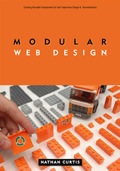
modularwebdesignModular Web Design: Creating Reusable Components for User Experience Design and Documentation, by Nathan Curtis, of eightshapes fame. Components, frameworks, and modularity are near and dear to my heart (when applied in the right times and places for design purposes), so I can say with confidence that Modular Web Design is the best exploration of the what, how and why of modular design currently available. It should change the way you think about architecting experiences of all kinds, and – if you’re on board already – help you put this approach into practice with clear examples, advice, and guidance.

cardsorting-mdCard Sorting: Designing Usable Categories, from the good people at Rosenfeld Media. Card Sorting is a thorough treatment of one of the most flexible, affordable, and lightweight methods in the user experience toolkit. Use my tool, but for chapter and verse on card sorting, read Donna Spencer’s book.

Buy both, and enjoy!

Comment » | Information Architecture, User Experience (UX)

User Experience: About To Be Commoditized?

October 2nd, 2008 — 12:00am

Reading about the recent release of SocialText 3 I was struck by the strong parallels between the defining characteristics of enterprise environments in 2003/2004, and the emerging public Web 2.0 landscape. The essential characteristics of many enterprise environments are:

  • Syndication: streams of modular content and functionality broadcast widely to subscribers within the firewall, such as enterprise data feeds, ERP, BI capabilities, CRM, custom capabilities shared via SOA
  • Services (e.g. environmental, like the bees we used to have for pollination): identity, security, publication, data management, cloud storage, imap email, etc.
  • Social Structures: tangible networks & communities of like-minded people, oriented around a common practice, purpose, process, or pain; think of all the matrixed, horizontal org structures and ad-hoc networks encoded via internal email lists, IM, sprawling intranets, corporate directories, etc.

These same attributes are emerging as the hallmarks of the public Web 2.0 landscape. This is how the three S’s manifest for Web 2.0:

  • Syndication: A literal and figurative torrent of content in the form of blogs, RSS, feeds, streams, APIs, for social objects of all types, as well as catalogs of rentable content
  • Services: This layer is growing rapidly for the public internet, with OpenID / OAuth, mapping, visualization, backup, calendaring – the list is nearly infinite, and still expanding
  • Social Structures: The Web (and soon the mobile universe) is profoundly social now, and will continue to become ever more so.

I think you can easily see the strong parallels. It’s this similarity between the older enterprise environments and the emerging Web 2.0 environment that user experience practitioners, — and especially anyone practicing information architecture — should note.
Why? As I’ve written before, modularity is everywhere in this new environment, it’s apparent at all layers of the information world, from utilities like processing power, to services, to the elements that make up the user experience. The effects of modularity in syndication, services, and social structures on developers and IT have been profound; practices, processes, organizational structures, and business models have all shifted in response.

This wave of change first affected the developers who build and work directly with code and systems. But inevitably, disciplines further up the stack are feeling the impact of this shift, though many of us (and I’m putting user experience in this class) may not know it yet.

How will we feel that impact? One obvious way is in the pressure to adopt agile and other modular product construction practices created by and for developers as the preferred way to structure user experience and design efforts. This is a mistake that confuses the different stages of software / digital product creation (as Alan Cooper explained well at Agile2008). Design is not construction, and shouldn’t be treated as if it is. And one size fits all does not work when choosing the process and toolkit used for creating complex digital products, services, or experiences.

One result of this modularity rules all approach to user experience is the erosion of bounded or well-structured design processes that balance risk effectively for the various stages of design, and were meant to ensure the quality and relevance of the resulting products and experiences. Erosion is visible the trends toward compression or elimination of recognizable design concept exploration and usability verification activities in many design methods.

More immediately – in fact staring us right in the face, though I haven’t seen mention of it yet in m/any user experience forums – is the growing number of situations wherein there’s “No designer required”.

Examples of this abound, but just consider this feature list for the Social Text 3 Dashboard:

  • You decide what matters
  • Create your dashboard in minutes
  • Include 3rd party information and applications
  • Track & attend to what’s most important to you
  • Status updates flow automatically, as you work

If that’s not specific enough, here’s what comes out of the box, in the form of pre-built widgets:

  • My Conversations – changes others have made to any Socialtext workspace page you authored, edited, or commented on
  • My Colleagues – recent updates made by people you are subscribed to
  • Workspaces – workspaces you have access to and their activity metrics
  • Workspace Page – any page from any of your Socialtext workspaces
  • RSS Viewer – results of an RSS feed you configure
  • Workspace Tags – a tag cloud of all tags in a particular workspace
  • All People Tags – a tag cloud of all tags on people in Socialtext People

No architect required for most people here… and this trend is everywhere.

And then there’s the awesome spectre ofcommoditization. Listening to a friend describe the confusing experience of trying to select a short list of design firms for inclusion in an RFP made the linkage clear to me. I’ll quote Weil’s definition of commoditization from the paper referenced above, to make the point explicit.

Please recall that commoditization denotes the development of a competitive environment where:

  • Product differentiation is very difficult;
  • Customer loyalty and brand values are low;
  • Competition is based primarily on price; and
  • Sustainable advantage comes from cost (and sometimes quality) leadership.
  • Commoditization is driven by excess capacity.

Please note that I’m not implying user experience practitioners face overnight obsoletion.

But I am saying that I doubt our current disciplinary worldview and toolkit adequately prepare us for the realities of the new environment emerging so rapidly. Code, by contrast, is and always will be modular. (After all, that is the defining attribute of our alphabets.)

But user experience is holistic, and has to learn to build in its own way from these smaller pieces like a writer combining words and phrases. Eventually, you can create works of tremendous depth, richness, and sophistication; think of Ulysses by James Joyce, or the Mahabharata. These are richly nuanced experiences that are the result of working with modular elements.

My suggestion for one response to the oncoming wave of modularity and commoditization is to focus our value proposition in the creation of tools that other people use to define their individual experiences. In other words, shift our professional focus to higher layers of abstraction, and get into the business of defining and designing frameworks, networks, and systems of experience components. Practically, this will mean things like observing and defining the most valuable patterns arising in the use of systems of modular elements we design, and then advising on their use to solve problems. This is the direction common within enterprise environments, and in light of the appearance of public pattern libraries (Yahoo’s UI), I think I see it happening within parts of the user experience community. I’m not sure it’s happening fast enough, though.

I hoped to communicate some of these ideas in my talk on why frameworks are the future (at least for anyone practicing Experience Architecture) for the 2008 EuroIA Summit that just took place here in lovely Amsterdam. I’ll post the slides shortly. In the meantime, what do you think? Is user experience ready for the modularized, enterprise-like environment of Web 2.0? How are you responding to these changes? Is commoditization even on your radar?

Comment » | Information Architecture, Tools, User Experience (UX)

Understanding Juicy Rationalizations: How Designers Make Ethical Choices

June 23rd, 2008 — 12:00am

Understanding Juicy Rationalizations, part 3 of the Designing Ethical Experiences series, just went live at UXMatters.

Here’s the teaser:

From “The Big Chill”

Michael: “I don’t know anyone who could get through the day without two or three juicy rationalizations.”

“They’re more important than sex.”

Sam: “Ah, come on. Nothing’s more important than sex.”

Michael: “Oh yeah? Ever gone a week without a rationalization?”

Designers rationalize their choices just as much as everyone else. But we also play a unique role in shaping the human world by creating the expressive and functional tools many people use in their daily lives. Our decisions about what is and is not ethical directly impact the lives of a tremendous number of people we will never know. Better understanding of the choices we make as designers can help us create more ethical user experiences for ourselves and for everyone.
circle-logo_newBg3.gif
Understanding Juicy Rationalizations is the first of a pair of articles focused on the ways that individual designers make ethical choices, and how we can improve our choices. This second pair of articles is a bit of eye-opening window into how people make many of the choices in our daily lives – not just design decisions. Or, at least it was for me… Readers will see connections much broader than simply choices we explicitly think of as ‘ethical’ and / or design related.

The final installment in the Designing Ethical Experiences series is titled “Managing the Imp of the Perverse” – watch for it sometime soon.

With the publication of these next two articles, the Designing Ethical Experiences series consists of two sets of matched pairs of articles; the first article in each pair framing a problematic real-life situation designers will face, and the second suggesting some ways to resolve these challenges ethically.

The first pair of articles – Social Media and the Conflicted Future and Some Practical Suggestions for Designing Ethical Experiences – looked at broad cultural and technology trends like social media and DIY / co-creation, suggesting ways to discover and manage likely ethical conflicts within the design process.

It’s a nice symmetrical structure, if you dig that sort of thing.  (And what architect doesn’t?)

For commuters / multi-taskers / people who prefer listening to reading, Jeff Parks interviewed me on the contents of this second set of articles, which he will publish shortly as a podcast.

Thanks again to the editorial team at UXMatters for supporting my exploration of this very important topic for the future of experience design. In an age when everyone can leverage professional-grade advertising the likes of Spotunner, the ethicality of the expressive tools and frameworks designers create is a question of critical significance for us all.

Comment » | Ethics & Design, Social Media, User Experience (UX)

Designing Ethical Experiences: Some Practical Suggestions Live @ UXMatters

April 13th, 2008 — 12:00am

A quick anouncement: part two of the series on ethics and experience design Designing Ethical Experiences: Some Practical Suggestions, is just live at UXMatters. In this followup to the first installment, you’ll find a fiarly extensive set of suggested techniques for resolving conflicts – ethical and otherwise – during the strategy and design phases of experience design efforts. If you’ve had issues with ethics or conflict during a design effort, these simple techniques should be a useful starting point.

Looking ahead, part three of the series will explore recent research on the way that people make decisions with ethical implications in business settings (good for designers who want to be aware of their own methods and states of mind, and how those drive design work), and the importance of neutral models in making ethical design decisions.

Here’s an excerpt:

Thankfully, successfully addressing ethical challenges during design does not require the creation of a formal or detailed code of ethics–or the creation of a professional body that would sustain such an effort. Designers can use the fact that ethical questions often appear first in the form of conflicts–in values, goals, mental models, or otherwise–to manage ethical dilemmas as simply another form of conflict. Further, we can treat conflict as a natural, though often unexplored element of the larger context user experience always seeks to understand. With this framing, conflict becomes a new layer of integrated experiences–a layer that encompasses ethical dilemmas. We can pragmatically incorporate this new layer of ethical dilemmas into our existing frameworks for user experience.

Comment » | Ethics & Design, User Experience (UX)

New Books: ‘Tagging’ and ‘Mental Models’

March 12th, 2008 — 12:00am

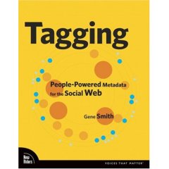
If you’re interested in tagging and social metadata, social bookmarking, or information management, be sure to check out Gene Smith’s Tagging: People-Powered Metadata for the Social Web recently published by from New Riders. I reviewed some of the early drafts of the book, and it’s come together very nicely.
tagging_cover.jpg
Tagging takes a very practical approach, and provides an ample set of examples in support of the insightful analysis. After an overview of tagging and its value, the book addresses tagging system design, tags in relation to traditional metadata and classification systems, and covers the user experience of creating and navigating tag clouds.

Gene likes to build things, so Tagging includes a chapter on technical design complete with suggested tools and tutorials for creating your own tagging apps.

All in all, Tagging is a worthy introduction to the subject, and a guide for deeper exploration.
While we’re talking books, kudos to Rosenfeld Media on the publication of their first book, Mental Models; Aligning Design Strategy with Human Behavior, by the very talented Indi Young!
mental-models-lg.gif
Mental Models is richly illustrated, filled with examples, lucid, and accompanied by a considerable amount of additional content from the Rosenfeld Media website.

Indi has considerable experience teaching others the techniques and methods behind creating insightful mental models for audiences and customers. Cognitive / frameworky methods can feel a bit heady at times (especially how-to’s on those methods), but Mental Models is straightforward reading throughout, and an eminently practical guide to using this important tool for user experience design and strategy.

Mental Models is available electronically as a .pdf for individual and group licenses, or in hard copy; it’s choose your own medium in action.

Comment » | Reading Room, Tag Clouds, User Experience (UX), User Research

Video of My BlogTalk Presentation

March 11th, 2008 — 12:00am

Video of my BlogTalk presentation ‘What happens when everyone designs social media? Practical suggestions for handling new ethical dilemmas’ is available from Ustream.tv. The resolution is low (it was shot with a webcam) but the audio is good: follow along with the slides on your own for the full experience.

More videos of BlogTalk sessions here.


Comment » | Ethics & Design, Networks and Systems, Social Media, User Experience (UX)

Blogtalk 2008 slides available

March 3rd, 2008 — 12:00am

My slides from Blogtalk 2008 are available online now: I went through a lot of ideas quickly, so this is a good way to follow along at your own pace…

FYI: This version of the deck includes presenters notes – I’ll upload a (larger!) view-only version once I’m back from holiday in lovely Eire.

When Everyone Is A Designer: Practical Techniques for Ethical Design in the DIY Future from Joe Lamantia

Comment » | Ideas, Networks and Systems, User Experience (UX)

Discovering User Goals / IR Goal Definitions

June 24th, 2006 — 12:00am

In an earlier post on creating Goal Based Information Retrieval Experiences, I offered a list of fundamental user goals that underlays needs and usage of four suggested information retrieval modes. In this post, I’ll share the approach employed to discover the fundamental goals of the users in our environment, with the aim of offering it as one way of understanding goals relevant for other types of environments and user experience architectures.

Since the root user goals we identified are potentially applicable to other environments and contexts, I’ll share the definitions behind the full set of root goals we discovered. Together, the approach and definitions should help demonstrate how capture a systematic and also holistic view of what users have need to accomplish when undertaking information retrieval tasks more complex than searching.

Finally, addressing the perspective of strategic design and user experience methodology, framing broad user goals well offers strong footing for addressing business perspectives, and engaging business audiences in productive discussions on the priority of capabilities and the functionality of the user experience.

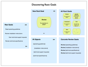
Discovering Root Goals
Beginning with raw goals gathered via a mixed palette of discovery and user research (interviews, task analysis, contextual inquiry, or other qualitative insight methods) incorporated into the project, we first called out the different types or objects of information users identified.

Our starting lists of raw user goals or needs looked something like this (though it was considerably larger, and more varied):

  • Read operating guidelines
  • Review installation instructions
  • Scan technical support requests
  • Review technical specifications

Identifying the objects in this set is not difficult: technical specifications, operating guidelines, installation instructions, and support requests. The activity verbs are also easy to spot:

  • read
  • scan
  • review

We then compared the activity verbs for similarity and differences, and refined these raw goals into a root goal of “review” that could apply to any of the objects users named.
Recombining the root goal with various objects yields a set of concrete goals:

  • Review operating guidelines
  • Review installation instructions
  • Review technical specifications
  • Review technical support requests

This approach is more art than science, but is systematic, and is independent of context and format.

Here’s an illustration of the process.

Discovering Root Goals

Final Root Goals For Our Environment
These are the definitions we established for the root goals we found for all our different types of users. [I haven’t included the objects of the goals, or the concrete goals.]

  • To Assess means to make a judgement or decision about, considering relevant factors
  • To Compare means to review the similarities and differences of two or more examples of the same type of thing by looking at them in detail
  • To Find means to learn the location and status of
  • To Identify means to distinguish by the use of specific criteria
  • To Locate means to become aware of where and how a thing may be found, and / or contacted. Locate and find are similar, so likely reflect differing but similar usages and contexts in the minds of users
  • To Monitor means to track the status and location of
  • To Obtain means to acquire and retain for other purposes
  • To Participate means to be present and recognized
  • To Review means to examine in detail
  • To Save means to store and keep
  • To See means to be presented with in a manner that makes assumed relationships or characteristics apparent
  • To Understand means to consider all available points of view or sources of information on a topic / item / situation, and formulate an opinion and frame of reference for one’s own purposes.

Some example concrete goals for an user experience that addresses travel planning could include:

  • Find hotels
  • Review hotel accommodations
  • Save travel itineraries
  • Compare vacation packages
  • See optional excursions offered by a hotel
  • Identify full-service or all-inclusive resorts
  • Locate the operators of scuba diving excursions
  • Monitor the price of airline tickets to Sardinia
  • Understand how to plan and purchase vacations
  • Assess the cost and value of a vacation package

Symmetry and Mental Models
We found the concept of a root goal insightful for helping to design user experience architectures because it is independent of particular user roles, information types, and usage contexts. Being root elements, they point at commonalities rather than differences, and so can help guide the definition of mental models that span user groups, or allow the reuse of an information architecture element such as a navigation component, task flow, or screen layout.

Building numerous concrete goals that are variations on a smaller set of common root goals allows the mental model for the environment to achieve a greater degree of consistency and predictability (we hope – we’ll see what the usability and evaluations bring back). This consistency helps further efforts toward symmetry throughout the information architecture. While most information architects unconsciously reach for symmetry in user experiences by designing repeated elements such as common labeling, rules for layout, and component systems of features and functionality – symmetry is something we should make more conscious efforts to encourage both within environments and across environments.

Speaking To the Business: Goal-based Prioritization of Capabilities and Functionality
With solid root goals and common information objects, it’s possible to build up a simple and consistent grammar that outlines the set of possible concrete goals across user types. This set of goals is a good basis for engaging business stakeholders in choosing the right set of priorities to guide design and build efforts. Systematically articulated goals allow business audiences a comfortable and neutral basis for prioritizing the capabilities the environment will offer users. Of course, choices of capability directly affect costs, effort levels, design and build timelines, and all the other tangible aspects of a user experience. Reference priorities can also help guide longer-term investment and strategy decisions.

Comment » | Information Architecture, User Experience (UX), User Research

Common Findings of Social Informatics

June 23rd, 2005 — 12:00am

Found via via, orig­i­nat­ing in an arti­cle titled Social Infor­mat­ics: Overview, Prin­ci­ples and Oppor­tu­ni­ties from the ASIST Bul­letin spe­cial issue on Social Infor­mat­ics, which, inci­den­tally is one of those very inter­est­ing dis­ci­plines I don’t have enough time to keep up with, but that has much to offer prac­tic­ing infor­ma­tion archi­tects.
On com­put­er­i­za­tion, Sawyer says, “Com­put­er­i­za­tion, to para­phrase soci­ol­o­gist Bev­erly Bur­riss, is the imple­men­ta­tion of com­put­er­ized tech­nol­ogy and advanced infor­ma­tion sys­tems, in con­junc­tion with related socioe­co­nomic changes, lead­ing to a fun­da­men­tal restruc­tur­ing of many social orga­ni­za­tions and insti­tu­tions.“
Add in a client man­age­ment clause, and this is essen­tially my job descrip­tion as an archi­tect / designer / cre­ator of infor­ma­tion envi­ron­ments that solve busi­ness prob­lems. I don’t know Bur­riss’ work — does any­one else?
Directly address­ing the role of a con­structed prob­lem Sawyer says, “…social infor­mat­ics is problem-oriented. This work is defined by its inter­est in par­tic­u­lar issues and prob­lems with com­put­er­i­za­tion and not by its adher­ence to cer­tain the­o­ries or par­tic­u­lar meth­ods (as is oper­a­tions research).“
In what looks like a neatly phrased snap­shot of user research, Sawyer says, “The strong empir­i­cal basis of social infor­mat­ics work, how­ever, is com­bined with both method­olog­i­cal and the­o­ret­i­cal plu­ral­ity. Social infor­mat­ics work typ­i­cally includes an array of data col­lec­tion approaches, sophis­ti­cated large-scale analy­ses and com­plex con­cep­tu­al­iza­tions.“
Here’s a longer excerpt:
The Com­mon Find­ings of Social infor­mat­ics
More than 30 years of care­ful empir­i­cal research exists in the social infor­mat­ics tra­di­tion. As noted, this work is found in a range of aca­d­e­mic dis­ci­plines, reflects a mix of the­o­ries and meth­ods, and focuses on dif­fer­ent issues and prob­lems with com­put­er­i­za­tion. Here I high­light five obser­va­tions that are so often (re)discovered that they take on the notion of com­mon find­ings rel­a­tive to com­put­er­i­za­tion.
1. Uses of ICT lead to mul­ti­ple and some­times para­dox­i­cal effects. Any one ICT effect is rarely iso­lat­able to a desired task. Instead, effects of using an ICT spread out to a much larger num­ber of peo­ple through the socio-technical links that com­prise con­text. An exam­i­na­tion of this larger con­text often reveals mul­ti­ple effects, rather than one all-encompassing out­come, and unex­pected as well as planned events. For exam­ple, peer-to-peer file shar­ing may help some musi­cians and hurt oth­ers.
2. Uses of ICT shape thought and action in ways that ben­e­fit some groups more than oth­ers. Peo­ple live and work together in pow­ered rela­tion­ships. Thus, the polit­i­cal, eco­nomic and tech­ni­cal struc­tures they con­struct include large-scale social struc­tures of cap­i­tal exchange, as well as the microstruc­tures that shape human inter­ac­tion. An exam­i­na­tion of power often shows that a system’s imple­men­ta­tions can both rein­force the sta­tus quo and moti­vate resis­tance. That is, the design, devel­op­ment and uses of ICTs help reshape access in unequal and often ill-considered ways. Thus, course man­age­ment sys­tems may pro­vide added ben­e­fits to some stu­dents, put added pres­sure on some fac­ulty and allow some admin­is­tra­tors to use the sys­tem to col­lect addi­tional evi­dence regard­ing the per­for­mances of both stu­dents and fac­ulty.
3. The dif­fer­en­tial effects of the design, imple­men­ta­tion and uses of ICTs often have moral and eth­i­cal con­se­quences. This find­ing is so often (re)discovered in stud­ies across the entire spec­trum of ICTs and across var­i­ous lev­els of analy­sis that igno­rance of this point bor­ders on pro­fes­sional naïveté. Social infor­mat­ics research, in its ori­en­ta­tion towards crit­i­cal schol­ar­ship, helps to raise the vis­i­bil­ity of all par­tic­i­pants and a wider range of effects than do other approaches to study­ing com­put­er­i­za­tion. For exam­ple, char­ac­ter­iz­ing errors in diag­nos­ing ill­nesses as a human lim­i­ta­tion may lead to the belief that imple­ment­ing sophis­ti­cated computer-based diag­nos­tic sys­tems is a bet­ter path. When these sys­tems err, the ten­dency may be to refo­cus efforts to improve the com­put­er­ized sys­tem rather than on bet­ter under­stand­ing the processes of triage and diag­no­sis.
4. The design, imple­men­ta­tion and uses of ICTs have rec­i­p­ro­cal rela­tion­ships with the larger social con­text. The larger con­text shapes both the ICTs and their uses. More­over, these arti­facts and their uses shape the emer­gent con­texts. This can be seen in the micro-scale adap­ta­tions that char­ac­ter­ize how peo­ple use their per­sonal com­put­ers and in the macro-scale adap­ta­tions evi­dent in both the evolv­ing set of norms and the chang­ing designs of library automa­tion sys­tems. Library automa­tion is not sim­ply about recent devel­op­ments of appli­ca­tions with sophis­ti­cated librar­i­an­ship func­tion­al­ity; it is also about patrons’ dif­fer­en­tial abil­i­ties to use com­put­ers, library bud­get pres­sures, Inter­net access to libraries and the increas­ing vis­i­bil­ity of the Inter­net and search­ing.
5. The phe­nom­e­non of inter­est will vary by the level of analy­sis. Because net­works of influ­ence oper­ate across many dif­fer­ent lev­els of analy­sis, rel­e­vant data on com­put­er­i­za­tion typ­i­cally span for­mal and infor­mal work groups; for­mal orga­ni­za­tions; for­mal and infor­mal social units like com­mu­ni­ties or pro­fes­sional occupation/associations; groups of orga­ni­za­tions and/or indus­tries; nations, cul­tural groups and whole soci­eties. This com­mon find­ing is exem­pli­fied by the tremen­dous pos­i­tive response by younger users to peer-to-peer file shar­ing, the absolute oppo­site response by music indus­try lead­ers and the many approaches taken by orga­ni­za­tional and civic lead­ers regard­ing the legal­i­ties and responses to use.

No related posts.

Comment » | User Research

Back to top