Tag: information_retrieval


Endeca Guided Navigation vs. Facets In Search Experiences

February 26th, 2007 — 12:00am

A recent question on the mailing list for the Taxonomy Community of Practice asked about search vendors whose products handle faceted navigation, and mentioned Endeca. Because vendor marketing distorts the meaning of accepted terms too often, it’s worth pointing out that Endeca’s tools differ from faceted navigation and organization systems in a number of key ways. These differences should affect strategy and purchase decisions on the best approach to providing high quality search experiences for users.

The Endeca model is based on Guided Navigation, a product concept that blends elements of user experience, administration, functionality, and possible information structures. In practice, guided navigation feels similar to facets, in that sets of results are narrowed or filtered by successive choices from available attributes (Endeca calls them dimensions).

But at heart, Endeca’s approach is different in key ways.

  • Facets are orthogonal, whereas Endeca’s dimensions can overlap.
  • Facets are ubiquitous, so always apply, whereas Endeca’s dimensions can be conditional, sometimes applying and sometimes not.
  • Facets reflect a fundamental characteristic or aspect of the pool of items. Endeca’s Dimensions may reflect some aspect of the pool of items (primary properties), they may be inferred (secondary properties), they may be outside criteria, etc.
  • The values possible for a individual facet are flat and equivalent. Endeca’s dimensions can contain various kinds of structures (unless I’m mistaken), and may not be equivalent.

In terms of application to various kinds of business needs and user experiences, facets can offer great power and utility for quickly identifying and manipulating large numbers of similar or symmetrical items, typically in narrower domains. Endeca’s guided navigation is well suited to broader domains (though there is still a single root at the base of the tree), with fuzzier structures than facets.

Operatively, facets often don’t serve well as a unifying solution to the need for providing structure and access to heterogeneous collections, and can encounter scaling difficulties when used for homogenous collections. Faceted experiences can offer genuine bidirectional navigation for users, meaning they work equally well for navigation paths that expand item sets from a single item to larger collections of similar items, because of the symmetry built in to faceted systems.

Guided navigation is better able to handle heterogeneous collections, but is not as precise for identification, does not reflect structure, and requires attention to correctly define (in ways not confusing / conflicting) and manage over time. Endeca’s dimensions do not offer bidirectional navigation by default (because of their structural differences – it is possible to create user experiences that support bidirectional navigation using Endeca).

In sum, these differences should help explain the popularity of Endeca in ecommerce contexts, where every architectural incentive (even those that may not align with user goals) to increasing the total value of customer purchases is significant, and the relevance of facets to searching and information retrieval experiences that support a broader set of user goals within narrower information domains.

Comment » | Enterprise, Information Architecture, User Experience (UX)
10 Information Retrieval Patterns

June 29th, 2006 — 12:00am

In an earlier posting titled Goal Based Information Retrieval, I reviewed four modes of information retrieval that my team identified as addressing user goals in a broader and more effective fashion than the simple query and response searching common today.

In this follow-up, I’ll share a set of 10 potentially reusable information retrieval patterns that describe the ways users combine and switch modes to meet goals: Each pattern is assembled from combinations of the same four modes. We found these patterns while analyzing and interpreting user research on the goals and behaviors of a wide variety of users active within a large information environment. This environment provides complex financial services content and capabilities through a product-based user experience that requires a costly subscription. This particular set of patterns emerged from a mix of user research gathered using ethnography, contextual analysis, cognitive walkthrough, and heuristics review, in addition to straight forward interviews with users.

The four modes we found for our users were: seeking, visiting stable destinations, monitoring, and receiving delivered information (full definitions available in the original article). Each mode emphasizes a different combination of lower or higher levels of user activity to obtain information, and greater or lesser stability of the settings users encounter.

The patterns identify consistent combinations and sequences of the information retrieval modes that users employ while undertaking goals.

We’ve suggested names to capture the flavor for the ten patterns we found:

  • Seeker
  • Regular Customer
  • Explorer
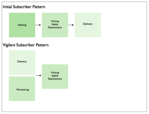
  • Initial Subscriber
  • Vigilant Subscriber
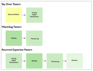
  • Skydiver
  • Watchdog
  • Returned Expatriate
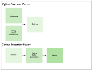
  • Vigilant Customer
  • Curious Subscriber

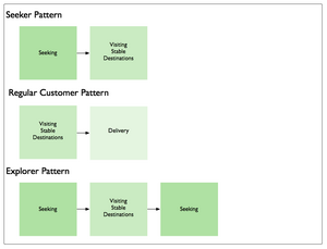
To make the patterns easier to understand, the illustrations and descriptions below show the different modes that make up each pattern.
Seeker, Regular Customer, Explorer Patterns

Seeker
The Seeker is looking for something. Once found, the Seeker goes elsewhere to accomplish other goals.

Regular Customer
The Regular Customer visits the same destination(s) consistently for the same reasons. Then the Regular Customer realizes they can save the time and effort of visiting, and switches modes to have the things they need delivered directly to them.

Explorer
The Explorer is learning about a new (or changed) environment; exploring it’s structure, contents, laws, etc. The Explorer may do this for their own purposes, or for others.

Initial Subscriber, Vigilant Subscriber Patterns

Initial Subscriber
The Initial Subscriber seeks what is needed, finds the things needed, goes to their location(s), and then chooses to have these things delivered to allow them to seek other things.

Vigilant Subscriber
The Vigilant Subscriber makes effective use of monitoring and delivery, followed up with visitation of destinations, to ensure they do not miss out on anything that might be useful to them within the environment.

Skydiver, Watchdog, Returned Expatriate Patterns

Skydiver
The Skydiver makes a bold entrance from outside the environment, and lands precisely on target.

Watchdog
The Watchdog first finds things, and then places them under careful watch.

Returned Expatriate
The Returned Expatriate was away, and is back again. They begin by revisiting known places, then seek out what has changed, monitor changes for a while, and eventually begin to have valuable things delivered.

Vigilant Customer, Curious Subscriber Patterns

Vigilant Customer
The Vigilant Customer comes by often, but wants to be sure, and so monitors things from afar for a while before deciding delivery is more effective.

Curious Subscriber
The Curious Subscriber has things delivered regularly, but visits all the same to see what else may be available. And just to be sure, they seek out the things they suspect are here, but cannot see immediately.

Reusing Modes and Patterns
Reuse is rare in the realm of user experience and information architecture. The information retrieval modes we identified are independent of user role, persona, or user type. As a result, the patterns assembled from those modes are also independent of the same contextual factors. Since the modes and patterns are not tied to specific features, functionality, or information structures, this would seem to indicate that modes and patterns may resuable in different environments for user populations pursuing similar root goals.

I hope mode-based patterns like these offer some level of reusability. To that end, I am curious about where and how they help define information retrieval experiences for other types of users and other domains.

If you use them, send me a note about where, when, and how.

1 comment » | Information Architecture, Modeling, User Experience (UX)

Discovering User Goals / IR Goal Definitions

June 24th, 2006 — 12:00am

In an earlier post on creating Goal Based Information Retrieval Experiences, I offered a list of fundamental user goals that underlays needs and usage of four suggested information retrieval modes. In this post, I’ll share the approach employed to discover the fundamental goals of the users in our environment, with the aim of offering it as one way of understanding goals relevant for other types of environments and user experience architectures.

Since the root user goals we identified are potentially applicable to other environments and contexts, I’ll share the definitions behind the full set of root goals we discovered. Together, the approach and definitions should help demonstrate how capture a systematic and also holistic view of what users have need to accomplish when undertaking information retrieval tasks more complex than searching.

Finally, addressing the perspective of strategic design and user experience methodology, framing broad user goals well offers strong footing for addressing business perspectives, and engaging business audiences in productive discussions on the priority of capabilities and the functionality of the user experience.

Discovering Root Goals
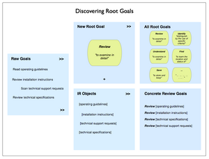
Beginning with raw goals gathered via a mixed palette of discovery and user research (interviews, task analysis, contextual inquiry, or other qualitative insight methods) incorporated into the project, we first called out the different types or objects of information users identified.

Our starting lists of raw user goals or needs looked something like this (though it was considerably larger, and more varied):

  • Read operating guidelines
  • Review installation instructions
  • Scan technical support requests
  • Review technical specifications

Identifying the objects in this set is not difficult: technical specifications, operating guidelines, installation instructions, and support requests. The activity verbs are also easy to spot:

  • read
  • scan
  • review

We then compared the activity verbs for similarity and differences, and refined these raw goals into a root goal of “review” that could apply to any of the objects users named.
Recombining the root goal with various objects yields a set of concrete goals:

  • Review operating guidelines
  • Review installation instructions
  • Review technical specifications
  • Review technical support requests

This approach is more art than science, but is systematic, and is independent of context and format.

Here’s an illustration of the process.

Discovering Root Goals

Final Root Goals For Our Environment
These are the definitions we established for the root goals we found for all our different types of users. [I haven’t included the objects of the goals, or the concrete goals.]

  • To Assess means to make a judgement or decision about, considering relevant factors
  • To Compare means to review the similarities and differences of two or more examples of the same type of thing by looking at them in detail
  • To Find means to learn the location and status of
  • To Identify means to distinguish by the use of specific criteria
  • To Locate means to become aware of where and how a thing may be found, and / or contacted. Locate and find are similar, so likely reflect differing but similar usages and contexts in the minds of users
  • To Monitor means to track the status and location of
  • To Obtain means to acquire and retain for other purposes
  • To Participate means to be present and recognized
  • To Review means to examine in detail
  • To Save means to store and keep
  • To See means to be presented with in a manner that makes assumed relationships or characteristics apparent
  • To Understand means to consider all available points of view or sources of information on a topic / item / situation, and formulate an opinion and frame of reference for one’s own purposes.

Some example concrete goals for an user experience that addresses travel planning could include:

  • Find hotels
  • Review hotel accommodations
  • Save travel itineraries
  • Compare vacation packages
  • See optional excursions offered by a hotel
  • Identify full-service or all-inclusive resorts
  • Locate the operators of scuba diving excursions
  • Monitor the price of airline tickets to Sardinia
  • Understand how to plan and purchase vacations
  • Assess the cost and value of a vacation package

Symmetry and Mental Models
We found the concept of a root goal insightful for helping to design user experience architectures because it is independent of particular user roles, information types, and usage contexts. Being root elements, they point at commonalities rather than differences, and so can help guide the definition of mental models that span user groups, or allow the reuse of an information architecture element such as a navigation component, task flow, or screen layout.

Building numerous concrete goals that are variations on a smaller set of common root goals allows the mental model for the environment to achieve a greater degree of consistency and predictability (we hope – we’ll see what the usability and evaluations bring back). This consistency helps further efforts toward symmetry throughout the information architecture. While most information architects unconsciously reach for symmetry in user experiences by designing repeated elements such as common labeling, rules for layout, and component systems of features and functionality – symmetry is something we should make more conscious efforts to encourage both within environments and across environments.

Speaking To the Business: Goal-based Prioritization of Capabilities and Functionality
With solid root goals and common information objects, it’s possible to build up a simple and consistent grammar that outlines the set of possible concrete goals across user types. This set of goals is a good basis for engaging business stakeholders in choosing the right set of priorities to guide design and build efforts. Systematically articulated goals allow business audiences a comfortable and neutral basis for prioritizing the capabilities the environment will offer users. Of course, choices of capability directly affect costs, effort levels, design and build timelines, and all the other tangible aspects of a user experience. Reference priorities can also help guide longer-term investment and strategy decisions.

Comment » | Information Architecture, User Experience (UX), User Research

Goal Based Information Retrieval Experiences

June 20th, 2006 — 12:00am

Though it’s common practice, thinking of information retrieval exclusively as ‘search’ is an arbitrarily narrow way of framing an area of capability with strong impact on overall perceptions of user experience quality and effectiveness. In the long term, it limits opportunities to offer customers more effective solutions to broader and more fully understood needs that involve information retrieval, but are motivated by other goals. This narrow view is especially limiting for the user experience architect, as it implies an immediate focus on the search aspects of information environments.
A better way of framing information retrieval is in terms of opportunities to meet genuine user goals and objectives by supporting more varied modes of activity. Users often have broad goals in mind while they pursue information retrieval activities; buying a car, making a good investment decision, or learning how to manage their health care plans. And yet the information architecture of many environments still overemphasizes searching as a way of accomplishing goals.
Addressing broader goals with an effective information retrieval experience will likely mean supporting modes of interaction beyond just searching. But providing these additional modes and user experience capabilities can open new opportunities for services, features, revenue, improving relationships, etc.
Even in situations where a wide range of users need to select very specific materials from a large archive or pool of content (the traditional library model), a search-centric information retrieval model that offers no/few other capabilities is reductive and overly simplistic.
Instead of immediately focusing on the scope or functionality of a search experience and system installation, look for the patterns in user goals and needs that imply common modes of interaction with information, and use them as a basis for defining capabilities the environment must offer.
Here’s a list of common types of user goals that involve information retrieval – think of them as root goals that take on different specialized forms in differing environments:

  • reviewing summaries of items
  • examining details
  • comparing multiples
  • understanding contexts and situations
  • learning about people in the environment
  • perceiving trends
  • predicting implications
  • monitoring status or activity
  • identifying by criteria
  • establishing similarity
  • obtaining information for reuse

None of these explicitly includes the activity of searching, though many do imply some level of finding.
For a recent project, we defined four information retrieval or interaction modes that would meet the goals of our expected users:

  • seeking information
  • visiting stable destinations
  • monitoring notifications
  • receiving delivered assets

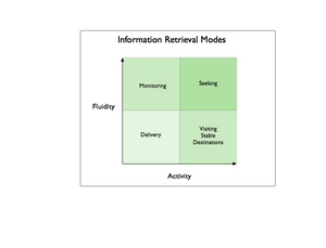
These modes range from more active seeking, to less active receiving delivery, and persistent settings (stable destinations) to fluid settings – monitoring or seeking. Together, they define possible kinds of information retrieval experiences and capabilities that will meet the varying needs and goals of users when properly combined.
Information Retrieval Modes

Seeking
The seeking mode focuses on traditional searching, but includes other activities such as narrowing sets using cumulative parameters, finding with/in faceted systems, and . A classic example of seeking mode is a user who poses an ad-hoc query via a search interface, and sorts through the list of search results returned in response. This list may incorporate many different kinds of items from many different sources, a combination that no other user ever encounters again.
From an information architecture perspective, the key characteristic of seeking mode is that, users bring the situations and contexts (like search results) they encounter into existence by seeking them out. When seeking, users encounter fluid destinations within the larger information environment based on what they are looking for, and how they are looking for it.
Another characteristic of the seeking mode is that users will not know in advance what they will encounter, even though they may have a very good idea of what they need to meet their goal. When seeking, users might be presented with a mixed set of conceptually related items of many different types, from unknown sources, with diverse contents / structure / composition.
Of course, users may not know what they need, or how to ask for it, as Donna Maurer’s 4 Modes of Seeking Information and How to Design for Them points out, but this was a less important factor in the way we framed seeking within our environment than whether users would know what to expect as a result of their seeking activities, and whether they could retrace their path to a particular step of their journey.
Visiting Stable Destinations
When visiting stable destinations, users encounter stable places within the information environment that exist regardless of the user’s activities. Where seeking invokes temporary contexts do not persist, a stable destination is persistent. Persistence could be conceptual only, reflected in navigation elements, or made part of the user experience via any number of mechanisms. All destinations have a focus of some kind, such as a topic, or product, or event, and may be defined by the intersection of several focuses, such as products or documents created by one person that are related to a topic or event.
Destinations could take the form of many kinds of pages – including the A-Z indexes Donna mentions – but could also consist of predetermined combinations of conditions and context that users can revisit without choosing them again. In an environment of known contents, destinations offer users a set of things they understand in advance and expect (after adequate opportunities for learning). Destinations will likely change based on business rules and user context, as well as changes in the items available within the environment.
A good example of a stable destination is the Arts page of the New York Time online; the articles and the art they concern change constantly, yet users know what to expect when they visit. The page is a visible part of the environment conceptually (as a category) and in terms of navigation, and is easily accessible directly from outside the environment.
Monitoring
The monitoring mode is a more fluid and less active information retrieval mode wherein the environment sends users notifications of events, activity, status, or changes taking place within it’s boundaries. The key characteristic of monitoring is that users can accomplish goals without entering the environment, or with only limited entry that takes them to a known setting.
Monitoring effectively extends the user experience and information retrieval capabilities beyond the boundaries of the originating environment, and allows users to know in advance what they will find or encounter when they enter the environment.
Monitoring naturally requires messages or communication tokens, commonly email, RSS, or SMS, but could take many other forms as well. A good example of monitoring is the configurable alerts that many travel services provide to indicate when prices for airline tickets to specific cities change, or match a price point.
Receiving Items via Delivery
Receiving delivered items is the least active mode we defined for users, allowing them to retrieve information without actively seeking, visiting a destination, or monitoring the environment. In this mode, users do not have to enter the environment at all to retrieve information, enabling them to further goals without increasing acquisition costs or effort.
Delivery implies mechanisms to manage the nature, rate, and format of the information to deliver, as well as the channel: email, attachments, RSS, podcasts, vlogs, etc.
Good examples of delivered information are the iconic stock ticker, RSS feeds for blog postings, and email publications.
Combining Modes: User Goals and Customer Lifecycles
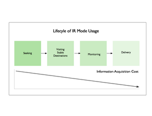
It’s natural that user goals will span modes, and that the preferred mode for accomplishing a goal may change over time to reflect shifting usage patterns and needs.
As an example, a single user might shift among different modes that reflect learning more about the structure and content of the environment. From initial seeking activity focused on searching for information related to a topic, a user may switch to visiting a known stable destination that addresses that topic, entering the environment from the outside without initial seeking.
This destination may include tools to establish monitoring for a specific type of item, which a user who understands the domain will appreciate and take advantage of as a way to reduce the number of required visits while remaining aware of activity or status. Eventually, this user might shift from monitoring to direct delivery of a few specific and very valuable information assets, through a channel and in a format of their choosing.
IR Mode Lifecycle

In the same way that patterns in goals allow experience architects to identify common modes of information retrieval, patterns of cross-mode usage will emerge in populations of users or customers. Once understood, these kinds of flows present opportunities on many levels; user experience, business model or process, and technical architecture.

Related posts:

Comment » | Information Architecture

Semantic Ambiguity Strikes Your Local Pub

May 16th, 2005 — 12:00am

Thursday night I was at Casablanca in Harvard Square for an information architecture meet and greet after Lou’s Enterprise IA seminar. I ordered a Wolver’s. It was dim and noisy, so after shouting three times and pointing, I ended up with a Wolaver’s
Not a surprise, right? My first thought was “What’s in my glass?” My second thought – I was surrounded by information architects – was about the semantic angle on the situation. It seems like a fair mistake to make in a loud and crowded bar. But as someone who works there, he should know the environmental context, the ways it affects fundamental tasks like talking and answering questions, and about any alternatives to what he thought I said that are close enough to be easily mistaken. Before I get too far, I’ll point out that I liked the mistake enough to order another.
Setting aside for a moment the notion of a semantically adept agent system that monitors interactions between bartenders and patrons to prevent mistakes like this, let’s look at something more likely, such as how does Google fair with this situation? Some post-socialization research shows that as far as Google is concerned, all roads do in fact lead to Wolaver’s. Even when Google’s results list begins with a link to a page on Wolver’s Ale from the originating brewery, it still suggests that you might want ‘wolaver’s ale’. Maybe this explains the bartender’s mistake.
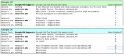
Here’s the breakdown: Google US suggests “wolaver’s ale” when you search for “wolvers ale” and “wolver’s ale”, but not the other way around. When you search for “Wolavers”, Google suggests the correctly punctuated “Wolaver’s”. You can get to the American ale, but not the British.
More surprising, it’s the same from Google UK, when searching only British pages. (Someone tell me how pages become part of the UK? Maybe when they’re sent off to full-time boarding school?)
Google’s insistence on taking me from wherever I start to “Wolaver’s Ale” comes from more than simple American brew chauvanism. This is what happens when the wrong factors drive decisions about the meanings of things; it’s these basic decisions about semantics that determine whether or not a thing correctly meet the needs of the people looking for answers to a question.
You might say semantic misalignment (or whatever we choose to call this condition) is fine, since Google’s business is aimed at doing something else, but I can’t imagine that business leaderhsip and staff at Wolver’s would be too happy to see Google directing traffic away from them by suggesting that people didn’t want to find them in the first place. Neither Wolver’s nor Wolavers seems to have Google ads running for their names, but what if they did? By now we’re all familar with the fact that googling ‘miserable failure‘ returns a link to the White House web site. This reflects a popularly defined association rich in cultural significance, but that isn’t going to satisfy a paying customer who is losing business because a semantically unaware system works against them.
This a good example of a situation in which intelligent disambiguation based on relationships and inferencing within a defined context has direct business ramifications.
Here’s a preview of the full size table that shows the results of checking some variants of wolvers / wolavers:

Related posts:

Comment » | Semantic Web

Back to top