Tag: design


The Rise of Holistic Thinking

July 24th, 2007 — 12:00am

Good design is the result of an unusual mix of two very dif­fer­ent ways of think­ing that must work together to a com­mon end; reduc­tive approaches (to define a prob­lem) and holis­tic approaches (to solve — or rede­fine — the prob­lem by con­sid­er­ing every aspect).

The com­bi­na­tion is a pow­er­ful syn­the­sis which relies on a bal­ance between com­pet­ing forces.

Design­ers have under­stood the impor­tance of this bal­ance — and thus the indis­pens­able role of holis­tic think­ing in design meth­ods — for a long time. But as a con­se­quence of the long-standing dom­i­nance of indus­trial pro­duc­tion processes and log­ics, which elim­i­nated or severely restricted oppor­tu­ni­ties for most peo­ple to design any part of the fab­ric of their every­day lives, holis­tic approaches and think­ing have had min­i­mal vis­i­bil­ity in the mod­ern cul­tural land­scape.

That seems to be chang­ing, and I sus­pect few would dis­pute the rise in vis­i­bil­ity and impor­tance of design within the cul­tural land­scape. Some might say we are in the midst of a renais­sance of design (that com­par­i­son breaks down under a crit­i­cal lens, in the end demon­strat­ing more the pos­i­tive aspi­ra­tions of design advo­cates than any­thing else).

Look­ing at the cul­ture as a whole, the rise of design is one aspect of a larger and much more impor­tant cul­tural shift: the rise of holis­tic think­ing. This shift towards holis­tic views is chang­ing the things we talk about and think about, and hold cen­tral as the ele­ments of our basic frame of ref­er­ence — in short, the way we con­ceive of the world.

The con­cepts in the list below are good exam­ples of the rise of holis­tic think­ing across dis­ci­plines and fields. Seem­ingly willy-nilly (which is exactly the point!), all these ideas rely on, include, or enhance holis­tic view­points at some level:

It’s no acci­dent that this list is also an index of many of the major ideas and con­cerns of our day. What does it mean? Well, it’s good for design at the moment. And maybe there’s a book in it for some­one with the time to syn­the­size an idea and work up a solid treatment…

Comment » | Ideas

Presenting on Ethics Panel at EuroIA 2007

July 2nd, 2007 — 12:00am

*Apologies for another announcement posting* but now that the program is final, I can mention that I’ll be speaking at EuroIA 2007 in lovely Barcelona, as part of the panel Perspectives on Ethics, moderated by Olly Wright. My presentation discusses conflict and ethics as an aspect of design for social online environments.

I shared some initial thoughts on this (under served) area last year, in a short post titled Conflict-Aware Design: Accounting For Conflict In User Experiences. The essential message of this post – and the thing I’m thinking about most regarding the question of conflict – is “conflict equals interest, and interest should be a focus for design.” The panel will be the forum for sharing promised (but not complete) follow-up postings.

While prepping the submission, I was working with this treatment for the topic.

Conflict is a fundamental component of human character and relations, with important ethical dimensions. Yet conflict rarely appears as an explicit consideration during the process of designing the experiences, architectures, systems, or environments that make up the new social and participatory media we use daily. Now that media are social, conflict is inevitable.

How can (or should) designers ethically address conflict within design efforts? Does an ethical framework for design require us to manage conflict in character and relations actively? What mechanisms or social structures should designers use to address conflict within new experiences? Are there new kinds of conflict created or necessitated by the social and participatory environments emerging now?

Some specific areas of discussion: privacy, identity, ownership, responsibility, speech.

I’d love any thoughts on the topic, the treatment, the implications, etc.

Fellow panelists at EuroIA include:

Barcelona is a magnificent city…

The full conference program is available at this address http://www.euroia.org/Programme.aspx, and the roster of speakers along is worth the trip to Barcelona.

And DrupalCon Barcelona happens at the same time – I wonder what sort of cross-pollination will emerge…?

Viva Catalunya!

Comment » | Ethics & Design, User Experience (UX)

Designers, Meet Systems (Recommended Reading)

March 9th, 2007 — 12:00am

2007 looks to be the year that the user experience, information architecture, and design communities embrace systems thinking and concepts.

It’s a meeting that’s been in the making for a while –
At the 2006 IA Summit, Karl Fast and D. Grant Campbell presented From Pace Layering to Resilience Theory: the Complex Implications of Tagging for Information Architecture.
Gene Smith has been writing about systems for a while. At the 2007 summit Gene and Matthew Milan will discuss some practical techniques in their presentation Rich mapping and soft systems: new tools for creating conceptual models.
Peter Merhholz has been posting and talking about the implications of some of these ideas often.
– and seems to have reached critical mass recently:

Here’s a set of reading recommendations related to systems and system thinking. These books, feeds, and articles either talk about systems and the ideas and concepts behind this way of thinking, or contain work that is heavily informed by systems thinking.

Either way, they’re good resources for learning more.

Tags:
http://del.icio.us/tag/systems_theory
http://del.icio.us/tag/systemstheory
http://del.icio.us/tag/SSM

Feeds:
Resilience Science recently featured three excellent essays on the work of C.S. Holling

Books:

And for a lighter read, try anything by author Bruce Sterling that features his recurring character Leggy Starlitz – a self-described systems analyst (likely the first example of one in a work of fiction that’s even moderately well known…). His stories Hollywood Kremlin, Are You for 86?, and The Littlest Jackal (two in short story collection Globalhead), are good places to start. The novel Zeitgest focuses on Starlitz.

Articles:
Sustainability, Stability, and Resilience

We’ve needed to bridge the gulf between views of design rooted in static notions of form and function, and the fluid reality of life for a long time. I hope this new friendship lasts a while.

Comment » | Ideas, Information Architecture, User Experience (UX)

Conflict-Aware Design: Accounting For Conflict In User Experiences

November 7th, 2006 — 12:00am

Conflict is a natural part of human experience. It’s something we encounter every day on levels small and large, and learn to address. And conflict appears at every level of a user experience, from business goals and strategy, user needs, concept and mental models, to task flows, screen-based interactions, terminology, and visual design choices.

Yet many of our user experience practices and approaches do not consider conflict adequately, or at all. User experience design assumptions, artifacts, habits of communication, and working practices combine to bypass adequate consideration of conflict. The result is neglect of conflict as an area of investigation, discussion, and design responsibility. It becomes something we consider only in passing, generally by noting an order of priority for the personas associated with an evolving design

Minimizing conflict may seem pragmatic: exploring conflict makes many people nervous, and stakeholders may not react well unless properly prepared. But this view misses the significance of conflict. Conflict is a pointer to something people care about, pay attention to, need, want, or think is important in some way.

In the same way that smoke equals fire, conflict equals interest, and interest should be a focus for design.

Social Architectures, Experiences, and Environments
Conflict is an especially important area for User experience design to consider now, thanks to the emerging landscape of social media. Social networks, participatory architectures, business and community models dependent on co-creation of content, and collaborative media formats all emphasize social dynamics. These dynamics inevitably include elements of conflict. The continued growth of sharing, networks, interconnections, and complex relationships linking individuals and groups on-line will only increase the role and significance of conflict for successful user experience efforts.

Plainly, if we aim to design for user experiences now and in the future, we must account for conflict. In terms of the evolution of user experience design, the consideration of conflict marks another step in the continued maturation of the field. We might call design approaches that take conflict into account conflict-aware design.

Conflict-aware Design In Practice
Conflict-aware design offers substantial value for designers, stake holders, users – all interested parties, really – with little impact on timelines, costs, approaches, or existing methods. Conflict is simply another aspect of the user experience to explore and understand, share analysis of with decision makers, and direct design solutions to address.

Conflict-aware design builds on and enhances existing practices, adding a layer of context at each stage of the design cycle concerned with the specific conflicts that will impact the user experience. No specialized design documents or techniques are required.

The second part of this essay will consider how common user experience activities and artifacts can be adapted for conflict-aware design.

Comment » | Ethics & Design, User Experience (UX)

Scatterplots As Page Shapes?

March 1st, 2006 — 12:00am

The February edition of Usability News reports on a usability study (Where’s the Search? Re-examining User Expectations of Web Objects) of user expectations for Web page layouts that contains a surprising but interesting visualization of page shapes, based on quantitative user research. (Note: I found the study via the UI Design Newsletter, from HFI.)

The study looks at users” expectations for the location of common web page components, such as site search and advertising. The authors find that expectations for page layouts are largely the same now, as compared to those found in an earlier study, Developing Schemas for the Location of Common Web Objects, conducted in 2001.

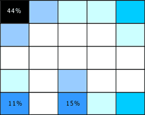
More interesting is the way the researchers report their results; visualizing them as heat map style grid plots for the expected location of each element vs. a blank grid. Here’s two examples, the first showing expected locations for ‘back to home’ links, the second for the ‘site search engine’.

Figure 1: Back to Home Link Location
backtohome.gif

Figure 2: Site Search Engine Location
sitesearch.gif

These heat maps look a lot like page shapes, expressed as scatterplots.

I like the combination of quantitative and qualitative perspectives at work in these page shapes rendered as scatterplots. I think it could allow for grounded discussion and interpretation of user feedback on design options, within a clear and simple structure that doesn’t require an HCI degree to appreciate. If I try it out, I’ll share the outcomes.

In a more traditional style of visualization, Eric Scheid found another another good example of page shapes a while back in Jonathon Boutelle’s posting on blog layouts called “Mullet”-style blog layout. Jonathon was advocating for a new default blog page shape that increases information density and scent, but hews closely to pre-existing expectations.

Figure 3: Typical Blog Page Shape
typical_small-thumb.jpg

Figure 4: Suggested Blog Page Shape
mullet_small.jpg
And that’s the last time I’m mentioning m.u.l.l.e.t.s this year, lest Google get the wrong idea about the subject matter of this blog :)

Comment » | Information Architecture, User Research

User Research = R&D

February 14th, 2006 — 12:00am

This weekend, some of my earlier posts discussing the user experience of Lotus Notes surfaced in the Notes community. Ed Brill – in a posting titled Mary Beth has been taking on the critics – referenced my mention of how the head of the Notes UI team was employing user research as a bridge to customers. Ed complimented the design team for reaching out to critics in public. This is a well-deserved pat on the back. Yet it falls short of recognizing the more important point that direct user research should be a basic component of any company’s overall strategy and planning for long term success (or survival).

Why? User research helps build customer relationships, further design efforts, and identify new business opportunities when applied across audiences (internal and external constituencies) and perspectives (marketing, sales, product development), and with an eye for needs beyond immediate feedback. This sort of engagement with customers of a software product (or any kind of product) should *not* be special or noteworthy – it should happen all the time. Continuously. I’m thinking of Jared Spool’s remarks during his keynote at UI10, to the effect that the user experience perspective is most successful when it it is a basic component of a company’s culture, and thus an assumed aspect of every initiative.

In fact, in a socially transparent, networked, and aware environment like the current FuturePresent, user research serves as a fundamental, indispensable form of research and development that companies and organizations must support as part of their portfolio of methods for seeking broad based environmental feedback (also here). I’ll go so far as to say that user research may move beyond the realm of essential corporate R&D, and qualify as genuine basic research.

BTW: maybe it’s just me, but isn’t it a bit ominous that the tag line for Notes 7 is “Innovate. Collaborate. Dominate.” ? Sounds like something the Borg might say if you asked them how to make breakfast…

Comment » | User Research

Don Norman, Bruce Sterling, The Attention Economy

January 17th, 2006 — 12:00am

Over at uiGarden.net Don Norman clarified some of his ideas regarding Activity Centered Design originally published in the summer of 2005.

I’d like to be comfortable saying that I’m with Don in spirit while disagreeing on some of the particulars, but I’ve read both the original essay and the clarifications twice, and the ideas and the messages are still too raw to support proper reactions or to fully digest. Maybe Don’s working on a new book, and this is interim thinking?

That might explain why the contrast between Norman’s two recent pieces and Bruce Sterling’s Shaping Things – which also is a sort of design philosophy / manifesto – is so dramatic. Halfway through Shaping Things, I’m left – as I usually am when reading Sterling’s work – feeling envious that I wasn’t gifted the same way.

Sterling is speaking at ETech, which this year focuses on The Attention Economy. No surprises with this matchup, given that Sterling’s devoted a whole book – Distraction – to some of the same ideas proponents of the Attention Economy advocate we use as references when designing the future.

Comment » | User Experience (UX), User Research

Enterprise Software is Dead! Long Live… Thingamy?

January 5th, 2006 — 12:00am

Peter Merholz observes that enterprise software is being eaten away from below, by applications such as Moveable Type, and innovators such as SocialText.
“These smaller point solutions, systems that actually address the challenges that people face (instead of simply creating more problems of their own, problems that require hiring service staff from the software developers), these solutions are going to spread throughout organizations and supplant enterprise software the same way that PCs supplanted mainframes.
I sure wouldn’t want to be working in enterprise software right now. Sure, it’s a massive industry, and it will take a long time to die, but the progression is clear, and, frankly, inevitable.”
Indeed it is. Though there’s considerable analyst hoopla about rising enterprise content management or ECM spending and IT investment (see also In Focus: Content Management Heats Up, Imaging Shifts Toward SMBs), we’re in the midst of a larger and longer term cycle of evolution in which cheaper, faster, more agile competitors to established market leaders are following the classic market entry strategy of attacking the bottom of the pyramid. (The pyramid is a hierarchical representation of a given market or set of products; at the top of the pyramid sit the more expensive and mature products which offer more features, capabilities, quality, or complexity; the lower levels of the pyramid include lower cost products which offer fewer features.)
What’s most interesting about the way this pattern is playing out in the arena of enterprise content management solutions is that the new competitors were not at first attacking from the bottom as a deliberate strategy, think of MoveableType, but they have quite quickly moved to this approach as with the recent release of Alfresco. The different origins of Sixapart and Alfresco may have some bearing on their different market entry approaches: Sixapart was a personal publishing platform that’s grown into a content management tool, whereas Alfresco’s intented audience was enterprise customers from day one. I’d wager the founders of Alfresco looked to RedHat as an example of a business model built on OpenSource software, and saw opportunity in the enterprise content management space, especially concerning user experience annd usability weaknesses in ECM platforms.
There’s an easy (if general) parallel in the automotive industry: from American dominance of the domestic U.S. market for automobiles in the post-WWII decades, successive waves of competitors moved into the U.S. automobile market from the bottom of the pyramid, offering less expensive or higher quality automobiles with the same or similar features. The major Japanese firms such as Honda, Toyota, and Nissan were first, followed by Korean firms such as Hyundai and Daewoo. It’s plain that some of the older companies sitting at the top of the pyramid are in fact dying, both literally and figuratively: GM is financially crippled and faces onerous financial burdens — to the point of bankruptcy – as it attempts to pay for the healthcare of it’s own aging (dying) workforce.
So what’s in the future?
For auto makers it’s possible that Chinese or South American manufacturers will be next to enter the domestic U.S. market, using similar attacks at the bottom of the pyramid.
For enterprise software, I think organizations will turn away from monolithic and expensive systems with terrible user experiences — and correspondingly low levels of satisfaction, quality, and efficacy — as the best means of meeting business needs, and shift to a mixed palette of semantically integrated capabilities or services delivered via the Internet. These capabilities will originate from diverse vendors or providers, and expose customized sets of functionality and information specific to the individual enterprise. Staff will access and encounter these capabilities via a multiplicity of channels and user experiences; dashboard or portal style aggregators, RIA rich internet applications, mobile devices, interfaces for RSS and other micro-content formats.
David Weinberger thinks it will be small pieces loosely joined together. A group of entrepreneurs thinks it might look something like what Thingamy claims to be.
Regardless, it’s surely no coincidence that I find a blog post on market pyramids and entry strategies put up by someone working at an enterprise software startup…

Related posts:

Comment » | Architecture, Ideas

Getting Across The River

October 28th, 2005 — 12:00am

I can’t take credit for writ­ing this para­ble about the rela­tion­ship of infor­ma­tion archi­tec­ture and inter­ac­tion design — that goes to another mem­ber of the IAI — but I can help share it.
»»
A scor­pion who was an Infor­ma­tion Archi­tect and a frog who was an Inter­ac­tion Designer were stand­ing on the bank of a rag­ing river of infor­ma­tion.
“Let’s define the prob­lem” said the IA. “I can’t swim, but I need to get across that river.“
“Well — I can swim” said the ID “I could take you across, but I’m afraid that when we get halfway, you might pull out a Venn Dia­gram and hit me over the head with it.“
“Never!” cried the IA. “Let us brave the river of infor­ma­tion together!“
And so they dived in.
When they were halfway across the river, the IA took a out a wire­frame and stabbed the ID in the back with it.
As they both slowly sank beneath the waves, the ID cried “Why did you do that? Now we’ll both drown!“
Replied the Infor­ma­tion Archi­tect: “Because I was defined that way.“
»»>
I think the mes­sage is clear: What truly mat­ters is get­ting across the river. But that can be very hard to see, if your per­spec­tive doesn’t allow it.
Case in point: Spring of 2001, lit­er­ally a week after the bub­ble burst, I was in Vegas with the rest of the Expe­ri­ence Design Group from Zefer. We were in the mid­dle of one of those impos­si­ble to imag­ine now but com­pletely sen­si­ble at the time 150 per­son design group sum­mit meet­ings about the company’s design method­ol­ogy, prac­tice, group struc­ture, etc.
Our IPO had just gone south, very per­ma­nently, but that wouldn’t by clear for sev­eral months. After a mini-rebellion at which we the assem­bled design con­sul­tants voted to skip the summit’s offi­cially sanc­tioned train­ing and dis­cus­sion activ­i­ties in favor of lots of self-organized cross-practice some­thing or other ses­sions, I ended up sit­ting in a room with the rest of the Usabil­ity and IA folks from the other offices.
Who promptly decided to define all the other design spe­cial­i­ties in detail, because doing so was the key to under­stand­ing our own roles. From here we were to move on to item­ize all the tasks and design doc­u­men­ta­tion asso­ci­ated with each dis­ci­pline, and then define the implicit and explicit con­nec­tions to the spe­cific IA deliv­er­ables. In alpha­bet­i­cal order. Using flip charts, white boards, stick­ies, and notepads.
After five min­utes, I went and to see what the Visual Design­ers were doing. They were sit­ting in a cir­cle in a large and quiet room, dis­cussing their favorite exam­ples of good design in prod­ucts, expe­ri­ences, typog­ra­phy, inter­faces; their goal was to help show the value of design prac­tices to clients. Some of them were also prac­tic­ing yoga, though I’m not sure that was related. The over­all expe­ri­ence was quite a bit more — engag­ing. And use­ful / effec­tive / rel­e­vant, espe­cially out­side the bound­aries of the group. The visual design­ers wanted to get across the river, while the IA’s were taken over by the com­plu­sion to be dili­gent infor­ma­tion archi­tects.
Maybe it’s a per­spec­tive difference?

No related posts.

Comment » | Information Architecture

CMS Schematics, Page Shapes, Wire Frames

September 7th, 2005 — 12:00am

A recent post on the IAI mailing list asked how common it is for IAs to define page shapes or “…wire frames from 10,000 feet, with names for each of the “zones” (n.b. not “elements”, “zones”). …Any given site may have a handful of page shapes, and each page shape has a handful of page zones. Each page and each shape would be named for easy reference.”
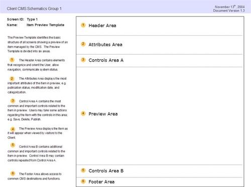
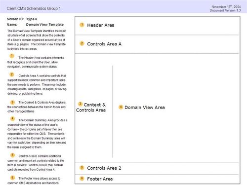
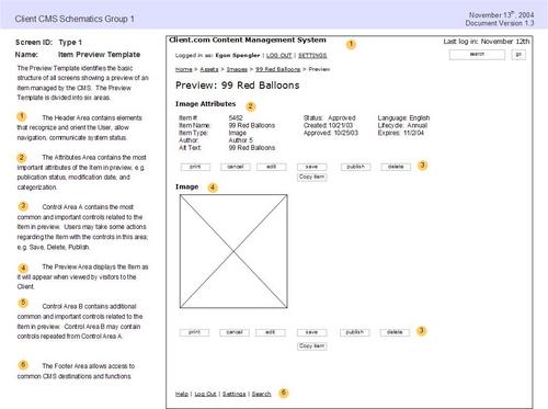
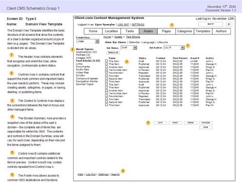
I’ve used a very similar approach based on the defining a limited number of ‘screen types’ that show standardized page structures and layouts for documenting browser based applications. I’ve posted an example of this kind of schematics or wire frames packet done for a small content managment system. This packet includes a conceptual overview of the user domain, as well as a set of defined screen types, screen flows, and wire frames. Here’s the full packet, exported from Visio as html.
Page shapes or screen types look like this:
jpg_7.jpg
Or this:
jpg_11.jpg
These are the accompanying wire frames or schematics:
jpg_8.jpg
jpg_12.jpg

Related posts:

Comment » | Information Architecture

Back to top