September 30th, 2008 — 12:00am
Designers interested in the new challenges of ubiquitous computing / ubicomp, ethics, and the future of integrated experiences will enjoy Improving Our Ethical Choices: Managing the Imp of the Perverse, published in UXMatters on September 8th.
Ranging from Baudelaire to the Big Chill, with Edgar Allen Poe as guiding spirit, this fourth and final installment of the Designing Ethical Experiences series written for UXMatters provides practical suggestions – drawn mostly from business, psychology, and ethics researchers – on how to balance the tensions of difficult design choices. We’re not all philosophers, so as always the focus is on insights into how we make all types of decisions, not simply ethical dilemmas.
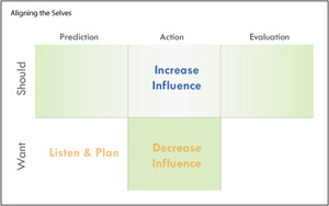
Aligning The Decision Cycle

Here’s an excerpt:
Ethical fading, the tension between our Want and Should Selves, and our natural tendency to create juicy rationalizations are powerful obstacles to the making of ethical design choices. As UX professionals, how can we better align our Want and Should Selves, ensuring that we create ethical experiences?
I learned a great deal about myself and my outlook while researching and writing this series of articles. I hope readers find the insights and tools valuable; either directly as a resource for dealing with ethical challenges of the new integrated experiences, or more generally during the day to day ebb and flow of design work.
Comment » | Ethics & Design, The Working Life, User Experience (UX)
June 30th, 2008 — 12:00am
The I.A. Podcast (by Jeff Parks of I.A. Consultants and BoxesandArrows podcast fame) just published the second of two interviews discussing research on ethics, design, social media, and conflict.
Play and download the second interview here.
Subscribe to the iTunes and feedburner feeds for the I.A. Podcast here.
These podcasts are based on the Designing Ethical Experiences series I’m writing for UXMatters: watch for publication of the final article later this summer.
Thanks again, Jeff!
Comment » | Ethics & Design, Social Media, User Experience (UX)
June 23rd, 2008 — 12:00am
Understanding Juicy Rationalizations, part 3 of the Designing Ethical Experiences series, just went live at UXMatters.
Here’s the teaser:
From “The Big Chill”
Michael: “I don’t know anyone who could get through the day without two or three juicy rationalizations.”
“They’re more important than sex.”
Sam: “Ah, come on. Nothing’s more important than sex.”
Michael: “Oh yeah? Ever gone a week without a rationalization?”
Designers rationalize their choices just as much as everyone else. But we also play a unique role in shaping the human world by creating the expressive and functional tools many people use in their daily lives. Our decisions about what is and is not ethical directly impact the lives of a tremendous number of people we will never know. Better understanding of the choices we make as designers can help us create more ethical user experiences for ourselves and for everyone.

Understanding Juicy Rationalizations is the first of a pair of articles focused on the ways that individual designers make ethical choices, and how we can improve our choices. This second pair of articles is a bit of eye-opening window into how people make many of the choices in our daily lives – not just design decisions. Or, at least it was for me… Readers will see connections much broader than simply choices we explicitly think of as ‘ethical’ and / or design related.
The final installment in the Designing Ethical Experiences series is titled “Managing the Imp of the Perverse” – watch for it sometime soon.
With the publication of these next two articles, the Designing Ethical Experiences series consists of two sets of matched pairs of articles; the first article in each pair framing a problematic real-life situation designers will face, and the second suggesting some ways to resolve these challenges ethically.
The first pair of articles – Social Media and the Conflicted Future and Some Practical Suggestions for Designing Ethical Experiences – looked at broad cultural and technology trends like social media and DIY / co-creation, suggesting ways to discover and manage likely ethical conflicts within the design process.
It’s a nice symmetrical structure, if you dig that sort of thing. (And what architect doesn’t?)
For commuters / multi-taskers / people who prefer listening to reading, Jeff Parks interviewed me on the contents of this second set of articles, which he will publish shortly as a podcast.
Thanks again to the editorial team at UXMatters for supporting my exploration of this very important topic for the future of experience design. In an age when everyone can leverage professional-grade advertising the likes of Spotunner, the ethicality of the expressive tools and frameworks designers create is a question of critical significance for us all.
Comment » | Ethics & Design, Social Media, User Experience (UX)
June 20th, 2008 — 12:00am
I’m happy to announce I’m speaking at EuroIA 2008 in Amsterdam, September 26 – 27. My session is titled ‘Frameworks Are the Future of IA’. If the exciting title isn’t enough to sell you on attending (what’s more compelling than a case study on an open structural design framework for self-assembled user experiences and information spaces…?), here’s a description:
The Web is shifting to a DIY (Do It Yourself) model of user experience creation, where people assemble individual combinations of content and functionality gathered from many sources to meet their particular needs. The DIY model for creating user experiences offers many benefits in public and consumer settings, and also inside the enterprise. But over time, it suffers many of the same problems that historically made portals unusable and ineffective, including congested designs, poorly planned growth, and inability to accommodate changes in structure and use.
This case study demonstrates a simple design framework of standardized information architecture building blocks that is directly applicable to portals and the DIY model for creating user experiences, in two ways. First, the building blocks framework can help maintain findability, usability and user experience quality in portal and DIY settings by effectively guiding growth and change. Second, it is an example of the changing role of IA in the DIY world, where we now define the frameworks and templates other people choose from when creating their own tools and user experiences.
Using many screenshots and design documents, the case study will follow changes in the audiences, structures, and contents of a suite of enterprise portals constructed for users in different countries, operating units, and managerial levels of a major global corporation. Participants will see how the building blocks provided an effective framework for the design, expansion, and integration of nearly a dozen distinct portals assembled from a common library of functionality and content.
This case study will also explore the building blocks as an example of the design frameworks IA’s will create in the DIY future. We will discuss the goals and design principles that inspired the building blocks system, and review its evolution over time.

The conference program includes some very interesting sessions, and Adam Greenfield (of Everyware reknown) is the keynote.
Amsterdam is lovely in September, but if you need more reason to come and say hello, Picnic 08 – with a stellar lineup of speakers – is just before EuroIA.
Comment » | Building Blocks, Information Architecture, Social Media, User Experience (UX)
April 17th, 2008 — 12:00am
I’ve posted slides for my recent Effective IA For Enterprise Portals presentation at the IA Summit in Miami. Portals are not a traditional space for user experience practitioners, so many thanks to the packed house that turned out, and stayed as we both started late to accommodate the crowd, and then ran long.
These slides include a substantial amount of case study and example material that I didn’t cover directly in the talk. For the repeat session on Sunday, I showed additional examples beyond those included here in the starting slides.
Stay tuned for a more detailed writeup of both published and unpublished example material – one that shows the building blocks in action at all levels of a multi-year portal effort from initial strategy through design and into governance / evolution – in part six of the Building Blocks series running in Boxes and Arrows, due out once the post-summit flurry settles down.
1 comment » | Building Blocks, Dashboards & Portals, Information Architecture, User Experience (UX)
April 13th, 2008 — 12:00am
A quick anouncement: part two of the series on ethics and experience design Designing Ethical Experiences: Some Practical Suggestions, is just live at UXMatters. In this followup to the first installment, you’ll find a fiarly extensive set of suggested techniques for resolving conflicts – ethical and otherwise – during the strategy and design phases of experience design efforts. If you’ve had issues with ethics or conflict during a design effort, these simple techniques should be a useful starting point.
Looking ahead, part three of the series will explore recent research on the way that people make decisions with ethical implications in business settings (good for designers who want to be aware of their own methods and states of mind, and how those drive design work), and the importance of neutral models in making ethical design decisions.
Here’s an excerpt:
Thankfully, successfully addressing ethical challenges during design does not require the creation of a formal or detailed code of ethics–or the creation of a professional body that would sustain such an effort. Designers can use the fact that ethical questions often appear first in the form of conflicts–in values, goals, mental models, or otherwise–to manage ethical dilemmas as simply another form of conflict. Further, we can treat conflict as a natural, though often unexplored element of the larger context user experience always seeks to understand. With this framing, conflict becomes a new layer of integrated experiences–a layer that encompasses ethical dilemmas. We can pragmatically incorporate this new layer of ethical dilemmas into our existing frameworks for user experience.
Comment » | Ethics & Design, User Experience (UX)
April 8th, 2008 — 12:00am
I’ve just started a new ‘Organizational Architecture‘ group on Slideshare, to explore links to user experience, and questions like these:
- What is organizational architecture?
- How does organizational architecture relate to user experience?
- What can user experience practitioners borrow from OA to become more effective?
Join now!
Comment » | Information Architecture, Networks and Systems, User Experience (UX)
March 12th, 2008 — 12:00am
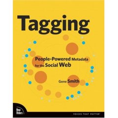
If you’re interested in tagging and social metadata, social bookmarking, or information management, be sure to check out Gene Smith’s Tagging: People-Powered Metadata for the Social Web recently published by from New Riders. I reviewed some of the early drafts of the book, and it’s come together very nicely.

Tagging takes a very practical approach, and provides an ample set of examples in support of the insightful analysis. After an overview of tagging and its value, the book addresses tagging system design, tags in relation to traditional metadata and classification systems, and covers the user experience of creating and navigating tag clouds.
Gene likes to build things, so Tagging includes a chapter on technical design complete with suggested tools and tutorials for creating your own tagging apps.
All in all, Tagging is a worthy introduction to the subject, and a guide for deeper exploration.
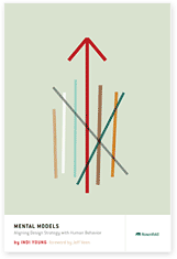
While we’re talking books, kudos to Rosenfeld Media on the publication of their first book, Mental Models; Aligning Design Strategy with Human Behavior, by the very talented Indi Young!

Mental Models is richly illustrated, filled with examples, lucid, and accompanied by a considerable amount of additional content from the Rosenfeld Media website.
Indi has considerable experience teaching others the techniques and methods behind creating insightful mental models for audiences and customers. Cognitive / frameworky methods can feel a bit heady at times (especially how-to’s on those methods), but Mental Models is straightforward reading throughout, and an eminently practical guide to using this important tool for user experience design and strategy.
Mental Models is available electronically as a .pdf for individual and group licenses, or in hard copy; it’s choose your own medium in action.
Comment » | Reading Room, Tag Clouds, User Experience (UX), User Research
March 11th, 2008 — 12:00am
Video of my BlogTalk presentation ‘What happens when everyone designs social media? Practical suggestions for handling new ethical dilemmas’ is available from Ustream.tv. The resolution is low (it was shot with a webcam) but the audio is good: follow along with the slides on your own for the full experience.
More videos of BlogTalk sessions here.
Comment » | Ethics & Design, Networks and Systems, Social Media, User Experience (UX)
March 11th, 2008 — 12:00am
The design of JetBlue’s new terminal at JFK as reported in the NY Times is a good example of the intersection of user experience design, and the specific technical and political requirements of the post-9/11 security-oriented state. The layout of the new terminal is focused on directing passengers as quickly as possible through a screen of 20 security lanes, and includes thoughtful features like wide security gates to accommodate luggage and wheelchairs, and rubber flooring for areas where people end up barefoot.
I’m of two minds about designing experiences and architectures specifically to enable security purposes. Anything that improves the currently miserable experience of passing through security screenings is good. (I am waiting for reports on people who show up at the gate wearing only a speedo one of these days, just to make a point.)

But in the long run, do we really want experience design to help us become culturally accustomed to a security-dominated mindset? Especially to the point where we encode this view of the world into our infrastructure? Lurking not so quietly below the surface of the design of the new JetBlue terminal is Bentham’s Panopticon (full contents here). The new terminal’s floor plan is a classic funnel shape, disturbingly similar in concept to the abattoir / apartment block described in the famous Monty Python Architect Sketch.
Pace layering makes clear that architectures change slowly once in place. And authorities rarely cede surveillance capabilities, even after their utility and relevance expire. Should experience design make an architecture dedicated to surveillance tolerable, or even comfortable?
Comment » | Architecture, Ethics & Design, User Experience (UX)
