June 27th, 2005 — 12:00am
I’m working on a portal project at the moment for a healthcare client, so I’ve heard a great deal about how the concept of ‘portal’ is so diluted as to be effectively meaningless. Following a series of surprisingly muddled conversations with technologists, business types, and end users representatives around the concept for this new portal, I realized that much of the hand-wringing and confusion comes from simple lack of perspective – on the different perspectives represented by each viewpoint. Ambiguity or disagreement about which perspective is the frame of reference in any given discussion is the biggest source of the confusion and friction that makes these projects needlessly difficult.
There are (at least) three different perspectives on the meaning of the term portal.
To technologists and system developers, a portal is a type of solution delivery platform with standard components like authentication, an application server, integration services, and business logic and presentation layers that is generally purchased from a vendor and then customized to meet specific needs. Examples are Plumtree, BEA, IBM, etc.
To users, a portal is a single destination where it’s possible to obtain a convenient and – likely, though not always – personalized combination of information and tools from many different sources. Some examples of this sense of the term include Yahoo, MSN, and a well-developed intranet.
To a business, a portal is a bounded vehicle for aggregating information and tools to address diverse constituent needs in a coordinated and coherent way, with lowered management and administration costs realized via framework features like personalization, customization, and role-based configuration.
One case where all three of these frames of reference intersect is with Executive Dashboard projects. A dashboard is a portal in all three of these senses (unless it happens to rest on a different architecture / technology stack, in which case I maintain that it’s something else, so as an IA it’s prudent to keep in mind the differing implications and assumptions associated with each perspective while dealing with their representatives.
Related posts:
Comment » | Building Blocks, Dashboards & Portals, Information Architecture, Intranets
June 23rd, 2005 — 12:00am
Found via via, originating in an article titled Social Informatics: Overview, Principles and Opportunities from the ASIST Bulletin special issue on Social Informatics, which, incidentally is one of those very interesting disciplines I don’t have enough time to keep up with, but that has much to offer practicing information architects.
On computerization, Sawyer says, “Computerization, to paraphrase sociologist Beverly Burriss, is the implementation of computerized technology and advanced information systems, in conjunction with related socioeconomic changes, leading to a fundamental restructuring of many social organizations and institutions.“
Add in a client management clause, and this is essentially my job description as an architect / designer / creator of information environments that solve business problems. I don’t know Burriss’ work — does anyone else?
Directly addressing the role of a constructed problem Sawyer says, “…social informatics is problem-oriented. This work is defined by its interest in particular issues and problems with computerization and not by its adherence to certain theories or particular methods (as is operations research).“
In what looks like a neatly phrased snapshot of user research, Sawyer says, “The strong empirical basis of social informatics work, however, is combined with both methodological and theoretical plurality. Social informatics work typically includes an array of data collection approaches, sophisticated large-scale analyses and complex conceptualizations.“
Here’s a longer excerpt:
The Common Findings of Social informatics
More than 30 years of careful empirical research exists in the social informatics tradition. As noted, this work is found in a range of academic disciplines, reflects a mix of theories and methods, and focuses on different issues and problems with computerization. Here I highlight five observations that are so often (re)discovered that they take on the notion of common findings relative to computerization.
1. Uses of ICT lead to multiple and sometimes paradoxical effects. Any one ICT effect is rarely isolatable to a desired task. Instead, effects of using an ICT spread out to a much larger number of people through the socio-technical links that comprise context. An examination of this larger context often reveals multiple effects, rather than one all-encompassing outcome, and unexpected as well as planned events. For example, peer-to-peer file sharing may help some musicians and hurt others.
2. Uses of ICT shape thought and action in ways that benefit some groups more than others. People live and work together in powered relationships. Thus, the political, economic and technical structures they construct include large-scale social structures of capital exchange, as well as the microstructures that shape human interaction. An examination of power often shows that a system’s implementations can both reinforce the status quo and motivate resistance. That is, the design, development and uses of ICTs help reshape access in unequal and often ill-considered ways. Thus, course management systems may provide added benefits to some students, put added pressure on some faculty and allow some administrators to use the system to collect additional evidence regarding the performances of both students and faculty.
3. The differential effects of the design, implementation and uses of ICTs often have moral and ethical consequences. This finding is so often (re)discovered in studies across the entire spectrum of ICTs and across various levels of analysis that ignorance of this point borders on professional naïveté. Social informatics research, in its orientation towards critical scholarship, helps to raise the visibility of all participants and a wider range of effects than do other approaches to studying computerization. For example, characterizing errors in diagnosing illnesses as a human limitation may lead to the belief that implementing sophisticated computer-based diagnostic systems is a better path. When these systems err, the tendency may be to refocus efforts to improve the computerized system rather than on better understanding the processes of triage and diagnosis.
4. The design, implementation and uses of ICTs have reciprocal relationships with the larger social context. The larger context shapes both the ICTs and their uses. Moreover, these artifacts and their uses shape the emergent contexts. This can be seen in the micro-scale adaptations that characterize how people use their personal computers and in the macro-scale adaptations evident in both the evolving set of norms and the changing designs of library automation systems. Library automation is not simply about recent developments of applications with sophisticated librarianship functionality; it is also about patrons’ differential abilities to use computers, library budget pressures, Internet access to libraries and the increasing visibility of the Internet and searching.
5. The phenomenon of interest will vary by the level of analysis. Because networks of influence operate across many different levels of analysis, relevant data on computerization typically span formal and informal work groups; formal organizations; formal and informal social units like communities or professional occupation/associations; groups of organizations and/or industries; nations, cultural groups and whole societies. This common finding is exemplified by the tremendous positive response by younger users to peer-to-peer file sharing, the absolute opposite response by music industry leaders and the many approaches taken by organizational and civic leaders regarding the legalities and responses to use.
No related posts.
Comment » | User Research
May 31st, 2005 — 12:00am
Concept maps popped onto the radar last week when an article in Wired highlighted a concept mapping tool called Cmap. Cmap is one of a variety of concept mapping tools that’s in use in schools and other educational settings to teach children to model the structure and relationships connecting – well – concepts.
The root idea of using concept mapping in educational settings is to move away from static models of knowledge, and toward dynamic models of relationships between concepts that allow new kinds of reasoning, understanding, and knowledge. That sounds a lot like the purpose of OWL.
It might be a stretch to say that by advocating concept maps, schools are in fact training kids to create ontologies as a basic learning and teaching method, and a vehicle for communicating complex ideas – but it’s a very interesting stretch all the same. As Information Architects, we’re familiar with the ways that structured visualizations of interconnected things – pages, topics, functions, etc. – communicate complex notions quickly and more effectively than words. But most of the rest of the world doesn’t think and communicate this way – or at least isn’t consciously aware that it does.
It seems reasonable that kids who learn to think in terms of concept maps from an early age might start using them to directly communicate their understandings of all kinds of things throughout life. It might be a great way to communicate the complex thoughts and ideas at play when answering a simple question like “What do you think about the war in Iraq?”
Author Nancy Kress explores this excact idea in the science fiction novel ‘Beggars In Spain’, calling the constructions “thought strings”. In Kress’ book, thought strings are the preferred method of communcation for extremely intelligent genetically engineered children, who have in effect moved to realms of cognitive complexity that exceed the structural capacity of ordinary languages. As Kress describes them, the density and multidimensional nature of thought strings makes it much easier to share nuanced understandings of extremely complex domains, ideas, and situations in a compact way.
I’ve only read the first novel in the trilogy, so I can’t speak to how Kress develops the idea of thought strings, but there’s a clear connection between the construct she defines and the concept map as laid out by Novak, who says, “it is best to construct concept maps with reference to some particular question we seek to answer or some situation or event that we are trying to understand”.
Excerpts from the Wired article:
“Concept maps can be used to assess student knowledge, encourage thinking and problem solving instead of rote learning, organize information for writing projects and help teachers write new curricula. “
“We need to move education from a memorizing system and repetitive system to a dynamic system,” said Gaspar Tarte, who is spearheading education reform in Panama as the country’s secretary of governmental innovation.”
“We would like to use tools and a methodology that helps children construct knowledge,” Tarte said. “Concept maps was the best tool that we found.”
Related posts:
Comment » | Modeling, Semantic Web
May 20th, 2005 — 12:00am
Below is an excerpt from an email sent to all employees – a ‘global broadcast’, very Max Headroom… – of a larger company (name removed), in response to repeated plees to improve the nightmarish user experience of the time and expense system that all employees must use.
<begin transmission>
There have been a few issues with the submitting and/or processing of Expense Reports resulting from individuals using data fields which have no value to [company], but may have processing impacts within the system. At this time, there is no way to remove or ‘grey-out’ these unused fields. If you have not been trained on the use of a field and/or do not know what the field may/may not do, don’t enter any data within that field – ask your branch admin or contact the help desk.
</end transmission>
What a fantastic example of a user experience directly impacting business: useless but open entry fields = garbage data = inaccurate financials!
Let’s peak into the inner chambers, to see how this might play out:
CEO> “How are we doing this week for revenue?”
CFO> “No idea. I don’t have any numbers to work with.”
CEO> “Why not? That’s ten weeks in a row!”
COO> “Another financials system crash.”
CTO> “Some junior tech in nowheresville accidentally hit the drop select of death again, and now we can’t get reports done for that half of the country.”
CEO> “The analysts and the board are going to kill me – someone take care of this right now.”
COO> “Fix it, or get rid of it!”
CTO> “We can’t fix it – we didn’t buy the configuration module. And we cut the deployment services contract from 24 weeks to 6 weeks, so there was no time to figure out which fields we needed from the generic installation…”
Related posts:
Comment » | User Experience (UX)
May 16th, 2005 — 12:00am
Thursday night I was at Casablanca in Harvard Square for an information architecture meet and greet after Lou’s Enterprise IA seminar. I ordered a Wolver’s. It was dim and noisy, so after shouting three times and pointing, I ended up with a Wolaver’s…
Not a surprise, right? My first thought was “What’s in my glass?” My second thought – I was surrounded by information architects – was about the semantic angle on the situation. It seems like a fair mistake to make in a loud and crowded bar. But as someone who works there, he should know the environmental context, the ways it affects fundamental tasks like talking and answering questions, and about any alternatives to what he thought I said that are close enough to be easily mistaken. Before I get too far, I’ll point out that I liked the mistake enough to order another.
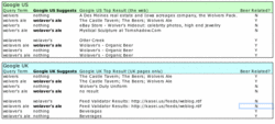
Setting aside for a moment the notion of a semantically adept agent system that monitors interactions between bartenders and patrons to prevent mistakes like this, let’s look at something more likely, such as how does Google fair with this situation? Some post-socialization research shows that as far as Google is concerned, all roads do in fact lead to Wolaver’s. Even when Google’s results list begins with a link to a page on Wolver’s Ale from the originating brewery, it still suggests that you might want ‘wolaver’s ale’. Maybe this explains the bartender’s mistake.
Here’s the breakdown: Google US suggests “wolaver’s ale” when you search for “wolvers ale” and “wolver’s ale”, but not the other way around. When you search for “Wolavers”, Google suggests the correctly punctuated “Wolaver’s”. You can get to the American ale, but not the British.
More surprising, it’s the same from Google UK, when searching only British pages. (Someone tell me how pages become part of the UK? Maybe when they’re sent off to full-time boarding school?)
Google’s insistence on taking me from wherever I start to “Wolaver’s Ale” comes from more than simple American brew chauvanism. This is what happens when the wrong factors drive decisions about the meanings of things; it’s these basic decisions about semantics that determine whether or not a thing correctly meet the needs of the people looking for answers to a question.
You might say semantic misalignment (or whatever we choose to call this condition) is fine, since Google’s business is aimed at doing something else, but I can’t imagine that business leaderhsip and staff at Wolver’s would be too happy to see Google directing traffic away from them by suggesting that people didn’t want to find them in the first place. Neither Wolver’s nor Wolavers seems to have Google ads running for their names, but what if they did? By now we’re all familar with the fact that googling ‘miserable failure‘ returns a link to the White House web site. This reflects a popularly defined association rich in cultural significance, but that isn’t going to satisfy a paying customer who is losing business because a semantically unaware system works against them.
This a good example of a situation in which intelligent disambiguation based on relationships and inferencing within a defined context has direct business ramifications.
Here’s a preview of the full size table that shows the results of checking some variants of wolvers / wolavers:
Related posts:
Comment » | Semantic Web
May 3rd, 2005 — 12:00am
Prompted by curiousity, and a desire to see if interactive art really is irritating, I took in several exhibits for the 2005 Boston CyberArts Festival, at the Decordova Museum this weekend.
Sarah Boxer’s review of Trains – a landscape made of tiny model railroad buildings and figures, adorned with movie images from famous movie scenes, and populated by passengers that appear only on the video screen of a Gameboy – offers several stellar insights about the emotionally unhealthy states of mind brought on by attempting to interact with computerized interfaces. Boxer says:
Alas, some cyberworks combine all the annoyances of interactive art (prurience, ritual, ungraciousness and moral superiority) to produce a mega-annoyance: total frustration. Case in point: John Klima’s “Trains,” at the DeCordova Museum School Gallery, in the Boston suburb Lincoln, which is a model train set guided by cellphone.
It’s clear from this that the emotional or other content of the art installation itself was obscured by the user experience Boxer had to negotiate in order to engage with the piece. Boxer’s expectations for user experience quality might have been lower if she were trying out a new spreadsheet, or Lotus Notes, but that’s just an example of how the software industry has trained customers to expect abusively bad experiences. See photos of Trains here.
One of the more usable – if that judgement applies – is Nam June Paik’s “Requiem for the 20th Century“. Requiem – photo here – according to Boxer is less annoying “…a relief to just stand there and watch the apocalyptic montage! No interaction. No instruction. No insults.”
Once past the interface, I found Requiem elegiac as expected, but unsatisfying for two reasons: first by virtue of concerning mostly Paik’s work in video art, and second by being strangely empty at heart (or was that the point?). The svelte physicality of the Chrysler Airstream art-deco automobile contrasted sharply with the ephemeral nature of the video images showing on it’s windows, in a clear example of concepts that were well-thought-through, but in the end, this is another example of art (post modern and/or otherwise) that is clever, yet incapable of engaging and establishing emotional resonance. “Requiem” is not even effectively psychological, which would broaden it’s potential modes of address. To ameliorate this weakness, I recommend obtaining the audiobook version of J.G. Ballard’s “Crash“, and listening to it’s auto-erotic on headphones while taking in the silvered spectacle.
From the description: “Requiem sums up the twentieth century as a period of transformative socio-cultural change from an industrial based society to an electronic information based society. The automobile and the television figure as both the most significant inventions of the century as well as the most prominent signifiers of Western consumerism.”
The most interesting installation was a wiki based soundscape, the first example I know of in which information architecture becomes both medium and art.
From the official description of the festival:
The creative connection between two of Boston’s most vital forces – the arts community and the high-tech industry – is once again in the spotlight, with more than 70 exhibitions and events in and around the Boston area from April 22 through May 8. It’s the first and largest collaboration of artists working in new technologies in all media in North America, encompassing visual art, dance, music, electronic literature, web art, and public art.
Related posts:
Comment » | Art, User Experience (UX)
April 25th, 2005 — 12:00am
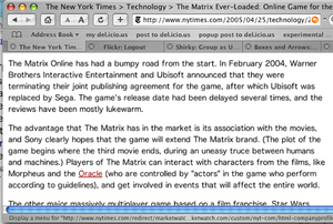
Reading the online edition of the New York Times just before leaving work this afternoon, I came across an ironic mistake that shows the utility of a well developed semantic framework that models the terms and relationships in defingin different editorial contexts. In an article discussing the Matrix Online multiplayer game, text identifying the movie character the Oracle mistakenly linked to a business profile page on the company of the same name. In keeping with the movie’s sinister depictions of technology as a tool for creating deceptive mediated realities, by the time I’d driven home and made mojitos for my visiting in-laws, the mistake was corrected…
Ironic humor aside, it’s unlikely that NYTimes Digital editors intended to confuse a movie character with a giant software company. It’s possible that the NYTimes Digital publishing platform uses some form of semantic framework to oversee automated linking of terms that exist in one or more defined ontologies, in which case this mistake implies some form of mis-categorization at the article level,invokgin the wrong ontology. Or perhaps this is an example of an instance where a name in the real world exists simultaneously in two very different contexts, and there is no semantic rule to govern how the system handles reconciliation of conflicts or invocation of manual intervention in cases when life refuses to fit neatly into a set of ontologies. That’s a design failure in the governance components of the semantic framework itself.
It’s more likely that the publishing platform automatically searches for company names in articles due for publication, and then creates links to the corresponding profile information page without reference to a semantic framework that employs contextual models to discriminate between ambiguous or conflicting term usage. For a major content creator and distributor like the NY Times, that’s a strategic oversight.
In this screen capture, you can see the first version of the article text, with the link to the Oracle page clearly visible:
Mistake:
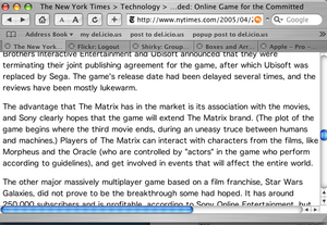
The new version, without the mistaken link, is visible in this screen capture:
New Version:
Related posts:
Comment » | Semantic Web
April 20th, 2005 — 12:00am
The April issue of D-Lib Magazine includes a two-part Survey of social bookmarking tools.
Social bookmarking is on the collective brain – at least for the moment -and most of those writing about it choose to take one or more positions for, against, or orthogonal to its various aspects. Here’s the position of the D-Lib survey authors:
“Despite all the current hype about tags – in the blogging world, especially – for the authors of this paper, tags are just one kind of metadata and are not a replacement for formal classification systems such as Dublin Core, MODS, etc. [n15]. Rather, they are a supplemental means to organize information and order search results.”
This is — no surprise from “a solely electronic publication with a primary focus on digital library research and development, including but not limited to new technologies, applications, and contextual social and economic issues” — the librarians’ view, succinctly echoed by Peter Morville in his presentation during the panel ‘Sorting Out Social Classification’ at this year’s Information Architecture summit.
The D-Lib authors’ assessment dovetails nicely with Peter’s views on The Speed of Information Architecture from 2001, and it shows how library science professionals may decide to place social bookmarking in relation to the larger context of meta-data lifecycles; a realm they’ve known and inhabited for far longer than most people have used Flickr to tag their photos.
I found some of the authors’ conclusions more surprising. They say, “In many ways these new tools resemble blogs stripped down to the bare essentials.” I’m not sure what this means; stripped-down is the sort of term that usually connotes a minimalist refactoring or adaptation that is designed to emphasize the fundamental aspects of some original thing under interpretation, but I don’t think they want readers to take away the notion that social bookmarking is an interpretation of blogging.
Moving on, they say, “Here the essential unit of information is a link, not a story, but a link decorated with a title, a description, tags and perhaps even personal recommendation points.” which leaves me wondering why it’s useful to compare Furl to blogging?
A cultural studies professor of mine used to say of career academics, “We decide what things mean for a living”. I suspect this is what the D-Lib authors were working toward with their blogging comparison. Since the label space for this thing itself is a bit crowded (contenders being ethnoclassification, folksonomy, social classification), it makes better sense to elevate the arena of your own territorial claim to a higher level that is less cluttered with other claimants, and decide how it relates to something well-known and more established.
They close with, “It is still uncertain whether tagging will take off in the way that blogging has. And even if it does, nobody yet knows exactly what it will achieve or where it will go – but the road ahead beckons.”
This is somewhat uninspiring, but I assume it satisfies the XML schema requirement that every well-structured review or essay end with a conclusion that opens the door to future publications.
Don’t mistake my pique at the squishiness of their conclusions for dis-satisfaction with the body of the survey; overall, the piece is well-researched and offers good context and perspective on the antecedents of and concepts behind their subject. Their invocation of Tim O’Reilly’s ‘architectures of participation’ is just one example of the value of this survey as an entry point into related phenomena.
Another good point the D-Lib authors make is the way that the inherent locality, or context-specificity, of collections of social bookmarks allows them to provide higher-quality pointers to resources relevant for specialized purposes than the major search engines, which by default index globally, or without an editorial perspective.
Likely most useful for the survey reader is their set of references, which taps into the meme flow for social bookmarking by citing a range of source conversations, editorials, and postings from all sides of the phenomenon.
Related posts:
Comment » | Social Media
April 2nd, 2005 — 12:00am
David Brooks Op-Ed column The Art of Intelligence in today’s NY Times is strongly relevant to questions of user research method, design philosophy, and understanding user experiences.
Brooks opens by asserting that that US Intelligence community shifted away from qualitative / interperative research and analysis methods to quantitative research and analysis methods during the 60’s in an attempt to legitimize conclusions in the fashion of the physical sciences. From this beginning, Brooks’ conclusion is that the basic epistemological shift in thought about what sorts of information are relevant to understanding the needs and views of groups of people (nations, societies, political leadership circles) yielded interpretations of their views and plans which were either useless or incorrect, models which then lead decision makers to a series of dramatic policy errors – examples of which we still see to this day.
Brooks contrasts the “unimaginative” quantitative interpretations assembled by statistical specialists with the broad mix of sources and perspectives which cultural and social thinkers in the 50’s used to understand American and other societies in narrative, qualitative ways.
According to Brooks, narrative, novelistic ways of understanding provided much better – more insightful, imaginative, accureate, and useful – advice on how Americans and others understood the world, opening the way to insight into strategic trends and opportunities. I’ve read many of the books he uses as examples – they’re some of the classics on social / cultural / historical reading lists – of the qualitative tradition, and taken away vivid pictures of the times and places they describe that I use to this day when called on to provide perspective on those environments.
Perhaps it’s implied, but what Brooks doesn’t mention is the obvious point that both approaches – qualitative and quantitative – are necessary to crafting fully-dimensioned pictures of people. Moving explicitly to the context of user research, qualitative analysis can tell us what people want or need or think or feel, but numbers give specific answers regarding things like what they’re willing or able to spend, how much time they will invest in trying to find a piece of information, or how many interruptions they will tolerate before quitting a task in frustration.
When a designer must choose between interaction patterns, navigation labels, product imagery, or task flows, they need both types of understanding to make an informed decision.
Some excerpts from Brooks’ column:
“They relied on their knowledge of history, literature, philosophy and theology to recognize social patterns and grasp emerging trends.”
This sounds like a strong synthetic approach to user research.
“I’ll believe the system has been reformed when policy makers are presented with competing reports, signed by individual thinkers, and are no longer presented with anonymous, bureaucratically homogenized, bulleted points that pretend to be the product of scientific consensus.”
“But the problem is not bureaucratic. It’s epistemological. Individuals are good at using intuition and imagination to understand other humans. We know from recent advances in neuroscience, popularized in Malcolm Gladwell’s “Blink,” that the human mind can perform fantastically complicated feats of subconscious pattern recognition. There is a powerful backstage process we use to interpret the world and the people around us.”
“When you try to analyze human affairs using a process that is systematic, codified and bureaucratic, as the CIA does, you anesthetize all of these tools. You don’t produce reason – you produce what Irving Kristol called the elephantiasis of reason.”
Related posts:
Comment » | User Research
March 23rd, 2005 — 12:00am
Proving that satire is one of humanity’s fundamental instincts, Packetrat strikes a blow for (wood)fiber-based communications networks with paperblogging, or plogging.
Outstanding.
Related posts:
Comment » | The Media Environment