Archive for October 2007


Speaking At The Italian IA Summit In November

October 30th, 2007 — 12:00am

I’m excited to be speaking at the Italian IA Summit 2007, in Trento Italy, November 16th and 17th. Organized by Alberto Mucignat, Emanuele Quintarelli, Andrea Resmini, Luca Rosati and many others, this is the second Italian IA Summit. It’s great that so many events like the German IA conference, the EuroIA Summit, and OZ-IA related to design, information architecture, and user experience, are happening around the world.

The program is posted (in Italian). My closing keynote is Saturday, right before five-minute-madness, which allows plenty of time for a long and leisurely afternoon lunch following the conference.

Hope to see you there!

Comment » | Information Architecture, Travel

EuroIA Presentations and Proceedings Available

October 30th, 2007 — 12:00am

All (well, almost all) of the EuroIA Summit presentations and proceedings are available online now. If you couldn’t make the conference, then definitely take advantage of this great material.

View the presentations here.

Download the proceedings here.

Comment » | Information Architecture, Travel

Al Gore Wins The Nobel *Presentation* Prize…?

October 12th, 2007 — 12:00am

Former U.S. Vice President Al Gore and the United Nations Intergovernmental Panel on Climate Change were awarded the 2007 Nobel Peace Presentation Prize today.
Al Gore
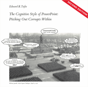
Though I’m sad to say it, this latest round of Celebrity Information Design Death Match, pitting Information Visualization Guru Dr. Edward Tufte vs. presentation tools and their legions of droning slide shufflers goes too –
Presentation software (at least it’s Keynote)…
<announcer voice>
Gore’s Nobel Prize must truly be a bitter pill for the esteemed Dr. Tufte, whose extensive declamations on the evils of PowerPoint remain insightful and even amusing, but have been outflanked by Gore’s combination of savvy presentation techniques, and repeated use of the famous “Earth’s Environment Is About to Perish” flying scissorkick move.
</announcer voice>

Seriously: Aside from the environment (we fervently hope), the real winner of this year’s Nobel Peace prize is effective storytelling that blends qualitative and quantitative messages to create a compelling visually supported narrative experience that clearly communicates complex ideas in an emotionally compelling package.

The scientists and Mr. Gore take quite different approaches to the climate changes. The committee has been a measured, peer-reviewed, government-approved statement focused on the most non-controversial findings, whereas Mr. Gore rails against a “planetary emergency.”

Both messages — however imperfect — play their part, scientists said on Friday. The Nobel Prize “is honoring the science and the publicity, and they’re necessarily different,” said Spencer A. Weart, a historian at the American Institute of Physics and author of The Discovery of Global Warming, a recent book.
From Gore and U.N. Panel Win Peace Prize for Climate Work

Dr. Tufte says, “PowerPoint presentations too often resemble a school play – very loud, very slow, and very simple.” Too often, Dr. Tufte is right: think about how many times in the last five years you’ve considered feigning a seizure or gastro-intestinal distress to escape a truly awful presentation.
book_pp_cover.gif
Yet for some ideas – and perhaps the very biggest of audiences – ‘the [school] play’s the thing’. Loud, slow, and simple might be just the right rhetorical style for complex messages that require the broadest kinds of consensus. (If Gore had figured this out during the campaign in 2000, the world would certainly be a very different place today…)

And yet, despite Gore’s pivotal role in shaping the Internet, a search for “al gore inconvenient truth” on the Slideshare website turns up – well – nothing that seems relevant in the first 10 results. There’s likewise no slideware to be had at the official site for the movie. But rest assured Mr. Gore, we know the humble origins of your Nobel Prize and Oscar winning documentary An Inconvenient Truth lie in a mere slide show.

Comment » | People, Tools

Jumpchart Sitemap Service: 3 Months Free

October 11th, 2007 — 12:00am

Jumpchart – the online sitemap service – is about to move from beta to subscription pricing.
Anyone who like to try it out, or who wants 3 free months of service should drop me a line to get an invite code.
Good luck to the Jumpchart team!

Related posts:

Comment » | Information Architecture, Tools

links for 2007-10-11

October 11th, 2007 — 12:00am

Related posts:

Comment » | Daily Links

Demographic Shifts and Experience Design Implications: Boomers and Mobile Devices

October 10th, 2007 — 12:00am

Ongoing demographic shifts (in the Western world) have massive numbers of Baby Boomers, with large amounts of disposable income – “Projections from Met Life Market Institute show that by the time the last boomer turns 65 in 2030, the generation will control more than 40 percent of disposable income in the United States.” (from Some Like It Hot) – aging rapidly. I think we’re just beginning to see what happens when business and Design respond to the implications of these demographic and economic shifts by creating both new businesses, and new designs.

To some extent Design has a frame of reference for the changes on the way: accessibility is a concern we already know, that will become a jumping off point to deeper, more contextual and more powerful design drivers. I expect these will challenge designers to employ increasingly holistic approaches to creating integrated products / services / experiences. The Jitterbug cell phone from GreatCall is a good example of design that initially addressed the changing sensory and physical needs of Boomers, but then goes further into considering the entire mobile phone experience, from activation to configuration and daily use from the point of view of seniors and their expectations for relating to technology. The end result was a new business.

Baby boomers and their parents haven’t been quick to adopt mobile phones, even for use in emergencies. The technology is too complicated for many to learn quickly, and the screens and controls too diminutive for aging or infirm hands. …The Jitterbug offers big buttons, easy-to-read text, and simplified, easy-to-use functions, an ear cushion, and an ergonomic shape. Personalized services make it easy for users to retrieve messages, and offers live operators for call-related support.
phone_one.gif
The Jitterbug clearly shows accessibility as a modifier of already well-defined user experiences, and how design can adapt these experiences to meet different needs. But Boomer needs exceed the point where simply adapting an existing product experience with minor changes (not at the level of the mental model) is a solution. And so the demographic shift of Boomer aging inspired the creation of a new company, GreatCall, that designs integrated products, services, and experiences, like the Jitterbug Onetouch:

…The JitterBug Onetouch sports three oversized buttons for users who primarily want a cell phone for emergency purposes, such as elderly or disabled users who need to be able to summon assistance with the push of a single button. One button dials 911, one summons live-operator call assistance, and the third can be programmed for any service the user wants, such as an emergency number, a towing service reception at an assisted living facility, or a loved one.

Three buttons that connect to predefined emergency services is not what I think of as a mobile phone, but it makes perfect sense for this set of design needs.

More important, the Jitterbug makes apparent that traditional scenarios for understanding mobile phone use do not adequately apply to seniors and aging Boomer populations. As design professionals, we know these scenarios, personas, and other design models serve as the basis for entire business processes, including manufacturing, marketing, sales, and service, as well as whole businesses.

In terms of design and business responses to large cultural shifts, the Jitterbug shows that integrated experiences require integrated design approaches, which in turn require close integration and systems-based thinking from all the entities contributing to the overall experience in some way, from hardware through the Web based phone management software.

For two years, Jitterbug and Samsung’s industrial designers collaborated before bringing the new phones to market. Samsung understood immediately that there was a potentially large market for this new concept in mobile phones, but they had to be sold on doing more than creating a novel handset: they had to be willing to design the product in tandem with Jitterbug’s service system.

Harris: “For them (Samsung) it was a handset. For us, it was a system. The handset was just one element.”

Result: The Jitterbug phone design is simplified due to the fact it is managed remotely through a Web-based interface. “It’s not just the design of the handset, or what the call centers do, it’s all about the entire experience,”

From Jitterbug Phone Designed for Seniors, and Selling Technology to Baby Boomers & Seniors.

Comment » | Customer Experiences, User Experience (UX)

links for 2007-10-10

October 10th, 2007 — 12:00am

Related posts:

Comment » | Daily Links

links for 2007-10-09

October 9th, 2007 — 12:00am

Related posts:

Comment » | Daily Links

A New Kind of Architecture? JG Ballard on the Bilbao Guggenheim

October 9th, 2007 — 12:00am

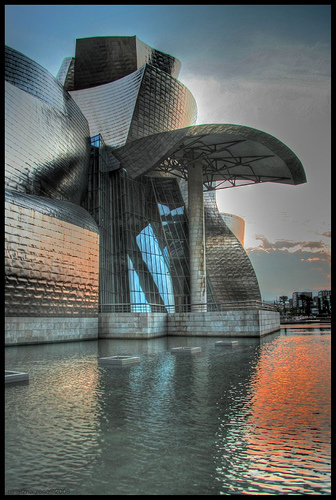
JG Bal­lard is one of the most archi­tec­turally ori­ented writ­ers I know. His writ­ing evokes the phys­i­cal and men­tal expe­ri­ences of spaces and places deftly and vividly. No acci­dent then that Ballard’s work is con­nected to psy­cho­geog­ra­phy by many (an idea I’ve men­tioned before as well). And so it is a plea­sure to read his piece on Gehry’s Bil­bao Guggen­heim, The lar­val stage of a new kind of archi­tec­ture, in Monday’s Guardian.
bilbao_guggenheim.jpg
From the arti­cle:

More to the point, I won­der if the Bil­bao Guggen­heim is a work of archi­tec­ture at all?  Per­haps it belongs to the cat­e­gory of exhi­bi­tion and fair­ground dis­plays, of giant inflat­a­bles and bouncy cas­tles.  The Guggen­heim may be the first per­ma­nent tem­po­rary struc­ture.  Its inte­rior is a huge dis­ap­point­ment, and con­firms the sus­pi­cion that the museum is a glo­ri­fied sales aid for the Guggen­heim brand. There is a giant atrium, always a sign that some corporation’s hand is slid­ing towards your wal­let, but the gal­leries are con­ven­tion­ally pro­por­tioned, and one can’t help feel­ing that they are irrel­e­vant any­way.  The museum is its own work of art, and the only one really on dis­play.  One can’t imag­ine the Mona Lisa, the Venus de Milo or Picasso’s Guer­nica ever being shown here.  There would be war in heaven.  Apart from any­thing else, these works have a dimen­sion of seri­ous­ness that the Guggen­heim lacks. Koons’ Puppy, faith­fully guard­ing the entrance to the enchanted cas­tle, gives the game away.  Archi­tec­ture today is a vis­i­tor attrac­tion, delib­er­ately play­ing on our love of the bright­est lights and the gaud­i­est neon.  The Bil­bao Guggenheim’s spir­i­tual Acrop­o­lis is Las Vegas, with its infan­til­is­ing pirate ships and Egypt­ian sphin­xes. Gehry’s museum would be com­pletely at home there, for a year at least, and then look a lit­tle dusty and jaded, soon to be torn down and replaced by another engag­ing mar­vel with which our imag­i­na­tions can play.

Nov­elty archi­tec­ture dom­i­nates through­out the world, pitched like the movies at the bored teenager inside all of us. Uni­ver­si­ties need to look like air­ports, with an up-and-away hol­i­day ethos. Office build­ings dis­guise them­selves as hi-tech apart­ment houses, every­thing has the chunky look of a child’s build­ing blocks, stir­ring dreams of the nurs­ery.

But per­haps Gehry’s Guggen­heim tran­scends all this. From the far side of the Styx I’ll look back on it with awe.

Comment » | Architecture

links for 2007-10-08

October 8th, 2007 — 12:00am

No related posts.

Comment » | Daily Links

Back to top