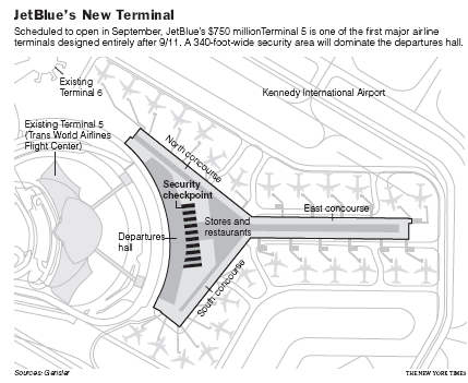
User Experience and the Security State: JetBlue’s New Terminal
The design of JetBlue’s new terminal at JFK as reported in the NY Times is a good example of the intersection of user experience design, and the specific technical and political requirements of the post-9/11 security-oriented state. The layout of the new terminal is focused on directing passengers as quickly as possible through a screen of 20 security lanes, and includes thoughtful features like wide security gates to accommodate luggage and wheelchairs, and rubber flooring for areas where people end up barefoot.
I’m of two minds about designing experiences and architectures specifically to enable security purposes. Anything that improves the currently miserable experience of passing through security screenings is good. (I am waiting for reports on people who show up at the gate wearing only a speedo one of these days, just to make a point.)

But in the long run, do we really want experience design to help us become culturally accustomed to a security-dominated mindset? Especially to the point where we encode this view of the world into our infrastructure? Lurking not so quietly below the surface of the design of the new JetBlue terminal is Bentham’s Panopticon (full contents here). The new terminal’s floor plan is a classic funnel shape, disturbingly similar in concept to the abattoir / apartment block described in the famous Monty Python Architect Sketch.
Pace layering makes clear that architectures change slowly once in place. And authorities rarely cede surveillance capabilities, even after their utility and relevance expire. Should experience design make an architecture dedicated to surveillance tolerable, or even comfortable?
Category: Architecture, Ethics & Design, User Experience (UX) | Tags: panopticon, privacy, user_experience Comment »