Cartograms, Tag Clouds and Visualization
I was enjoying some of the engaging cartograms available from Worldmapper, when I realized tag clouds might have some strong parallels with cartograms. After a quick substitution exercise, I’ve come to believe tag clouds could be to lists of metadata what cartograms are to maps; attempted solutions to similar visualization problems driven by common and historically consistent information needs.
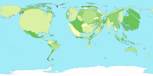
Here’s the train of thought behind the analogy. Cartograms are the distorted but captivating maps that change the familiar shapes of places on a map to visually show data about geographic locations. Cartograms change the way locations appear to make a point or communicate relative differences in the underlying data; for example, by making countries with higher GDP (gross domestic product) bigger, and those with lower GDP smaller. In the example below, Japan’s size is much larger than it’s geographic area, because it’s GDP is so high (it’s the dark green blob on the far right, much larger than China or India), while Africa is nearly invisible.
Tag clouds pursue the same goal: to enhance our understanding by communicating contextual meaning through changes in the way a set of things are visualized, relying additional dimensions of information to make context explicit. Where cartograms change geographic units, tag clouds change the display of a list of labels (the end point of a chain of linkages connecting concepts to focuses) to communicate the semantic importance or context of the underlying concepts shown in the list.
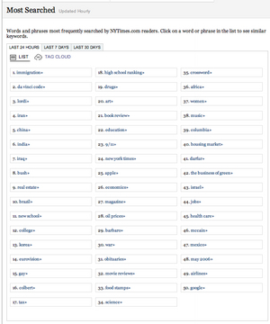
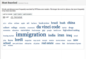
Visually, the relationship of clouds to lists is similar to that of maps and cartograms; compare these two renderings of the most popular search terms recorded by nytimes.com, one a simple list and the other a tag cloud.
List Rendering of Search Terms

Cloud Rendering of Search Terms

This explanation of cartograms from Cartogram Central a site supported by the U.S. Geological Survey and tional Center for Geographic Information and Analysis makes the parallels clearer, in greater detail.
“A cartogram is a type of graphic that depicts attributes of geographic objects as the object’s area. Because a cartogram does not depict geographic space, but rather changes the size of objects depending on a certain attribute, a cartogram is not a true map.
Cartograms vary on their degree in which geographic space is changed; some appear very similar to a map, however some look nothing like a map at all.”
Now for the cut and paste. Substitute ‘tag cloud’ for cartogram, ‘semantic’ for geographic, and ‘list’ in for map, and the same explanation reads:
“A tag cloud is a type of graphic that depicts attributes of semantic objects as the object’s area. Because a tag cloud does not depict semantic space, but rather changes the size of objects depending on a certain attribute, a tag cloud is not a true list. Tag Clouds vary on their degree in which semantic space is changed; some appear very similar to a list, however some look nothing like a list at all.”
This is a good match for the current understanding of tag clouds.
Diving in deeper, Cartogram Central offers an excerpt from Cartography: Thematic Map Design, that goes into more detail about the specific characteristics of cartograms.
Erwin Raisz called cartograms ‘diagrammatic maps.’ Today they might be called cartograms, value-by-area maps, anamorphated images or simply spatial transformations. Whatever their name, cartograms are unique representations of geographical space.
Examined more closely, the value-by-area mapping technique encodes the mapped data in a simple and efficient manner with no data generalization or loss of detail. Two forms, contiguous and non-contiguous, have become popular. Mapping requirements include the preservation of shape, orientation contiguity, and data that have suitable variation. Successful communication depends on how well the map reader recognizes the shapes of the internal enumeration units, the accuracy of estimating these areas, and effective legend design. Complex forms include the two-variable map. Cartogram construction may be by manual or computer means. In either method, a careful examination of the logic behind the use of the cartogram must first be undertaken.”Doing the same substitution exercise on this excerpt with the addition of ‘relevance’ for value, ‘size’ for area, and ‘term’ for shape, yields similar results:
“Erwin Raisz called tag clouds ‘diagrammatic lists.’ Today they might be called tag clouds, relevance-by-size lists, anamorphated images or simply spatial transformations. Whatever their name, tag clouds are unique representations of semantic space. Examined more closely, the relevance-by-size listing technique encodes the listed data in a simple and efficient manner with no data generalization or loss of detail. Two forms, contiguous and non-contiguous, have become popular. Listing requirements include the preservation of term, orientation, contiguity, and data that have suitable variation. Successful communication depends on how well the list reader recognizes the terms (of the internal enumeration units), the accuracy of estimating these sizes, and effective legend design. Complex forms include the two-variable list. Tag cloud construction may be by manual or computer means. In either method, a careful examination of the logic behind the use of the tag cloud must first be undertaken.”
The correspondence here is strong as well.
Stable Need
The fact that cartograms and tag clouds show close parallels means that while the tag cloud may be a new user interface element emerging for the Web (and major desktop applications like Outlook, in the case of Taglocity), tag clouds as a type of visualization have strong precedents in other much more mature user experience contexts, such as the display of multiple dimensions of information within geographic or geospatial frames of reference. Instances of strong correspondence of problem solving approach in both mature and emerging contexts could indicate simple application of parallel framing (from the mature context to the emerging context) as an untested conditional, until the true extent of divergence separating the two contexts is understood. This is very common new media.
Instead, in the case of tag clouds, I think it points at stable needs driving structurally similar solutions to the basic problem of how to visually communicate important relationships and additional dimensions of meaning under the limitations of inherent flatness.
The parallels between cartograms and tag clouds place the appearance of the tag cloud within the larger history of continuing exploration of new ways of visualizing information. In this view, tag clouds are a recent manifestation of the stable need to create strong and effective visual ways of conveying more than membership in a one-dimensional set (the list), or location and extent within a two-dimensional coordinate system (the map).
