Tag: visualization


Defining Discovery: Core Concepts

October 18th, 2013 — 12:00am

Discovery tools have had a referenceable working definition since at least 2001, when Ben Shneiderman published ‘Inventing Discovery Tools: Combining Information Visualization with Data Mining‘.  Dr. Shneiderman suggested the combination of the two distinct fields of data mining and information visualization could manifest as new category of tools for discovery, an understanding that remains essentially unaltered over ten years later.  An industry analyst report titled Visual Discovery Tools: Market Segmentation and Product Positioning from March of this year, for example, reads, “Visual discovery tools are designed for visual data exploration, analysis and lightweight data mining.”

Tools should follow from the activities people undertake (a foundational tenet of activity centered design), however, and Dr. Shneiderman does not in fact describe or define discovery activity or capability. As I read it, discovery is assumed to be the implied sum of the separate fields of visualization and data mining as they were then understood.  As a working definition that catalyzes a field of product prototyping, it’s adequate in the short term.  In the long term, it makes the boundaries of discovery both derived and temporary, and leaves a substantial gap in the landscape of core concepts around discovery, making consensus on the nature of most aspects of discovery difficult or impossible to reach.  I think this definitional gap is a major reason that discovery is still an ambiguous product landscape.

To help close that gap, I’m suggesting a few definitions of four core aspects of discovery.  These come out of our sustained research into discovery needs and practices, and have the goal of clarifying the relationship between discvoery and other analytical categories.  They are suggested, but should be internally coherent and consistent.

Discovery activity is: “Purposeful sense making activity that intends to arrive at new insights and understanding through exploration and analysis (and for these we have specific defintions as well) of all types and sources of data.”

Discovery capability is: “The ability of people and organizations to purposefully realize valuable insights that address the full spectrum of business questions and problems by engaging effectively with all types and sources of data.”

Discovery tools: “Enhance individual and organizational ability to realize novel insights by augmenting and accelerating human sense making to allow engagement with all types of data at all useful scales.”

Discovery environments: “Enable organizations to undertake effective discovery efforts for all business purposes and perspectives, in an empirical and cooperative fashion.”

Note: applicability to a world of Big data is assumed – thus the refs to all scales / types / sources – rather than stated explicitly.  I like that Big Data doesn’t have to be written into this core set of definitions, b/c I think it’s a transitional label – the new version of Web 2.0 – and goes away over time.

References and Resources:

Comment » | Big Data, Language of Discovery

The Architecture of Discovery: Slides from Discover Conference 2011

April 16th, 2011 — 12:00am

Endeca invites customers, partners and leading members of the broader search and discovery technology and solutions communities to meet annually, and showcase the most interesting and exciting work in the field of discovery.  As lead for the UX team that designs Endeca’s discovery products, I shared some of our recent work on patterns in the structure of discovery applications, as well as best practices in information design and visualization that we use to drive product definition and design for Endeca’s Latitude Discovery Framework.

This material is useful for program and project managers and business analysts defining requirements for discovery solutions and applications, UX and system architects crafting high-level structures and addressing long-term growth, interaction designers and technical developers defining and building information workspaces at a fine grain, and

There are three major sections: the first presents some of our tools for identifying and understanding people’s needs and goals for discovery in terms of activity (the Language of Discovery as we call it), the second brings together screen-level, application level, and user scenario / use-case level patterns we’ve observed in the applications created to meet those needs, and the final section shares condensed best practices and fundamental principles for information design and visualization based on academic research disciplines such as cognitive science and information retrieval.

It’s no coincidence that these sections reflect the application of the core UX disciplines of user research, information architecture, and interaction design to the question of “who will need to encounter information for some end, and in what kind of experience will they encounter it”.  This flow and ordering is deliberate; it demonstrates on two levels the results of our own efforts applying the UX perspective to the questions inherent in creating discovery tools, and shares some of the tools, insights, templates, and resources we use to shape the platform used to create discovery experiences across diverse industries.

Session outline

Session description

“How can you harness the power and flexibility of Latitude to create useful, usable, and compelling discovery applications for enterprise discovery workers? This session goes beyond the technology to explore how you can apply fundamental principles of information design and visualization, analytics best practices and user interface design patterns to compose effective and compelling discovery applications that optimize user discovery, success, engagement, & adoption.”

The patterns are product specific in that they show how to compose screens and applications using the predefined components in the Discovery Framework library.  However, many of the product-specific components are built to address common or recurring needs for interaction with information via well-known mechanisms such as search, filtering, navigation, visualization, and presentation of data.  In other words, even if you’re not using the literal Discovery Framework component library to compose your specific information analysis workspace, you’ll find these patterns relevant at workspace and application levels of scale.

The deeper story of these patterns is in demonstrating the evolution of discovery and analysis applications over time.  Typically, discovery applications begin by offering users a general-purpose workspace that satisfies a wide range of interaction tasks in an approximate fashion.  Over time, via successive expansions in the the scope and variety of data they present, and the discovery and analysis capabilities they provide, discovery applications grow to include several different types of workspaces that individually address distinct sets of needs for visualization and sense making by using very different combinations of components.  As a composite, these functional and informationally diverse workspaces span the full range of interaction needs for differing types of users.

I hope you find this toolkit and collection of patterns and information design principles useful.  What are some of the resources you’re using to take on these challenges?

User Experience Architecture For Discovery Applications from Joe Lamantia

Comment » | Dashboards & Portals, Information Architecture, User Experience (UX)

8 Waves of Change Shaping Digital Experiences

December 11th, 2008 — 12:00am

I’ve been focused on understanding future directions in the landscape of digital experiences recently (which nicely parallels some of the work I’ve been doing on design and futures in general), so I’m sharing a summary of the analysis that’s come out of this research.
This presentation shares an overview of all the major waves of change affecting digital experiences, some of the especially forward-looking insights around shifts in our identities, and the implications for those creating digital experiences.
The 8 waves discussed here (are there more? let me know!)

  • Digital = Social
  • Co-Creation
  • Digital Natives
  • Itʼs All a Game
  • Take Away
  • Everyware
  • Convergence
  • Seeing Is Believing

Waves of Change Shaping Digital Experiences from Joe Lamantia

Comment » | Everyware, Ideas, The Media Environment, User Experience (UX)

Is Daylife the Collective Conscious?

July 20th, 2007 — 12:00am

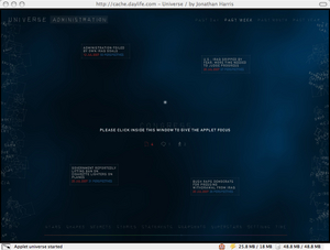
Jung posited the idea of the col­lec­tive uncon­scious (later refined, but a good point of depar­ture). Do Daylife and sim­i­lar stream aggre­ga­tors / visu­al­iz­ers (I’m reach­ing for a han­dle to describe these enti­ties) like Uni­verse, point at what a col­lec­tive con­scious could be?

Uni­verse
daylife_universe.jpg

Some pre­cur­sors might be Yahoo’s Taglines and TagMaps, Google Zeit­geist / Trends, and the var­i­ous cloud style visu­al­iza­tions like clouda­li­cious, etc.

Plainly, the num­ber and vari­ety of tools and des­ti­na­tions for visu­al­iz­ing what’s on the mind of groups is grow­ing rapidly.
If the par­al­lelism holds, mean­ing Daylife and kin are them­selves points of depar­ture, where is this going? I’m not think­ing of col­lec­tive intel­li­gence — just the visu­al­iza­tion aspect, and how that may evolve.

Comment » | Ideas

Watching Ideas Bloom: Text Clouds of the Republican Debate At Democrats.org

May 4th, 2007 — 12:00am

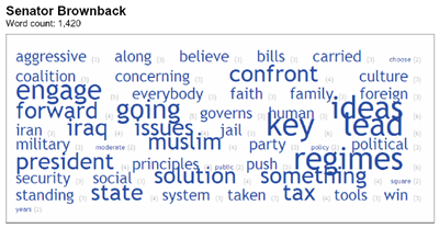
A meme is emerging for the use text clouds as visualization for – and a source of insight into – political speeches and speakers.
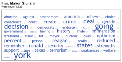
Text clouds of the Republican Presidential candidates’ debate appear front and center on the DNC blog democrats.org, in Tag Clouds Can Tell Us a Lot…. (sourced from media analysis firm Upstream Analysis via Pollster.com).
GiulianiTag400.png
BrownbackTag400.png
As you can see in the quote from the writeup below, we’re quickly developing sophisticated readings of the (comparatively) simple visualization methods used to generate text clouds.

But sometimes a cloud also reflects concerns that voters share about a candidate. This is because the candidate gets asked about the issue–a lot–and then has to talk about it.

Check out the large “Pro-Life” tag in flip-flopping Romney’s cloud, or the large “Think” tag in Giuliani’s cloud–the candidate notorious for leaping first and thinking later.

Political interpretations aside, this is a nuanced reading of the resulting clouds: it recognizes the dynamic feedback link between intentions and responses that becomes visible in the rendered clouds. For a visualization geek, these clouds show the differing agendas of candidates and audience as they played out, a nice example of social mechanisms in action.

Note to the tool builders of the world

How about putting together a visualization toolset that shows evolving text clouds as the debate progresses? I’m imagining a timeline plus transcript plus cloud view of the accumulating text cloud for each candidate, with options for moving forward or back in the stream of words.

What could be better than watching words and ideas bloom over time, the same way we see flowers in a garden blossom, open, and close in time lapse photography. I’d like to think we can grow something poetic and beautiful, as well as useful, from the (sadly debased) soil of politicized sound bites surrounding us.

Or, with a nod to the brutal competition built into most natural systems, you may choose to watch the struggle of waterlillies for sunlight, in this clip from The Amazing Life of Plants.

Comment » | Tag Clouds

Text Clouds and Advertising: Microsoft’s Community Buzz Project

April 28th, 2007 — 12:00am

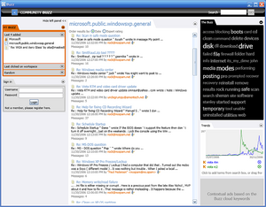
Thanks to Datamining, for posting a writeup and screenshot of a prototype of Community Buzz, which features a text cloud. Community Buzz is a Microsoft Research project, and this is a perfect use of a text cloud to visualize concepts and further comprehension in a body of text.

More interesting than the text cloud is the space in the screenshot that looks like a placeholder for advertising driven by the contents of the text cloud. The annotation reads “Contextual ads based on the Buzz cloud keywords”, implying an advertising based revenue mechanism driven by creation and analysis of a text cloud.

Community Buzz Screenshot

The description of Community Buzz posted on the TechFest 2007 page, includes the following, making the connection to an advertising model explicit:

Community Buzz combines text mining, social accounting (Netscan/MSR-Halo), and new visualization techniques to study and present the content of communication threads in online discussion groups. The merging of these research technologies results in a system that gives great value to community participants, enables highly directed advertising, and supplies rich metrics to product managers.

Assuming it’s possible to provide highly directed advertising and rich metrics based on text clouds, I can see the benefits of for advertisers and product managers, and researchers of many kinds. Yet I’m not convinced of the benefits for community participants. Where will the text clouds come from, and how will their content reflect the needs of the community? How will social dynamics shape or affect these text clouds, to make it possible for them to leverage network effects, differential participation, and the scale benefits of connected social systems?

Text clouds – at least at this stage of development – support rapid but shallow comprehension: maybe this is perfect for advertising purposes…

Like a pile of dry bones that used to make up a skeleton, text clouds lack the specific structure and context of their source, and so cannot replace comprehension. Text clouds deconstruct the word elements that make up a body of text the same way spectrum analysis identifies the different wavelengths of light from a distant star. It’s a bit like using statistical analysis to read King Lear, instead of using a variety of tools to learn more about what Lear might have to say.

A better use of text clouds, or any other type of deconstructive method (a variant of semiotics) is as a tool for enhancing comprehension. Text clouds seem to bypass distinctions between high context and low context that present barriers to understanding deep context, by focusing on the raw content of the source, on the level of it’s constituent elements.

The goal of examining the fundamental or essential makeup of something we’re exploring – as a way of better understanding that thing overall – is an epistemological method pursued by Plato and a host of other Western philosophers and natural scientists. We should be cautious with new tools, however, as the urge to illuminate and dissect the fundamental makeup of that which is complex and nuanced can go too far, crossing from the insightful to the sterile domain of soulless reductivism. Witness the responses of corrupt officials to Javier Bardem’s character Agustín, in John Malkovich’s directorial debut The Dancer Upstairs.
Agustín is a police hero who saves his country from a criminal and oppressive government, social disintegration, and guerilla takeover. He then surrenders all prospects of winning the presidency and leading his struggling nation to prosperity for the unrequited love of a woman who aided the same guerilla leader he helped capture. Agustín strikes a secret bargain to secure her freedom with the corrupt powers that be, on condition that he withdraw from public life. His choice is incomprehensible to the soulless officials in power. To these people, who buy, sell, and execute hundreds without a thought, Agustín’s lover “…is just a girl – 70% water.”

For reference, the overview of Community Buzz:

  • Community Buzz combines analysis of the content of online discussions and social structure of the communities to identify hot topics and visualize how they evolve over time.
  • Through search and Buzz cloud users can access relevant discussion threads and adverts linked to the search results and Buzz keywords.
  • Visualization of keyword trends enables the users to monitor the popularity of selected topics. Mesasages can be filtered based on the ‘social status’ of the author in the community.

And the complete description of the demo mentioned by Datamining:

Community Buzz is a new window into online communities! Interesting and useful conversations, authors, and groups are discovered easily using this tool, jointly developed by Microsoft Research Redmond’s Community Technologies group and Microsoft Research Cambridge’s Integrated Systems team, with sponsorship from Live Labs. Community Buzz combines text mining, social accounting (Netscan/MSR-Halo), and new visualization techniques to study and present the content of communication threads in online discussion groups. The merging of these research technologies results in a system that gives great value to community participants, enables highly directed advertising, and supplies rich metrics to product managers.

Comment » | Tag Clouds

NYTimes.com Redesign Includes Tag Clouds

April 11th, 2006 — 12:00am

Though you may not have noticed it at first (I didn’t – they’re located a few steps off the front page), the recently launched design of NYTimes.com includes tag clouds. After a quick review, I think their version is a good example of a cloud that offers some increased capabilities and contextual information that together fall in line with the likely directions of tag cloud evolution we’ve considered before.

Specifically, the New York Times tag cloud:

NYtimes.com Tag Cloud

The NYTimes.com tag cloud shows the most popular search terms used by readers within three time frames: the last 24 hours, the last 7 days, and the last 30 days. Choosing search terms as the makeup for a cloud is a bit curious – but it may be as close to socially generated metadata as seemed reasonable for a first exploration (one that doesn’t require a substantial change in the business or publishing model).

Given the way that clouds lend themselves to showing multiple dimensions of meaning, such as change over time, I think the Times tag cloud would be more valuable if it offered the option to see all three time frames at once. I put together a quick cut and paste of a concept screen that shows this sort of layout:

Screen Concept: 3 Clouds for Different Time Frames

In an example of the rapid morphing of memes and definitions to fit shifting usage contexts (as in Thomas Vanderwal’s observations on the shifting usage of folksonomy) the NYTimes.com kept the label tag cloud, while this is more properly a weighted list: the tags shown are in fact search terms, and not labels applied to a focus of some kind by taggers.

It’s plain from the limited presence and visibility of clouds within the overall site that the staff at NYTimes.com are still exploring the value of tag clouds for their specific needs (which I think is a mature approach), otherwise I imagine the new design concept and navigation model would utilize and emphasized tag clouds to a greater degree. So far, the Times uses tag clouds only in the new “Most Popular” section, and they are offered as an alternative to the default list style presentation of popular search terms. This position within the site structure places them a few steps in, and off the standard front page-to-an-article user flow that must be one of the core scenarios supported by the site’s information architecture.

NYTimes.com User Flow to Tag Cloud

Still, I do think it’s a clear sign of increasing awareness of the potential strength of tag clouds as a way of visualizing semantic information. The Times is an established entity (occasionally serving as the definition of ‘the establishment’), and so is less likely to endanger established relationships with customers by changing its core product across any of the many channels used for delivery.

Questions of risk aside, tag clouds (here I mean any visualization of semantic metadata) couLd be a very effective way to scan the headlines for a sense of what’s happening at the moment, and the shifting importance of topics in relation to on another. With a tag cloud highlighting “immigration”, “duke”, and “judas”, visitors can immediately begin to understand what is newsworthy – at least in the minds of NYTimes.com readers.

At first glance, lowering the amount of time spent reading the news could seem like a strong business disincentive for using tag clouds to streamline navigation and user flow. With more consideration, I think it points to a new potential application of tag clouds to enhance comprehension and findability by giving busy customers powerful tools to increase the speed and quality of their judgments about what to devote their attention to in order to acheive understanding greater depth. In the case of publications like the NYTimes.com, tag clouds may be well suited for conveying snapshots or summaries of complex and deep domains that change quickly (what’s the news?), and offering rapid navigation to specific areas or topics.

A new user experience that offers a variety of tag clouds in more places might allow different kinds of movement or flow through the larger environment, enabling new behaviors and supporting differing goals than the current information architecture and user experience.

Possible Screen Flow Incorporating Clouds

Stepping back from the specifics of the design, a broader question is “Why tag clouds now?” They’re certainly timely, but that’s not a business model. This is just speculation, but I recall job postings for an Information Architect position within the NYTimes.com group on that appeared on several recruiting websites a few months ago – maybe the new team members wanted or were directed to include tag clouds in this design? If any of those involved are allowed to share insights, I’d very much like to hear the thoughts of the IAs / designers / product managers or other team members responsible for including tag clouds in the new design and structure.

And in light of Mathew Patterson’s comments here about customer acceptance of multiple clouds in other settings and contexts (priceline europe), I’m curious about any usability testing or other user research that might have been done around the new design, and any the findings related to tag clouds.

Comment » | Ideas, Tag Clouds

Tag Clouds: Navigation For Landscapes of Meaning

March 14th, 2006 — 12:00am

I believe the value of second generation clouds will be to offer ready navigation and access to deep, complex landscapes of meaning built up from the cumulative semantic information contained in many interconnected tag clouds. I’d like share some thoughts on this idea; I’ll split the discussion into two posts, because there’s a fair amount of material.

In a previous post on tag clouds, I suggested that the great value of first generation tag clouds is their ability to make concepts and metadata – semantic fields – broadly accessible and easy to understand and work with through visualization. I believe the shift in the balance of roles and value from first to second generation reflects natural growth in cloud usage and awareness, and builds on the two major trends of tag cloud evolution: enhanced visualization and functionality for working with clouds, and provision of extensive contextual information to accompany tag clouds.

Together, these two growth paths allow cloud consumers to follow the individual chains of understanding that intersect at connected clouds, and better achieve their goals within the information environment and outside. Fundamentally, I believe the key distinctions between first and second generation clouds will come from the way that clouds function simultaneously as visualizations and navigation mechanisms, and what they allow navigation of – landscapes of meaning that are rich in semantic content of high value.

For examples of both directions of tag cloud evolution coming together to support navigation of semantic landscapes, we can look at some of the new features del.icio.us has released in the past few months. I’ve collected three versions of the information architecture of the standard del.icio.us URL details page from the past seven months as an example of evolution happening right now.

The first version (screenshot and breakdown in Figure 1) shows the URL details page sometime before August 15th, 2005, when it appeared on Matt McAlister’s blog.

Figure 1: Del.icio.us URL Page – August 2005

The layout or information architecture is fairly simple, offering a list of the common tags for the url / focus, a summary of the posting history, and a more detailed listing of the posting history that lists the dates and taggers who bookmarked the item, as well as the tags used for bookmarking. There’s no cloud style visualization of the tags attached to this single focus available: at this time, del.icio.us offered a rendered tag cloud visualization at the aggregate level for the whole environment.

Environment and system designers know very well that as the scope and complexity of an environment increase – in this case, the number of taggers, focuses, and tags, plus their cumulative histories – it becomes more important for people to be explicitly aware of the context of any item in order to understand it properly. Explicit context becomes more important because they can rely less and less on implicit context or assumptions about context based on the universal aspects of the environment. This is how cloud consumers’ needs for clearly visible and accessible chains of understanding drives the features and capabilities of tag clouds. Later versions of this page addresses these needs in differing ways, with differing levels of success.

Figure 2 shows a more recent version of the del.licio.us history for the Ma.gnolia.com service. This screenshot taken about ten days ago in early March, while I was working on a draft of this post.

Figure 2: Del.icio.us URL Page – Early March 2006

Key changes from the first version in August to this second version include:

The most important change in this second version is the removal of the individual sets of tags from the Posting History. Separating the tags applied to the focus from associaton with the individual taggers that chose them strips them of an important layer of context. Removing the necessary context for the tag cloud breaks the chain of understanding (Figure 3) linking taggers and cloud consumers, and obscures or increases the costs of the social conceptual exchange that is the basic value of del.icio.us to its many users. In this version, cloud consumers consumers reading the URL details page can only find specific taggers based on the concepts they’ve matched with this focus by visiting or navigating to each individual taggers’ area within the larger del.icio.us environment one at a time.

Figure 3: Chain of Understanding
chain_of_understanding.gif

The switch to rendering the Common Tags block as a tag cloud is also important, as an indicator of the consistent spread of clouds to visualize semantic fields, and their growing role as navigation tools within the larger landscape.

The User Notes are a good example of an attempt to provide additional contextual information with (potentially) high value. User Notes are created by users exclusively for the purpose of providing context. The other forms of context shown in the new layout – the Posting History, Related Items – serve a contextual function, but are not created directly by users with this goal in mind. The difference between the two purposes for these items undoubtedly influences the way that people create them, and what they create: it’s a question that more detailed investigations of tagging practices will surely examine.

The third version of the same URL history page, shown in Figure 4, was released very shortly after the second, proving tag cloud evolution is happening so quickly as to be difficult to track deliberately on a broad scale.

Figure 4: Del.icio.us URL Page – March 2006 #2

This version changes the content and layout of the Posting History block, restoring the combined display of individual taggers who tagged the URL, with the tags they applied to it, in the order in which they tagged the URL for the first time.
The third version makes two marked improvements over the first and second versions:

These three different versions of the del.icio.us URL details page show that the amount and type of contextual information accompanying a single focus is increasing, and that the number of concrete navigable connections to the larger semantic landscape of which the focus is one element also increasing

Overall, it’s clear that clouds are quickly emerging as navigation tools for complex landscapes of meaning, and that cloud context has and will continue to become more important for cloud creation and use.

And so before discussing the context necesary for clouds and the role of clouds as navigation aids in more detail, it will be helpful to get an overview of landscapes of meaning, and how they arise.

Landscapes of Meaning
A landscape of meaning is a densely interconnected, highly valuable, extensive information environment rich in semantic content that is created by communities of taggers who build connected tag clouds. In the early landscapes of meaning emerging now, a connection between clouds can be a common tag, tagger, or focus: any one of the three legs of the Tagging Triangle required for a tag cloud (more on this below). Because tag clouds visualize semantic fields, connected tag clouds visualize and offer access to connected semantic fields, serving as bridges between the individual accumulations of meaning each cloud contains.

Connecting hundreds of thousands of individually created clouds and fields, as del.icio.us has enabled social bookmarkers to do by providing necessary tools and infrastructure, creates a very large information environment whose terrain or geography is composed of semantic information. Such a semantic landscape is a landscape constructed or made up of meaning. It is an information environment that allows people to share concepts or for social purposes of all kinds, while supported with visualization, contextual information, functionality, and far-ranging navigation capabilities.

The flickr Landscape
flickr is a good example of a landscape of meaning that we can understand as a semantic landscape. In a previous post on tag clouds, I considered the flickr all time most popular tags cloud (shown in Figure 5) in light of the basic structure of clouds:

“The flickr style tag cloud is …a visualization of many tag separate clouds aggregated together. …the flickr tag cloud is the visualization of the cumulative semantic field accreted around many different focuses, by many people. …the flickr tag cloud functions as a visualization of a semantic landscape built up from all associated concepts chosen from the combined perspectives of many separate taggers.”

Figure 5: The flickr All Time Most Popular Tags Cloud

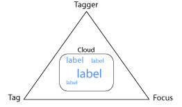
From our earlier look at the structure of first generation tag clouds we know a tag cloud visualizes a semantic field made up of concepts referred to by labels which are applied as tags to a focus of some sort by taggers.
Based on our understanding of the structure of a tag cloud as having a single focus, the flickr cloud shows something different because it includes many focuses. The flickr all time most popular tags cloud combines all the individual tag clouds around all the individual photos in flickr into a single visualization, as Figure 6 shows.

Figure 6: The flickr Landscape of Meaning

This means the flickr all time most popular tags cloud is in fact a visualization of the combined semantic fields behind each of those individual clouds. It’s quite a bit bigger in scope than a traditional single focus cloud. Because the scope is so large, the amount of meaning it summarizes and conveys is tremendous. The all time most popular tags cloud is in fact a historic window on the current and historical state of the semantic landscape of flickr as a whole.

This is where context becomes critical to the proper understanding of a tag cloud. The cloud title “All time most popular tags” sets the context for this tag cloud, within the boundaries of the larger landscape environment defined and communicated by flickr’s user epxerience. Without this title, the cloud is meaningless despite the large and complex semantic landscape – all of the information environment of flickr – it visualizes so effectively, because cloud consumers cannot retrace a complete chain of understanding to correctly identify the cloud’s origin.

flickr – 1st Generation Landscape Navigation
The flickr cloud is a powerful navigation mechanism for quickly and easily moving about within the landscape of meaning built up by all those thousands and thousands of individual clouds. Still, because it is a first generation cloud, we cannot directly follow any of the many individual chains of understanding connecting this cloud’s tags back to specific taggers, or the concepts they associate with specific photos or focuses. In this visualization, the group’s understanding of meaning is more important than any individual’s understanding. And so the flickr cloud does not yet allow us comprehensive navigation of the underlying semantic landscape illustrated in Figure 6 (chains of understanding suggested in light green). The flickr cloud also remains a first generation tag cloud because users cannot control its context.

Figure 7: A Semantic Landscape

Even so, these navigational and contextual needs will help identify the way that users rely on clouds to work in landscapes of meaning.

Growth of Landscapes
Landscapes of meaning like flickr, del.icio.us, or the burgeoning number of social semantic business ventures debuting as I write – typically grow from the bottom up, emerging as dozens or thousands of individual tag clouds created for different reasons by different taggers coincidentally or deliberately interconnect and overlap, all of this happening through a variety of social mechanisms. Taggers typically create connected or overlapping tag clouds one at a time, adding tags, focuses, and taggers (by creating new accounts) in the ad hoc fashion of open networks and architectures. But first we should look at the Tagging Triangle to understand the most basic elements of a tag cloud.

The Tagging Triangle
To make a tag cloud, you have to have three elements: a focus, a tagger, and a(t least one) tag. I call this the Tagging Triangle, illustrated in Figure 8. In the most common renderings of familiar tag clouds, one or two of these elements are often implied but not shown: yet all three are always present.

This illustration shows a cloud of labels, not tags, because a rendered cloud is really a list of labels. The labels shown in most first generation clouds are often tags, but structurally they could also be a set of names for taggers, as in the del.icio.us posting history block proto-cloud we saw above, or a set of focuses as in the ‘Inverted Cloud’ I suggested.
Figure 8: The Tagging Triangle
context_triangle_label.jpg

An Example Landscape
A simple example of the growth of semantic landscapes leads naturally to the discussion of specific ways that tag clouds will enable navigation within large landscapes of meaning.

Figure 9 shows the tag cloud accreted around a single focus. This cloud includes some of the tags that Tagger 1 has used in total across all the tag clouds she’s created (those other clouds aren’t shown). We’ll assume that she’s created other clouds for other focuses.

Figure 9: A Single Tag Cloud

When a second person, Tagger 2, tags that same focus (again with a subset of the total set of all his tags), and some of those tags are the same as those used for this focus by Tagger 1, their individual tag clouds for this focus (shown by the dashed line in the cumulative tag cloud) connect via the common tags, and the cumulative cloud grows. If any of the tags from their total sets are the same, but are not used for this focus, they form another connection between the two taggers. Figure 10 shows two individual clouds connected in both these ways.

Figure 10: Two Connected Clouds

When a third tagger adds a third cloud with common tags and unique tags around the same focus, the cumulative cloud grows, and the number of both kinds of connections between tags and taggers grows. Figure 11 shows three connected clouds.

Figure 11: Connected Clouds

Every tag cloud visualizes a semantic field, and so the result of this bottom up growth is a series of interlinked semantic fields centered around a common focus, as Figure 12 shows. Since semantic fields are made of concepts, linked fields result in linked concepts.

Figure 12: Connected Semantic Fields

The total number and the variety of kinds of interconnections amongst these three taggers, their tags, and a single focus is remarkable. As this simple example shows, the total number and density of connections linking even a moderate size population of taggers, tags, and focuses could quickly become very large. This increased scale drives qualitative and quantitative topology changes in the network that permit a landscape of meaning to emerge from connected semantic fields.

Landscapes And Depth
The accumulation of connections and concepts creates a landscape of meaning with real depth; but it’s the depth of a landscape that drives its value. For this discussion, I’m defining depth loosely as the amount of semantic information or the density of the semantic field either across the whole landscape, or at a chosen point.

Value of course is a very subjective judgement. In participatory economies like that of del.icio.us, the value to individual users is predominantly one of loosely structured semantic exchange based on accumulation of collective value through shared individual efforts. From a business viewpoint, a group of investors and yahoo as a buyer saw considerable value in the emergent landscape and / or other kinds of assets

To make the idea of depth a bit clearer, Figure 13 illustrates two views of a semantic landscape built up by the overlap of tag clouds. The aerial view shows the contents, distribution, and overlap of a number of tag clouds around a set of focuses. The horizon view shows the depth of the semantic field for each focus, based on the amount of overlap or connection between the cloud around that focus and all the other clouds.

Figure 13: Semantic Landscape Depth Views

Of course this is only a conceptual way of showing the cumulative semantic information that makes up a landscape of meaning, so it does not address the relative value of this information. Plainly some indication of the quality of the semantic information in a landscape is critical important to measurements of both depth and value. Metrics for quality could come from a combination of assessment of the diversity and granularity of the tag population for the focus, benchmarks for the domain of the focus and taggers (healthcare industry), and an estimate on the maturity of the domain, the focus, and the tag clouds in the semantic landscape.
Looking ahead, it’s likely that accepted metrics for defining and describing the depth, value, and characteristics of semantic fields and landscapes will emerge as new combinations of some of the measurements used now in the realms of cognitive linguistics, set theory, system theory, topology, information theory, and quite a few other disciplines besides.

In Part Two
The second post in this series of two will follow several of the topics introduced here to conclusion, as well as cover some new topics, including:

  • How chains of understanding shape needs for cloud context and navigation paths
  • How the tagging triangle will define navigation within landscapes of meaning
  • The emergence of stratification in landscapes of meaning
  • The idea that clouds and landscapes have a shape which conveys meaning and value
  • The kinds of contextual information and controls necessary for navigation and social exchanges

Watching Navigation Follow Chains of Understanding
I’ll close with a screencast put together by Jon Udell that captures a wide ranging navigation path through the del.icio.us landscape.
Comment » | Ideas, Tag Clouds

The Aargh Page: Visualizing Pirate Argot

January 10th, 2006 — 12:00am

What happens when this classic vernacular interjection meets linguistics, data visualization, and the Web?
The Aargh page, of course. (It should really be The Aargh! Page, but this is so fantastic that I can’t complain…)
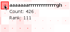
Here’s a screenshot of the graph that shows frequency of variant spellings for aargh in Google, along two axes:
aarrgghh_full.png
Note the snazzy mouseover effect, which I’ll zoom here:
aarrgghh_zoom.gif
Looking into the origins aargh inevitably brings up Robert Newton, the actor who played Long John Silver in several Disney productions based on the writings of Robert Louis Stevenson. I remember seeing the movies as a child, without knowing that they were the first live action Disney movies broadcast on television. So do plenty of other people who’ve created tribute pages>.
Aargh may have many spelling variations, but at least three of them bear a stamp of legitimacy, as the editorial review of
The Official Scrabble Players Dictionary (Paperback) at Amazon.com explains, “If you’re using the 1991 edition or the 1978 original, you’re woefully behind the Scrabble-playing times. With more than 100,000 2- to 8-letter words, there are some interesting additions (“aargh,” “aarrgh,” and “aarrghh” are all legitimate now), while words they consider offensive are no longer kosher. “
There’s even International Talk Like A Pirate Day, celebrated on September 19th every year. The organizers’ site offers a nifty English-to-Pirate-Translator.
Most random perhaps is the Wikipedia link for Aargh the videogame, from the 80’s, without pirates.

Related posts:

Comment » | The Media Environment

Back to top