November 17th, 2005 — 12:00am
I got caught in an on-line opinion survey trap last week. The setup: In exchange for 10% off my next purchase, a Banana Republic cashier told me, I had to answer a few questions about my shopping experience. Retailers often solicit opinions from customers in return for a variety of rewards. It’s common enough that there’s an understanding on the amount of information requested, in exchange for the expected reward. So I thought I was safe…
Twenty screens later, after answering more than fifty questions and with no end in sight, I was feeling a little cranky. Even my wife was irritated; I was holding up grocery shopping for dinner guests. Very quickly, the reward for my time shifted from a coupon, to using Banana Republic as an example of an on-line survey experience that undermines your brand.
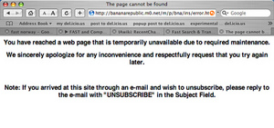
The full survey ran more than thirty five screens, and ended with an error message. Very professional.
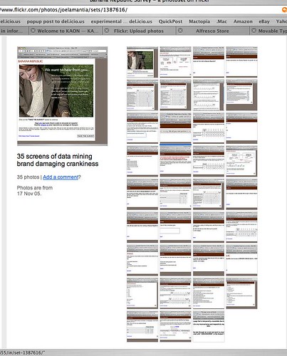
Thumbnails of the whole survey:

For kicks, I posted the screenshots to Flickr. If you run the slideshow, you can see where I became frustrated and started to give spoiler answers – like wearing a size 98, or spending $10 / year on clothing.
Why was the survey experience bad?
1. They didn’t make clear how much time they were asking for. The opening screen said 10 minutes, this is misleading for a 100 question survey. If you’re asking for my time, respect me enough to be honest about what’s required.
2. They didn’t make the real purpose of the survey clear. From the shopping experience itself, the questions quickly shifted to my age, income, marital status, and education level. This is a transparent attempt to feed data mining and demographic needs that relied on an amateur segue to turn the conversation around and ask for personal information.
3. They contradicted the experience I had in their store. The store staff were nice enough to keep track of the umbrella I left in a fitting room, and return it before I left, which was thoughtful. Consistency is the core of a successful brand, but the survey experience was inconsistent.
How does this damage Banana Republic’s brand?
1. Banana Republic left me with a series of negative impressions that work against their brand values: I now feel I was chosen to participate in a survey under false pretenses, a survey that offers me little value in return for important personal information that is inappropriate to ask for in the first place.
2. Banana Republic closed a growing channel for conducting business with a customer. I may purchase more from their stores — if I have no other retailer at hand, and I need business clothes to meet with a client CEO the next morning once again — but I’m certainly not willing to engage with them online.
Merchants in all areas of retailing work very hard to encourage customers to form positive associations with their brands. Fashion retailers work especially hard at encouraging customers to associate values, such as trust and respect, with a brand because these values serve as the foundation for longer term and more lucrative relationships with customers than single purchases. Every experience a customer has with your brand — every touch point — influences this network of associations, reinforcing or weakening the link between a brand and the feelings that customers have about the products and the company behind it. A simple test any retailer should use when considering bringing an experience to customers is wether the experience will reinforce the right brand associations.
Loyalty programs, and their offspring the online opinion survey, are good examples of the intersections of customer interests and retailer interests in an experience that can reinforce a customer’s perceptions of the brand and the values associated with it. Many retailers manage these kinds of programs well.
Just not Banana Republic.
The error message at the end.
Error Message:

I wear size 98:
Size 98:

Related posts:
Comment » | User Experience (UX)
October 9th, 2005 — 12:00am
Usability issues pop up in the strangest places. For example, Monday night, while I was sitting in the Lisbon Tourist Police office, filling out a report on how I’d just been robbed. The officer handling my report took a moment to apologize for how long it took him to complete the process. He said, “We have a new internet based system to fill out all the forms, and its very confusing.” Seems that Accenture created a .net based environment for the Portugese police to record assaults on travellers, but they didn’t pay proper attention to user experience and usability concerns. The officers use all the classic workarounds: composing text in a word-processor before pasting it into input fields, post-it notes for shortcuts and passwords all over the workstations; and they live in fear of hitting the wrong navigation button and losing all their in-progress work.
It’s not as good as getting my wallet back, but it might make a good anecdote at the next IA cocktail hour.
Related posts:
Comment » | Travel, User Experience (UX)
May 20th, 2005 — 12:00am
Below is an excerpt from an email sent to all employees – a ‘global broadcast’, very Max Headroom… – of a larger company (name removed), in response to repeated plees to improve the nightmarish user experience of the time and expense system that all employees must use.
<begin transmission>
There have been a few issues with the submitting and/or processing of Expense Reports resulting from individuals using data fields which have no value to [company], but may have processing impacts within the system. At this time, there is no way to remove or ‘grey-out’ these unused fields. If you have not been trained on the use of a field and/or do not know what the field may/may not do, don’t enter any data within that field – ask your branch admin or contact the help desk.
</end transmission>
What a fantastic example of a user experience directly impacting business: useless but open entry fields = garbage data = inaccurate financials!
Let’s peak into the inner chambers, to see how this might play out:
CEO> “How are we doing this week for revenue?”
CFO> “No idea. I don’t have any numbers to work with.”
CEO> “Why not? That’s ten weeks in a row!”
COO> “Another financials system crash.”
CTO> “Some junior tech in nowheresville accidentally hit the drop select of death again, and now we can’t get reports done for that half of the country.”
CEO> “The analysts and the board are going to kill me – someone take care of this right now.”
COO> “Fix it, or get rid of it!”
CTO> “We can’t fix it – we didn’t buy the configuration module. And we cut the deployment services contract from 24 weeks to 6 weeks, so there was no time to figure out which fields we needed from the generic installation…”
Related posts:
Comment » | User Experience (UX)
August 10th, 2004 — 12:00am
I first saw Edward Tufte deliver his well-known seminar Presenting Data and Information in the heady summer days of ’99. At the time, I was working for a small interactive agency in downtown Boston. I’d heard about Tufte’s seminar from a former colleague, and was eager to learn more about Information Design, user interfaces, and whatever else was relevant to creating user experiences and information spaces. Tufte’s seminars also seemed to tap into some sort of transformational mojo; the person I was working with went in as a Web Developer, and came back a Usability Specialist. The logic of this still escapes me, since I haven’t heard the esteemed Professor mention usability, let alone lecture on it yet: I think it’s more a good lesson in how desperate Seth was to escape writing HTML.
But I’m getting away from the point.
In ’99, Tufte delivered a solid and succinct grounding in Information Design history and principles, supported by frequent references to his gorgeous self-published titles. Bravo.
He promptly followed this with a short segment on “The Web”, which was mostly irrelevant, and wholly behind the times. Professor Tufte’s chief gripes at the time included excessive use of chrome on buttons, bulleted lists, and unformatted tables. He was mired in recounting the failings of HTML 2.0. Outside, it was 1999. But in the lecture hall, it felt more like 1996… I was embarrassed to see an old master dancing poorly to new music.
Forward five years, and now clients are asking me to attend Professor Tufte’s presentation in New York, again in the summer. I expected to be severely disappointed; if Tufte was this far behind when there wasn’t much history in the first place, then it could only have gotten worse.
And so I was pleasantly surprised. The Information Design showcase was like refreshing cool rain after too much time using low-fidelity charting applications. But what really caught my ears was his ready embrace of core Information Architecture language and outlook. Dr. Tufte is hip to IA now. He even gave us some good homework: the session handout lists 11 classics of 20th century Information Architecture – on page 2, right after the day’s agenda.
Yes, his piece on the Web was still a bit behind – static navigation systems and generic corporate marketing site IA aren’t exactly cutting edge topics, and it’s hardly open-minded to say that there’s no reason for having more than a single navigation bar at the top of a page – but at least it was behind in the right direction.
And it was still nice outside.
Kudos to the old master for picking better music.
And for being canny enough to know that it’s good for business to encourage eveyrone to take notes, but not provide note paper in the regstration packet – its for sale of course at the back of the hall…
Related posts:
Comment » | Information Architecture, People

