Tag: userexperience


Enterprise Information Article on Portal Usability Problems

December 9th, 2006 — 12:00am

Janus Boye (of CMSWatch) just published an article called The trouble with portal dashboards… in Enterprise Information, in which he discusses the usability problems of enterprise portals.

Janus identifies the essential problem of current portal design approaches built on flat tiles:

Today most organisations blindly adopt the default ‘building block’ approach to layout found in enterprise portals – a relic from the early days of public internet portals. But users complain that while such an interface may look slick in early sales demonstrations, in production it typically only facilitates work for technically adept super-users. The occasional user easily gets confused and frustrated working with a cluttered screen of little boxes showing many different portlets. Getting adequate value from the portal typically requires substantial training.

This is a good snapshot of the long term weaknesses of a flat portal user experience, what Janus calls “the default ‘building block’ approach” [emphasis mine]. It strongly parallels my recent post outlining some of the inherent usability weaknesses of portals, and is a great lead in for the building blocks. (Note: Janus uses the term building blocks differently.)

In another highlight worth mentioning Janus identifies six distinct types of portals, referring to them as use cases. I think of these as types of information environments. The difference is a semantic one that’s shaped by your context for the term portal. Janus is speaking from the business perspective, thus his focus on the business problem solved by each type of portal.

They are:

  • Dynamic web publishing; the simplest use case and a common entry point for portal developers
  • Self-service portal; enabling staff or customers to help themselves and obtain service on their terms
  • Collaboration portal; enabling dispersed teams to work together on projects
  • Enterprise intranet; helping staff work more efficiently, often via multiple specialised portal applications
  • E-business portal; enabling enterprises to extend commercial information and services to external trading partners, suppliers and customers
  • Enterprise integration; linking systems to achieve greater efficiency and agility.

What’s important to understand from this list is that the default flat tiles approach underlying these different environments is the same, and so are the resulting usability problems, with their attendant business costs. The building blocks will support all six portal types handily.

Comment » | Building Blocks, Dashboards & Portals, Information Architecture, User Experience (UX)

Conflict-Aware Design: Accounting For Conflict In User Experiences

November 7th, 2006 — 12:00am

Conflict is a natural part of human experience. It’s something we encounter every day on levels small and large, and learn to address. And conflict appears at every level of a user experience, from business goals and strategy, user needs, concept and mental models, to task flows, screen-based interactions, terminology, and visual design choices.

Yet many of our user experience practices and approaches do not consider conflict adequately, or at all. User experience design assumptions, artifacts, habits of communication, and working practices combine to bypass adequate consideration of conflict. The result is neglect of conflict as an area of investigation, discussion, and design responsibility. It becomes something we consider only in passing, generally by noting an order of priority for the personas associated with an evolving design

Minimizing conflict may seem pragmatic: exploring conflict makes many people nervous, and stakeholders may not react well unless properly prepared. But this view misses the significance of conflict. Conflict is a pointer to something people care about, pay attention to, need, want, or think is important in some way.

In the same way that smoke equals fire, conflict equals interest, and interest should be a focus for design.

Social Architectures, Experiences, and Environments
Conflict is an especially important area for User experience design to consider now, thanks to the emerging landscape of social media. Social networks, participatory architectures, business and community models dependent on co-creation of content, and collaborative media formats all emphasize social dynamics. These dynamics inevitably include elements of conflict. The continued growth of sharing, networks, interconnections, and complex relationships linking individuals and groups on-line will only increase the role and significance of conflict for successful user experience efforts.

Plainly, if we aim to design for user experiences now and in the future, we must account for conflict. In terms of the evolution of user experience design, the consideration of conflict marks another step in the continued maturation of the field. We might call design approaches that take conflict into account conflict-aware design.

Conflict-aware Design In Practice
Conflict-aware design offers substantial value for designers, stake holders, users – all interested parties, really – with little impact on timelines, costs, approaches, or existing methods. Conflict is simply another aspect of the user experience to explore and understand, share analysis of with decision makers, and direct design solutions to address.

Conflict-aware design builds on and enhances existing practices, adding a layer of context at each stage of the design cycle concerned with the specific conflicts that will impact the user experience. No specialized design documents or techniques are required.

The second part of this essay will consider how common user experience activities and artifacts can be adapted for conflict-aware design.

Comment » | Ethics & Design, User Experience (UX)

Discovering User Goals / IR Goal Definitions

June 24th, 2006 — 12:00am

In an earlier post on creating Goal Based Information Retrieval Experiences, I offered a list of fundamental user goals that underlays needs and usage of four suggested information retrieval modes. In this post, I’ll share the approach employed to discover the fundamental goals of the users in our environment, with the aim of offering it as one way of understanding goals relevant for other types of environments and user experience architectures.

Since the root user goals we identified are potentially applicable to other environments and contexts, I’ll share the definitions behind the full set of root goals we discovered. Together, the approach and definitions should help demonstrate how capture a systematic and also holistic view of what users have need to accomplish when undertaking information retrieval tasks more complex than searching.

Finally, addressing the perspective of strategic design and user experience methodology, framing broad user goals well offers strong footing for addressing business perspectives, and engaging business audiences in productive discussions on the priority of capabilities and the functionality of the user experience.

Discovering Root Goals
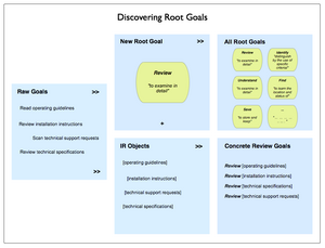
Beginning with raw goals gathered via a mixed palette of discovery and user research (interviews, task analysis, contextual inquiry, or other qualitative insight methods) incorporated into the project, we first called out the different types or objects of information users identified.

Our starting lists of raw user goals or needs looked something like this (though it was considerably larger, and more varied):

  • Read operating guidelines
  • Review installation instructions
  • Scan technical support requests
  • Review technical specifications

Identifying the objects in this set is not difficult: technical specifications, operating guidelines, installation instructions, and support requests. The activity verbs are also easy to spot:

  • read
  • scan
  • review

We then compared the activity verbs for similarity and differences, and refined these raw goals into a root goal of “review” that could apply to any of the objects users named.
Recombining the root goal with various objects yields a set of concrete goals:

  • Review operating guidelines
  • Review installation instructions
  • Review technical specifications
  • Review technical support requests

This approach is more art than science, but is systematic, and is independent of context and format.

Here’s an illustration of the process.

Discovering Root Goals

Final Root Goals For Our Environment
These are the definitions we established for the root goals we found for all our different types of users. [I haven’t included the objects of the goals, or the concrete goals.]

  • To Assess means to make a judgement or decision about, considering relevant factors
  • To Compare means to review the similarities and differences of two or more examples of the same type of thing by looking at them in detail
  • To Find means to learn the location and status of
  • To Identify means to distinguish by the use of specific criteria
  • To Locate means to become aware of where and how a thing may be found, and / or contacted. Locate and find are similar, so likely reflect differing but similar usages and contexts in the minds of users
  • To Monitor means to track the status and location of
  • To Obtain means to acquire and retain for other purposes
  • To Participate means to be present and recognized
  • To Review means to examine in detail
  • To Save means to store and keep
  • To See means to be presented with in a manner that makes assumed relationships or characteristics apparent
  • To Understand means to consider all available points of view or sources of information on a topic / item / situation, and formulate an opinion and frame of reference for one’s own purposes.

Some example concrete goals for an user experience that addresses travel planning could include:

  • Find hotels
  • Review hotel accommodations
  • Save travel itineraries
  • Compare vacation packages
  • See optional excursions offered by a hotel
  • Identify full-service or all-inclusive resorts
  • Locate the operators of scuba diving excursions
  • Monitor the price of airline tickets to Sardinia
  • Understand how to plan and purchase vacations
  • Assess the cost and value of a vacation package

Symmetry and Mental Models
We found the concept of a root goal insightful for helping to design user experience architectures because it is independent of particular user roles, information types, and usage contexts. Being root elements, they point at commonalities rather than differences, and so can help guide the definition of mental models that span user groups, or allow the reuse of an information architecture element such as a navigation component, task flow, or screen layout.

Building numerous concrete goals that are variations on a smaller set of common root goals allows the mental model for the environment to achieve a greater degree of consistency and predictability (we hope – we’ll see what the usability and evaluations bring back). This consistency helps further efforts toward symmetry throughout the information architecture. While most information architects unconsciously reach for symmetry in user experiences by designing repeated elements such as common labeling, rules for layout, and component systems of features and functionality – symmetry is something we should make more conscious efforts to encourage both within environments and across environments.

Speaking To the Business: Goal-based Prioritization of Capabilities and Functionality
With solid root goals and common information objects, it’s possible to build up a simple and consistent grammar that outlines the set of possible concrete goals across user types. This set of goals is a good basis for engaging business stakeholders in choosing the right set of priorities to guide design and build efforts. Systematically articulated goals allow business audiences a comfortable and neutral basis for prioritizing the capabilities the environment will offer users. Of course, choices of capability directly affect costs, effort levels, design and build timelines, and all the other tangible aspects of a user experience. Reference priorities can also help guide longer-term investment and strategy decisions.

Comment » | Information Architecture, User Experience (UX), User Research

Goal Based Information Retrieval Experiences

June 20th, 2006 — 12:00am

Though it’s common practice, thinking of information retrieval exclusively as ‘search’ is an arbitrarily narrow way of framing an area of capability with strong impact on overall perceptions of user experience quality and effectiveness. In the long term, it limits opportunities to offer customers more effective solutions to broader and more fully understood needs that involve information retrieval, but are motivated by other goals. This narrow view is especially limiting for the user experience architect, as it implies an immediate focus on the search aspects of information environments.
A better way of framing information retrieval is in terms of opportunities to meet genuine user goals and objectives by supporting more varied modes of activity. Users often have broad goals in mind while they pursue information retrieval activities; buying a car, making a good investment decision, or learning how to manage their health care plans. And yet the information architecture of many environments still overemphasizes searching as a way of accomplishing goals.
Addressing broader goals with an effective information retrieval experience will likely mean supporting modes of interaction beyond just searching. But providing these additional modes and user experience capabilities can open new opportunities for services, features, revenue, improving relationships, etc.
Even in situations where a wide range of users need to select very specific materials from a large archive or pool of content (the traditional library model), a search-centric information retrieval model that offers no/few other capabilities is reductive and overly simplistic.
Instead of immediately focusing on the scope or functionality of a search experience and system installation, look for the patterns in user goals and needs that imply common modes of interaction with information, and use them as a basis for defining capabilities the environment must offer.
Here’s a list of common types of user goals that involve information retrieval – think of them as root goals that take on different specialized forms in differing environments:

  • reviewing summaries of items
  • examining details
  • comparing multiples
  • understanding contexts and situations
  • learning about people in the environment
  • perceiving trends
  • predicting implications
  • monitoring status or activity
  • identifying by criteria
  • establishing similarity
  • obtaining information for reuse

None of these explicitly includes the activity of searching, though many do imply some level of finding.
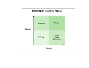
For a recent project, we defined four information retrieval or interaction modes that would meet the goals of our expected users:

  • seeking information
  • visiting stable destinations
  • monitoring notifications
  • receiving delivered assets

These modes range from more active seeking, to less active receiving delivery, and persistent settings (stable destinations) to fluid settings – monitoring or seeking. Together, they define possible kinds of information retrieval experiences and capabilities that will meet the varying needs and goals of users when properly combined.
Information Retrieval Modes

Seeking
The seeking mode focuses on traditional searching, but includes other activities such as narrowing sets using cumulative parameters, finding with/in faceted systems, and . A classic example of seeking mode is a user who poses an ad-hoc query via a search interface, and sorts through the list of search results returned in response. This list may incorporate many different kinds of items from many different sources, a combination that no other user ever encounters again.
From an information architecture perspective, the key characteristic of seeking mode is that, users bring the situations and contexts (like search results) they encounter into existence by seeking them out. When seeking, users encounter fluid destinations within the larger information environment based on what they are looking for, and how they are looking for it.
Another characteristic of the seeking mode is that users will not know in advance what they will encounter, even though they may have a very good idea of what they need to meet their goal. When seeking, users might be presented with a mixed set of conceptually related items of many different types, from unknown sources, with diverse contents / structure / composition.
Of course, users may not know what they need, or how to ask for it, as Donna Maurer’s 4 Modes of Seeking Information and How to Design for Them points out, but this was a less important factor in the way we framed seeking within our environment than whether users would know what to expect as a result of their seeking activities, and whether they could retrace their path to a particular step of their journey.
Visiting Stable Destinations
When visiting stable destinations, users encounter stable places within the information environment that exist regardless of the user’s activities. Where seeking invokes temporary contexts do not persist, a stable destination is persistent. Persistence could be conceptual only, reflected in navigation elements, or made part of the user experience via any number of mechanisms. All destinations have a focus of some kind, such as a topic, or product, or event, and may be defined by the intersection of several focuses, such as products or documents created by one person that are related to a topic or event.
Destinations could take the form of many kinds of pages – including the A-Z indexes Donna mentions – but could also consist of predetermined combinations of conditions and context that users can revisit without choosing them again. In an environment of known contents, destinations offer users a set of things they understand in advance and expect (after adequate opportunities for learning). Destinations will likely change based on business rules and user context, as well as changes in the items available within the environment.
A good example of a stable destination is the Arts page of the New York Time online; the articles and the art they concern change constantly, yet users know what to expect when they visit. The page is a visible part of the environment conceptually (as a category) and in terms of navigation, and is easily accessible directly from outside the environment.
Monitoring
The monitoring mode is a more fluid and less active information retrieval mode wherein the environment sends users notifications of events, activity, status, or changes taking place within it’s boundaries. The key characteristic of monitoring is that users can accomplish goals without entering the environment, or with only limited entry that takes them to a known setting.
Monitoring effectively extends the user experience and information retrieval capabilities beyond the boundaries of the originating environment, and allows users to know in advance what they will find or encounter when they enter the environment.
Monitoring naturally requires messages or communication tokens, commonly email, RSS, or SMS, but could take many other forms as well. A good example of monitoring is the configurable alerts that many travel services provide to indicate when prices for airline tickets to specific cities change, or match a price point.
Receiving Items via Delivery
Receiving delivered items is the least active mode we defined for users, allowing them to retrieve information without actively seeking, visiting a destination, or monitoring the environment. In this mode, users do not have to enter the environment at all to retrieve information, enabling them to further goals without increasing acquisition costs or effort.
Delivery implies mechanisms to manage the nature, rate, and format of the information to deliver, as well as the channel: email, attachments, RSS, podcasts, vlogs, etc.
Good examples of delivered information are the iconic stock ticker, RSS feeds for blog postings, and email publications.
Combining Modes: User Goals and Customer Lifecycles
It’s natural that user goals will span modes, and that the preferred mode for accomplishing a goal may change over time to reflect shifting usage patterns and needs.
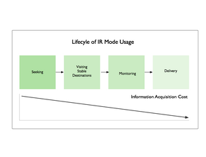
As an example, a single user might shift among different modes that reflect learning more about the structure and content of the environment. From initial seeking activity focused on searching for information related to a topic, a user may switch to visiting a known stable destination that addresses that topic, entering the environment from the outside without initial seeking.
This destination may include tools to establish monitoring for a specific type of item, which a user who understands the domain will appreciate and take advantage of as a way to reduce the number of required visits while remaining aware of activity or status. Eventually, this user might shift from monitoring to direct delivery of a few specific and very valuable information assets, through a channel and in a format of their choosing.
IR Mode Lifecycle

In the same way that patterns in goals allow experience architects to identify common modes of information retrieval, patterns of cross-mode usage will emerge in populations of users or customers. Once understood, these kinds of flows present opportunities on many levels; user experience, business model or process, and technical architecture.

Related posts:

Comment » | Information Architecture

Who Should Own How We Work? Collaboration, the New Enterprise Application

May 14th, 2006 — 12:00am

Col­lab­o­ra­tion is the lat­est ral­ly­ing cry of soft­ware ven­dors hop­ing to embed new gen­er­a­tions of enter­prise class tools and user expe­ri­ences into the fab­ric of the mod­ern work­place. Microsoft, IBM, and other firms expect that con­trol or lead­er­ship in the mar­ket for col­lab­o­ra­tion, whether by own­ing the archi­tec­ture, sys­tems, or other solu­tion com­po­nents, will be lucra­tive. A recent Rad­i­cati Group study (qual­ity uncon­firmed…) of the mar­ket size for enter­prise col­lab­o­ra­tion offered an esti­mate of $1.6 bil­lion now, grow­ing 10% annu­ally to $2.3 bil­lion in 2010.

Beyond the sub­stan­tial money to be made cre­at­ing, sell­ing, installing, and ser­vic­ing col­lab­o­ra­tion solu­tions lies the strate­gic advan­tage of mar­ket def­i­n­i­tion. The vendor(s) that own(s) the col­lab­o­ra­tion space expect(s) to become an inte­gral to the knowl­edge economy’s sup­port­ing envi­ron­ment in the same way that Ford and Gen­eral Motors became essen­tial to the sub­ur­ban­ized con­sumer archi­tec­tures of the post WWII era by serv­ing simul­ta­ne­ously as employ­ers, man­u­fac­tur­ers, cul­tural mar­keters, cap­i­tal reser­voirs, and auto­mo­bile sell­ers. Col­lab­o­ra­tion ven­dors know that achiev­ing any level of indis­pen­si­bil­ity will enhance their longevity by mak­ing them a neces­sity within the knowl­edge econ­omy.

It’s worth tak­ing a moment to call atten­tion to the impli­ca­tions: by defin­ing the user expe­ri­ences and tech­no­log­i­cal build­ing blocks brought together to real­ize col­lab­o­ra­tion in large enter­prises, these ven­dors will directly shape our basic con­cepts and under­stand­ing (our men­tal mod­els and cog­ni­tive frames) of col­lab­o­ra­tion. Once embed­ded, these archi­tec­tures, sys­tems, and busi­ness processes, and the social struc­tures and con­cep­tual mod­els cre­ated in response, will in large part define the (infor­ma­tion) work­ing envi­ron­ments of the future.And yes, this is exactly what these ven­dors aspire to achieve; the Microsoft Share­point Prod­ucts and Tech­nolo­gies Devel­op­ment Team blog, offers:

“Share­Point Prod­ucts and Tech­nolo­gies have become a key part of our strat­egy for deliv­er­ing a com­plete work­ing envi­ron­ment for infor­ma­tion work­ers, where they can col­lab­o­rate together, share infor­ma­tion with oth­ers, and find infor­ma­tion and peo­ple that can help them solve their busi­ness prob­lems.“
[From SHAREPOINT’S ROLE IN MICROSOFT’S COLLABORATION STRATEGY.]

And IBM’s mar­ket­ing is not pitched and deliv­ered in a man­ner as sweep­ing, but the impli­ca­tions are sim­i­lar, as in the overview IBM® Work­place™: Sim­ply a bet­ter way]:
“IBM Work­place™ Solu­tions are role-based frame­works to help cus­tomers apply IBM Work­place tech­nolo­gies faster and more pro­duc­tively… These solu­tions are designed to pro­vide ‘short-cuts’ for cre­at­ing a high per­for­mance role-based work envi­ron­ment, help­ing to accel­er­ate time-to-value.“

The Mod­els for com­mu­ni­ca­tion and rela­tion­ships built into our tools are very pow­er­ful, and often employed in other spheres of life. How many times have you started writ­ing a birth­day card for a friend, and found your­self instinc­tively com­pos­ing a set of bul­let points list­ing this person’s chief virtues, notable char­ac­ter traits, and the most impor­tant / amus­ing moments of your friend­ship. The creep­ing ubiq­uity of the rhetor­i­cal style of Pow­er­point (Tufte’s essay here) is just one exam­ple of the tremen­dous social impact of a habit­u­ated model of com­mu­nica­tive prac­tices that’s run amok.

What does the future hold, in terms of enter­prise ven­dor con­trol over every­day work­ing expe­ri­ences? I’ve writ­ten before on the idea that the days of the mono­lithic enter­prise sys­tems are num­bered, mak­ing the point along the way that these behe­moths are the result of a top-down, one-size-for-all approach. I think the same is true of the cur­rent approach to col­lab­o­ra­tion solu­tions and work­ing envi­ron­ments. And so I was happy to see Andrew McAfee of Har­vard Busi­ness School make sev­eral strong points about how enter­prise col­lab­o­ra­tion efforts will real­ize greater suc­cess by *reduc­ing* the amount of struc­ture imposed on their major ele­ments — roles, work­flows, arti­facts, and rela­tion­ships — in advance of actual use.

McAfee sees con­sid­er­able ben­e­fit in new approaches to enter­prise IT invest­ment and man­age­ment that reduce the top-down and imposed nature of enter­prise envi­ron­ments and solu­tions, in favor of emer­gent struc­tures cre­ated by the peo­ple who must work suc­cess­fully within them. McAfee advo­cates allow­ing staff to cre­ate the iden­ti­ties, struc­tures and pat­terns that will orga­nize and gov­ern their col­lab­o­ra­tion envi­ron­ments as nec­es­sary, in an emer­gent fash­ion, instead of fix­ing these aspects long before users begin to col­lab­o­rate.

McAfee says:
“When I look at a lot of cor­po­rate col­lab­o­ra­tion tech­nolo­gies after spend­ing time at Wikipedia, del.icio.us, Flickr, and Blog­ger I am struck by how reg­i­mented, inflex­i­ble, and lim­ited the cor­po­rate stuff seems, because it does some or all of the following:

  • Gives users iden­ti­ties before they start using the tech­nol­ogy. These iden­ti­ties assign them cer­tain roles, priv­i­leges, and access rights, and exclude them from oth­ers. These iden­ti­ties almost always also place them within the exist­ing orga­ni­za­tional struc­ture and for­mal cor­po­rate hierarchy.
  • Con­tains few truly blank pages. Instead, it has lots of templates–for meet­ings, for project track­ing, for doc­u­ments and reports, etc.
  • Has tons of explicit or implicit work­flow– seqences [sic] of tasks that must be exe­cuted in order.

How much of this struc­ture is nec­es­sary? How much is valu­able? Well, the clear suc­cess sto­ries of Web 2.0 demon­strate that for at least some types of com­mu­nity and col­lab­o­ra­tion, none of it is.“

The crit­i­cal ques­tion is then “what types of com­mu­nity and col­lab­o­ra­tion require which approaches to cre­at­ing struc­ture, and when?” As any­one who’s used a poorly or overly struc­tured col­lab­o­ra­tion (or other enter­prise) tool knows, the result­ing envi­ron­ment is often anal­o­gous to a feu­dal soci­ety designed and man­aged by crypto-technical over­lords; one in which most users feel as if they are serfs bound to the land for in per­pe­tu­ity in order to sup­port the leisure-time and war-making indul­gences of a small class of share­hold­ing nobil­ity.

Answer­ing these ques­tions with con­fi­dence based on expe­ri­ence will likely take time in the range of years, and require numer­ous failed exper­i­ments. There’s a larger con­text to take into account: the strug­gle of enter­prise soft­ware ven­dors to extend their reach and longevity by dom­i­nat­ing the lan­guage of col­lab­o­ra­tion and the range of offer­ings is one part of a much broader effort by soci­ety to under­stand dra­matic shifts in our ways of work­ing, and the social struc­tures that are both dri­ven by and shape these new ways of work­ing. And so there are sev­eral impor­tant ideas and ques­tions under­ly­ing McAfee’s assess­ment that social sys­tem design­ers should under­stand.

One of the most impor­tant is that the notion of “col­lab­o­ra­tion” is con­cep­tual short­hand for how you work, who you work with, and what you do. In other words, it’s a dis­til­la­tion of your pro­fes­sional iden­tity. Your role in a col­lab­o­ra­tion envi­ron­ment defines who you are within that envi­ron­ment.

More impor­tantly, from the per­spec­tive of growth and devel­op­ment, your sys­tem assigned role deter­mines who you can *become*. Knowl­edge work­ers are val­ued for their skills, expe­ri­ence, pro­fes­sional net­works, pub­lic rep­u­ta­tions, and many other fluid, con­text depen­dent attrib­utes. And so lock­ing down their iden­ti­ties in advance strips them of a sub­stan­tial pro­por­tion of their cur­rent value, and simul­ta­ne­ously reduces their abil­ity to adapt, inno­vate, and respond to envi­ron­men­tal changes by shift­ing their think­ing or prac­tices. In plain terms, deter­min­ing their iden­ti­ties in advance pre­cludes the cre­ation of future value.

Another impor­tant under­ly­ing idea is the impor­tance of prop­erly under­stand­ing the value and util­ity of dif­fer­ing approaches to sys­tem­ati­za­tion in dif­fer­ing con­texts. McAfee’s assess­ment of the unhealthy con­se­quences of impos­ing too much struc­ture in advance is use­ful for social sys­tem design­ers (such as infor­ma­tion archi­tects and knowl­edge man­agers), because it makes the out­comes of implicit design strate­gies and assump­tions clear and tan­gi­ble, in terms of the neg­a­tive effects on the even­tual users of the col­lab­o­ra­tion envi­ron­ment. For com­plex and evolv­ing group set­tings like the mod­ern enter­prise, cre­at­ing too much struc­ture in advance points to a mis­placed under­stand­ing of the value and role of design and archi­tec­ture.

Fun­da­men­tally, it indi­cates an over­es­ti­ma­tion of the value of the activ­ity of sys­tem­atiz­ing (design­ing) col­lab­o­ra­tion envi­ron­ments to high lev­els of detail, and with­out recog­ni­tion for evo­lu­tion­ary dynam­ics. The design or struc­ture of any col­lab­o­ra­tion envi­ron­ment — of any social sys­tem — is only valu­able for how well it encour­ages rela­tion­ships and activ­ity which advance the goals of the orga­ni­za­tion and it’s mem­bers. The value of a designer in the effort to cre­ate a col­lab­o­ra­tive com­mu­nity lies in the abil­ity to cre­ate designs that lead to effec­tive col­lab­o­ra­tion, not in the num­ber or speci­ficity of the designs they pro­duce, and espe­cially not in the arti­facts cre­ated dur­ing design — the tem­plates, work­flows, roles, and other McAfee men­tioned above. To sim­plify the dif­fer­ent views of what’s appro­pri­ate into two arti­fi­cially seg­mented camps, the [older] view that results in the pre­ma­ture cre­ation of too much struc­ture val­i­dates the design of things / arti­facts / sta­tic assem­blies, whereas the newer view valu­ing min­i­mal and emer­gent struc­tures acknowl­edges the greater effi­cacy of design­ing dynamic sys­tems / flows / frame­works.

The overly spe­cific and rigid design of many col­lab­o­ra­tion sys­tem com­po­nents com­ing from the older design view­point in fact says much about how large, com­plex enter­prises choose to inter­pret their own char­ac­ters, and cre­ate tools accord­ingly. Too often, a desire to achieve total­ity lies at the heart of this approach.

Of course, most total­i­ties only make sense — exhibit coher­ence — when viewed from within, and when using the lan­guage and con­cepts of the total­ity itself. The result is that attempts to achieve total­ity of design for many com­plex con­texts (like col­lab­o­ra­tion within enter­prises large or small) rep­re­sent a self-defeating approach. That the approach is self-defeating is gen­er­ally ignored, because the pur­suit of total­ity is a self-serving exer­cise in power val­i­da­tion, that ben­e­fits power hold­ers by con­sum­ing resources poten­tially used for other pur­poses, for exam­ple, to under­mine their power.

With the chimera of total­ity set in proper con­text, it’s pos­si­ble to see how col­lab­o­ra­tion envi­ron­ments — at least in their most poorly con­ceived man­i­fes­ta­tions — will resem­ble vir­tual retreads of Tay­lorism, wherein the real accom­plish­ment is to jus­tify the effort and expense involved in cre­at­ing the sys­tem by point­ing at an exces­sive quan­tity of pre­de­ter­mined struc­ture await­ing habi­ta­tion and use by dis­en­fran­chised staff.

At present, I see two diver­gent and com­pet­ing trends in the realm of enter­prise solu­tions and user expe­ri­ences. The first trend is toward homo­gene­ity of the work­ing envi­ron­ment with large amounts of struc­ture imposed in advance, exem­pli­fied by com­pre­hen­sive col­lab­o­ra­tion suites and archi­tec­tures such as MSOf­fice / Share­point, or IBM’s Work­place.

The sec­ond trend is toward het­ero­gene­ity in the struc­tures inform­ing the work­ing envi­ron­ment, vis­i­ble as vari­able pat­terns and locuses of col­lab­o­ra­tion estab­lished by fluid groups that rely on adhoc assort­ment of tools from dif­fer­ent sources (Base­Camp, GMail, social book­mark­ing ser­vices, RSS syn­di­ca­tion of social media struc­tures, com­mu­ni­ties of prac­tice, busi­ness ser­vices from ASP providers, open source appli­ca­tions, etc.).

But this itself is a short term view, when sit­u­a­tion within a longer term con­text is nec­es­sary. It is com­mon for sys­tems or envi­ron­ments of all sizes and com­plex­i­ties to oscil­late cycli­cally from greater to lesser degrees of struc­ture, along a con­tin­uüm rang­ing from homo­ge­neous to het­ero­ge­neous. In the short term view then, the quest for total­ity equates to homo­gene­ity, or even efforts at dom­i­na­tion. In the long term view, how­ever, the quest for total­ity could indi­cate an imma­ture ecosys­tem that is not diverse, but may become so in time.

Apply­ing two (poten­tial) lessons from ecol­ogy — the value of diver­sity as an enhancer of over­all resilience in sys­tems, and the ten­dency of mono­cul­tures to exhibit high fragility — to McAfee’s points on emer­gence, as well as the con­tin­uüm view of shift­ing degress of homo­gene­ity, should tell us that col­lab­o­ra­tion solu­tion design­ers would be wise to do three things:

The end result should be an enter­prise approach to col­lab­o­ra­tion that empha­sizes the design of infra­struc­ture for com­mu­ni­ties that cre­ate their own struc­tures. Big ven­dors be wary of this enlight­ened point of view, unless you’re will­ing to respond in kind.

Comment » | Architecture, Enterprise

User Research = R&D

February 14th, 2006 — 12:00am

This weekend, some of my earlier posts discussing the user experience of Lotus Notes surfaced in the Notes community. Ed Brill – in a posting titled Mary Beth has been taking on the critics – referenced my mention of how the head of the Notes UI team was employing user research as a bridge to customers. Ed complimented the design team for reaching out to critics in public. This is a well-deserved pat on the back. Yet it falls short of recognizing the more important point that direct user research should be a basic component of any company’s overall strategy and planning for long term success (or survival).

Why? User research helps build customer relationships, further design efforts, and identify new business opportunities when applied across audiences (internal and external constituencies) and perspectives (marketing, sales, product development), and with an eye for needs beyond immediate feedback. This sort of engagement with customers of a software product (or any kind of product) should *not* be special or noteworthy – it should happen all the time. Continuously. I’m thinking of Jared Spool’s remarks during his keynote at UI10, to the effect that the user experience perspective is most successful when it it is a basic component of a company’s culture, and thus an assumed aspect of every initiative.

In fact, in a socially transparent, networked, and aware environment like the current FuturePresent, user research serves as a fundamental, indispensable form of research and development that companies and organizations must support as part of their portfolio of methods for seeking broad based environmental feedback (also here). I’ll go so far as to say that user research may move beyond the realm of essential corporate R&D, and qualify as genuine basic research.

BTW: maybe it’s just me, but isn’t it a bit ominous that the tag line for Notes 7 is “Innovate. Collaborate. Dominate.” ? Sounds like something the Borg might say if you asked them how to make breakfast…

Comment » | User Research

New Amazon Features: Translating the Bookstore Experience On-line

January 12th, 2006 — 12:00am

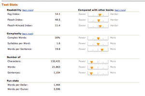
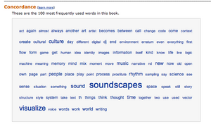
Amazon is offering new Text Stats on “Readability” and “Complexity”, and a Concordance feature, both part of their comprehensive effort to translate the physical book[store] experience into the online medium. The new features build on existing capabilities such as Look Inside, Wishlists, Recommendations, Editorial and Customer Reviews, Citations, and Better Together to create a comprehensive book buying experience. In the same way that bookstores include kiosks to allow customers access metadata and other information on the books for sale in the immediate environment, Amazon is offering on-line capabilities that simulate many of the activities of book buyers in a bookstore, such as checking the table of contents and indexes, flipping through a book to read passages, or look at select pages.

The new features appear on product pages for books, as well as other kinds of works. [Try this intro to FRBR for a look at the conceptual hierarchy differentiating works from items, and it’s implications for common user tasks like finding, identifying, selecting, and obtaining items.]

Text Stats may be experimental, but it’s hard to feel comfortable with their definition of complexity, which is: “A word is considered “complex” if it has three or more syllables.” To point out the obvious, English includes plenty of simple three syllable words – like “banana” – and some very complex one syllable words – “time” “thought” and “self” for example.

The Text Stats on Readability seem a bit better thought through. That’s natural, given their grounding in research done outside Amazon’s walls. But with clear evidence that US education standards vary considerably across states and even individual districts, and also evidence that those standards change over time, I have to question the value of Readability stats long term. I suppose that isn’t point…

The Concordance feature is easier to appreciate; perhaps it doesn’t attempt to interperet or provide meaning. It simply presents the raw statistical data on word frequencies, and allows you to do the interpretation. Amazon links each word in the concordance to a search results page listing the individual occurances of the word in the text, which is useful, and then further links the individual occruance listings to the location within the text.

With this strong and growing mix of features, Amazon both translates the bookstore experience on-line, and also augments that experience with capabilities available only in an information environment. The question is whether Amazon will continue to expand the capabilities it offers for book buying under the basic mental model of “being in a bookstore”, or if a new direction is ahead?

Here’s a screenshot of the Text Stats for DJ Spooky’s Rhythm Science.

Text Stats:

Here’s a screen shot of the Concordance feature.

Concordance:

Comment » | Modeling, User Experience (UX)

Enterprise Software is Dead! Long Live… Thingamy?

January 5th, 2006 — 12:00am

Peter Merholz observes that enterprise software is being eaten away from below, by applications such as Moveable Type, and innovators such as SocialText.
“These smaller point solutions, systems that actually address the challenges that people face (instead of simply creating more problems of their own, problems that require hiring service staff from the software developers), these solutions are going to spread throughout organizations and supplant enterprise software the same way that PCs supplanted mainframes.
I sure wouldn’t want to be working in enterprise software right now. Sure, it’s a massive industry, and it will take a long time to die, but the progression is clear, and, frankly, inevitable.”
Indeed it is. Though there’s considerable analyst hoopla about rising enterprise content management or ECM spending and IT investment (see also In Focus: Content Management Heats Up, Imaging Shifts Toward SMBs), we’re in the midst of a larger and longer term cycle of evolution in which cheaper, faster, more agile competitors to established market leaders are following the classic market entry strategy of attacking the bottom of the pyramid. (The pyramid is a hierarchical representation of a given market or set of products; at the top of the pyramid sit the more expensive and mature products which offer more features, capabilities, quality, or complexity; the lower levels of the pyramid include lower cost products which offer fewer features.)
What’s most interesting about the way this pattern is playing out in the arena of enterprise content management solutions is that the new competitors were not at first attacking from the bottom as a deliberate strategy, think of MoveableType, but they have quite quickly moved to this approach as with the recent release of Alfresco. The different origins of Sixapart and Alfresco may have some bearing on their different market entry approaches: Sixapart was a personal publishing platform that’s grown into a content management tool, whereas Alfresco’s intented audience was enterprise customers from day one. I’d wager the founders of Alfresco looked to RedHat as an example of a business model built on OpenSource software, and saw opportunity in the enterprise content management space, especially concerning user experience annd usability weaknesses in ECM platforms.
There’s an easy (if general) parallel in the automotive industry: from American dominance of the domestic U.S. market for automobiles in the post-WWII decades, successive waves of competitors moved into the U.S. automobile market from the bottom of the pyramid, offering less expensive or higher quality automobiles with the same or similar features. The major Japanese firms such as Honda, Toyota, and Nissan were first, followed by Korean firms such as Hyundai and Daewoo. It’s plain that some of the older companies sitting at the top of the pyramid are in fact dying, both literally and figuratively: GM is financially crippled and faces onerous financial burdens — to the point of bankruptcy – as it attempts to pay for the healthcare of it’s own aging (dying) workforce.
So what’s in the future?
For auto makers it’s possible that Chinese or South American manufacturers will be next to enter the domestic U.S. market, using similar attacks at the bottom of the pyramid.
For enterprise software, I think organizations will turn away from monolithic and expensive systems with terrible user experiences — and correspondingly low levels of satisfaction, quality, and efficacy — as the best means of meeting business needs, and shift to a mixed palette of semantically integrated capabilities or services delivered via the Internet. These capabilities will originate from diverse vendors or providers, and expose customized sets of functionality and information specific to the individual enterprise. Staff will access and encounter these capabilities via a multiplicity of channels and user experiences; dashboard or portal style aggregators, RIA rich internet applications, mobile devices, interfaces for RSS and other micro-content formats.
David Weinberger thinks it will be small pieces loosely joined together. A group of entrepreneurs thinks it might look something like what Thingamy claims to be.
Regardless, it’s surely no coincidence that I find a blog post on market pyramids and entry strategies put up by someone working at an enterprise software startup…

Related posts:

Comment » | Architecture, Ideas

Building Channels To Customers With User Research

December 26th, 2005 — 12:00am

Proving that a well-developed sense of humor is required for success in product design — especially for Lotus Notes — Mary Beth Raven, who leads the design team for the next version of Lotus Notes, recently posted a rather funny comment in reply to my suggestion that the Notes Design team offer customers a choice of unpleasant but related user experience themes. She used this as the occasion to invite all members of the community of Notes to users to register as volunteers for usability testing.
I’ve made three postings to date specifically discussing the Notes user experience: Lotus Notes User Experience = Disease, Mental Models, Resilience, and Lotus Notes, and Better UI Tops Notes Users’ Wish Lists. I’m not sure which of these prompted Mary Beth to reach out, but I’m glad she did, because doing so is smart business on two levels. At the first level, Mary Beth plainly understands that while vocal critics may seem daunting to user experience designers, product managers, and business owners, engaging these critics in fact presents design teams with opportunities to build strong connections to users and gather valuable feedback at the same time. What better way is there to show the strategic value of user research?
I learned this at first hand while working on a redesign of the flagship web presence of a large software firm several years ago. Some of the most insightful and useful feedback on the strengths and weaknesses of the user experiences I was responsible for came from ‘disgruntled’ customers. The user research I was doing on site structures, navigation paths, and user goals established a channel that allowed unhappy (and happy) customers to communicate about a broad range of their experiences with PTC products and services in a more complete way than by simply buying a competing product, or renewing an existing software license.
Based on these and other experiences building user research programs, I suggest that product managers, user research leads, and user experience designers first collaborate to define a user research strategy, and then define and create a simple but effective user research infrastructure (like registration gateways to volunteer databases, community / program identifiers and incentives, contact management tools, specific personas that technical and customer support teams can learn to recognize and recruit at all stages of the customer lifecycle, etc.) that will support the creation of channels to users throughout the design cycle.
At the second level, it allows the Notes team to directly explore collaboration methods, products, and technologies related to the very competitive collaboration suite / integrated electronic workspace / office productivity markets in which IBM, Microsoft, and several other giant firms are looking to secure dominant positions in the new culture of collaboration. [Note: I’ve posted a few times on Microsoft products as well – Backwards Goals: MS Office Results Oriented UI, and Microsoft’s Philosophy On Information Architecture.]
Members of the community of Lotus Notes users can register as volunteers for usability tests during the design of the next version of Notes at this URL: https://www-10.lotus.com/ldd/usentry.nsf/register?openform.

Related posts:

Comment » | User Experience (UX), User Research

Backwards Goals: MS Office Results Oriented UI

November 18th, 2005 — 12:00am

In the overview of the new “results oriented” UI planned for MS Office 12, our friends in Redmond offer:
“The overriding design goal for the new UI is to deliver a user interface that enables users to be more successful finding and using the advanced features of Microsoft Office. An additional important design goal was to preserve an uncluttered workspace that reduces distraction for users so that they can spend more time and energy focused on their work.”
Let me get that straight. Your first goal is to make it easier for me to find and use advanced features that the vast majority of people employ rarely if ever, and didn’t need in the first place?
And something else that was also important – but not as important as access to all those shiny advanced features – was to make the workspace uncluttered and allow me to focus on my work?
Isn’t that… backwards?

Related posts:

Comment » | User Experience (UX)

Back to top