Tag: userexperience


The Architecture of Discovery: Slides from Discover Conference 2011

April 16th, 2011 — 12:00am

Endeca invites customers, partners and leading members of the broader search and discovery technology and solutions communities to meet annually, and showcase the most interesting and exciting work in the field of discovery.  As lead for the UX team that designs Endeca’s discovery products, I shared some of our recent work on patterns in the structure of discovery applications, as well as best practices in information design and visualization that we use to drive product definition and design for Endeca’s Latitude Discovery Framework.

This material is useful for program and project managers and business analysts defining requirements for discovery solutions and applications, UX and system architects crafting high-level structures and addressing long-term growth, interaction designers and technical developers defining and building information workspaces at a fine grain, and

There are three major sections: the first presents some of our tools for identifying and understanding people’s needs and goals for discovery in terms of activity (the Language of Discovery as we call it), the second brings together screen-level, application level, and user scenario / use-case level patterns we’ve observed in the applications created to meet those needs, and the final section shares condensed best practices and fundamental principles for information design and visualization based on academic research disciplines such as cognitive science and information retrieval.

It’s no coincidence that these sections reflect the application of the core UX disciplines of user research, information architecture, and interaction design to the question of “who will need to encounter information for some end, and in what kind of experience will they encounter it”.  This flow and ordering is deliberate; it demonstrates on two levels the results of our own efforts applying the UX perspective to the questions inherent in creating discovery tools, and shares some of the tools, insights, templates, and resources we use to shape the platform used to create discovery experiences across diverse industries.

Session outline

Session description

“How can you harness the power and flexibility of Latitude to create useful, usable, and compelling discovery applications for enterprise discovery workers? This session goes beyond the technology to explore how you can apply fundamental principles of information design and visualization, analytics best practices and user interface design patterns to compose effective and compelling discovery applications that optimize user discovery, success, engagement, & adoption.”

The patterns are product specific in that they show how to compose screens and applications using the predefined components in the Discovery Framework library.  However, many of the product-specific components are built to address common or recurring needs for interaction with information via well-known mechanisms such as search, filtering, navigation, visualization, and presentation of data.  In other words, even if you’re not using the literal Discovery Framework component library to compose your specific information analysis workspace, you’ll find these patterns relevant at workspace and application levels of scale.

The deeper story of these patterns is in demonstrating the evolution of discovery and analysis applications over time.  Typically, discovery applications begin by offering users a general-purpose workspace that satisfies a wide range of interaction tasks in an approximate fashion.  Over time, via successive expansions in the the scope and variety of data they present, and the discovery and analysis capabilities they provide, discovery applications grow to include several different types of workspaces that individually address distinct sets of needs for visualization and sense making by using very different combinations of components.  As a composite, these functional and informationally diverse workspaces span the full range of interaction needs for differing types of users.

I hope you find this toolkit and collection of patterns and information design principles useful.  What are some of the resources you’re using to take on these challenges?

User Experience Architecture For Discovery Applications from Joe Lamantia

Comment » | Dashboards & Portals, Information Architecture, User Experience (UX)

Frameworks Are the Future (Slides From EuroIA 2008)

October 8th, 2008 — 12:00am

In case you couldn’t make it to Amsterdam for EuroIA 2008, or if you were in town but preferred to stay outside in the warmth of a sunny September Saturday than venture into the marvelous Tsuchinski theater, I’ve posted the slides from my talk Frameworks are the Future of Design.
Enjoy!

Frameworks Are The Future of Design from Joe Lamantia

Comment » | Architecture, Building Blocks, Information Architecture, User Experience (UX)

IA Summit Slides: Effective IA For Enterprise Portals

April 17th, 2008 — 12:00am

I’ve posted slides for my recent Effective IA For Enterprise Portals presentation at the IA Summit in Miami. Portals are not a traditional space for user experience practitioners, so many thanks to the packed house that turned out, and stayed as we both started late to accommodate the crowd, and then ran long.

These slides include a substantial amount of case study and example material that I didn’t cover directly in the talk. For the repeat session on Sunday, I showed additional examples beyond those included here in the starting slides.

Stay tuned for a more detailed writeup of both published and unpublished example material – one that shows the building blocks in action at all levels of a multi-year portal effort from initial strategy through design and into governance / evolution – in part six of the Building Blocks series running in Boxes and Arrows, due out once the post-summit flurry settles down.

Effective IA For Portals: The Building Blocks Framework from Joe Lamantia

1 comment » | Building Blocks, Dashboards & Portals, Information Architecture, User Experience (UX)
Connectors for Dashboards and Portals Live on BoxesandArrows.com

November 1st, 2007 — 12:00am

Boxes and Arrows just published Part 4 of the Building Blocks series, Connectors for Dashboards and Portals.
lamantia.connector.dropcap.s1.jpg
We’re into the home stretch of the series – just two more to go!
Stay tuned for a downloadable toolkit to support easy use of the building blocks during design efforts.

Comment » | Building Blocks, Information Architecture, User Experience (UX)

Portal Building Blocks Intro on Boxes and Arrows

July 24th, 2007 — 12:00am

Boxes and Arrows just published part two of the Portal Building Blocks series – Introduction to the Building Blocks. This second installment covers the design concepts behind the portal building blocks system, and guidelines on how to flexibly combine the blocks into a well-structured user experience.

If you are working on a portal, dashboard, widget, social media platform, web-based desktop, or any tile-based design, this series should help clarify the growth and usability challenges you will encounter, as well as provide a possible solution, in the form of a simple design framework that is platform and vendor neutral.

Stay tuned for the third installment in the series, due out shortly!

Comment » | Building Blocks, Dashboards & Portals, Information Architecture, User Experience (UX)

Presenting on Ethics Panel at EuroIA 2007

July 2nd, 2007 — 12:00am

*Apologies for another announcement posting* but now that the program is final, I can mention that I’ll be speaking at EuroIA 2007 in lovely Barcelona, as part of the panel Perspectives on Ethics, moderated by Olly Wright. My presentation discusses conflict and ethics as an aspect of design for social online environments.

I shared some initial thoughts on this (under served) area last year, in a short post titled Conflict-Aware Design: Accounting For Conflict In User Experiences. The essential message of this post – and the thing I’m thinking about most regarding the question of conflict – is “conflict equals interest, and interest should be a focus for design.” The panel will be the forum for sharing promised (but not complete) follow-up postings.

While prepping the submission, I was working with this treatment for the topic.

Conflict is a fundamental component of human character and relations, with important ethical dimensions. Yet conflict rarely appears as an explicit consideration during the process of designing the experiences, architectures, systems, or environments that make up the new social and participatory media we use daily. Now that media are social, conflict is inevitable.

How can (or should) designers ethically address conflict within design efforts? Does an ethical framework for design require us to manage conflict in character and relations actively? What mechanisms or social structures should designers use to address conflict within new experiences? Are there new kinds of conflict created or necessitated by the social and participatory environments emerging now?

Some specific areas of discussion: privacy, identity, ownership, responsibility, speech.

I’d love any thoughts on the topic, the treatment, the implications, etc.

Fellow panelists at EuroIA include:

Barcelona is a magnificent city…

The full conference program is available at this address http://www.euroia.org/Programme.aspx, and the roster of speakers along is worth the trip to Barcelona.

And DrupalCon Barcelona happens at the same time – I wonder what sort of cross-pollination will emerge…?

Viva Catalunya!

Comment » | Ethics & Design, User Experience (UX)

Moving Beyond Reactive IT Strategy With User Experience

May 9th, 2007 — 12:00am

For those in the enterprise IA / UX space, The next frontier in IT strategy: A McKinsey Survey centered on the idea that “…IT strategy is maturing from a reactive to a proactive stance”is worth a look.

This nicely parallels a point made about the reactive mindset common to IT in many large organizations, in discussion on the IAI mailing list last month. Lou Rosenfeld’s post Information architects on communicating to IT managers, summarizes the original discussion in the IAI thread, and is worth reading as a companion piece.

Lou’s summary of information architecture and user experience voices in the enterprise arena is noteworthy for including many examples of strong correspondence between McKinsey’s understanding of how IT strategy will mature (a traditional management consulting view), and the collected IA / UX viewpoints on addressing IT leadership – typical buyers for enterprise anything – and innovation.

Dialogs that show convergence of understanding like this serve as positive signs for the future. At present, a large set of deeply rooted cultural assumptions (at their best inaccurate, usually reductive, sometimes even damaging) about the roles of IT, business, and design combine with the historical legacies of corporate structures to needlessly limit what’s possible for User Experience and IA in the enterprise landscape. In practical terms, I’m thinking of those limitations as barriers to the strategy table; constraining who can talk to who, and about which important topics, such as how to spend money, and where the business should go.
Considering the gulf that separated UX and IT viewpoints ten – or even five – years ago, this kind of emerging common understanding is a good sign that the cultural obstacles to a holistic view of the modern enterprise are waning. We know that a holistic view will rely on deep understanding of the user experience aspects of business at all levels to support innovation in products and services. I’m hoping the rest of the players come to understand this soon.

Another good sign is that CIO’s have won a seat at the strategy table, after consistent effort:

Further evidence of IT’s collaborative role in shaping business strategy is the fact that so many CIOs now have a seat at the table with senior management. They report to the CEO in 44 percent of all cases; an additional 42 percent report to either the chief operating officer or the chief financial officer.

Looking ahead, information architecture and user experience viewpoints and practitioners should work toward a similar growth path. We fill a critical and missing strategic role that other traditional viewpoints are not as well positioned to supply.

Quoting McKinsey again:

IT strategy in most companies has not yet reached its full potential, which in our experience involves exploiting innovation to drive constant improvement in the operations of a business and to give it a real advantage over competitors with new products and capabilities. Fewer than two-thirds of the survey respondents say that technological innovation shapes their strategy. Only 43 percent say they are either very or extremely effective at identifying areas where IT can add the most value.

User Experience can and should have a leading voice in setting the agenda for innovation, and shaping understandings of where IT and other groups can add the most value in the enterprise. To this end, I’ll quote Peter Merholz (with apologies for not asking in advance):

“…we’ve reached a point where we’ve maximized efficiency until we can’t maximize no more, and that in order to realize new top-line value, we need to innovate… And right now, innovations are coming from engaging with the experiences people want to have and satisfying *that*.”

McKinsey isn’t making the connection between strategic user experience perspectives and innovation – at least not yet. That’s most likely a consequence of the fact that management consulting firms base their own ways of thinking, organizational models, and product offerings (services, intellectual property, etc.) on addressing buyers who are themselves deeply entrenched in traditional corporate structures and worldviews. And in those worlds, everything is far from miscellaneous, as a glance at the category options available demonstrates; your menu here includes Corporate Finance, Information Technology, Marketing, Operations, Strategy…

BTW: if you weren’t convinced already, this should demonstrate the value of the $40 IAI annual membership fee, or of simply reading Bloug, which is free, over paying for subscriptions to management journals :)

Comment » | Customer Experiences, Enterprise, Information Architecture, User Experience (UX)

Text Clouds of the Democratic Debate

April 28th, 2007 — 12:00am

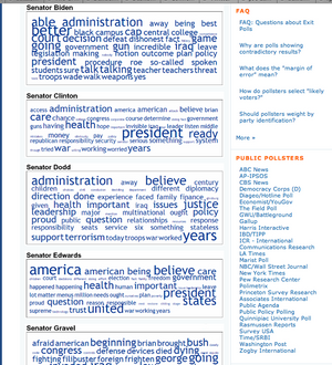
Mark Blumenthal, of Pollster.com, recently posted a set of text clouds showing the words used by each candidate in the Democratic presidential debate Thursday night. The clouds were generated from transcripts of the debate, using Daniel Steinbock’s Tag Crowd tool.

Candidates’ Text Clouds

In the screenshot of Mark’s posting, it’s easy to see this is a great example of a collection of text clouds used for comparative visualization and interpretation. The goal is to enhance understanding of the meaning and content of the candidate’s overall conversations during the debate, an idea I explored briefly last year.

Just a month ago, in a post that identified text clouds as a new and distinct tag cloud variant, I suggested:

text clouds may become a generally applied tool for managing growing information overload by using automated synthesis and summarization. In the information saturated future (or the information saturated present), text clouds are the common executive summary on steroids

Supporting the comparison and interpretation of political speeches is an inventive, timely, and resourceful application that could make text clouds a regular part of the new personal and professional toolkit for effectively handling the torrents of information overwhelming people in important situations like vetting political candidates.

I especially like the way this use of text clouds helps neatly sidestep the disheartening ubiquity of the soundbite, by aggregating, distilling, and summarizing all the things the candidates said. I suspect few – if any – of the campaigns realize the potential for text clouds, but they definitely know the detrimental power of soundbites:

“It’s a mess,” said an exasperated-sounding Mr. Prince, Mr. Edwards’s deputy campaign manager. “Debates are important, but in these big multicandidate races they end up not being an exchange of ideas, but just an exchange of sound bites. They have become a distraction.”

From Debates Losing a Bit of Luster in a Big Field

The value of a collection of soundbites over an insightful dialog is – apologies for the pun – debatable. But even if a simple exchange of soundbites is what the new shortened formats of many debates yields us, text clouds may help derive some value and insight from the results. The combined deconstructive and reconstructive approach that text clouds employ should make it possible to balance the weight of single remarks of candidates by placing them in a larger and more useful context.

History Repeats Itself

In the longer term view of the history of our responses to the problems of information overload, the appearance of text clouds may mark the emergence of a new general puprose tool for visualizing ever greater quantities of information to support some qualitatively beneficial end (like picking a good candidate for President, which we sorely need).

The underlying pattern – a consistent oscillation between managing effectively and ineffectively coping, depending on the balance between information quantity and tool quality – remains the same. Yet there is also value in knowing the cycles that shape our experience of handling the information crucial to making decisions, especially decisions as important as who leads the country.

The NY Times transcript of the debate is available here.

Comment » | Tag Clouds

Designers, Meet Systems (Recommended Reading)

March 9th, 2007 — 12:00am

2007 looks to be the year that the user experience, information architecture, and design communities embrace systems thinking and concepts.

It’s a meeting that’s been in the making for a while –
At the 2006 IA Summit, Karl Fast and D. Grant Campbell presented From Pace Layering to Resilience Theory: the Complex Implications of Tagging for Information Architecture.
Gene Smith has been writing about systems for a while. At the 2007 summit Gene and Matthew Milan will discuss some practical techniques in their presentation Rich mapping and soft systems: new tools for creating conceptual models.
Peter Merhholz has been posting and talking about the implications of some of these ideas often.
– and seems to have reached critical mass recently:

Here’s a set of reading recommendations related to systems and system thinking. These books, feeds, and articles either talk about systems and the ideas and concepts behind this way of thinking, or contain work that is heavily informed by systems thinking.

Either way, they’re good resources for learning more.

Tags:
http://del.icio.us/tag/systems_theory
http://del.icio.us/tag/systemstheory
http://del.icio.us/tag/SSM

Feeds:
Resilience Science recently featured three excellent essays on the work of C.S. Holling

Books:

And for a lighter read, try anything by author Bruce Sterling that features his recurring character Leggy Starlitz – a self-described systems analyst (likely the first example of one in a work of fiction that’s even moderately well known…). His stories Hollywood Kremlin, Are You for 86?, and The Littlest Jackal (two in short story collection Globalhead), are good places to start. The novel Zeitgest focuses on Starlitz.

Articles:
Sustainability, Stability, and Resilience

We’ve needed to bridge the gulf between views of design rooted in static notions of form and function, and the fluid reality of life for a long time. I hope this new friendship lasts a while.

Comment » | Ideas, Information Architecture, User Experience (UX)

Suggested Tag for Building Blocks Stuff

December 31st, 2006 — 12:00am

I’ve created a suggested (and highly original) tag for bookmarking items related to the building blocks:

ia_building_blocks

I’ve tagged a few items on del.icio.us – my default bookmarking service – and will monitor tag streams from some of the other bookmarking services.
http://del.icio.us/tag/ia_building_blocks

Comment » | Building Blocks, Information Architecture

Back to top