June 6th, 2011 — 12:00am
I’m pleased to be presenting ‘A Taxonomy of Enterprise Search’ at the upcoming EuroHCIR workshop, part of the 2011 HCI conference in the UK. Co-authored with Tony Russell-Rose of UXLabs, and Mark Burrell here at Endeca, this is our first publication of some of the very exciting work we’re doing to understand and describe discovery activities in enterprise settings, and do so within a changed and broader framing than traditional information retrieval. The paper builds on work I’ve done previously on understanding and defining information needs and patterns of information retrieval activity, while working on search and discovery problems as part of larger user experience architecture efforts.
Here’s the abstract of the paper:
Classic IR (information retrieval) is predicated on the notion of users searching for information in order to satisfy a particular “information need”. However, it is now accepted that much of what we recognize as search behaviour is often not informational per se. For example, Broder (2002) has shown that the need underlying a given web search could in fact be navigational (e.g. to find a particular site or known item) or transactional (e.g. to find a sites through which the user can transact, e.g. through online shopping, social media, etc.). Similarly, Rose & Levinson (2004) have identified consumption of online resources as a further category of search behaviour and query intent.
In this paper, we extend this work to the enterprise context, examining the needs and behaviours of individuals across a range of search and discovery scenarios within various types of enterprise. We present an initial taxonomy of “discovery modes”, and discuss some initial implications for the design of more effective search and discovery platforms and tools.
There’s a considerable amount of research available on information retrieval — even within a comparatively new discipline like HCIR, focused on the human to system interaction aspects of IR — but I think it’s the attempt to define an activity centered grammar for interacting with information that makes our approach worth examining. The HCIR events in the U.S. (and now Europe) blend academic and practitioner perspectives, so are an appropriate audience for our proposed vocabulary of discovery activity ‘modes’ that’s based on a substantial body of data collected and analyzed during solution design and deployment engagements.
I’ll post the paper itself once the proceedings are available.
Comment » | Language of Discovery, User Experience (UX), User Research
April 1st, 2006 — 12:00am
Congratulations to James Robertson and StepTwo Designs for releasing an updated version of the Intranet Review Toolkit, just before this year’s IA summit in lovely Vancouver (obligatory flickr link).
Version 1.1 of the Intranet Review Toolkit includes a heuristics summary designed for quick use; it’s based on a condensed version of the complete set of heuristics you may remember I offered a while back. StepTwo was kind enough to credit my modest contribution to the overall effort.
Other additions include a collaboration / community of use destination site http://www.intranetreviewtoolkit.org.
Comment » | Intranets, Tools
March 1st, 2006 — 12:00am
The February edition of Usability News reports on a usability study (Where’s the Search? Re-examining User Expectations of Web Objects) of user expectations for Web page layouts that contains a surprising but interesting visualization of page shapes, based on quantitative user research. (Note: I found the study via the UI Design Newsletter, from HFI.)
The study looks at users” expectations for the location of common web page components, such as site search and advertising. The authors find that expectations for page layouts are largely the same now, as compared to those found in an earlier study, Developing Schemas for the Location of Common Web Objects, conducted in 2001.
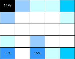
More interesting is the way the researchers report their results; visualizing them as heat map style grid plots for the expected location of each element vs. a blank grid. Here’s two examples, the first showing expected locations for ‘back to home’ links, the second for the ‘site search engine’.
Figure 1: Back to Home Link Location

Figure 2: Site Search Engine Location

These heat maps look a lot like page shapes, expressed as scatterplots.
I like the combination of quantitative and qualitative perspectives at work in these page shapes rendered as scatterplots. I think it could allow for grounded discussion and interpretation of user feedback on design options, within a clear and simple structure that doesn’t require an HCI degree to appreciate. If I try it out, I’ll share the outcomes.
In a more traditional style of visualization, Eric Scheid found another another good example of page shapes a while back in Jonathon Boutelle’s posting on blog layouts called “Mullet”-style blog layout. Jonathon was advocating for a new default blog page shape that increases information density and scent, but hews closely to pre-existing expectations.
Figure 3: Typical Blog Page Shape

Figure 4: Suggested Blog Page Shape

And that’s the last time I’m mentioning m.u.l.l.e.t.s this year, lest Google get the wrong idea about the subject matter of this blog 
Comment » | Information Architecture, User Research
February 14th, 2006 — 12:00am
This weekend, some of my earlier posts discussing the user experience of Lotus Notes surfaced in the Notes community. Ed Brill – in a posting titled Mary Beth has been taking on the critics – referenced my mention of how the head of the Notes UI team was employing user research as a bridge to customers. Ed complimented the design team for reaching out to critics in public. This is a well-deserved pat on the back. Yet it falls short of recognizing the more important point that direct user research should be a basic component of any company’s overall strategy and planning for long term success (or survival).
Why? User research helps build customer relationships, further design efforts, and identify new business opportunities when applied across audiences (internal and external constituencies) and perspectives (marketing, sales, product development), and with an eye for needs beyond immediate feedback. This sort of engagement with customers of a software product (or any kind of product) should *not* be special or noteworthy – it should happen all the time. Continuously. I’m thinking of Jared Spool’s remarks during his keynote at UI10, to the effect that the user experience perspective is most successful when it it is a basic component of a company’s culture, and thus an assumed aspect of every initiative.
In fact, in a socially transparent, networked, and aware environment like the current FuturePresent, user research serves as a fundamental, indispensable form of research and development that companies and organizations must support as part of their portfolio of methods for seeking broad based environmental feedback (also here). I’ll go so far as to say that user research may move beyond the realm of essential corporate R&D, and qualify as genuine basic research.
BTW: maybe it’s just me, but isn’t it a bit ominous that the tag line for Notes 7 is “Innovate. Collaborate. Dominate.” ? Sounds like something the Borg might say if you asked them how to make breakfast…
Comment » | User Research
December 2nd, 2005 — 12:00am
Update: Version 1.1 of the Intranet Review Toolkit is available as of 03/20/2006, and now includes a summary spreadsheet.
Thanks go to James Robertson for very gently reminding me that the licensing arrangements for the Intranet Review Toolkit preclude republishing it as a summarized form, such as the spreadsheet I posted earlier today. In my enthusiasm to share a tool with the rest of the community, I didn’t work through the full licensing implications…
Accordingly, I’ll be removing the spreadsheet from harms way immediately, while hoping it’s possible to make it available in a more legally acceptable form.
Apologies to James and the rest of the Toolkit team for any unintended harm from my oversight.
Related posts:
Comment » | Information Architecture, Intranets, Tools
April 2nd, 2005 — 12:00am
David Brooks Op-Ed column The Art of Intelligence in today’s NY Times is strongly relevant to questions of user research method, design philosophy, and understanding user experiences.
Brooks opens by asserting that that US Intelligence community shifted away from qualitative / interperative research and analysis methods to quantitative research and analysis methods during the 60’s in an attempt to legitimize conclusions in the fashion of the physical sciences. From this beginning, Brooks’ conclusion is that the basic epistemological shift in thought about what sorts of information are relevant to understanding the needs and views of groups of people (nations, societies, political leadership circles) yielded interpretations of their views and plans which were either useless or incorrect, models which then lead decision makers to a series of dramatic policy errors – examples of which we still see to this day.
Brooks contrasts the “unimaginative” quantitative interpretations assembled by statistical specialists with the broad mix of sources and perspectives which cultural and social thinkers in the 50’s used to understand American and other societies in narrative, qualitative ways.
According to Brooks, narrative, novelistic ways of understanding provided much better – more insightful, imaginative, accureate, and useful – advice on how Americans and others understood the world, opening the way to insight into strategic trends and opportunities. I’ve read many of the books he uses as examples – they’re some of the classics on social / cultural / historical reading lists – of the qualitative tradition, and taken away vivid pictures of the times and places they describe that I use to this day when called on to provide perspective on those environments.
Perhaps it’s implied, but what Brooks doesn’t mention is the obvious point that both approaches – qualitative and quantitative – are necessary to crafting fully-dimensioned pictures of people. Moving explicitly to the context of user research, qualitative analysis can tell us what people want or need or think or feel, but numbers give specific answers regarding things like what they’re willing or able to spend, how much time they will invest in trying to find a piece of information, or how many interruptions they will tolerate before quitting a task in frustration.
When a designer must choose between interaction patterns, navigation labels, product imagery, or task flows, they need both types of understanding to make an informed decision.
Some excerpts from Brooks’ column:
“They relied on their knowledge of history, literature, philosophy and theology to recognize social patterns and grasp emerging trends.”
This sounds like a strong synthetic approach to user research.
“I’ll believe the system has been reformed when policy makers are presented with competing reports, signed by individual thinkers, and are no longer presented with anonymous, bureaucratically homogenized, bulleted points that pretend to be the product of scientific consensus.”
“But the problem is not bureaucratic. It’s epistemological. Individuals are good at using intuition and imagination to understand other humans. We know from recent advances in neuroscience, popularized in Malcolm Gladwell’s “Blink,” that the human mind can perform fantastically complicated feats of subconscious pattern recognition. There is a powerful backstage process we use to interpret the world and the people around us.”
“When you try to analyze human affairs using a process that is systematic, codified and bureaucratic, as the CIA does, you anesthetize all of these tools. You don’t produce reason – you produce what Irving Kristol called the elephantiasis of reason.”
Related posts:
Comment » | User Research


