Starbucks and Stroopwafels
In two earlier posts about Starbucks and product metadata, I mentioned the strange sensation of a product experience overwhelmed by packaging – specifically the metadata aspects of the packaging. Now I’d like to share two more examples of packaging burdened with metadata cruft. The first shows an awkward translation that is an attempt to smooth a significant semantic transition or boundary, one created by a high degree of relative cultural and conceptual distance between Dutch and English food categories. The second shows a phenomenon I call brand subsumption. These examples of translation and brand subsumption broaden the original problem into one of inconsistency and misalignment with the overall experience. Starbucks has built an empire on the repeatable, predictable customer experience, and so this inconsistency impacts the Starbucks brand. [At least for those who read the packaging for their food…]
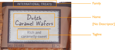
In the first example, Starbucks uses a marketing dictionary to transform stroopwafels into ‘Dutch Caramel Wafers’ that are ‘rich and caramelly-sweet’. I can understand the inclination to change the product name; stroopwafel is a Dutch word that’s likely outside the awareness of most Starbucks customers. And it’s certainly further away in terms of cultural distance than ‘madeleine’. But the resulting translation is awkward because it addresses a very narrow point of view: It’s only if you’ve forgotten the proper Dutch word while trying to explain the concept of a stroopwafel that you’ll need to fall back on a label that reads “Dutch caramel wafer”.
Caramel Wafers Label:

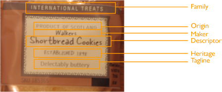
Example two is a branding mashup, involving Walkers Short Bread Cookies and Starbucks. In addition to the standard labeling from the madeleines, we’re now told the maker, the country of origin, and when the maker was established, for a total of six pieces of information. The new elements exactly match the standard branding of most Walkers merchandise. I call this phenomenon brand subsumption, when one brand subsumes another without breaking it down. The Walkers brand arguably has greater international recognition and a longer history than Starbucks, so I imagine the deal bringing their ‘delectably buttery’ cookies to Starbucks counters everywhere required this unusual compromise. The resulting experience is an uneven hybrid; not Walkers, not Starbucks.
Walkers Package Label:

Looking at all three products together, it’s clear the new product family attached to both packages, ‘International Treats’, contributes to the brand impact by introducing a puzzling inconsistency. Compare the original item that started us on this path – madeleines, designated ‘Traditional Favorites’ – with the Dutch and Scottish products labeled ‘International’. Labeling the madeleines French but not international makes no sense, until you turn over the packages: the stroopwafels are made in the Netherlands, the shortbread cookies are made in Scotland, and the madeleines are made in the US. The same product label on one package denotes a cultural category for food items, but on other packages defines the manufacturing location. The product family labels are used for different purposes, which belies their consistent presentation context across products, via similar style, layout, structure, colors, fonts, etc.
Altogether, the combination of metadata quantity, labeling inconsistency, and branding strategies of translation and subsumption, is unexpected from Starbucks – a company built on consistent customer experiences.
Comment » | Customer Experiences, Information Architecture, User Experience (UX)