October 12th, 2007 — 12:00am
Former U.S. Vice President Al Gore and the United Nations Intergovernmental Panel on Climate Change were awarded the 2007 Nobel Peace Presentation Prize today.

Though I’m sad to say it, this latest round of Celebrity Information Design Death Match, pitting Information Visualization Guru Dr. Edward Tufte vs. presentation tools and their legions of droning slide shufflers goes too –
Presentation software (at least it’s Keynote)…
<announcer voice>
Gore’s Nobel Prize must truly be a bitter pill for the esteemed Dr. Tufte, whose extensive declamations on the evils of PowerPoint remain insightful and even amusing, but have been outflanked by Gore’s combination of savvy presentation techniques, and repeated use of the famous “Earth’s Environment Is About to Perish” flying scissorkick move.
</announcer voice>
Seriously: Aside from the environment (we fervently hope), the real winner of this year’s Nobel Peace prize is effective storytelling that blends qualitative and quantitative messages to create a compelling visually supported narrative experience that clearly communicates complex ideas in an emotionally compelling package.
The scientists and Mr. Gore take quite different approaches to the climate changes. The committee has been a measured, peer-reviewed, government-approved statement focused on the most non-controversial findings, whereas Mr. Gore rails against a “planetary emergency.”
Both messages — however imperfect — play their part, scientists said on Friday. The Nobel Prize “is honoring the science and the publicity, and they’re necessarily different,” said Spencer A. Weart, a historian at the American Institute of Physics and author of The Discovery of Global Warming, a recent book.
From Gore and U.N. Panel Win Peace Prize for Climate Work
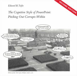
Dr. Tufte says, “PowerPoint presentations too often resemble a school play – very loud, very slow, and very simple.” Too often, Dr. Tufte is right: think about how many times in the last five years you’ve considered feigning a seizure or gastro-intestinal distress to escape a truly awful presentation.

Yet for some ideas – and perhaps the very biggest of audiences – ‘the [school] play’s the thing’. Loud, slow, and simple might be just the right rhetorical style for complex messages that require the broadest kinds of consensus. (If Gore had figured this out during the campaign in 2000, the world would certainly be a very different place today…)
And yet, despite Gore’s pivotal role in shaping the Internet, a search for “al gore inconvenient truth” on the Slideshare website turns up – well – nothing that seems relevant in the first 10 results. There’s likewise no slideware to be had at the official site for the movie. But rest assured Mr. Gore, we know the humble origins of your Nobel Prize and Oscar winning documentary An Inconvenient Truth lie in a mere slide show.
Comment » | People, Tools
June 27th, 2005 — 12:00am
From someone else named Joe, a free service that generates sparklines:
http://bitworking.org/projects/sparklines/
Now I can plot the truly disatisfying long-term performance of my 401ks using a convenient networked infrastructure service…
Related posts:
Comment » | Tools
August 10th, 2004 — 12:00am
I first saw Edward Tufte deliver his well-known seminar Presenting Data and Information in the heady summer days of ’99. At the time, I was working for a small interactive agency in downtown Boston. I’d heard about Tufte’s seminar from a former colleague, and was eager to learn more about Information Design, user interfaces, and whatever else was relevant to creating user experiences and information spaces. Tufte’s seminars also seemed to tap into some sort of transformational mojo; the person I was working with went in as a Web Developer, and came back a Usability Specialist. The logic of this still escapes me, since I haven’t heard the esteemed Professor mention usability, let alone lecture on it yet: I think it’s more a good lesson in how desperate Seth was to escape writing HTML.
But I’m getting away from the point.
In ’99, Tufte delivered a solid and succinct grounding in Information Design history and principles, supported by frequent references to his gorgeous self-published titles. Bravo.
He promptly followed this with a short segment on “The Web”, which was mostly irrelevant, and wholly behind the times. Professor Tufte’s chief gripes at the time included excessive use of chrome on buttons, bulleted lists, and unformatted tables. He was mired in recounting the failings of HTML 2.0. Outside, it was 1999. But in the lecture hall, it felt more like 1996… I was embarrassed to see an old master dancing poorly to new music.
Forward five years, and now clients are asking me to attend Professor Tufte’s presentation in New York, again in the summer. I expected to be severely disappointed; if Tufte was this far behind when there wasn’t much history in the first place, then it could only have gotten worse.
And so I was pleasantly surprised. The Information Design showcase was like refreshing cool rain after too much time using low-fidelity charting applications. But what really caught my ears was his ready embrace of core Information Architecture language and outlook. Dr. Tufte is hip to IA now. He even gave us some good homework: the session handout lists 11 classics of 20th century Information Architecture – on page 2, right after the day’s agenda.
Yes, his piece on the Web was still a bit behind – static navigation systems and generic corporate marketing site IA aren’t exactly cutting edge topics, and it’s hardly open-minded to say that there’s no reason for having more than a single navigation bar at the top of a page – but at least it was behind in the right direction.
And it was still nice outside.
Kudos to the old master for picking better music.
And for being canny enough to know that it’s good for business to encourage eveyrone to take notes, but not provide note paper in the regstration packet – its for sale of course at the back of the hall…
Related posts:
Comment » | Information Architecture, People

