Tag: ia


CMS Schematics, Page Shapes, Wire Frames

September 7th, 2005 — 12:00am

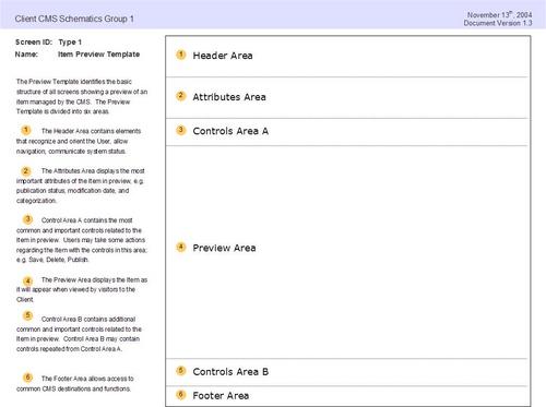
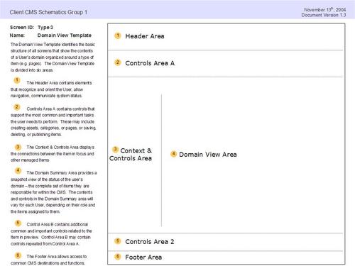
A recent post on the IAI mailing list asked how common it is for IAs to define page shapes or “…wire frames from 10,000 feet, with names for each of the “zones” (n.b. not “elements”, “zones”). …Any given site may have a handful of page shapes, and each page shape has a handful of page zones. Each page and each shape would be named for easy reference.”
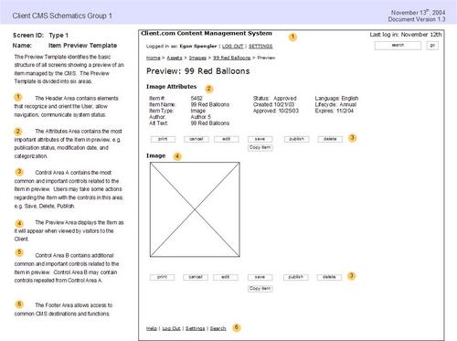
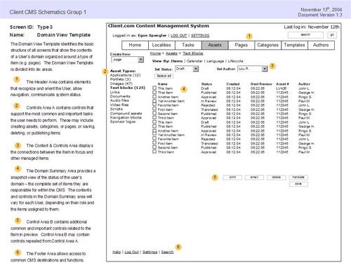
I’ve used a very similar approach based on the defining a limited number of ‘screen types’ that show standardized page structures and layouts for documenting browser based applications. I’ve posted an example of this kind of schematics or wire frames packet done for a small content managment system. This packet includes a conceptual overview of the user domain, as well as a set of defined screen types, screen flows, and wire frames. Here’s the full packet, exported from Visio as html.
Page shapes or screen types look like this:
jpg_7.jpg
Or this:
jpg_11.jpg
These are the accompanying wire frames or schematics:
jpg_8.jpg
jpg_12.jpg

Related posts:

Comment » | Information Architecture

Enterprise Information Architects = “An artist, a guru, a coach, and a spy”

August 23rd, 2005 — 12:00am

“An artist, a guru, a coach, and a spy” is how David C. Baker and Michael Janiszewski describe enterprise architects in their article 7 Essential Elements of EA.
The full quote is, “An enterprise architect requires a unique blend of skills. At various times he or she needs to employ the characteristics of an artist, a guru, a coach, and a spy.” Besides being pithy because it sounds like the intro to one of those ‘____ walk into a bar’ jokes, this rings true for enterprise information architects. However, humorousness aside, this isn’t terribly useful. And overall, the article is a fine breakdown of what’s required to put enterprise architecture into practice, but it only offers the pioneer’s perspective on where enterprise-level architects come from.
Their take, “Enterprise architects grow from within the technical architecture ranks, learning how to be artists, gurus, coaches, and spies as they work their way from being technical specialists, through application or infrastructure architects, eventually to enterprise architects.”
This is an honest if after-the-fact apprasial of a self-directed career growth trajectory that is no stranger to veteran IAs. It’s not adequate as a way to expand the understood scope of information architecture roles to address the enterprise perspective. I feel comfortable saying Information Architecture is accepted as relevant and useful in many areas of business activity, from user research and experience design to product development and strategy, after a few lean years following the dot com crash. But I’m not comfortable saying we have appropriate representation or even access to the enterprise level. It’s here that the business and information perspectives come together in an architectural sense, and also here where we should strive to make sure we’re valued and sought out.
We need to discover, create and define the paths that lead Information Architects to enterprise level positions.to action>
The alternative is being left behind.

Related posts:

Comment » | Architecture, Information Architecture

Executive Dashboards Poster From The IA Summit

March 11th, 2005 — 12:00am

Thanks to all who stopped by to ask questions and express interest in some of the concepts central to executive dashboards, portals, or to simply say hello during the poster session at the IA Summit in Montreal. Many of you took cards, and I look forward to hearing from you soon. Based on the level of interest, I’m talking with the good people at Boxes and Arrows about how to share some of this experience and these ideas in more depth. Stay tuned.

Meanwhile, until the summit site offers a full set of presenter materials, you can find the.pdf version (it’s a largish ~6MB) here.

The published description of the poster is below:

Executive Dashboards: Simple IA Building Blocks Support A Suite of Sophisticated Portals
This poster depicts how a small set of standardized Information Architecture structures and elements was used to create an effective suite of interconnected Executive Dashboards at low cost and without substantial redesign effort.

This suite of dashboards meets the diverse information needs of senior decision makers working within many different business units in a global pharmaceutical company. These dashboards incorporate a wide variety of data types and functionality, but present everything within a consistent and usable User Experience by employing modular tiles and navigation structures.

This set of modular tiles and navigation structures met the diverse information needs of senior decision makers operating within several different business units.

The poster shows how the basic IA component or ‘atom’ of a tile or portlet, with a standard structure, elements, and labeling can contain a tremendous variety of content types. The content types include qualitative and quantitative visual and textual data displays, as well as complex functionality syndicated from other enterprise applications. It also shows how tiles are easily combined with other tiles or portlets to create larger scale and more sophisticated structures that are still easy for users to comprehend, allowing them to synthesize and compare formerly siloed information views to guide strategic decisions.

The poster shows how simple information architecture components common to all the dashboards allow rapid access to a tremendous amount of information, from many sources. The poster shows how this IA framework scaled well and responded to changing business needs over time, allowing the addition of large numbers of new tiles, views, and types of information to existing Dashboards without substantial redesign or cost.

The poster demonstrates how a set of IA components allows designers to present critical business information by operating unit, geography, topic, or specific business metric, at varying levels of detail, based on the needs of specific audiences.
The poster shows how this set of IA components allowed numerous design teams to innovate within a framework, thus creating an extensive library of reusable tiles and views available for syndication throughout the suite of Executive Dashboards.
The end result of this approach to solving diverse design problems is a series of well integrated User Experiences offering substantial business value to a wide audience of users.
Comment » | Building Blocks, Dashboards & Portals, Information Architecture, User Experience (UX)

IA Summit Photos

March 9th, 2005 — 12:00am

I’ve added a batch of photos to the Flickr group for the IA Summit here. More coming soon…

Related posts:

Comment » | Information Architecture

See You At the Information Architecture Summit

February 11th, 2005 — 12:00am

After missing the first four IA summits, I’m very much looking forward to this year’s IA Summit in lovely Montreal.
For this year’s gathering, I’m presenting a poster on how a simple set of IA building blocks can support powerful information architectures, in the context of interconnected exeuctive portals. Aside from benefits in terms of user experience consistency, learnability, and increased rates of user satisfaction and adoption, the true business value of a system of simple information objects that conveys a tremendous variety of content is in meeting diverse needs for decision making inputs across a wide variety of audiences and functional requirements.
This is a follow-on to the better part of a year spent working on the strategy, design, and development of a suite of executive dashboards and portals for major pharmaceutical clients.
In the look-over-your-shoulder-as-you-run-forward mode typical of most consulting roles, it’s quite a bit different from the semantic web / semantic architecture work I’m engaged with now. But that’s the joy of always being on to new things :)

Related posts:

Comment » | Information Architecture

NYC Information Architecture Meetup

February 7th, 2005 — 12:00am

Two thumbs up to Anders Ramsay for organizing IA meetups down in NYC. I had the chance to come to one of these regular get-togethers in January, and meet Anders, Lou Rosenfeld, Liz Danzico, Peter Van Dijk, and quite a few others while in town to see clients. After some refreshing beverages at Vig Bar, we moved on to the Mercer Kitchen for a swanky, tasty dinner. Word of mouth has it that the duck at is a religious experience. And it’s always nice to put faces to a great many blog posts.
Anders posted some photos here:
http://ia.meetup.com/14/photos/
I don’t see any of the umbrellas decorating the interior of the main dining area in the photos – but you had to look up to see them hanging from the ceiling in the first place.
Visual Puzzler Challenge: someone in these photos is a System Architect maquerading as an IA – can you spot the imposter?

Related posts:

Comment » | Information Architecture, People, Travel

User Interface 9 (UI9) Recap

November 17th, 2004 — 12:00am

In October, I had the chance to attend the UI9 User Interface Conference here in Cambridge. I was registered for the full-day session Deconstructing Web Applications: Learning from the Best Designs, hosted by Hagan Rivers of Two Rivers Consulting. I also listened in on a few minutes of Adaptive Path’s workshop From Construct to Structure: Information Architecture from Mental Models. Recognized, well-informed speakers presented both sessions, and did so capably.
Deconstructing Web Applications opened with a useful theoretical section in which Rivers identified a basic model for defining a web application, continued into a breakdown of the base-level IA of a typical web app as presented to users, and then walked through a number of examples of how widely available web applications adhere to or diverge from this model and structure. The material in each portion of the session was well illustrated with screen shots and examples, and it’s clear that Rivers is a comfortable and experienced presenter who understands her material. I’ve recently made use of her framework for the structure of web applications in a number of my active projects.
The session made five bold statements about what attendees would learn or accomplish. In light of very tall requirements to live up to, Rivers did an admirable job of presenting an overview and introduction to several complex applications in a single day’s time. But I can’t say that I have a sense of the core Information Architecture or structure behind the tools reviewed during the session, or an in-depth understanding of why the design teams responsible for them chose a given form. Deconstruction was a poorly defined academic movement whose virtues and drawbacks still generate vehement debates, but as way of seeking understanding (and a choice for a conference session title), it implies a rigorous level of thoroughness that went unmet.
The emotional response section of the workshop was the least developed of the broad areas. It digresses the most from the focus of the rest of talk in form and content. I suspect it represents an area of current interest for Rivers, who included it in order to supplement the material in her program with a timely topic that carries important implications. Emotional design is certainly a growing area that deserves more investigation, especially in the ways that it’s tenets influence basic design methods and their products. However, in the absence of clearer formulation in the terms of reference from Rivers basic theoretical framework for web applications, this portion of the session felt tacked on to the end.
Of course it’s true that you shouldn’t literally believe what you read in any marketing copy – even if it’s written by User Interface Engineering (or possibly the PR firm hired to create their conference website?). But there are unfortunate consequences in creating infulfilled expectations: when you have to sell attendance at a conference to your management, who then expect you to share comprehensive knowledge with colleagues; when conference attendees make business or design decisions thinking they have the full body of information required when in fact they have only an overview; and when we as consumers of conference content don’t insist on full quality and depth across all of the forums we have for sharing professional knowledge.

Related posts:

Comment » | Information Architecture

MicroSoft’s Philosophy on Information Architecture

September 17th, 2004 — 12:00am

While looking around inside the Sharepoint documentation, I found this tasty snippet that explains a great deal about the way Microsoft approaches information architecture, probably design and architecture:
“Creating an effective category structure requires planning and some understanding of how others might organize the content.”
Yes, that’s right – you only need SOME understanding of how others MIGHT organize the content. No need to get the right people, even – anyone off the street will do, as long as they are clearly a member of the group ‘others’, so maybe even the neighbor’s kid would be fine.
Besides, I’m sure the inconvenience associated with trying to develop a decent information architecture informed by knowledge of users’ mental models would probably get in the way of all that planning that’s so important to the success of your portal project.

Related posts:

Comment » | Information Architecture

Revisiting Tufte – 5 Years On

August 10th, 2004 — 12:00am

I first saw Edward Tufte deliver his well-known seminar Presenting Data and Information in the heady summer days of ’99. At the time, I was working for a small interactive agency in downtown Boston. I’d heard about Tufte’s seminar from a former colleague, and was eager to learn more about Information Design, user interfaces, and whatever else was relevant to creating user experiences and information spaces. Tufte’s seminars also seemed to tap into some sort of transformational mojo; the person I was working with went in as a Web Developer, and came back a Usability Specialist. The logic of this still escapes me, since I haven’t heard the esteemed Professor mention usability, let alone lecture on it yet: I think it’s more a good lesson in how desperate Seth was to escape writing HTML.
But I’m getting away from the point.
In ’99, Tufte delivered a solid and succinct grounding in Information Design history and principles, supported by frequent references to his gorgeous self-published titles. Bravo.
He promptly followed this with a short segment on “The Web”, which was mostly irrelevant, and wholly behind the times. Professor Tufte’s chief gripes at the time included excessive use of chrome on buttons, bulleted lists, and unformatted tables. He was mired in recounting the failings of HTML 2.0. Outside, it was 1999. But in the lecture hall, it felt more like 1996… I was embarrassed to see an old master dancing poorly to new music.
Forward five years, and now clients are asking me to attend Professor Tufte’s presentation in New York, again in the summer. I expected to be severely disappointed; if Tufte was this far behind when there wasn’t much history in the first place, then it could only have gotten worse.
And so I was pleasantly surprised. The Information Design showcase was like refreshing cool rain after too much time using low-fidelity charting applications. But what really caught my ears was his ready embrace of core Information Architecture language and outlook. Dr. Tufte is hip to IA now. He even gave us some good homework: the session handout lists 11 classics of 20th century Information Architecture – on page 2, right after the day’s agenda.
Yes, his piece on the Web was still a bit behind – static navigation systems and generic corporate marketing site IA aren’t exactly cutting edge topics, and it’s hardly open-minded to say that there’s no reason for having more than a single navigation bar at the top of a page – but at least it was behind in the right direction.
And it was still nice outside.
Kudos to the old master for picking better music.
And for being canny enough to know that it’s good for business to encourage eveyrone to take notes, but not provide note paper in the regstration packet – its for sale of course at the back of the hall…

Related posts:

Comment » | Information Architecture, People

Simmons College Panel on IA as a Career for LIS Grads

May 3rd, 2004 — 12:00am

Thanks to Beatrice Pulliam and Caryn Anderson for the the chance to talk about Information Architecture at a Simmons College panel on careers for LIS graduate students. The event – Information Professionals In and Out of the Box: An ASIS&T Alternative Career Panel – brought four GSLIS graduates and myself back to talk about potential careers related to LIS. I was the only non-graduate and the only IA on the panel. Titles for the other speakers included Manager, Data Services and Quality Product Manager, Metadata Specialist, and Database Manager – all roles that I’ve worked closely with or in some way performed under the heading of Information Architecture.

It was a genuine pleasure to talk to a group of interested students, and also my first window into the early academic codification that’s happening in and around the realm of IA.

After the session, I was introduced to some of the Simmons faculty; Candy Schwartz (also here), who taught the first dedicated course on IA offered at Simmons, and Gerry Benoit the current instructor. Dr. Benoit works in many areas, including Systems Theory – which is one of the subjects I’d like to explore more, since it seems very relevant to some of the core concepts of IA.

Following up, I learned that Caryn is
“…working with a Harvard research fellow and Fulbright scholar on the emerging specialization of Integration & Implementation Sciences which is coordinating research and development in the areas of complexity science, systems thinking, participatory methods, diverse epistemologies, interdisciplinarity and knowledge management for application to complex, large scale problems. One of the key challenges of integrating research from various disciplines is facilitating the various personalities, priorities and languages of the folks involved.”

Aside from sounding very interesting, this is a good summation of my current consulting role, minus the obligation to create too many Powerpoint presentations. I’ll try to find out a bit more, and put out an update on what I learn.

Here’s a recap of the session, complete with some zesty live-action photos.

Comment » | Information Architecture, People

Back to top