Tag: ia


10 Information Retrieval Patterns

June 29th, 2006 — 12:00am

In an earlier posting titled Goal Based Information Retrieval, I reviewed four modes of information retrieval that my team identified as addressing user goals in a broader and more effective fashion than the simple query and response searching common today.

In this follow-up, I’ll share a set of 10 potentially reusable information retrieval patterns that describe the ways users combine and switch modes to meet goals: Each pattern is assembled from combinations of the same four modes. We found these patterns while analyzing and interpreting user research on the goals and behaviors of a wide variety of users active within a large information environment. This environment provides complex financial services content and capabilities through a product-based user experience that requires a costly subscription. This particular set of patterns emerged from a mix of user research gathered using ethnography, contextual analysis, cognitive walkthrough, and heuristics review, in addition to straight forward interviews with users.

The four modes we found for our users were: seeking, visiting stable destinations, monitoring, and receiving delivered information (full definitions available in the original article). Each mode emphasizes a different combination of lower or higher levels of user activity to obtain information, and greater or lesser stability of the settings users encounter.

The patterns identify consistent combinations and sequences of the information retrieval modes that users employ while undertaking goals.

We’ve suggested names to capture the flavor for the ten patterns we found:

  • Seeker
  • Regular Customer
  • Explorer
  • Initial Subscriber
  • Vigilant Subscriber
  • Skydiver
  • Watchdog
  • Returned Expatriate
  • Vigilant Customer
  • Curious Subscriber

To make the patterns easier to understand, the illustrations and descriptions below show the different modes that make up each pattern.
Seeker, Regular Customer, Explorer Patterns
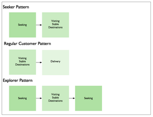
Seeker
The Seeker is looking for something. Once found, the Seeker goes elsewhere to accomplish other goals.

Regular Customer
The Regular Customer visits the same destination(s) consistently for the same reasons. Then the Regular Customer realizes they can save the time and effort of visiting, and switches modes to have the things they need delivered directly to them.

Explorer
The Explorer is learning about a new (or changed) environment; exploring it’s structure, contents, laws, etc. The Explorer may do this for their own purposes, or for others.

Initial Subscriber, Vigilant Subscriber Patterns
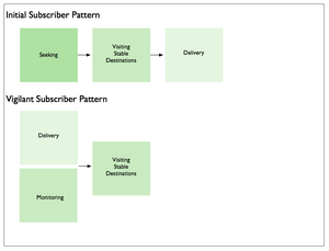
Initial Subscriber
The Initial Subscriber seeks what is needed, finds the things needed, goes to their location(s), and then chooses to have these things delivered to allow them to seek other things.

Vigilant Subscriber
The Vigilant Subscriber makes effective use of monitoring and delivery, followed up with visitation of destinations, to ensure they do not miss out on anything that might be useful to them within the environment.

Skydiver, Watchdog, Returned Expatriate Patterns
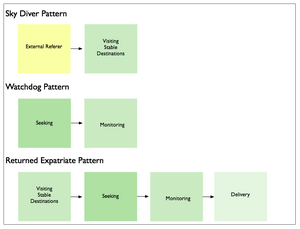
Skydiver
The Skydiver makes a bold entrance from outside the environment, and lands precisely on target.

Watchdog
The Watchdog first finds things, and then places them under careful watch.

Returned Expatriate
The Returned Expatriate was away, and is back again. They begin by revisiting known places, then seek out what has changed, monitor changes for a while, and eventually begin to have valuable things delivered.

Vigilant Customer, Curious Subscriber Patterns
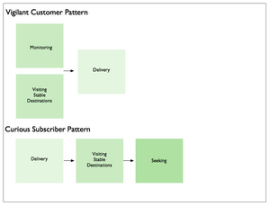
Vigilant Customer
The Vigilant Customer comes by often, but wants to be sure, and so monitors things from afar for a while before deciding delivery is more effective.

Curious Subscriber
The Curious Subscriber has things delivered regularly, but visits all the same to see what else may be available. And just to be sure, they seek out the things they suspect are here, but cannot see immediately.

Reusing Modes and Patterns
Reuse is rare in the realm of user experience and information architecture. The information retrieval modes we identified are independent of user role, persona, or user type. As a result, the patterns assembled from those modes are also independent of the same contextual factors. Since the modes and patterns are not tied to specific features, functionality, or information structures, this would seem to indicate that modes and patterns may resuable in different environments for user populations pursuing similar root goals.

I hope mode-based patterns like these offer some level of reusability. To that end, I am curious about where and how they help define information retrieval experiences for other types of users and other domains.

If you use them, send me a note about where, when, and how.

1 comment » | Information Architecture, Modeling, User Experience (UX)
Goal Based Information Retrieval Experiences

June 20th, 2006 — 12:00am

Though it’s common practice, thinking of information retrieval exclusively as ‘search’ is an arbitrarily narrow way of framing an area of capability with strong impact on overall perceptions of user experience quality and effectiveness. In the long term, it limits opportunities to offer customers more effective solutions to broader and more fully understood needs that involve information retrieval, but are motivated by other goals. This narrow view is especially limiting for the user experience architect, as it implies an immediate focus on the search aspects of information environments.
A better way of framing information retrieval is in terms of opportunities to meet genuine user goals and objectives by supporting more varied modes of activity. Users often have broad goals in mind while they pursue information retrieval activities; buying a car, making a good investment decision, or learning how to manage their health care plans. And yet the information architecture of many environments still overemphasizes searching as a way of accomplishing goals.
Addressing broader goals with an effective information retrieval experience will likely mean supporting modes of interaction beyond just searching. But providing these additional modes and user experience capabilities can open new opportunities for services, features, revenue, improving relationships, etc.
Even in situations where a wide range of users need to select very specific materials from a large archive or pool of content (the traditional library model), a search-centric information retrieval model that offers no/few other capabilities is reductive and overly simplistic.
Instead of immediately focusing on the scope or functionality of a search experience and system installation, look for the patterns in user goals and needs that imply common modes of interaction with information, and use them as a basis for defining capabilities the environment must offer.
Here’s a list of common types of user goals that involve information retrieval – think of them as root goals that take on different specialized forms in differing environments:

  • reviewing summaries of items
  • examining details
  • comparing multiples
  • understanding contexts and situations
  • learning about people in the environment
  • perceiving trends
  • predicting implications
  • monitoring status or activity
  • identifying by criteria
  • establishing similarity
  • obtaining information for reuse

None of these explicitly includes the activity of searching, though many do imply some level of finding.
For a recent project, we defined four information retrieval or interaction modes that would meet the goals of our expected users:

  • seeking information
  • visiting stable destinations
  • monitoring notifications
  • receiving delivered assets

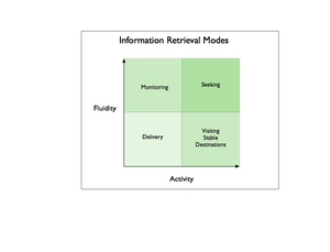
These modes range from more active seeking, to less active receiving delivery, and persistent settings (stable destinations) to fluid settings – monitoring or seeking. Together, they define possible kinds of information retrieval experiences and capabilities that will meet the varying needs and goals of users when properly combined.
Information Retrieval Modes

Seeking
The seeking mode focuses on traditional searching, but includes other activities such as narrowing sets using cumulative parameters, finding with/in faceted systems, and . A classic example of seeking mode is a user who poses an ad-hoc query via a search interface, and sorts through the list of search results returned in response. This list may incorporate many different kinds of items from many different sources, a combination that no other user ever encounters again.
From an information architecture perspective, the key characteristic of seeking mode is that, users bring the situations and contexts (like search results) they encounter into existence by seeking them out. When seeking, users encounter fluid destinations within the larger information environment based on what they are looking for, and how they are looking for it.
Another characteristic of the seeking mode is that users will not know in advance what they will encounter, even though they may have a very good idea of what they need to meet their goal. When seeking, users might be presented with a mixed set of conceptually related items of many different types, from unknown sources, with diverse contents / structure / composition.
Of course, users may not know what they need, or how to ask for it, as Donna Maurer’s 4 Modes of Seeking Information and How to Design for Them points out, but this was a less important factor in the way we framed seeking within our environment than whether users would know what to expect as a result of their seeking activities, and whether they could retrace their path to a particular step of their journey.
Visiting Stable Destinations
When visiting stable destinations, users encounter stable places within the information environment that exist regardless of the user’s activities. Where seeking invokes temporary contexts do not persist, a stable destination is persistent. Persistence could be conceptual only, reflected in navigation elements, or made part of the user experience via any number of mechanisms. All destinations have a focus of some kind, such as a topic, or product, or event, and may be defined by the intersection of several focuses, such as products or documents created by one person that are related to a topic or event.
Destinations could take the form of many kinds of pages – including the A-Z indexes Donna mentions – but could also consist of predetermined combinations of conditions and context that users can revisit without choosing them again. In an environment of known contents, destinations offer users a set of things they understand in advance and expect (after adequate opportunities for learning). Destinations will likely change based on business rules and user context, as well as changes in the items available within the environment.
A good example of a stable destination is the Arts page of the New York Time online; the articles and the art they concern change constantly, yet users know what to expect when they visit. The page is a visible part of the environment conceptually (as a category) and in terms of navigation, and is easily accessible directly from outside the environment.
Monitoring
The monitoring mode is a more fluid and less active information retrieval mode wherein the environment sends users notifications of events, activity, status, or changes taking place within it’s boundaries. The key characteristic of monitoring is that users can accomplish goals without entering the environment, or with only limited entry that takes them to a known setting.
Monitoring effectively extends the user experience and information retrieval capabilities beyond the boundaries of the originating environment, and allows users to know in advance what they will find or encounter when they enter the environment.
Monitoring naturally requires messages or communication tokens, commonly email, RSS, or SMS, but could take many other forms as well. A good example of monitoring is the configurable alerts that many travel services provide to indicate when prices for airline tickets to specific cities change, or match a price point.
Receiving Items via Delivery
Receiving delivered items is the least active mode we defined for users, allowing them to retrieve information without actively seeking, visiting a destination, or monitoring the environment. In this mode, users do not have to enter the environment at all to retrieve information, enabling them to further goals without increasing acquisition costs or effort.
Delivery implies mechanisms to manage the nature, rate, and format of the information to deliver, as well as the channel: email, attachments, RSS, podcasts, vlogs, etc.
Good examples of delivered information are the iconic stock ticker, RSS feeds for blog postings, and email publications.
Combining Modes: User Goals and Customer Lifecycles
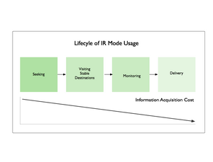
It’s natural that user goals will span modes, and that the preferred mode for accomplishing a goal may change over time to reflect shifting usage patterns and needs.
As an example, a single user might shift among different modes that reflect learning more about the structure and content of the environment. From initial seeking activity focused on searching for information related to a topic, a user may switch to visiting a known stable destination that addresses that topic, entering the environment from the outside without initial seeking.
This destination may include tools to establish monitoring for a specific type of item, which a user who understands the domain will appreciate and take advantage of as a way to reduce the number of required visits while remaining aware of activity or status. Eventually, this user might shift from monitoring to direct delivery of a few specific and very valuable information assets, through a channel and in a format of their choosing.
IR Mode Lifecycle

In the same way that patterns in goals allow experience architects to identify common modes of information retrieval, patterns of cross-mode usage will emerge in populations of users or customers. Once understood, these kinds of flows present opportunities on many levels; user experience, business model or process, and technical architecture.

Related posts:

Comment » | Information Architecture

Signs of Crisis and Decline In Organizations

April 21st, 2006 — 12:00am

A few months ago I came across a presentation titled Organizations in Crisis and Decline, by Randall Dunham. After giving examples of organizations in crisis and decline that include Kmart, General Motors, United Airlines, and Michael Jackson. (interesting example of an enterprise…), Dunham goes on to summarize typical symptoms of crisis, the strategic consequences of decline, and 10 behaviors of unhealthy organizations.

I came across this while doing some research on how the structures and cultures of organizations influence modes of thinking, resilience, and decision making, so this is related to some of my postings on enterprise software. It might be a while before I have the chance to write up all the ideas, so I’ll share Dunham’s material now.

Why is this of note to IAs? Quite a few Information architects (practitioners, not just those with the title…) are actively looking for effective tools and modes of understanding to help frame and manage enterprise problems.

Understanding the signs of decline and crisis in organizations can help information architects and other change agents understand the environmental context of a situation in the critical early stages of setting expectations and roles, and before it’s “too late”, when everyone at the management table has strong opinions they must defend. In other words, before making a leap is into an active project, a planning and budgeting cycle, a strategic vision session, etc.

I see (at least) two very important aspects of a situation that Dunham’s warning signs could help identify; how healthy an organization is, and what latitude for activity and change is available. Building on this, these criteria can help identify situations to avoid or be wary of. Of course, organizations in crisis and decline can present opportunities as well as risks, but sometimes the ship is going down no matter how much you try to patch the holes…

For those without powerpoint, I’m going to present some of the material here as text, with acknowledgment that I’m borrowing directly from Dunham, who himself credits this source: Mische, M.A. (2001). Ten warning signs of strategic Decline. In Strategic Renewal: Becoming a High-Performance Organization (pp. 25-30). Upper Saddle River, NJ: Prentice Hall.
Typical Symptoms of Crisis/Decline

  • Lower earnings & revenues
  • Increased employee turnover
  • Reduced market presence
  • Decrease in customer satisfaction & interest
  • Increasing costs & high structural costs

Strategic Consequences of Crisis/Decline

  • Lower market value
  • Inconsistent strategies
  • Misalignment of internal strategies & external goals
  • Diminished capacity to attract top talent
  • Increased vulnerability

10 Behaviors that Signal Decline

  • The organization exhibits a lack of understanding the environmental and economic realities confronting it, or is in denial
  • The management of the organization is arrogant with regard to its view of the world & assessment of its internal competencies. Ex: Icarus Paradox
  • The organization has lost perspective with respect to customers, products, suppliers, and competitors
  • Management and employees have an insular focus or preoccupation with internal processes, internal measurements, and politics
  • The organization has lost its sense of urgency and lacks an attitude of self-determination
  • The organization is relying on historical and poorly conceptualized or inappropriate business strategies and traditional management methods to address new & different challenges
  • The organization has the propensity to repeat mistakes and fails to learn from past experiences
  • The organization has low or slow innovation practices and is late to market with new products/services
  • The organization has a tendency to recycle marginally performing managers
  • The organization relies exclusively on internal talent as a source of leadership

Key Factors that Contribute to Decline

  • Age of the organization: Older, more established firms may rely on legacy practices
  • Size of the organization: Large firms with many vertical levels can have trouble adapting
  • Financial success and past performance: Past success can lead to desire to follow same path in hopes of future success
  • Ownership and equity structure: Is there accountability at all times to outside agents?
  • Environmental influences: External shocks
  • Ability to learn and discern patterns: Lack of learning organization culture
  • Certainty/uncertainty: Effectiveness of change management
  • Leadership: Young & inexperienced without desire to learn

Success Can Drive Crisis

  • The same processes that lead to success in an organization can also lead to failure
  • This is because success promotes rigidity, resistance to change, and habitual response
  • Biggest problem – people learn the ‘right’ way to solve a problem and do that over and over again, even if that way will no longer solve the problem

It’s true these are quite general. Naturally, the art is in knowing how to apply them as criteria, or interperet what you found. As a quick test of accuracy, I’ve used the behaviors and warning signs to retrospectively review several of the organizations I’ve seen from the inside. When those organizations showed several of the behaviors and warning signs at an aggregate level (not necessarily my group, but the whole enterprise) then the strategic consequence dunham mentioned were visible at the same time.

From a practical perspective, a rating scale or some indicators of relative degree would be very useful. In order to gauge whether to stay or go, you need to understand the intensity of the decline or crisis and what action you can take: for example, do you have time to go back to the cabin to save your handwritten screenplay before the ship sinks?

Comment » | Information Architecture

Scatterplots As Page Shapes?

March 1st, 2006 — 12:00am

The February edition of Usability News reports on a usability study (Where’s the Search? Re-examining User Expectations of Web Objects) of user expectations for Web page layouts that contains a surprising but interesting visualization of page shapes, based on quantitative user research. (Note: I found the study via the UI Design Newsletter, from HFI.)

The study looks at users” expectations for the location of common web page components, such as site search and advertising. The authors find that expectations for page layouts are largely the same now, as compared to those found in an earlier study, Developing Schemas for the Location of Common Web Objects, conducted in 2001.

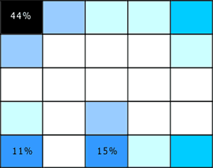
More interesting is the way the researchers report their results; visualizing them as heat map style grid plots for the expected location of each element vs. a blank grid. Here’s two examples, the first showing expected locations for ‘back to home’ links, the second for the ‘site search engine’.

Figure 1: Back to Home Link Location
backtohome.gif

Figure 2: Site Search Engine Location
sitesearch.gif

These heat maps look a lot like page shapes, expressed as scatterplots.

I like the combination of quantitative and qualitative perspectives at work in these page shapes rendered as scatterplots. I think it could allow for grounded discussion and interpretation of user feedback on design options, within a clear and simple structure that doesn’t require an HCI degree to appreciate. If I try it out, I’ll share the outcomes.

In a more traditional style of visualization, Eric Scheid found another another good example of page shapes a while back in Jonathon Boutelle’s posting on blog layouts called “Mullet”-style blog layout. Jonathon was advocating for a new default blog page shape that increases information density and scent, but hews closely to pre-existing expectations.

Figure 3: Typical Blog Page Shape
typical_small-thumb.jpg

Figure 4: Suggested Blog Page Shape
mullet_small.jpg
And that’s the last time I’m mentioning m.u.l.l.e.t.s this year, lest Google get the wrong idea about the subject matter of this blog :)

Comment » | Information Architecture, User Research

Enterprise Software is Dead! Long Live… Thingamy?

January 5th, 2006 — 12:00am

Peter Merholz observes that enterprise software is being eaten away from below, by applications such as Moveable Type, and innovators such as SocialText.
“These smaller point solutions, systems that actually address the challenges that people face (instead of simply creating more problems of their own, problems that require hiring service staff from the software developers), these solutions are going to spread throughout organizations and supplant enterprise software the same way that PCs supplanted mainframes.
I sure wouldn’t want to be working in enterprise software right now. Sure, it’s a massive industry, and it will take a long time to die, but the progression is clear, and, frankly, inevitable.”
Indeed it is. Though there’s considerable analyst hoopla about rising enterprise content management or ECM spending and IT investment (see also In Focus: Content Management Heats Up, Imaging Shifts Toward SMBs), we’re in the midst of a larger and longer term cycle of evolution in which cheaper, faster, more agile competitors to established market leaders are following the classic market entry strategy of attacking the bottom of the pyramid. (The pyramid is a hierarchical representation of a given market or set of products; at the top of the pyramid sit the more expensive and mature products which offer more features, capabilities, quality, or complexity; the lower levels of the pyramid include lower cost products which offer fewer features.)
What’s most interesting about the way this pattern is playing out in the arena of enterprise content management solutions is that the new competitors were not at first attacking from the bottom as a deliberate strategy, think of MoveableType, but they have quite quickly moved to this approach as with the recent release of Alfresco. The different origins of Sixapart and Alfresco may have some bearing on their different market entry approaches: Sixapart was a personal publishing platform that’s grown into a content management tool, whereas Alfresco’s intented audience was enterprise customers from day one. I’d wager the founders of Alfresco looked to RedHat as an example of a business model built on OpenSource software, and saw opportunity in the enterprise content management space, especially concerning user experience annd usability weaknesses in ECM platforms.
There’s an easy (if general) parallel in the automotive industry: from American dominance of the domestic U.S. market for automobiles in the post-WWII decades, successive waves of competitors moved into the U.S. automobile market from the bottom of the pyramid, offering less expensive or higher quality automobiles with the same or similar features. The major Japanese firms such as Honda, Toyota, and Nissan were first, followed by Korean firms such as Hyundai and Daewoo. It’s plain that some of the older companies sitting at the top of the pyramid are in fact dying, both literally and figuratively: GM is financially crippled and faces onerous financial burdens — to the point of bankruptcy – as it attempts to pay for the healthcare of it’s own aging (dying) workforce.
So what’s in the future?
For auto makers it’s possible that Chinese or South American manufacturers will be next to enter the domestic U.S. market, using similar attacks at the bottom of the pyramid.
For enterprise software, I think organizations will turn away from monolithic and expensive systems with terrible user experiences — and correspondingly low levels of satisfaction, quality, and efficacy — as the best means of meeting business needs, and shift to a mixed palette of semantically integrated capabilities or services delivered via the Internet. These capabilities will originate from diverse vendors or providers, and expose customized sets of functionality and information specific to the individual enterprise. Staff will access and encounter these capabilities via a multiplicity of channels and user experiences; dashboard or portal style aggregators, RIA rich internet applications, mobile devices, interfaces for RSS and other micro-content formats.
David Weinberger thinks it will be small pieces loosely joined together. A group of entrepreneurs thinks it might look something like what Thingamy claims to be.
Regardless, it’s surely no coincidence that I find a blog post on market pyramids and entry strategies put up by someone working at an enterprise software startup…

Related posts:

Comment » | Architecture, Ideas

Getting Across The River

October 28th, 2005 — 12:00am

I can’t take credit for writ­ing this para­ble about the rela­tion­ship of infor­ma­tion archi­tec­ture and inter­ac­tion design — that goes to another mem­ber of the IAI — but I can help share it.
»»
A scor­pion who was an Infor­ma­tion Archi­tect and a frog who was an Inter­ac­tion Designer were stand­ing on the bank of a rag­ing river of infor­ma­tion.
“Let’s define the prob­lem” said the IA. “I can’t swim, but I need to get across that river.“
“Well — I can swim” said the ID “I could take you across, but I’m afraid that when we get halfway, you might pull out a Venn Dia­gram and hit me over the head with it.“
“Never!” cried the IA. “Let us brave the river of infor­ma­tion together!“
And so they dived in.
When they were halfway across the river, the IA took a out a wire­frame and stabbed the ID in the back with it.
As they both slowly sank beneath the waves, the ID cried “Why did you do that? Now we’ll both drown!“
Replied the Infor­ma­tion Archi­tect: “Because I was defined that way.“
»»>
I think the mes­sage is clear: What truly mat­ters is get­ting across the river. But that can be very hard to see, if your per­spec­tive doesn’t allow it.
Case in point: Spring of 2001, lit­er­ally a week after the bub­ble burst, I was in Vegas with the rest of the Expe­ri­ence Design Group from Zefer. We were in the mid­dle of one of those impos­si­ble to imag­ine now but com­pletely sen­si­ble at the time 150 per­son design group sum­mit meet­ings about the company’s design method­ol­ogy, prac­tice, group struc­ture, etc.
Our IPO had just gone south, very per­ma­nently, but that wouldn’t by clear for sev­eral months. After a mini-rebellion at which we the assem­bled design con­sul­tants voted to skip the summit’s offi­cially sanc­tioned train­ing and dis­cus­sion activ­i­ties in favor of lots of self-organized cross-practice some­thing or other ses­sions, I ended up sit­ting in a room with the rest of the Usabil­ity and IA folks from the other offices.
Who promptly decided to define all the other design spe­cial­i­ties in detail, because doing so was the key to under­stand­ing our own roles. From here we were to move on to item­ize all the tasks and design doc­u­men­ta­tion asso­ci­ated with each dis­ci­pline, and then define the implicit and explicit con­nec­tions to the spe­cific IA deliv­er­ables. In alpha­bet­i­cal order. Using flip charts, white boards, stick­ies, and notepads.
After five min­utes, I went and to see what the Visual Design­ers were doing. They were sit­ting in a cir­cle in a large and quiet room, dis­cussing their favorite exam­ples of good design in prod­ucts, expe­ri­ences, typog­ra­phy, inter­faces; their goal was to help show the value of design prac­tices to clients. Some of them were also prac­tic­ing yoga, though I’m not sure that was related. The over­all expe­ri­ence was quite a bit more — engag­ing. And use­ful / effec­tive / rel­e­vant, espe­cially out­side the bound­aries of the group. The visual design­ers wanted to get across the river, while the IA’s were taken over by the com­plu­sion to be dili­gent infor­ma­tion archi­tects.
Maybe it’s a per­spec­tive difference?

No related posts.

Comment » | Information Architecture

Tagging Comes To Starbucks

October 25th, 2005 — 12:00am

Getting coffee this afternoon, I saw several packages of tasy looking madeleines sitting in front of the register at Starbucks. For the not small number of people who don’t know that shell shaped pastries made with butter are called madeleines – not everyone has seen The Transporter yet – the package was helpfully labeled “Madeleines”.

Proving that tagging as a practice has gone too far, right below the word madeleines, the label offered the words “tasty French pastry”.

Just in case the customers looking at the clear plastic package aren’t capable of correctly identifying a pastry?
Or to support the large population who can’t decide for themselves what qualifies as tasty?

Comment » | Architecture, Information Architecture

Psychogeography Comes to Central Square

October 17th, 2005 — 12:00am

Art Interactive and Glowlab, a local “network of psychogeographers” is using Central Square as an exhibition and investigation space for the next nine weeks, conducting experiments with laughing bicycles, art/clothing made from trash, and other psychogeographic phenomena.
Wikipedia says, “Psychogeography is “The study of specific effects of the geographical environment, consciously organised or not, on the emotions and behaviour of individuals”, according to the article Preliminary Problems in Constructing a Situation, in Situationniste Internationale No. 1 (1958) .”
I first heard the term psychogeography while reading J.G. Ballard’s The Terminal Beach, Concrete Island, and Crash. Richard Calder is a more recent example of a writer working with these ideas. (Note to the curious: Calder’s writings include some *unusual* tastes and flavors.) Calder may have optioned one of his novels for film production. Of the members of the Situationist International mentioned by Wikipedia, I’m most familar with Guy Debord’s writings, from quite a few semina sessions on media theory, cultural theory, postmodern theory.
Regardless of psychogeography’s origins, all roads lead to the internet now: a quick Google query turns up psychogeography.org.uk, which links to an essay titled Dada Photomontage and net.art Sitemaps that compares Dadaist photomontages to the familar sitemap. The first two citations in the piece are the Yale Style Guide, and Tufte’s Visualizing Information.
The circle closes easily, since one of the link threads leads to socialfiction.org, where you find a page on [Generative] Psychogeogrpahy. Random note; socialfiction’s banner carries references to “carthographic sadism * gabber avant-gardism * experimental knowledge * DIY urbanism” – all likely cadidates for Amazon’s SIP statistically improbable phrases listings. Perhaps most intriguing is “disco socialism”. Now that might catch on in some public policy circles that could use a bit of help picking a good back beat…
A quick selection of events that looked interesting:
TUESDAY NOVEMBER 15TH, 6:30PM – 8:30PM
6:30PM – 8:30PM: N55 Artist Talk & Dinner
Hosted with the Center for Advanced Visual Studies at MIT
Danish artists’ group N55 creates mobile tools and situations for everyday living: a workplace, a modular boat, a shop, a factory, a clean air machine, a commune, and even a personal rocket. Food & Drink provided. NOTE: This event is hosted at CAVS, 265 Mass Ave, 3Fl (Bldg N-52, Rm 390), Cambridge MA.
THURSDAY OCTOBER 27TH, 6PM – 9PM
6PM – 9PM: Glowlab Party!
Hosted by the Boston Society of Architects. All young artists, designers, architects and their friends are invited to enjoy good food and cheer and become a part of a growing network of young professionals who are shaping the future of Boston. Free drinks & entertainment. RSVP to bsa@architects.org.
For those of you with fashion inclinations (spurred by watching too much InStyle?)
SATURDAY DECEMBER 10TH, 12PM – 6PM
12PM – 5PM: DIY Wearable Challenge
Make an interactive outfit from Cambridge trash and discarded electronics Led by Jonah Brucker-Cohen and Katherine Moriwaki.

Related posts:

Comment » | Architecture, Art

Defining Enterprise Semantics

September 15th, 2005 — 12:00am

JP Morgenthal of DMReview.com offers a snapshot of the process for defining enterprise semantics in Enterprise Architecture: The Holistic View: The Role of Semantics in Business.
Morgenthal says, “When you understand the terms that your business uses to conduct business and you understand how those terms impact your business, you can see clearly how to support and maintain the processes that use those terms with minimal effort.”
Not a surprise, but how to make it happen, and how to explain that to the business?

Related posts:

Comment » | Architecture, Information Architecture

On Semantics At The Enterprise Level

September 14th, 2005 — 12:00am

In the same way that information architecture helps take users’ understandings of the structure, meaning, and organization of information into account at the level of domain-specific user experiences, information spaces, and systems, the complex semantic boundaries and relationships that define and link enterprise-level domains is a natural area of activity for enterprise information architecture.
Looking for some technically oriented materials related to this level of IA – what I call enterprise semantic frameworks – I came across a solid article titled Enterprise Semantics: Aligning Service-Oriented Architecture with the Business in the Web Services Journal.
The authors – Joram Borenstein and Joshua Fox – take a web-services perspective on the business benefits of enterprise-level semantic efforts, but they do a good job of laying out the case for the importance of semantic concepts, understanding, and alignment at the enterprise level.
From the article abtract:
“Enterprises need transparency, a clear view of what is happening in the organization. They also need agility, which is the ability to respond quickly to changes in the internal and external environments. Finally, organizations require integration: the smooth interoperation of applications across organizational boundaries. Encoding business concepts in a formal semantic model helps to achieve these goals and also results in additional corollary benefits. This semantic model serves as a focal point and enables automated discovery and transformation services in an organization.”
They also offer some references at the conclusion of the article:

  • Borenstein, J. and , J. (2003). “Semantic Discovery for Web Services.” Web Services Journal. SYS-CON Publications, Inc. Vol. 3, issue 4. www.sys-con.com/webservices/articleprint.cfm?id=507
  • Cowles, P. (2005). “Web Service API and the Semantic Web.” Web Services Journal. SYS-CON Publications, Inc. Vol. 5, issue 2. www.sys-con.com/story/?storyid=39631&DE=1
  • Genovese, Y., Hayword, S., and Comport, J. (2004). “SOA Will Demand Re-engineering of Business Applications.” Gartner. October 8.
  • Linthicum, D. (2005). “When Building Your SOA…Service Descriptions Are Key.” WebServices.Org. March 2005. www.webservices.org/ws/content/view/full/56944
  • Schulte, R.W., Valdes, R., and Andrews, W. (2004). “SOA and Web Services Offer Little Vendor Independence.” Gartner. April 8.
  • W3C Web Services Architecture Working Group: www.w3.org/2002/ws/arch/

Related posts:

Comment » | Architecture, Information Architecture, Modeling

Back to top