Tag: ia


“Beyond Findability: IA Practice & Strategy for the New Web” – IA Summit 2010 Workshop

February 12th, 2010 — 12:00am

“Beyond Findability: IA Practice & Strategy for the New Web” the full-day workshop that debuted at the 2009 IA Summit, is back for 2010.   Featuring an expanded lineup that includes Andrew Hinton, Matthew Milan, Christian Crumlish, Erin Malone, Cindy Chastain, and me, the workshop explores leading edge theory and practice to equip experience architects for the challenges of designing social experiences, the DIY Internet, engaging business strategically, and more.

Read the full description here, and then register here!

Bonus: All workshop attendees will receive a free copy of Social Mania – the social patterns design card game unveiled at IDEA09.

Last year’s rendition was positively invigorating, with participants from experience-based businesses like Zappos, and practitioners from leading firms like Adaptive Path.  But this one goes to eleven: we hope you’ll join us!

Comment » | Information Architecture, User Experience (UX)

Join Me For ‘Beyond Findability’ the IA Summit 09 Workshop

February 23rd, 2009 — 12:00am

If you’re keen to help shape the way that the user experiences of the future are conceived and defined, join Andrew Hinton, Matthew Milan, Livia Labate, and yours truly in a full-day workshop / seminar titled “Beyond Findability: Reframing IA Practice & Strategy for Turbulent Times” at the 2009 IA Summit in Memphis.
We’ve got a lot of great material to share – and shape – on where this new[ish] discipline is headed, from four complementary but distinct professional perspectives (digital agency, in-house services group, management, design consultancy), shared by leading practitioners.

Here’s a quick description:
“Changes are happening fast in technology, the economy, and even the various User Experience professions. In the midst of such turbulence, conventional Information Architecture can have trouble seeming fully relevant. Some may see it as a commodity, or a narrow specialty that has little to do with the game-changing emergence of social media, ubiquitous & mobile computing, and the rest.
This full-day workshop will address such concerns with a boundary-pushing foray into IA craft and strategy. We’ll show how core IA skills are more relevant and strategically important than ever, and we’ll explore how we can extend IA to its full potential in 21st century UX design.”

Read more about Beyond Findability here.

Register here.

See you in Memphis!

Comment » | Information Architecture, User Experience (UX)

Discount Code for Indi Young’s ‘Mental Models’ Webinar

December 10th, 2008 — 12:00am

Designers, product managers, and anyone who aims to create relevant and beautiful experiences would be wise to check out Indi Young’s upcoming webinar, Using Mental Models for Tactics and Strategy, on December 11th. Indi literally wrote the book on mental models for user experience – read it, if you haven’t yet – and this webinar is part of the Future Practice series produced by Smart Experience and Rosenfeld Media, so expect good things for your modest investment.

Even better, our friends at Smart Experience and Rosenfeld Media are offering a 25% discount on registrations, which is good for these tough times.

Use this discount code when registering: LAMANTIAWBNR

Enjoy!

Comment » | Information Architecture, User Experience (UX)

Frameworks Are the Future (Slides From EuroIA 2008)

October 8th, 2008 — 12:00am

In case you couldn’t make it to Amsterdam for EuroIA 2008, or if you were in town but preferred to stay outside in the warmth of a sunny September Saturday than venture into the marvelous Tsuchinski theater, I’ve posted the slides from my talk Frameworks are the Future of Design.
Enjoy!

Frameworks Are The Future of Design from Joe Lamantia

Comment » | Architecture, Building Blocks, Information Architecture, User Experience (UX)

Blogtalk 2008 slides available

March 3rd, 2008 — 12:00am

My slides from Blogtalk 2008 are available online now: I went through a lot of ideas quickly, so this is a good way to follow along at your own pace…

FYI: This version of the deck includes presenters notes – I’ll upload a (larger!) view-only version once I’m back from holiday in lovely Eire.

When Everyone Is A Designer: Practical Techniques for Ethical Design in the DIY Future from Joe Lamantia

Comment » | Ideas, Networks and Systems, User Experience (UX)

Moving Beyond Reactive IT Strategy With User Experience

May 9th, 2007 — 12:00am

For those in the enterprise IA / UX space, The next frontier in IT strategy: A McKinsey Survey centered on the idea that “…IT strategy is maturing from a reactive to a proactive stance”is worth a look.

This nicely parallels a point made about the reactive mindset common to IT in many large organizations, in discussion on the IAI mailing list last month. Lou Rosenfeld’s post Information architects on communicating to IT managers, summarizes the original discussion in the IAI thread, and is worth reading as a companion piece.

Lou’s summary of information architecture and user experience voices in the enterprise arena is noteworthy for including many examples of strong correspondence between McKinsey’s understanding of how IT strategy will mature (a traditional management consulting view), and the collected IA / UX viewpoints on addressing IT leadership – typical buyers for enterprise anything – and innovation.

Dialogs that show convergence of understanding like this serve as positive signs for the future. At present, a large set of deeply rooted cultural assumptions (at their best inaccurate, usually reductive, sometimes even damaging) about the roles of IT, business, and design combine with the historical legacies of corporate structures to needlessly limit what’s possible for User Experience and IA in the enterprise landscape. In practical terms, I’m thinking of those limitations as barriers to the strategy table; constraining who can talk to who, and about which important topics, such as how to spend money, and where the business should go.
Considering the gulf that separated UX and IT viewpoints ten – or even five – years ago, this kind of emerging common understanding is a good sign that the cultural obstacles to a holistic view of the modern enterprise are waning. We know that a holistic view will rely on deep understanding of the user experience aspects of business at all levels to support innovation in products and services. I’m hoping the rest of the players come to understand this soon.

Another good sign is that CIO’s have won a seat at the strategy table, after consistent effort:

Further evidence of IT’s collaborative role in shaping business strategy is the fact that so many CIOs now have a seat at the table with senior management. They report to the CEO in 44 percent of all cases; an additional 42 percent report to either the chief operating officer or the chief financial officer.

Looking ahead, information architecture and user experience viewpoints and practitioners should work toward a similar growth path. We fill a critical and missing strategic role that other traditional viewpoints are not as well positioned to supply.

Quoting McKinsey again:

IT strategy in most companies has not yet reached its full potential, which in our experience involves exploiting innovation to drive constant improvement in the operations of a business and to give it a real advantage over competitors with new products and capabilities. Fewer than two-thirds of the survey respondents say that technological innovation shapes their strategy. Only 43 percent say they are either very or extremely effective at identifying areas where IT can add the most value.

User Experience can and should have a leading voice in setting the agenda for innovation, and shaping understandings of where IT and other groups can add the most value in the enterprise. To this end, I’ll quote Peter Merholz (with apologies for not asking in advance):

“…we’ve reached a point where we’ve maximized efficiency until we can’t maximize no more, and that in order to realize new top-line value, we need to innovate… And right now, innovations are coming from engaging with the experiences people want to have and satisfying *that*.”

McKinsey isn’t making the connection between strategic user experience perspectives and innovation – at least not yet. That’s most likely a consequence of the fact that management consulting firms base their own ways of thinking, organizational models, and product offerings (services, intellectual property, etc.) on addressing buyers who are themselves deeply entrenched in traditional corporate structures and worldviews. And in those worlds, everything is far from miscellaneous, as a glance at the category options available demonstrates; your menu here includes Corporate Finance, Information Technology, Marketing, Operations, Strategy…

BTW: if you weren’t convinced already, this should demonstrate the value of the $40 IAI annual membership fee, or of simply reading Bloug, which is free, over paying for subscriptions to management journals :)

Comment » | Customer Experiences, Enterprise, Information Architecture, User Experience (UX)

Text Clouds of the Democratic Debate

April 28th, 2007 — 12:00am

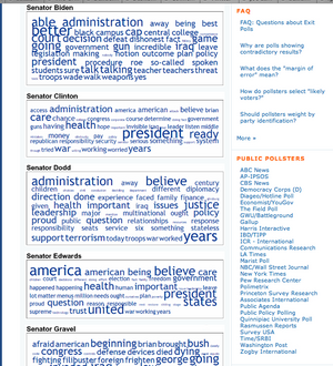
Mark Blumenthal, of Pollster.com, recently posted a set of text clouds showing the words used by each candidate in the Democratic presidential debate Thursday night. The clouds were generated from transcripts of the debate, using Daniel Steinbock’s Tag Crowd tool.

Candidates’ Text Clouds

In the screenshot of Mark’s posting, it’s easy to see this is a great example of a collection of text clouds used for comparative visualization and interpretation. The goal is to enhance understanding of the meaning and content of the candidate’s overall conversations during the debate, an idea I explored briefly last year.

Just a month ago, in a post that identified text clouds as a new and distinct tag cloud variant, I suggested:

text clouds may become a generally applied tool for managing growing information overload by using automated synthesis and summarization. In the information saturated future (or the information saturated present), text clouds are the common executive summary on steroids

Supporting the comparison and interpretation of political speeches is an inventive, timely, and resourceful application that could make text clouds a regular part of the new personal and professional toolkit for effectively handling the torrents of information overwhelming people in important situations like vetting political candidates.

I especially like the way this use of text clouds helps neatly sidestep the disheartening ubiquity of the soundbite, by aggregating, distilling, and summarizing all the things the candidates said. I suspect few – if any – of the campaigns realize the potential for text clouds, but they definitely know the detrimental power of soundbites:

“It’s a mess,” said an exasperated-sounding Mr. Prince, Mr. Edwards’s deputy campaign manager. “Debates are important, but in these big multicandidate races they end up not being an exchange of ideas, but just an exchange of sound bites. They have become a distraction.”

From Debates Losing a Bit of Luster in a Big Field

The value of a collection of soundbites over an insightful dialog is – apologies for the pun – debatable. But even if a simple exchange of soundbites is what the new shortened formats of many debates yields us, text clouds may help derive some value and insight from the results. The combined deconstructive and reconstructive approach that text clouds employ should make it possible to balance the weight of single remarks of candidates by placing them in a larger and more useful context.

History Repeats Itself

In the longer term view of the history of our responses to the problems of information overload, the appearance of text clouds may mark the emergence of a new general puprose tool for visualizing ever greater quantities of information to support some qualitatively beneficial end (like picking a good candidate for President, which we sorely need).

The underlying pattern – a consistent oscillation between managing effectively and ineffectively coping, depending on the balance between information quantity and tool quality – remains the same. Yet there is also value in knowing the cycles that shape our experience of handling the information crucial to making decisions, especially decisions as important as who leads the country.

The NY Times transcript of the debate is available here.

Comment » | Tag Clouds

Endeca Guided Navigation vs. Facets In Search Experiences

February 26th, 2007 — 12:00am

A recent question on the mailing list for the Taxonomy Community of Practice asked about search vendors whose products handle faceted navigation, and mentioned Endeca. Because vendor marketing distorts the meaning of accepted terms too often, it’s worth pointing out that Endeca’s tools differ from faceted navigation and organization systems in a number of key ways. These differences should affect strategy and purchase decisions on the best approach to providing high quality search experiences for users.

The Endeca model is based on Guided Navigation, a product concept that blends elements of user experience, administration, functionality, and possible information structures. In practice, guided navigation feels similar to facets, in that sets of results are narrowed or filtered by successive choices from available attributes (Endeca calls them dimensions).

But at heart, Endeca’s approach is different in key ways.

  • Facets are orthogonal, whereas Endeca’s dimensions can overlap.
  • Facets are ubiquitous, so always apply, whereas Endeca’s dimensions can be conditional, sometimes applying and sometimes not.
  • Facets reflect a fundamental characteristic or aspect of the pool of items. Endeca’s Dimensions may reflect some aspect of the pool of items (primary properties), they may be inferred (secondary properties), they may be outside criteria, etc.
  • The values possible for a individual facet are flat and equivalent. Endeca’s dimensions can contain various kinds of structures (unless I’m mistaken), and may not be equivalent.

In terms of application to various kinds of business needs and user experiences, facets can offer great power and utility for quickly identifying and manipulating large numbers of similar or symmetrical items, typically in narrower domains. Endeca’s guided navigation is well suited to broader domains (though there is still a single root at the base of the tree), with fuzzier structures than facets.

Operatively, facets often don’t serve well as a unifying solution to the need for providing structure and access to heterogeneous collections, and can encounter scaling difficulties when used for homogenous collections. Faceted experiences can offer genuine bidirectional navigation for users, meaning they work equally well for navigation paths that expand item sets from a single item to larger collections of similar items, because of the symmetry built in to faceted systems.

Guided navigation is better able to handle heterogeneous collections, but is not as precise for identification, does not reflect structure, and requires attention to correctly define (in ways not confusing / conflicting) and manage over time. Endeca’s dimensions do not offer bidirectional navigation by default (because of their structural differences – it is possible to create user experiences that support bidirectional navigation using Endeca).

In sum, these differences should help explain the popularity of Endeca in ecommerce contexts, where every architectural incentive (even those that may not align with user goals) to increasing the total value of customer purchases is significant, and the relevance of facets to searching and information retrieval experiences that support a broader set of user goals within narrower information domains.

Comment » | Enterprise, Information Architecture, User Experience (UX)

Presenting at the 2007 IA Summit in Las Vegas

January 19th, 2007 — 12:00am

I’m trying something new for the 2007 IA summit – a panel! I am one of four presenters for a panel titled Lessons from Failure: or How IAs Learn to Stop Worrying and Love the Bombs. We have a promising set of speakers: Christian Crumlish, Peter Jones, Lorelei Brown and myself.

My portion of the panel will focus on how states of mind, cultural outlooks, and unspoken assumptions about problems and their proper resolution shape responses to failure – on both small and large scales. Our goal is maximum audience participation and minimum talkingheaditis, so please don’t be shy about sharing examples and joining the discussion.

Of course, we’re one among many reasons to attend. Quite a few things look especially interesting on this year’s schedule, including several of the pre-conference sessions that touch on rapidly evolving areas of practice such as designing for social architectures and enterprise efforts.

Hope to see you in Vegas!

Comment » | Information Architecture

Presenting for the Taxonomy Community of Practice: IA and Taxonomy

December 1st, 2006 — 12:00am

I’m presenting for the Taxonomy Community of Practice web seminar today. I’ll be talking about a long-term, enterprise-level strategy and design engagement for a financial services client, sharing work that combines information architecture and taxonomy efforts over the past year.

The agenda for the call includes several other speakers; it should be a strong showcase of information architecture and taxonomy work from different settings.

If you’d like to listen, some details are below. Registration and more information is available from www.earley.com/events.htm

Date and time: Friday, December 1st, 2006 – 2:00 to 3:30 PM EDT

Duration: 90 minutes

Format: Teleconference

Cost: $50 per attendee

Register for the session (you will receive dial-in instructions and slides the day before the call)

Description:
User Experience design is often thought of as distinct or different from taxonomy design. What are good IA practices and how do they influence taxonomy design? In this session you’ll hear from three experienced IA’s who will share specific examples from their organizations and consulting projects that will illustrate principles that you can apply in your taxonomy projects.

In this session, hear about:

  • a user experience design effort that combines information architecture and taxonomy approaches for a major financial services client
  • specific experiences applying IA with Compaq and HP and “business taxonomies” – taxonomies that live within strict business limitations

Presenters:
Seth Earley, Earley & Associates

Joe Lamantia

Bob Goodman

Andrew Gent, Hewlitt Packard

Comment » | User Experience (UX)

Back to top