Tag: diy


Value Dissonance, Digital Goods, The Long Tail & My Oven

August 5th, 2009 — 12:00am

This weekend I went looking online for the service manual for my oven, to effect some DIY style repair work, and was unpleasantly surprised to find every collection of digital service manuals within ready googling distance locked tightly away behind a solid e-commerce wall.

Ten, five, or even three years ago, some thoughtful mechanical engineer would have lovingly uploaded a blurry pdf conversion of a scan of a photocopy of the original KorEnglish instruction manual to a public file share hosted somewhere deep in the wilds of homebrew electronics land.  And there it would be, waiting for people who needed it.

Not anymore, apparently.  Thanks to all the MBAs who read The Long Tail during the revenue models section of their Digital Business courses, and then went prospecting for an under-monetized content domain with predictable transaction and renewal flow volumes (read, opportunity), I now have to pay $20 to find out how to take apart my ailing appliance.  To soften the monetary blow, I have an instantly findable, one-click-to-purchase, secure-payment-capable experience.  But it’s still $20, when it would have been free last time I looked.

Take note, this is a sea change in digital culture staring us in the face: DIY become $DIY, thanks to ‘rationalization’ of the home brew electronics information economy.

If it sounds like I’m bemoaning the simple fact that businesses like to colonize new markets, and I now have to pay for something I used to get for free, I want to say ‘Not true.’  (Okay, partially true.)  Something was wrong with this experience.  At first I thought it was price: That manual is fully digital, meaning it comes with absurdly low publication costs for printing, distribution, inventory and restocking, thanks to the-great-copying-machine-in-the-sky-called-the-Internet.  It’s also transparently findable via a simple two-word query, which I know because I went looking for it myself, so there’s few of the typical costs from AIDA (generating awareness and motivating my decision to buy).  Yet the instruction and service manual for a piece of hand-me-down kitchen equipment now carries the hefty price tag of $19.95.  And that’s without a preview; this is digital merchandise I’m expected to buy on blind faith.  So much for free.

Then I realized something deeper was involved.  This experience is interesting because it demonstrates the inevitable tension that comes from living in an era during which basic cultural layers, with very different ways of assigning value, come into friction with one another.  At heart, this is a modern experience of value dissonance driven by two ancient human patterns in collision.

The first pattern: I am ‘given’ the oven for ‘free’ by virtue of my ‘membership’ – earned by marriage – in the local operating unit of the folk-recycling economy instantiated by my extended family; specifically, my Dutch in-laws.  Apartments in Europe don’t come with appliances, so after moving to Holland from New York, I need a new oven thanks to the legacy incompatibility in electric distribution infrastructures (voltage differences) between Norte America and Europa.  This lovely unit was available from the family’s pool of collectively managed assets, thanks to a construction accident in my wife’s cousin’s neighbor’s adjoining property, which caused a flood of water into their home while they were on a 3-week  holiday, resulting in substantial water damage, compensated in proper Dutch fashion by a hefty insurance settlement, which allowed this particular pair of agents in the extended family network to go shopping for a new kitchen set-up, all appliances included, long before the projected lifecycle expiration of their current oven. [ill winds indeed…])

This pattern is as old as managing the aggregate livestock and pasturage.  Deciding which of the children to educate, send to the military / priesthood (or some other form of bachelorhood), or sequester in a convent b/c of lack of required marriage dowries is the same thing.  For me, all is fine and good: I have the oven I need, and all I have to do in return is allow the extended family to use my house to host the annual family New Year’s dinner.   A fair trade for all parties.

The second pattern: the constant evolution in the definition of first-tier tradable goods: Successive waves of technosocial change have made the instruction manual for my oven a digitally tradeable good on it’s own.  At brith, the manual was “part of” the consumer product package of the oven, only available – and meaningful – when sold with the appliance.  Fast forward to the pre-Long Tail Internet, and the manual was free to me, as a resident of the unfenced realm of the digital frontier, exchanged via the folk economy of DIY practitioners.  But now that the technical infrastructure required to effectively enclose this resource is  itself nearly free, and every MBA knows the Long Tail (sounds like one of those terrible fake American Indian names people used be given in TV sitcoms, when some form of hijinks led them to visit a ‘Native American Tribe,’ and the characters had to be identified within the tribe’s conceptual space [another example of truly awful sort of cultural friction…]), this particular piece of digital content has a price tag.  A hefty one.

So using the free appliance now requires content from the ambient information cloud in the form of a paid asset that is now, on it’s own, a tradable good.  This misalignment causes friction and dissonance for me; I have an appliance from the folk-resources layer, but all the useful information *about* the appliance resides in the newly monetized Long Tail digital content economy.  The newly digital manual that should come with my hand me down oven is very much trying its hardest to be a traditional product from the universe of tradable goods: a Thing, with a Price, sold by a Business, to Customers.

What drives the friction, and what makes this worth paying attention to and writing about, is that it is the opposing direction of the movements of these different kinds of goods, digital and material, that creates dissonance by bringing me a free physical oven and an expensive digital service manual.

The oven used to be part of the first-tier tradable goods layer.  It was a packaged consumer appliance product, created by a manufacturer, sold via optimized distribution networks that moved it through the chain from manufacturer to wholesaler to retailer at a fixed price, communicated via marketing channels embedded within discovery and communications media.  Since then, it’s ‘fallen out of’ the tradable goods economy, and is treated as a family asset, to be handed around as best suits the collective needs, without any official transactions taking place.  We could put it back into the tradable goods economy as used, if we choose to sell it, or even enter it into the recycling economy, where it would be broken down into constituent elements – e.g. motors, wiring, display, or at a lower level of integration physical materials like glass and steel – to whatever extent possible.  But almost all of the changes in value for material goods when they shift from one cultural / economic layer to another are one-way, and downwards.  The possible paths for re-uptake of material goods that have fallen into the folk economy layer used to be transformation into antiques, art, or collectibles – all one form or another of the museum economy.

That’s not the case with digital goods in general, like the newly Long Tailed service manual for my oven.  The manual was originally part of the consumer / product economy for tradable goods when bundled with the oven.   Since then, it has undergone several transformations.  First, it was un-bundled and digitized for the DIY layer (making it part of the folk economy),  Now it is once again part of the product economy, though now in it’s un-bundled  and digitized form.  In terms of which economy it’s part of, *the manual is moving all around the page on it’s own*.  That’s highly unnatural!

This is a key property of digital goods that the material world is just beginning to understand.  Digital goods are designed for just this sort of mobility: We can move digital goods all around the map in terms of the cultural / economic layers they inhabit, and their consequent value, with a few changes in addressing and format.  No transformation of a digital good is necessarily one-way.  And when these transformations aren’t synchronized with the elements that inhabit the physical world, we feel the conflict and tension that results.

In my case, the oven is moving one way, while the information about it is moving the other way.  This failure to dance together economically and culturally is a consequence of the way that the oven was designed, made, marketed, distributed, etc.  It’s a temporally isolated form of dissonance that emerges from friction with the new digital layer that’s permeating the world so rapidly.  If you’re familiar with spimes, and related concepts like service avatars and information shadows, you know this is a (ostensibly) temporary state of affairs.  Once our cultural frames of reference catch up with our technical capabilities, and everything is part of the great database in the sky, these experiences of friction should be much less common.

But in the meantime, I have to fix my oven on my own.  Or cough up the $20 for the manual…

Comment » | Ideas

Frameworks Are the Future (Slides From EuroIA 2008)

October 8th, 2008 — 12:00am

In case you couldn’t make it to Amsterdam for EuroIA 2008, or if you were in town but preferred to stay outside in the warmth of a sunny September Saturday than venture into the marvelous Tsuchinski theater, I’ve posted the slides from my talk Frameworks are the Future of Design.
Enjoy!

Frameworks Are The Future of Design from Joe Lamantia

Comment » | Architecture, Building Blocks, Information Architecture, User Experience (UX)

Frameworks are the Future of IA: A Case Study and Example

August 20th, 2008 — 12:00am

September in Amsterdam approaches: in addition to the inevitable mix of clouds, rain, more rain, and tiny slivers of sunlight, September means EuroIA 2008, where yours truly will speak about design frameworks.

In case you can’t make the conference, here’s a text only summary of my talk. Pictures will follow the presentation – promise!

It’s a DIY Future
The Web is shifting to a DIY [Do It Yourself] model of user experience creation, one where people assemble individual combinations of content gathered form elsewhere for expressive, functional, and (many) other purposes. The rapid growth of widgets, the resurgence of enterprise portals, the spread of identity platforms from social network destinations to blogging services, and the rapid increase in the number of public APIs syndicating functionality and data, are all examples of the DIY shift.

Architects of the Future
For design professionals, the defining characteristic of DIY future is co-creation: the participation of a broad spectrum of people in creating experiences. In this new world, the role of designers is to define the tools co-creators use to assemble experiences for themselves and others. These tools will increasingly take the form of design frameworks that define the modular components of familiar structures such as social networks, functional applications, collaboration platforms, personalized dashboards, and management consoles.

Why Frameworks?
Frameworks are the future for three reasons. First, everyone can create sophisticated information structures now, and designers no longer serve as a gateway. Second, the definition of frameworks allows designers to continue to provide valuable services and expertise in a cost effective manner: It’s something designers can sell in a commodified digital economy. Third, designers have an good combination of human insight and architecture design skills; this hybrid way of thinking can serve as a differentiator and strength.

One example of the sort of design framework information architects will create more of in the DIY future is the Portal Building Blocks system described herein. Providentially, this design framework addresses many of the problems inherent in the current architectural schema for DIY self-assembled experiences.

History Repeats Itself: The Problem With Portals
The rise and fall of the Web 1.0 portal form offers a useful historical lesson for creators of the new generation of design frameworks underlying DIY self-assembled experiences.
Despite early promises of utility and convenience, portals built with flat portlets could only grow by expanding horizontally. The resulting experience of low-density information architectures was similar to that of navigating postwar suburban sprawl. Like the rapid decline of many once-prosperous suburbs, the inconvenience of these sprawling collections of portlets quickly overwhelmed the value of the content they aggregated.
The common problem that doomed many very different portals to the same fate was the complete lack of any provision for structure, interaction, or connection between the self-contained portlets of the standard portal design framework.
Looking ahead, the co-created experiences of the DIY future will repeat this cycle of unhealthy growth and sprawl – think of all those apps clogging your iPhone’s home screen right now – unless we create design frameworks that effectively provide for structure, connection, and interaction.

The Building Blocks – An Example Design Framework
The building block framework is meant to serve as a robust architectural foundation for the many kinds of tools and functionality – participatory, social, collaborative – that support the vision of two-way flows within and across the boundaries of information structures. This means:

  • Allow for rapid growth and structural change
  • Establish a common language for all co-creation perspectives
  • Encourage construction of scalable, reusable structures
  • Create high-quality user experiences
  • Enable sharing of assets across boundaries
  • Enhance social dynamics, such as 2-way conversation flows

The Building Blocks framework defines two types of information architecture components in detail – building blocks (or Containers), and navigation components (or Connectors) – as well as the supporting rules and guidelines that make it possible to assemble complex user experience architectures quickly and effectively.

The Containers and Connectors specifically provide for structure, interaction, and connection at all levels of the information environment; from the user experience – visual design, information design, interaction design, information architecture – to functionality, metadata, business rules, system architecture, administrative processes, and strategic governance.
Case Study: Evolution of an Enterprise Portal Suite

The Building Blocks began life as an internal tool for lowering costs and speeding design during the course of sustained portal work done for a Fortune 100 client. Over a span of ~24 months, the Building Blocks provided an effective framework for the design, expansion, and eventual integration of nearly a dozen distinct portals.

The design framework evolved in response to changes in the audiences, structures, and contents of portals constructed for users in different countries, different operating units, and several organizational levels.
The portal suite went through several stages of evolution and growth:

  • Experimentation
  • Rapid expansion
  • Consolidation & integration
  • Stability and continuity

Lessons In Designing Frameworks
Successful co-created experiences – Flickr (commercial) and Wikipedia (non-commercial) – combine deliberate top-down architecture and design with emergent or bottom-up contribution and participation in a new kind of structure Kevin Kelly calls the “hybrid”. Frameworks support hybrids!

Hope to see many of you in Amsterdam!

Comment » | Building Blocks, Dashboards & Portals, Information Architecture

Ethics and Design Podcast: Part Deux

June 30th, 2008 — 12:00am

The I.A. Podcast (by Jeff Parks of I.A. Consultants and BoxesandArrows podcast fame) just published the second of two interviews discussing research on ethics, design, social media, and conflict.

Play and download the second interview here.

Subscribe to the iTunes and feedburner feeds for the I.A. Podcast here.

These podcasts are based on the Designing Ethical Experiences series I’m writing for UXMatters: watch for publication of the final article later this summer.

Thanks again, Jeff!

Comment » | Ethics & Design, Social Media, User Experience (UX)

Understanding Juicy Rationalizations: How Designers Make Ethical Choices

June 23rd, 2008 — 12:00am

Understanding Juicy Rationalizations, part 3 of the Designing Ethical Experiences series, just went live at UXMatters.

Here’s the teaser:

From “The Big Chill”

Michael: “I don’t know anyone who could get through the day without two or three juicy rationalizations.”

“They’re more important than sex.”

Sam: “Ah, come on. Nothing’s more important than sex.”

Michael: “Oh yeah? Ever gone a week without a rationalization?”

Designers rationalize their choices just as much as everyone else. But we also play a unique role in shaping the human world by creating the expressive and functional tools many people use in their daily lives. Our decisions about what is and is not ethical directly impact the lives of a tremendous number of people we will never know. Better understanding of the choices we make as designers can help us create more ethical user experiences for ourselves and for everyone.
circle-logo_newBg3.gif
Understanding Juicy Rationalizations is the first of a pair of articles focused on the ways that individual designers make ethical choices, and how we can improve our choices. This second pair of articles is a bit of eye-opening window into how people make many of the choices in our daily lives – not just design decisions. Or, at least it was for me… Readers will see connections much broader than simply choices we explicitly think of as ‘ethical’ and / or design related.

The final installment in the Designing Ethical Experiences series is titled “Managing the Imp of the Perverse” – watch for it sometime soon.

With the publication of these next two articles, the Designing Ethical Experiences series consists of two sets of matched pairs of articles; the first article in each pair framing a problematic real-life situation designers will face, and the second suggesting some ways to resolve these challenges ethically.

The first pair of articles – Social Media and the Conflicted Future and Some Practical Suggestions for Designing Ethical Experiences – looked at broad cultural and technology trends like social media and DIY / co-creation, suggesting ways to discover and manage likely ethical conflicts within the design process.

It’s a nice symmetrical structure, if you dig that sort of thing.  (And what architect doesn’t?)

For commuters / multi-taskers / people who prefer listening to reading, Jeff Parks interviewed me on the contents of this second set of articles, which he will publish shortly as a podcast.

Thanks again to the editorial team at UXMatters for supporting my exploration of this very important topic for the future of experience design. In an age when everyone can leverage professional-grade advertising the likes of Spotunner, the ethicality of the expressive tools and frameworks designers create is a question of critical significance for us all.

Comment » | Ethics & Design, Social Media, User Experience (UX)

Speaking at EuroIA 2008 In Amsterdam

June 20th, 2008 — 12:00am

I’m happy to announce I’m speaking at EuroIA 2008 in Amsterdam, September 26 – 27. My session is titled ‘Frameworks Are the Future of IA’. If the exciting title isn’t enough to sell you on attending (what’s more compelling than a case study on an open structural design framework for self-assembled user experiences and information spaces…?), here’s a description:

The Web is shifting to a DIY (Do It Yourself) model of user experience creation, where people assemble individual combinations of content and functionality gathered from many sources to meet their particular needs. The DIY model for creating user experiences offers many benefits in public and consumer settings, and also inside the enterprise. But over time, it suffers many of the same problems that historically made portals unusable and ineffective, including congested designs, poorly planned growth, and inability to accommodate changes in structure and use.

This case study demonstrates a simple design framework of standardized information architecture building blocks that is directly applicable to portals and the DIY model for creating user experiences, in two ways. First, the building blocks framework can help maintain findability, usability and user experience quality in portal and DIY settings by effectively guiding growth and change. Second, it is an example of the changing role of IA in the DIY world, where we now define the frameworks and templates other people choose from when creating their own tools and user experiences.

Using many screenshots and design documents, the case study will follow changes in the audiences, structures, and contents of a suite of enterprise portals constructed for users in different countries, operating units, and managerial levels of a major global corporation. Participants will see how the building blocks provided an effective framework for the design, expansion, and integration of nearly a dozen distinct portals assembled from a common library of functionality and content.

This case study will also explore the building blocks as an example of the design frameworks IA’s will create in the DIY future. We will discuss the goals and design principles that inspired the building blocks system, and review its evolution over time.

logo.ashx.gif


The conference program includes some very interesting sessions, and Adam Greenfield (of Everyware reknown) is the keynote.
Amsterdam is lovely in September, but if you need more reason to come and say hello, Picnic 08 – with a stellar lineup of speakers – is just before EuroIA.

Comment » | Building Blocks, Information Architecture, Social Media, User Experience (UX)

Hybrids: Architectures For The Ecology of Co-Creation

March 21st, 2008 — 12:00am

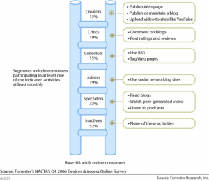
Common models for participation in social and contributory media invariably set ‘content creators’ – the group of people who provide original material – at the top of an implied or explicit scale of comparative value. Bradley Horowitz’s Content Production Pyramid is one example, Forrester’s Social Technographics Ladder is another. In these models, value – usually to potential marketers or advertisers external to the domain in question – is usually measured in terms of the level of involvement of the different groups present, whether consumers, synthesizers, or creators.
ladder_3.gif
By the numbers, these models are accurate: the vast majority of the content in social media comes from a small slice of the population. And for businesses, content creators offer greater potential to commercialize / monetize / trade influence.

It’s time to evolve these models a bit, to better align them with the sweeping DIY cultural and technological shift happening offline in the real world, as well as online.

The DIY shift manifests in many ways:

The essential feature of the DIY shift is co-creation: the presence of many more people in *all aspects* of creation and production, whether of software, goods, ideas, etc. Co-creation encompasses more than straightforward on-line content creation – such as sharing a photo, or writing a blog post – acknowledged by the architecture of participation, user-generated content (and ugly term…), crowd-sourcing, and collective and contributory media models.
diy_audiences.jpg
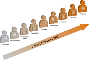
Co-creation includes active shaping of structure, pattern, rules, and mechanisms, that support simple content creation. This requires activity and involvement from roles we often label editor, builder, designer, or architect, depending on the context. The pyramid and ladder models either implicitly collapse these perspectives into the general category of ‘creator’, which obscures very important distinctions between them, or leaves them out entirely (I’m not sure which). It is possible to plot these more nuanced creative roles on the general continuum of ‘level of involvement’, and I often do this when I talk about the future of design in the DIY world.

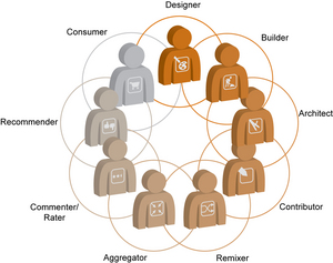
A better model for this world is the ecology of co-creation, which recognizes that the key difference between industrial production models and the DIY future is that the walls separating traditional creators from consumers have fallen, and all parties interconnect. Judgements of value in ecologies take on very different meanings: Consider the differing but all vitally important roles of producers, consumers, and decomposers in a living ecosystem.
ecology_cocreation.jpg
What will an ecology of co-creation look like in practical / operational form? In The Bottom Is Not Enough, Kevin Kelly offers, “…now that crowd-sourcing and social webs are all the rage, it’s worth repeating: the bottom is not enough. You need a bit of top-down as well.”

An ecology of co-creation that combines top-down architecture and design with bottom-up contribution and participation will take the form of a deliberate hybrid.

I’ll quote Kelly again (at some length):

Here’s how I sum it up:  The bottom-up hive mind will always take us much further than even seems possible. It keeps surprising us in this regard. Given enough time, dumb things can be smarter than we think.

At that same time, the bottom-up hive mind will never take us to our end goal. We are too impatient. So we add design and top down control to get where we want to go.

The systems we keep will be hybrid creations. They will have a strong rootstock of peer-to-peer generation, grafted below highly refined strains of controlling functions.  Sturdy, robust foundations of user-made content and crowd-sourced innovation will feed very small slivers of leadership agility. Pure plays of 100% smart mobs or 100% smart elites will be rare.

The real art of business and organizations in the network economy will not be in harnessing the crowd of “everybody” (simple!) but in finding the appropriate hybrid mix of bottom and top for each niche, at the right time. The mix of control/no-control will shift as a system grows and matures.

[Side note: Metaphors for achieving the appropriate mix of control/no-control for a system will likely include choreographing, cultivating, tuning, conducting, and shepherding, in contrast to our current directive framings such as driving, directing, or managing.]

Knowledge at Wharton echoes Kelly, in their recent article The Experts vs. the Amateurs: A Tug of War over the Future of Media
A tug of war over the future of media may be brewing between so-called user-generated content — including amateurs who produce blogs, video and audio for public consumption — and professional journalists, movie makers and record labels, along with the deep-pocketed companies that back them. The likely outcome: a hybrid approach built around entirely new business models, say experts at Wharton.

No one has quite figured out what these new business models will look like, though experimentation is under way with many new ventures from startups and existing organizations.

The BBC is putting hybridization and tuning into effect now, albeit in limited ways that do not reflect a dramatic shift of business model.

In Value of citizen journalism Peter Horrocks writes:

Where the BBC is hosting debate we will want the information generated to be editorially valuable. Simply having sufficient resource to be able to moderate the volume of debate we now receive is an issue in itself.

And the fact that we are having to apply significant resource to a facility that is contributed regularly by only a small percentage of our audiences is something we have to bear in mind. Although of course a higher proportion read forums or benefit indirectly from how it feeds into our journalism. So we may have to loosen our grip and be less worried about the range of views expressed, with very clear labeling about the BBC’s editorial non-endorsement of such content. But there are obvious risks.

We need to be able to extract real editorial value from such contributions more easily. We are exploring as many technological solutions as we can for filtering the content, looking for intelligent software that can help journalists find the nuggets and ways in which the audience itself can help us to cope with the volume and sift it.

What does all this mean for design(ers)? Stay tuned for part two…

Comment » | Civil Society, Ideas, Information Architecture, Social Media

Video of My BlogTalk Presentation

March 11th, 2008 — 12:00am

Video of my BlogTalk presentation ‘What happens when everyone designs social media? Practical suggestions for handling new ethical dilemmas’ is available from Ustream.tv. The resolution is low (it was shot with a webcam) but the audio is good: follow along with the slides on your own for the full experience.

More videos of BlogTalk sessions here.


Comment » | Ethics & Design, Networks and Systems, Social Media, User Experience (UX)

Blogtalk 2008 slides available

March 3rd, 2008 — 12:00am

My slides from Blogtalk 2008 are available online now: I went through a lot of ideas quickly, so this is a good way to follow along at your own pace…

FYI: This version of the deck includes presenters notes – I’ll upload a (larger!) view-only version once I’m back from holiday in lovely Eire.

When Everyone Is A Designer: Practical Techniques for Ethical Design in the DIY Future from Joe Lamantia

Comment » | Ideas, Networks and Systems, User Experience (UX)

‘Designing Ethical Experiences: Social Media and the Conflicted Future’ is live at UXMatters

February 12th, 2008 — 12:00am

circle-logo_newBg3.gif
UXMatters just published part 1 of a two part series I’m writing on ethics and design titled, Designing Ethical Experiences: Social Media and the Conflicted Future.

Here’s an excerpt, to whet your appetites for a practical take on what’s often seen as a philosophical subject.

Questions of ethics and conflict can seem far removed from the daily work of user experience (UX) designers who are trying to develop insight into people’s needs, understand their outlooks, and design with empathy for their concerns. In fact, the converse is true: When conflicts between businesses and customers–or any groups of stakeholders–remain unresolved, UX practitioners frequently find themselves facing ethical dilemmas, searching for design compromises that satisfy competing camps. This dynamic is the essential pattern by which conflicts in goals and perspectives become ethical concerns for UX designers. Unchecked, it can lead to the creation of unethical experiences that are hostile to users–the very people most designers work hard to benefit–and damaging to the reputations and brand identities of the businesses responsible.

Stay tuned for part two, which will share a set of suggestions for how design can manage conflict and work toward the creation of ethical integrated experiences. Meanwhile, let us know what you think of the ideas here, or at the UXMatters site.

1 comment » | Ethics & Design, Ideas, Social Media, User Experience (UX)

Back to top