April 29th, 2006 — 12:00am
What follows is a brief tale of customer distress and redemption, featuring a cast of characters including several well-known players in modern drama:
Fret not readers, for this yarn has a happy ending in a windfall for yours truly.
Chapter 1: Sir Quality Control Failure
For a brief period in 2005, JoeLamantia.com happily relied on a Dustbuster to help keep things neat and tidy. When the machine died suddenly after two months of service, we felt sadness at having placed faith in yet another defective consumer good. These feelings turned to relief when Black and Decker promised to send a replacement within “7 to 10 days”.
Chapter 2: Queen Fickle CRM
Four weeks went by. We called again: our records had been “lost”, so another order was placed. Emotionally unreliable CRM systems will sometimes decide to break up with you, but — lacking the confidence to tell you directly — leave you find out in awkward ways like this. Not to worry for us, however, we would have another dustbuster in “7 to 10 days”.
Chapter 3: King Chronically Unstable Supply Chain Management
Four weeks passed. When we called again, the ordering system was down for the weekend, and no information was available. While their enterprise class SCM system with five nines uptime was out, the magic of post-it notes — which rarely experience down time, except during periods of humid weather — allowed Black and Decker to assure us we would receive a replacement in “7 to 10 days”.
Chapter 4: Duke Conflicting Master Data
Four weeks passed, leaving JoeLamantia.com sorely in need of dustbusting capability. We called a fourth time, to learn our replacement was on back order, and would arrive in “7 to 10 days”. As a courtesy, we’d been upgraded to a more powerful model — presumably to help us pick up all the dust accumulated over the past three months.
Chapter 5: Windfall, and Happy Ending
The next day, we found three dustbusters, all different models, shipped from different places, with different order numbers, and different customer IDs on the labels, waiting on the front porch.
Windfall

Comment » | Customer Experiences
December 26th, 2005 — 12:00am
Proving that a well-developed sense of humor is required for success in product design — especially for Lotus Notes — Mary Beth Raven, who leads the design team for the next version of Lotus Notes, recently posted a rather funny comment in reply to my suggestion that the Notes Design team offer customers a choice of unpleasant but related user experience themes. She used this as the occasion to invite all members of the community of Notes to users to register as volunteers for usability testing.
I’ve made three postings to date specifically discussing the Notes user experience: Lotus Notes User Experience = Disease, Mental Models, Resilience, and Lotus Notes, and Better UI Tops Notes Users’ Wish Lists. I’m not sure which of these prompted Mary Beth to reach out, but I’m glad she did, because doing so is smart business on two levels. At the first level, Mary Beth plainly understands that while vocal critics may seem daunting to user experience designers, product managers, and business owners, engaging these critics in fact presents design teams with opportunities to build strong connections to users and gather valuable feedback at the same time. What better way is there to show the strategic value of user research?
I learned this at first hand while working on a redesign of the flagship web presence of a large software firm several years ago. Some of the most insightful and useful feedback on the strengths and weaknesses of the user experiences I was responsible for came from ‘disgruntled’ customers. The user research I was doing on site structures, navigation paths, and user goals established a channel that allowed unhappy (and happy) customers to communicate about a broad range of their experiences with PTC products and services in a more complete way than by simply buying a competing product, or renewing an existing software license.
Based on these and other experiences building user research programs, I suggest that product managers, user research leads, and user experience designers first collaborate to define a user research strategy, and then define and create a simple but effective user research infrastructure (like registration gateways to volunteer databases, community / program identifiers and incentives, contact management tools, specific personas that technical and customer support teams can learn to recognize and recruit at all stages of the customer lifecycle, etc.) that will support the creation of channels to users throughout the design cycle.
At the second level, it allows the Notes team to directly explore collaboration methods, products, and technologies related to the very competitive collaboration suite / integrated electronic workspace / office productivity markets in which IBM, Microsoft, and several other giant firms are looking to secure dominant positions in the new culture of collaboration. [Note: I’ve posted a few times on Microsoft products as well – Backwards Goals: MS Office Results Oriented UI, and Microsoft’s Philosophy On Information Architecture.]
Members of the community of Lotus Notes users can register as volunteers for usability tests during the design of the next version of Notes at this URL: https://www-10.lotus.com/ldd/usentry.nsf/register?openform.
Related posts:
Comment » | User Experience (UX), User Research
November 17th, 2005 — 12:00am
I got caught in an on-line opinion survey trap last week. The setup: In exchange for 10% off my next purchase, a Banana Republic cashier told me, I had to answer a few questions about my shopping experience. Retailers often solicit opinions from customers in return for a variety of rewards. It’s common enough that there’s an understanding on the amount of information requested, in exchange for the expected reward. So I thought I was safe…
Twenty screens later, after answering more than fifty questions and with no end in sight, I was feeling a little cranky. Even my wife was irritated; I was holding up grocery shopping for dinner guests. Very quickly, the reward for my time shifted from a coupon, to using Banana Republic as an example of an on-line survey experience that undermines your brand.
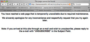
The full survey ran more than thirty five screens, and ended with an error message. Very professional.
Thumbnails of the whole survey:
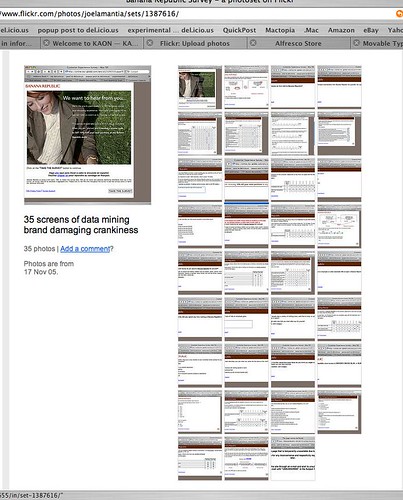
For kicks, I posted the screenshots to Flickr. If you run the slideshow, you can see where I became frustrated and started to give spoiler answers – like wearing a size 98, or spending $10 / year on clothing.
Why was the survey experience bad?
1. They didn’t make clear how much time they were asking for. The opening screen said 10 minutes, this is misleading for a 100 question survey. If you’re asking for my time, respect me enough to be honest about what’s required.
2. They didn’t make the real purpose of the survey clear. From the shopping experience itself, the questions quickly shifted to my age, income, marital status, and education level. This is a transparent attempt to feed data mining and demographic needs that relied on an amateur segue to turn the conversation around and ask for personal information.
3. They contradicted the experience I had in their store. The store staff were nice enough to keep track of the umbrella I left in a fitting room, and return it before I left, which was thoughtful. Consistency is the core of a successful brand, but the survey experience was inconsistent.
How does this damage Banana Republic’s brand?
1. Banana Republic left me with a series of negative impressions that work against their brand values: I now feel I was chosen to participate in a survey under false pretenses, a survey that offers me little value in return for important personal information that is inappropriate to ask for in the first place.
2. Banana Republic closed a growing channel for conducting business with a customer. I may purchase more from their stores — if I have no other retailer at hand, and I need business clothes to meet with a client CEO the next morning once again — but I’m certainly not willing to engage with them online.
Merchants in all areas of retailing work very hard to encourage customers to form positive associations with their brands. Fashion retailers work especially hard at encouraging customers to associate values, such as trust and respect, with a brand because these values serve as the foundation for longer term and more lucrative relationships with customers than single purchases. Every experience a customer has with your brand — every touch point — influences this network of associations, reinforcing or weakening the link between a brand and the feelings that customers have about the products and the company behind it. A simple test any retailer should use when considering bringing an experience to customers is wether the experience will reinforce the right brand associations.
Loyalty programs, and their offspring the online opinion survey, are good examples of the intersections of customer interests and retailer interests in an experience that can reinforce a customer’s perceptions of the brand and the values associated with it. Many retailers manage these kinds of programs well.
Just not Banana Republic.
The error message at the end.
Error Message:
I wear size 98:
Size 98:

Related posts:
Comment » | User Experience (UX)
October 16th, 2005 — 12:00am
OCLC has caught the socially constructed metadata fever. A release on the OCLC site titled “User-contributed content pilot” discusses a pilot program to allow Open WorldCat users to add publicly visible metadata, in the form of reviews and descriptive details, to existing records.
This looks the latest step in the wave of exploration of methods and models for putting socially constructed metadata into practice that’s playing out in public. (Is this necessarily done in public? I’m curious to hear thoughts on how this might be done with closed or cloaked communities, like IBM’s intranet).
Broadly, it looks like a wide variety of entities are following the standard new product or service development cycle with regards to socially constructed metadata. A simplified version of this cycle is:
1.Conceptualization, technology development
2.Product development
3.Introduction to market
4.Market Acceptance and growth
5.Ongoing Market as conventional product
A quick review of known social bookmarking / tagging ventures distributed over a number of organizations supports the idea that each experiment is at one of these stages.
Some visualizations of development and prototype cycles are available here, and here.
Where’s it headed? I think we’ll see at least forms forms or applications of socially constructed metadata stabilize and become publicly recognized and accepted in the near future, with more on the way that will surprise everyone. Those four are:
1. Fee for services models, paying for access to premium quality pools of collectively managed information under professional (paid) editorial custody. OCLC could adopt this model.
2. Non-commercial community driven pools of social knowledge. This might be delicio.us.
3. Deployment as an enabler or attribute of other product / service models. Flickr is an example of this perhaps.
4. Publicly free but commercialized information mining operations, deriving salable value from formalizing the semantic relationships between people, groups, and information objects. TagCloud.com might fall into this group, or maybe Cloudalicious.
5. Something very innovative I will wish I’d thought of when it’s released.
Excerpts from the OCLC release:
“As of October 9, 2005, Open WorldCat users are able to add their own content to authoritative WorldCat information about library-held titles. Available under the Details and Reviews tabs, this functionality permits those who have located library items through Open WorldCat to return to the interface and add evaluative content.”
“User-contributed content will help extend the OCLC cataloging cooperative to include non-cataloging library professionals and – more importantly – patrons. Their shared participation in WorldCat content creation and management could foster a larger sense of library-centered community and generate more interest in library resources.”
Related posts:
Comment » | Social Media
September 23rd, 2005 — 12:00am
But not the new features list for the next release. In a previous post Lotus Notes UI = Disease, I cited a SearchDomino.com article in which Ken Bisconti, IBM Lotus vice president of Workplace, portal and collaboration products, is quoted as saying “Through improvements such as contextual collaboration and support for composite apps, we’ve gone *above and beyond simple UI enhancement*”. [Emphasis mine.] Above and beyond? I think UI enhancement – which is often far from simple, especially when the existing user experience is fundamentally flawed – is exactly what Notes needs.
After watching software development first hand, I know that many Product Managers understand the importance of quality, design, and meeting users’ needs, but do not feel empowered to work against the pervasive featuritis that leads to unusable bloatware. Good product managers and designers often work for organizations or managers who remain blinded by standard practices and marketing driven perceptions of priority, and thus feel it’s impossible to step off the new functionality treadmill.
That is, unless they are armed with information that indicates to the contrary.
The article in Ken’s statement appears, Beyond Notes 7.0: IBM Lotus sketches ‘Hannover’ user experience, is dated June 14, 2005. Yet when digging it bit more, I discovered an earlier piece from May 9, 2005, titled Better UI tops Notes users’ wish list, in which the same author, Peter Blochner, reports on the results of an open request for Lotus Notes features made by Ed Brill(Brill heads the worldwide sales group for Notes, according to Blochner). In his review of user responses to Brill’s question, Blochner says, “the most requested feature was for an improved user interface for Notes.”
Simple UI enhancement is all that the users want, and they’ve said it themselves. Yet Notes is going way beyond this? Despite repeated and public requests for this from committed users (Ed Brill’s blog is a predominantly Notes-friendly forum) in their own voices, and in response to questions from your own team. Why not listen to them?
For reference, Blochner’s article is reproduced below:
By Peter Bochner
09 May 2005 | SearchDomino.com
IBM is already working on plans for the next major releases of Lotus Notes beyond 7.0. Last week, on May 3, visitors to the blog site of Ed Brill, who heads up worldwide sales for Lotus Notes and Domino, were asked, “If you could add one feature to Lotus Notes 7.x, what would it be?”
As of May 9, his question has garnered 184 comments, although many respondents circumvented the question’s one-feature limit by submitting multiple posts.
To kick off the thread, Brill provided his own request – multi-level undo – and that was reiterated by seven posters. However, the most requested feature was for an improved user interface for Notes. “It’s time to give the Notes client UI a much-needed facelift,” wrote one respondent. When people say Exchange is better than Notes, said another, “What they are saying is that the Outlook interface is . . .nicer than the [Notes] mail template. A top UI for the next release would top off a lot of end-user complaints.”
Only a handful of responses mentioned specific suggestions for improving the UI. One asked for “a first-class, richly configurable Welcome Panel that resembles a Web portal.” Another suggested UI improvements such as “more user-selectable columns in folders/views, having preferences all in one place, or rules that can act on documents already in the mail file.” Still another requested “a sexy modern mail template with a single UI in Notes and on the Web.”
Finally, one user said, “What would it be worth if every part of the Notes mail experience, which …is the Notes interface for the majority of users, from the toolbars to the icons to interaction and behavior, was consistent, modern, clean and inviting? There is no point in having the superior everything if it’s not appealing to look at.”
P.S. Brill has requested a moratorium on suggestions, because the thread is now so long it has become unwieldy.
Related posts:
Comment » | User Experience (UX), User Research
July 7th, 2005 — 12:00am
I went to the 4th of July concert on the Esplanade this past Monday, for the first time in several years, expecting to show some international visitors genuine Boston Americana. After all, 4th of July celebrations are singularly American experiences; part summer solstice rite, part brash revolutionary gesture, part demonstration of martial prowess, part razzle-dazzle spectacle as only Americans put on.
I suppose a unique American experience is what we got: in return for our trouble, we felt like unpaid extras in a television production recreating the holiday celebrations for a remote viewing audience miles or years away. It was — de-centered — hollow and inverted. It’s become a simulacrum, with a highly unnatural flow driven by the calculus of supra-local television programming goals. The center of gravity is now a national television audience sitting in living rooms everywhere and nowhere else, and not the 500,000 people gathered around the Hatch Shell who create the celebration and make it possible by coming together every year.
Despite all the razzle-dazzle — and in true American fashion there was a lot, from fighter jets to fireworks, via brass bands, orchestras, and pop stars along the way — the experience itself was deeply unsatisfying, because it was obvious from the beginning that the production company (B4) held the interests of broadcasters far more important than the people who come to the Esplanade.
There were regular commercial breaks.
In a 4th of July concert.
For half a million people.
Commercial breaks which the organizers — no doubt trapped between the Scylla of contractual obligations and the Charybdis of shame at jilting a half-million people out of a summer holiday to come to this show — filled with filler. While the commercials aired, and the audience waited, the ‘programmers’ plugged the holes in the concert schedule with an awkward mix of live songs lasting less than three minutes, pre-recorded music, and inane commentary from local talking heads. We felt like we were sitting *behind* a monitor at a taping session for a 4th of July show, listening while other people watched the screen in front.
I bring this out because it offers good lessons for those who design or create experiences, or depend upon the design or creation of quality experiences.
Briefly, those lessons are:
1. If you have an established audience, and you want or need to engage a new one, make sure you don’t leave your loyal customers behind by making it obvious that they are less important to you than your new audience.
2. If you’re entering a new medium, and your experience will not translate directly to the new channel (and which well-crafted experience does translate exactly?), make sure you don’t damage the experience of the original channel while you’re translating to the new one.
3. When adding a new or additional channel for delivering your experience, don’t trade quality in the original channel for capability in the new channel. Many separate factors affect judgments of quality. Capability in one channel is not equivalent to quality in another. Quality is much harder to achieve.
4. Always preserve quality, because consistent quality wins loyalty, which is worth much more in the long run. Consistent quality differentiates you, and encourages customers to recommend you to other people with confidence, and allows other to become your advocates, or even your partners. For advocates, think of all the people who clear obstacles for you without direct benefit, such as permit and license boards. For partners, think of all the people who’s business connect to or depend upon your experience in some way; the concessions vendors who purchase a vending license to sell food and beverages every year are a good example of this.
For people planning to attend next year’s 4th of July production, I hope the experience you have in 2006 reflects some of these lessons. If not, then I can see the headline already, in bold 42 point letter type, “Audiences nowhere commemorate Independence Day again via television! 500,000 bored extras make celebration look real for remote viewers!“
Since this is the second time I’ve had this experience, I’ve changed my judgment on the quality of the production, and I won’t be there: I attended in 2002, and had exactly the same experience.
No related posts.
Comment » | The Media Environment, User Experience (UX)