Scatterplots As Page Shapes?
The February edition of Usability News reports on a usability study (Where’s the Search? Re-examining User Expectations of Web Objects) of user expectations for Web page layouts that contains a surprising but interesting visualization of page shapes, based on quantitative user research. (Note: I found the study via the UI Design Newsletter, from HFI.)
The study looks at users” expectations for the location of common web page components, such as site search and advertising. The authors find that expectations for page layouts are largely the same now, as compared to those found in an earlier study, Developing Schemas for the Location of Common Web Objects, conducted in 2001.
More interesting is the way the researchers report their results; visualizing them as heat map style grid plots for the expected location of each element vs. a blank grid. Here’s two examples, the first showing expected locations for ‘back to home’ links, the second for the ‘site search engine’.
Figure 1: Back to Home Link Location
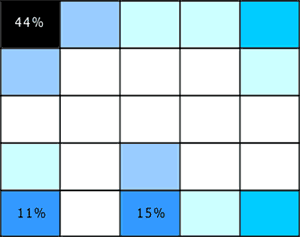
Figure 2: Site Search Engine Location

These heat maps look a lot like page shapes, expressed as scatterplots.
I like the combination of quantitative and qualitative perspectives at work in these page shapes rendered as scatterplots. I think it could allow for grounded discussion and interpretation of user feedback on design options, within a clear and simple structure that doesn’t require an HCI degree to appreciate. If I try it out, I’ll share the outcomes.
In a more traditional style of visualization, Eric Scheid found another another good example of page shapes a while back in Jonathon Boutelle’s posting on blog layouts called “Mullet”-style blog layout. Jonathon was advocating for a new default blog page shape that increases information density and scent, but hews closely to pre-existing expectations.
Figure 3: Typical Blog Page Shape

Figure 4: Suggested Blog Page Shape

And that’s the last time I’m mentioning m.u.l.l.e.t.s this year, lest Google get the wrong idea about the subject matter of this blog ![]()
