Lotus Notes User Experience = Disease
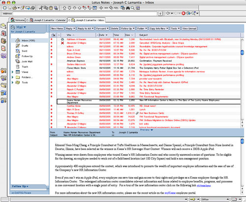
Lotus Notes has one of the most unpleasant and unwelcoming User Experiences this side of a medium-security prison where the warden has aspirations towards interior design and art instruction. One of the most painful aspects of the Notes experience is the default settings for font size and color in the email window. The default font size (for Macs) is on the order of 7 point type, and the default color for unread messages is — ironically — red. The combination yields a user experience that resembles a bad skin rash.
I call it “angry red microNotes” disease, and it looks like this:
Overall, it has an unhealthy affect on one’s state of mind. The undertones of hostility and resentment running throughout are manifold. And naturally, it is impossible to change the default font size and color for the email reader. This is further confirmation for my theory that Notes has yet to escape it’s roots as a thick client for series of unconnected databases.
After three weeks of suffering from angry red microNotes, I realized I was literally going blind from squinting at the tiny type, and went to Google for relief. I found niniX 1.7, a utility that allows Mac based Lotus Notes users the ability to edit the binary format Notes preferences file, and change the font size of the email client. I share it in the hopes that others may break the chains that blind them. This will only solve half the problem — if someone can figure out how to change the default color for unread messages to something besides skin rash red, I will happily share with the rest of the suffering masses (and apparently there are on the order of 118 million of us out there).
But will it always be this (horrible) way?
In Beyond Notes 7.0: IBM Lotus sketches ‘Hannover’ user experience Peter Bochner of SearchDomino.com says this of the next Notes release, “Notes has often been criticized for its somewhat staid user interface. According to IBM’s Bisconti, in creating Hannover, IBM paid attention “to not just the user interface, but the user experience.“
Okay… So does that mean I’ll have my choice of diseases as themes for the user experience of my collaboration environment?
According to Ken Bisconti, IBM Lotus vice president of Workplace, portal and collaboration products, “Through improvements such as contextual collaboration and support for composite apps, we’ve gone above and beyond simple UI enhancement”.
I think simple UI enhancement is exactly what Ken and his team should focus on for the next several years, since they have so much opportunity for improvement.
Category: Enterprise, Tools, User Experience (UX) | Tags: collaboration, customer_experience, Enterprise, lotusnotes, mental_models, userexperience 22 comments » Comment »
