Category: User Experience (UX)


Intrusive Online Surveys Damage Brands

November 17th, 2005 — 12:00am

I got caught in an on-line opinion survey trap last week. The setup: In exchange for 10% off my next purchase, a Banana Republic cashier told me, I had to answer a few questions about my shopping experience. Retailers often solicit opinions from customers in return for a variety of rewards. It’s common enough that there’s an understanding on the amount of information requested, in exchange for the expected reward. So I thought I was safe…
Twenty screens later, after answering more than fifty questions and with no end in sight, I was feeling a little cranky. Even my wife was irritated; I was holding up grocery shopping for dinner guests. Very quickly, the reward for my time shifted from a coupon, to using Banana Republic as an example of an on-line survey experience that undermines your brand.
The full survey ran more than thirty five screens, and ended with an error message. Very professional.
Thumbnails of the whole survey:
img:thumbnails of the whole survey
For kicks, I posted the screenshots to Flickr. If you run the slideshow, you can see where I became frustrated and started to give spoiler answers – like wearing a size 98, or spending $10 / year on clothing.
Why was the survey experience bad?
1. They didn’t make clear how much time they were asking for. The opening screen said 10 minutes, this is misleading for a 100 question survey. If you’re asking for my time, respect me enough to be honest about what’s required.
2. They didn’t make the real purpose of the survey clear. From the shopping experience itself, the questions quickly shifted to my age, income, marital status, and education level. This is a transparent attempt to feed data mining and demographic needs that relied on an amateur segue to turn the conversation around and ask for personal information.
3. They contradicted the experience I had in their store. The store staff were nice enough to keep track of the umbrella I left in a fitting room, and return it before I left, which was thoughtful. Consistency is the core of a successful brand, but the survey experience was inconsistent.
How does this damage Banana Republic’s brand?
1. Banana Republic left me with a series of negative impressions that work against their brand values: I now feel I was chosen to participate in a survey under false pretenses, a survey that offers me little value in return for important personal information that is inappropriate to ask for in the first place.
2. Banana Republic closed a growing channel for conducting business with a customer. I may purchase more from their stores — if I have no other retailer at hand, and I need business clothes to meet with a client CEO the next morning once again — but I’m certainly not willing to engage with them online.
Merchants in all areas of retailing work very hard to encourage customers to form positive associations with their brands. Fashion retailers work especially hard at encouraging customers to associate values, such as trust and respect, with a brand because these values serve as the foundation for longer term and more lucrative relationships with customers than single purchases. Every experience a customer has with your brand — every touch point — influences this network of associations, reinforcing or weakening the link between a brand and the feelings that customers have about the products and the company behind it. A simple test any retailer should use when considering bringing an experience to customers is wether the experience will reinforce the right brand associations.
Loyalty programs, and their offspring the online opinion survey, are good examples of the intersections of customer interests and retailer interests in an experience that can reinforce a customer’s perceptions of the brand and the values associated with it. Many retailers manage these kinds of programs well.
Just not Banana Republic.
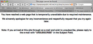
The error message at the end.
Error Message:
I wear size 98:
Size 98:

Related posts:
Comment » | User Experience (UX)

Usability Everywhere

October 9th, 2005 — 12:00am

Usability issues pop up in the strangest places. For example, Monday night, while I was sitting in the Lisbon Tourist Police office, filling out a report on how I’d just been robbed. The officer handling my report took a moment to apologize for how long it took him to complete the process. He said, “We have a new internet based system to fill out all the forms, and its very confusing.” Seems that Accenture created a .net based environment for the Portugese police to record assaults on travellers, but they didn’t pay proper attention to user experience and usability concerns. The officers use all the classic workarounds: composing text in a word-processor before pasting it into input fields, post-it notes for shortcuts and passwords all over the workstations; and they live in fear of hitting the wrong navigation button and losing all their in-progress work.
It’s not as good as getting my wallet back, but it might make a good anecdote at the next IA cocktail hour.

Related posts:

Comment » | Travel, User Experience (UX)

Better UI Tops Notes Users’ Wish List

September 23rd, 2005 — 12:00am

But not the new features list for the next release. In a previous post Lotus Notes UI = Disease, I cited a SearchDomino.com article in which Ken Bisconti, IBM Lotus vice president of Workplace, portal and collaboration products, is quoted as saying “Through improvements such as contextual collaboration and support for composite apps, we’ve gone *above and beyond simple UI enhancement*”. [Emphasis mine.] Above and beyond? I think UI enhancement – which is often far from simple, especially when the existing user experience is fundamentally flawed – is exactly what Notes needs.
After watching software development first hand, I know that many Product Managers understand the importance of quality, design, and meeting users’ needs, but do not feel empowered to work against the pervasive featuritis that leads to unusable bloatware. Good product managers and designers often work for organizations or managers who remain blinded by standard practices and marketing driven perceptions of priority, and thus feel it’s impossible to step off the new functionality treadmill.
That is, unless they are armed with information that indicates to the contrary.
The article in Ken’s statement appears, Beyond Notes 7.0: IBM Lotus sketches ‘Hannover’ user experience, is dated June 14, 2005. Yet when digging it bit more, I discovered an earlier piece from May 9, 2005, titled Better UI tops Notes users’ wish list, in which the same author, Peter Blochner, reports on the results of an open request for Lotus Notes features made by Ed Brill(Brill heads the worldwide sales group for Notes, according to Blochner). In his review of user responses to Brill’s question, Blochner says, “the most requested feature was for an improved user interface for Notes.”
Simple UI enhancement is all that the users want, and they’ve said it themselves. Yet Notes is going way beyond this? Despite repeated and public requests for this from committed users (Ed Brill’s blog is a predominantly Notes-friendly forum) in their own voices, and in response to questions from your own team. Why not listen to them?
For reference, Blochner’s article is reproduced below:
By Peter Bochner
09 May 2005 | SearchDomino.com
IBM is already working on plans for the next major releases of Lotus Notes beyond 7.0. Last week, on May 3, visitors to the blog site of Ed Brill, who heads up worldwide sales for Lotus Notes and Domino, were asked, “If you could add one feature to Lotus Notes 7.x, what would it be?”
As of May 9, his question has garnered 184 comments, although many respondents circumvented the question’s one-feature limit by submitting multiple posts.
To kick off the thread, Brill provided his own request – multi-level undo – and that was reiterated by seven posters. However, the most requested feature was for an improved user interface for Notes. “It’s time to give the Notes client UI a much-needed facelift,” wrote one respondent. When people say Exchange is better than Notes, said another, “What they are saying is that the Outlook interface is . . .nicer than the [Notes] mail template. A top UI for the next release would top off a lot of end-user complaints.”
Only a handful of responses mentioned specific suggestions for improving the UI. One asked for “a first-class, richly configurable Welcome Panel that resembles a Web portal.” Another suggested UI improvements such as “more user-selectable columns in folders/views, having preferences all in one place, or rules that can act on documents already in the mail file.” Still another requested “a sexy modern mail template with a single UI in Notes and on the Web.”
Finally, one user said, “What would it be worth if every part of the Notes mail experience, which …is the Notes interface for the majority of users, from the toolbars to the icons to interaction and behavior, was consistent, modern, clean and inviting? There is no point in having the superior everything if it’s not appealing to look at.”
P.S. Brill has requested a moratorium on suggestions, because the thread is now so long it has become unwieldy.

Related posts:

Comment » | User Experience (UX), User Research

Lotus Notes User Experience = Disease

September 22nd, 2005 — 12:00am

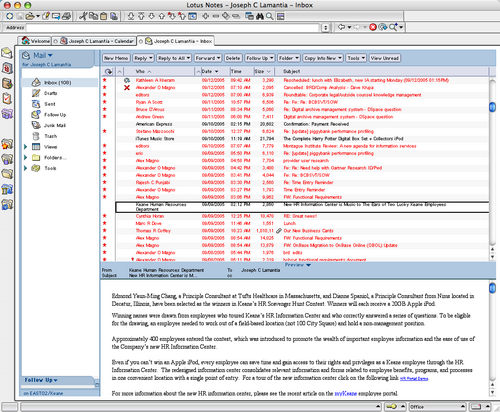
Lotus Notes has one of the most unpleas­ant and unwel­com­ing User Expe­ri­ences this side of a medium-security prison where the war­den has aspi­ra­tions towards inte­rior design and art instruc­tion. One of the most painful aspects of the Notes expe­ri­ence is the default set­tings for font size and color in the email win­dow. The default font size (for Macs) is on the order of 7 point type, and the default color for unread mes­sages is — iron­i­cally — red. The com­bi­na­tion yields a user expe­ri­ence that resem­bles a bad skin rash.

I call it “angry red microNotes” dis­ease, and it looks like this:

angry_red_micro_notes.png

Over­all, it has an unhealthy affect on one’s state of mind. The under­tones of hos­til­ity and resent­ment run­ning through­out are man­i­fold. And nat­u­rally, it is impos­si­ble to change the default font size and color for the email reader. This is fur­ther con­fir­ma­tion for my the­ory that Notes has yet to escape it’s roots as a thick client for series of uncon­nected data­bases.

After three weeks of suf­fer­ing from angry red microNotes, I real­ized I was lit­er­ally going blind from squint­ing at the tiny type, and went to Google for relief. I found niniX 1.7, a util­ity that allows Mac based Lotus Notes users the abil­ity to edit the binary for­mat Notes pref­er­ences file, and change the font size of the email client. I share it in the hopes that oth­ers may break the chains that blind them. This will only solve half the prob­lem — if some­one can fig­ure out how to change the default color for unread mes­sages to some­thing besides skin rash red, I will hap­pily share with the rest of the suf­fer­ing masses (and appar­ently there are on the order of 118 mil­lion of us out there).

But will it always be this (hor­ri­ble) way?

In Beyond Notes 7.0: IBM Lotus sketches ‘Han­nover’ user expe­ri­ence Peter Bochner of SearchDomino.com says this of the next Notes release, “Notes has often been crit­i­cized for its some­what staid user inter­face. Accord­ing to IBM’s Bis­conti, in cre­at­ing Han­nover, IBM paid atten­tion “to not just the user inter­face, but the user expe­ri­ence.“

Okay… So does that mean I’ll have my choice of dis­eases as themes for the user expe­ri­ence of my col­lab­o­ra­tion envi­ron­ment?
Accord­ing to Ken Bis­conti, IBM Lotus vice pres­i­dent of Work­place, por­tal and col­lab­o­ra­tion prod­ucts, “Through improve­ments such as con­tex­tual col­lab­o­ra­tion and sup­port for com­pos­ite apps, we’ve gone above and beyond sim­ple UI enhance­ment”.

I think sim­ple UI enhance­ment is exactly what Ken and his team should focus on for the next sev­eral years, since they have so much oppor­tu­nity for improvement.

Comment » | Enterprise, Tools, User Experience (UX)

Mental Models, Resilience, and Lotus Notes

September 5th, 2005 — 12:00am

Several very unpleasant experiences I’ve had with the Lotus Notes webmail client during the past few weeks have brought up some questions about mental models; specifically how users respond to challenges to their mental models, and how resilience plays a part in how changes to mental models occur.
The IAWiki defines a mental model as, “a mental model is how the user thinks the product works.” This is a simplified definition, but it’s adequate for the moment. For a deeper exploration, try Martina Angela Sasse’s thesis
Eliciting and Describing Users’ Models of Computer Systems.
In this case, the model and the challenge are straightforward. My mental model of the Notes webmail client includes the understanding that it can send email messages. The challenge: the Lotus webmail client cannot send email messages – at least not as I experience it.
Here’s what happens my mental model and my reality don’t match:

  1. I log in to my email client via Firefox – the only browser on the Mac that renders the Notes webmail client vaguely correctly – (I’m using webmail because the full Notes client requires VPN, meaning I’m unable to access anything on my local network, or the internet, which, incidentally, makes it difficult to seem like a credible internet consultant.) again, because it’s frozen and crashed my browser in the past ten minutes.
  2. I realize I need to respond to an email
  3. I do not remember that the Notes webmail client is incapable of sending out email messages
  4. I open a new message window, and compose a chunk of semi-grammatical techno-corporate non-speak to communicate a few simple points in blame-retardant consultantese
  5. I attempt to send this email
  6. I am confronted with a cryptic error message via javascript prompt, saying something like “We’re really sorry, but Domino sucks, so you can’t send out any messages using your email client.”
  7. Over the span of .376 seconds, I move through successive states of surprise, confusion, comprehension, frustration, anger, resentment, resignation, and malaise (actually, mailaise is more accurate.)
  8. I swear: silently if clients are within earshot, out loud if not
  9. I switch to gmail, create a new message, copy the text of my message from the Notes webmail window to Gmail, and send the message to some eagerly waiting recipient
  10. I close the Notes webmail client, and return to business as usual.
  11. I forget that the Notes webmail client cannot send email messages.

Despite following this same path three times per day, five days each week, for the past five weeks, (for a total of ~75 clear examples), I am always surprised when I can’t send a message. I’m no expert on Learning theory but neither lack of attention nor stubbornness explain why seventy-five examples aren’t enough to change my model of how Notes works.
Disciplines including systems theory, biology, and sociology use a concept called resilience. In any stable system, “Resilience generally means the ability to recover from some shock, insult, or disturbance.” From an ecological perspective, resilience “is a measure of the amount of change or disruption that is required to transform a system.” The psychological view emphasizes “the ability of people to cope with stress and catastrophe.”
Apparently, the resilience of my model for email clients is high enough to withstand considerable stress, since – in addition to the initial catastrophe of using Notes itself – seventy-five consecutive examples of failure to work as expected do not equal enough shock, insult, and disturbance to my model to lead to a change my in understanding.
Notice that I’m using a work-around – switching to Gmail – to achieve my goal and send email. In
Resilience Management in Social-ecological Systems: a Working Hypothesis for a Participatory Approach , Brian Walker and several others refine the meaning of resilience to include, “The degree to which the system expresses capacity for learning and adaptation.” This accounts nicely for the Gmail work-around.
I also noticed that I’m relying on a series of assumptions – email clients can send messages; Notes is an email client; therefore, Notes can send messages – that make it logical to use a well established model for email clients in general to anticipate the workings of Notes webmail in particular. In new contexts, it’s easier to borrow an existing model than develop a new one. In short order, I expect I’ll change one of the assumptions, or build a model for Notes webmail.
Here’s a few questions that come to mind:

  1. What factors determine the resilience of a mental model?
  2. How to measure resiliency in mental models?
  3. What’s the threshold of recovery for a mental model?
  4. Put another way, what’s required to change a mental model?

Based on a quick review of the concept of resilience from several perspectives, I’m comfortable saying it’s a valuable way of looking at mental models, with practical implications for information architects.
Some of those implications are:

  1. Understand the relevance of existing mental models when designing new systems
  2. Anticipate and plan the ways that users will form a mental model of the system
  3. Use design at multiple levels to further the formation of mental models
  4. Understand thresholds and resilience factors when challenging existing mental models

From a broader view, I think it’s safe to say the application of systems theory to information architecture constitutes an important area for exploration, one containing challenges and opportunities for user experience practitioners in general, and information architects in particular.
Time to close this post before it gets too long.
Further reading:
Bio of Ludwig Bertalanffy, important contributor to General System Theory.
Doug Cocks Resilience Alliance
Garry Peterson’s blog Resilience Science

Related posts:

Comment » | Modeling, User Experience (UX)

A Very Postmodern 4th of July

July 7th, 2005 — 12:00am

I went to the 4th of July con­cert on the Esplanade this past Mon­day, for the first time in sev­eral years, expect­ing to show some inter­na­tional vis­i­tors gen­uine Boston Amer­i­cana. After all, 4th of July cel­e­bra­tions are sin­gu­larly Amer­i­can expe­ri­ences; part sum­mer sol­stice rite, part brash rev­o­lu­tion­ary ges­ture, part demon­stra­tion of mar­tial prowess, part razzle-dazzle spec­ta­cle as only Amer­i­cans put on.
I sup­pose a unique Amer­i­can expe­ri­ence is what we got: in return for our trou­ble, we felt like unpaid extras in a tele­vi­sion pro­duc­tion recre­at­ing the hol­i­day cel­e­bra­tions for a remote view­ing audi­ence miles or years away. It was — de-centered — hol­low and inverted. It’s become a sim­u­lacrum, with a highly unnat­ural flow dri­ven by the cal­cu­lus of supra-local tele­vi­sion pro­gram­ming goals. The cen­ter of grav­ity is now a national tele­vi­sion audi­ence sit­ting in liv­ing rooms every­where and nowhere else, and not the 500,000 peo­ple gath­ered around the Hatch Shell who cre­ate the cel­e­bra­tion and make it pos­si­ble by com­ing together every year.
Despite all the razzle-dazzle — and in true Amer­i­can fash­ion there was a lot, from fighter jets to fire­works, via brass bands, orches­tras, and pop stars along the way — the expe­ri­ence itself was deeply unsat­is­fy­ing, because it was obvi­ous from the begin­ning that the pro­duc­tion com­pany (B4) held the inter­ests of broad­cast­ers far more impor­tant than the peo­ple who come to the Esplanade.
There were reg­u­lar com­mer­cial breaks.
In a 4th of July con­cert.
For half a mil­lion peo­ple.
Com­mer­cial breaks which the orga­niz­ers — no doubt trapped between the Scylla of con­trac­tual oblig­a­tions and the Charyb­dis of shame at jilt­ing a half-million peo­ple out of a sum­mer hol­i­day to come to this show — filled with filler. While the com­mer­cials aired, and the audi­ence waited, the ‘pro­gram­mers’ plugged the holes in the con­cert sched­ule with an awk­ward mix of live songs last­ing less than three min­utes, pre-recorded music, and inane com­men­tary from local talk­ing heads. We felt like we were sit­ting *behind* a mon­i­tor at a tap­ing ses­sion for a 4th of July show, lis­ten­ing while other peo­ple watched the screen in front.
I bring this out because it offers good lessons for those who design or cre­ate expe­ri­ences, or depend upon the design or cre­ation of qual­ity expe­ri­ences.
Briefly, those lessons are:
1. If you have an estab­lished audi­ence, and you want or need to engage a new one, make sure you don’t leave your loyal cus­tomers behind by mak­ing it obvi­ous that they are less impor­tant to you than your new audi­ence.
2. If you’re enter­ing a new medium, and your expe­ri­ence will not trans­late directly to the new chan­nel (and which well-crafted expe­ri­ence does trans­late exactly?), make sure you don’t dam­age the expe­ri­ence of the orig­i­nal chan­nel while you’re trans­lat­ing to the new one.
3. When adding a new or addi­tional chan­nel for deliv­er­ing your expe­ri­ence, don’t trade qual­ity in the orig­i­nal chan­nel for capa­bil­ity in the new chan­nel. Many sep­a­rate fac­tors affect judg­ments of qual­ity. Capa­bil­ity in one chan­nel is not equiv­a­lent to qual­ity in another. Qual­ity is much harder to achieve.
4. Always pre­serve qual­ity, because con­sis­tent qual­ity wins loy­alty, which is worth much more in the long run. Con­sis­tent qual­ity dif­fer­en­ti­ates you, and encour­ages cus­tomers to rec­om­mend you to other peo­ple with con­fi­dence, and allows other to become your advo­cates, or even your part­ners. For advo­cates, think of all the peo­ple who clear obsta­cles for you with­out direct ben­e­fit, such as per­mit and license boards. For part­ners, think of all the peo­ple who’s busi­ness con­nect to or depend upon your expe­ri­ence in some way; the con­ces­sions ven­dors who pur­chase a vend­ing license to sell food and bev­er­ages every year are a good exam­ple of this.
For peo­ple plan­ning to attend next year’s 4th of July pro­duc­tion, I hope the expe­ri­ence you have in 2006 reflects some of these lessons. If not, then I can see the head­line already, in bold 42 point let­ter type, “Audi­ences nowhere com­mem­o­rate Inde­pen­dence Day again via tele­vi­sion! 500,000 bored extras make cel­e­bra­tion look real for remote view­ers!“
Since this is the sec­ond time I’ve had this expe­ri­ence, I’ve changed my judg­ment on the qual­ity of the pro­duc­tion, and I won’t be there: I attended in 2002, and had exactly the same experience.

No related posts.

Comment » | The Media Environment, User Experience (UX)

Don’t Cross the Streams! The Terrible User Experience of Enterprise Software

May 20th, 2005 — 12:00am

Below is an excerpt from an email sent to all employees – a ‘global broadcast’, very Max Headroom… – of a larger company (name removed), in response to repeated plees to improve the nightmarish user experience of the time and expense system that all employees must use.
<begin transmission>
There have been a few issues with the submitting and/or processing of Expense Reports resulting from individuals using data fields which have no value to [company], but may have processing impacts within the system. At this time, there is no way to remove or ‘grey-out’ these unused fields. If you have not been trained on the use of a field and/or do not know what the field may/may not do, don’t enter any data within that field – ask your branch admin or contact the help desk.
</end transmission>
What a fantastic example of a user experience directly impacting business: useless but open entry fields = garbage data = inaccurate financials!
Let’s peak into the inner chambers, to see how this might play out:
CEO> “How are we doing this week for revenue?”
CFO> “No idea. I don’t have any numbers to work with.”
CEO> “Why not? That’s ten weeks in a row!”
COO> “Another financials system crash.”
CTO> “Some junior tech in nowheresville accidentally hit the drop select of death again, and now we can’t get reports done for that half of the country.”
CEO> “The analysts and the board are going to kill me – someone take care of this right now.”
COO> “Fix it, or get rid of it!”
CTO> “We can’t fix it – we didn’t buy the configuration module. And we cut the deployment services contract from 24 weeks to 6 weeks, so there was no time to figure out which fields we needed from the generic installation…”

Related posts:

Comment » | User Experience (UX)

The User Experience of Interactive Art: Boston CyberArts Festival 2005

May 3rd, 2005 — 12:00am

Prompted by curiousity, and a desire to see if interactive art really is irritating, I took in several exhibits for the 2005 Boston CyberArts Festival, at the Decordova Museum this weekend.
Sarah Boxer’s review of Trains – a landscape made of tiny model railroad buildings and figures, adorned with movie images from famous movie scenes, and populated by passengers that appear only on the video screen of a Gameboy – offers several stellar insights about the emotionally unhealthy states of mind brought on by attempting to interact with computerized interfaces. Boxer says:

Alas, some cyberworks combine all the annoyances of interactive art (prurience, ritual, ungraciousness and moral superiority) to produce a mega-annoyance: total frustration. Case in point: John Klima’s “Trains,” at the DeCordova Museum School Gallery, in the Boston suburb Lincoln, which is a model train set guided by cellphone.

It’s clear from this that the emotional or other content of the art installation itself was obscured by the user experience Boxer had to negotiate in order to engage with the piece. Boxer’s expectations for user experience quality might have been lower if she were trying out a new spreadsheet, or Lotus Notes, but that’s just an example of how the software industry has trained customers to expect abusively bad experiences. See photos of Trains here.
One of the more usable – if that judgement applies – is Nam June Paik’sRequiem for the 20th Century“. Requiem – photo here – according to Boxer is less annoying “…a relief to just stand there and watch the apocalyptic montage! No interaction. No instruction. No insults.”
Once past the interface, I found Requiem elegiac as expected, but unsatisfying for two reasons: first by virtue of concerning mostly Paik’s work in video art, and second by being strangely empty at heart (or was that the point?). The svelte physicality of the Chrysler Airstream art-deco automobile contrasted sharply with the ephemeral nature of the video images showing on it’s windows, in a clear example of concepts that were well-thought-through, but in the end, this is another example of art (post modern and/or otherwise) that is clever, yet incapable of engaging and establishing emotional resonance. “Requiem” is not even effectively psychological, which would broaden it’s potential modes of address. To ameliorate this weakness, I recommend obtaining the audiobook version of J.G. Ballard’s “Crash“, and listening to it’s auto-erotic on headphones while taking in the silvered spectacle.
From the description: “Requiem sums up the twentieth century as a period of transformative socio-cultural change from an industrial based society to an electronic information based society. The automobile and the television figure as both the most significant inventions of the century as well as the most prominent signifiers of Western consumerism.”

The most interesting installation was a wiki based soundscape, the first example I know of in which information architecture becomes both medium and art.
From the official description of the festival:

The creative connection between two of Boston’s most vital forces – the arts community and the high-tech industry – is once again in the spotlight, with more than 70 exhibitions and events in and around the Boston area from April 22 through May 8. It’s the first and largest collaboration of artists working in new technologies in all media in North America, encompassing visual art, dance, music, electronic literature, web art, and public art.

Related posts:

Comment » | Art, User Experience (UX)

Executive Dashboards Poster From The IA Summit

March 11th, 2005 — 12:00am

Thanks to all who stopped by to ask questions and express interest in some of the concepts central to executive dashboards, portals, or to simply say hello during the poster session at the IA Summit in Montreal. Many of you took cards, and I look forward to hearing from you soon. Based on the level of interest, I’m talking with the good people at Boxes and Arrows about how to share some of this experience and these ideas in more depth. Stay tuned.

Meanwhile, until the summit site offers a full set of presenter materials, you can find the.pdf version (it’s a largish ~6MB) here.

The published description of the poster is below:

Executive Dashboards: Simple IA Building Blocks Support A Suite of Sophisticated Portals
This poster depicts how a small set of standardized Information Architecture structures and elements was used to create an effective suite of interconnected Executive Dashboards at low cost and without substantial redesign effort.

This suite of dashboards meets the diverse information needs of senior decision makers working within many different business units in a global pharmaceutical company. These dashboards incorporate a wide variety of data types and functionality, but present everything within a consistent and usable User Experience by employing modular tiles and navigation structures.

This set of modular tiles and navigation structures met the diverse information needs of senior decision makers operating within several different business units.

The poster shows how the basic IA component or ‘atom’ of a tile or portlet, with a standard structure, elements, and labeling can contain a tremendous variety of content types. The content types include qualitative and quantitative visual and textual data displays, as well as complex functionality syndicated from other enterprise applications. It also shows how tiles are easily combined with other tiles or portlets to create larger scale and more sophisticated structures that are still easy for users to comprehend, allowing them to synthesize and compare formerly siloed information views to guide strategic decisions.

The poster shows how simple information architecture components common to all the dashboards allow rapid access to a tremendous amount of information, from many sources. The poster shows how this IA framework scaled well and responded to changing business needs over time, allowing the addition of large numbers of new tiles, views, and types of information to existing Dashboards without substantial redesign or cost.

The poster demonstrates how a set of IA components allows designers to present critical business information by operating unit, geography, topic, or specific business metric, at varying levels of detail, based on the needs of specific audiences.
The poster shows how this set of IA components allowed numerous design teams to innovate within a framework, thus creating an extensive library of reusable tiles and views available for syndication throughout the suite of Executive Dashboards.
The end result of this approach to solving diverse design problems is a series of well integrated User Experiences offering substantial business value to a wide audience of users.

Comment » | Building Blocks, Dashboards & Portals, Information Architecture, User Experience (UX)

mSpace Online Demo

February 20th, 2005 — 12:00am

There’s an mSpace demo online.

Related posts:

Comment » | Modeling, Semantic Web, User Experience (UX)

Back to top