Category: Information Architecture


Usability Weaknesses Inherent In Portals

December 8th, 2006 — 12:00am

In a recent comment, Joe Sokohl asked about usability in portals, specifically if designing with the building blocks improves usability.

Here’s his question:
One topic I hope you cover is any usability testing results you might’ve come up with. How usable is this approach, for example? How successfully are execs using these tiles? I think it’s a neat way to shortcut the dev process, too.

Portal user experiences suffer from a number of inbuilt usability weaknesses that the building blocks are designed to eliminate. For instance, flat tile schemes assume all tiles are structurally the same, and that they have no relationship to any other tiles. This makes all tiles of equal importance to the portal’s information architecture. [Welcome to Flatland…] Yet any designer or information architect addressing diverse user needs and goals knows that the priorities of users make some content more important than others, and that the structure of the user experience should reflect these priorities and any necessary relationships.
Flatness also hampers interaction design and information design, obstructing the establishment of good visual flows and pathways leading the eye to the right areas of a portal page. The eye and brain (visual system) interprets the features and “terrain” of the current field of view, a process that occurs when users look at a portal page. The absence of conceptual differences between tiles in flat portal experiences makes it difficult to create supporting visual cues that direct the eye to the appropriate features of the field of view. Effectively, it’s a featureless landscape lacking depth that the eye and brain cannot easily interpret, an effect similar to driving through whiteout conditions (an extreme example).

Further, tight scheduling and budget realities often mean design teams inherit the default user experience aspects of tiles from the portal platform, with limited or no leeway for change. In these situations cases, the default designs and navigation become a technology constraint, instead of a point of departure, as intended!

The most common solution to these inbuilt weaknesses is to rely on the contents of tiles to solve all three problems at the same time: indicate structure and relationships, lead users to the right area of the page, and overcome the user experience design constraints of the technology platform or presentation framework.

This is the wrong approach, for many reasons. It counts on content to do the job of structure. It contradicts the purpose of independent tiles. It decreases usability overall, because in many portals, syndicated tiles appear in many different places and contexts where the relationships assumed and expressed in their content are neither present nor valid.

By contrast, the goal of the building blocks is to provide a simple vocabulary for creating useful structures and relationships obviating the need to overload tiles. Using the building blocks eliminates these sorts of emergent usability problems rooted in the weaknesses of flat portal user experiences.

Time and space allowing, I’ll talk more about some of the usability findings in the case study / example material that’s planned for the series. A brief note about executive dashboards, as opposed to portals: Dashboards often serve very small user groups, which means that usability concerns and findings end up being closely tied to the usage patterns and preferences of that small group (sometimes a single user). In several instances, after some very puzzling usability feedback, we discovered the preferred way of using the dashboard was to have an assistant print out a page assembled from a complex set of tiles structured with the building blocks.

Comment » | Building Blocks, Dashboards & Portals, Information Architecture, User Experience (UX)
Forthcoming Boxes and Arrows Series on Portal Building Blocks

December 7th, 2006 — 12:00am

Hurray for volunteer publishing: Next week, Boxes and Arrows, is publishing the first installment of a series of articles on information architecture for portals and tile-based user experiences. It introduces a system of reusable building blocks that provides consistent structure for and lowers the costs of designing and maintaining portals.

The building blocks are a portal design toolkit I developed while working on several executive dashboard projects in close succession. I’ve used the building block system in portals, Web applications, business intelligence tools, dashboards, and content management systems: essentially any design relying on or incorporating tiles or portlets. The building blocks play nicely with RIA, AJAX, and other evolving user experience and development approaches, because they address information architecture concerns without requiring any specific technology or platform.

Follow up articles will explain the building blocks in detail, and how to use them quickly and efficiently.

The series will cover:

  • Basic principles and assumptions
  • Guidelines for assembling blocks into larger units
  • Modular building blocks of all sizes (Containers)
  • Modular navigation components (Connectors)
  • Standardized Convenience Functionality for blocks
  • Common Utility Functionality
  • Suggested metadata attributes for blocks

Assuming the response to the first pieces is positive (be sure to read and comment!), we’ll provide a case study, and create a set of supporting materials to make it easy to use the building blocks for your own projects. The goal is to offer a complete package for someone who needs help creating an effective and scalable user experience for a portal or tile-based environment.

Aside from being a resource for the design of portal user experiences, the building blocks are the first attempt (disclaimer: that I know of…) at creating a reusable IA design framework for a common type of business problem / user experience / information environment. It’s not as broad in scope as Jesse Jame Garrett’s Visual Vocabulary, because it works at a more granular level of detail, but it should support design efforts in a wide variety of settings.

Those who enjoyed the 2005 IA Summit in Montreal might remember I presented a poster on the building block idea. The poster is essentially a preview of what the series will cover fully.

And it’s a perfect excuse to try out Rashmi’s new Slideshare service.

I’ll be on holiday (in Jamaica: did someone say Red Stripe…?) next week, but will try to log on to catch up on comments and questions.

Hope everyone enjoys the articles.

Update
The first article The Challenge of Dashboards and Portals is live as of December 14th

Information Architecture Building Blocks for Portals from Joe Lamantia

2 comments » | Building Blocks, Dashboards & Portals, Information Architecture

Setting Expectations for Taxonomy Efforts

September 30th, 2006 — 12:00am

Setting good expectations for the outcomes of a taxonomy design effort is often difficult. It can be especially if any of the following are true:

  • The goal is to create an initial taxonomy, and no reference exists
  • The solution environment the taxonomy will “live in” is in flux (owners, tools, governance…)
  • The business scope which the taxonomy will address is not well defined
  • Organizational awareness of taxonomy concepts and is low
  • Organizational maturity and experience with managing information architectures and metadata is low

When dealing with situations like these, consider changing the emphasis and goals of the effort to a “taxonomy pilot”. This will shift the expectations you need to meet from creating a production-ready taxonomy that can stand on its own something more reasonable, such as an interim taxonomy that effectively solves a limited scope problem, while setting in motion a well balanced taxonomy effort likely to be successful in the longer term.
The objectives of a taxonomy pilot effort that balances short and long term business needs in this way could be:

The project plan for a pilot taxonomy effort aiming to achieve the objectives above should further a culture of learning, rather than scope of accomplishment. This kind of plan would:

  • Establish frequent checkpoints that bring all interested parties together to discuss the process itself, in addition to accomplishments and milestones
  • Create regular forums where taxonomy designers and business sponsors make decisions on tools and standards with guidance from qualified experts
  • Incorporate multiple iterations or cycles of user driven review and revision of in-progress taxonomies
  • Include time for the creation of “next time” recommendations for what to do differently or the same as a group

Of course, it’s not always possible to change expectations, especially after funding and timelines are set. When expectations are unreasonable and set stone, take shelter in the inevitable “next version” and frame the taxonomy you’re designing as an initial effort that will require subsequent revision…

Comment » | Information Architecture

10 Information Retrieval Patterns

June 29th, 2006 — 12:00am

In an earlier posting titled Goal Based Information Retrieval, I reviewed four modes of information retrieval that my team identified as addressing user goals in a broader and more effective fashion than the simple query and response searching common today.

In this follow-up, I’ll share a set of 10 potentially reusable information retrieval patterns that describe the ways users combine and switch modes to meet goals: Each pattern is assembled from combinations of the same four modes. We found these patterns while analyzing and interpreting user research on the goals and behaviors of a wide variety of users active within a large information environment. This environment provides complex financial services content and capabilities through a product-based user experience that requires a costly subscription. This particular set of patterns emerged from a mix of user research gathered using ethnography, contextual analysis, cognitive walkthrough, and heuristics review, in addition to straight forward interviews with users.

The four modes we found for our users were: seeking, visiting stable destinations, monitoring, and receiving delivered information (full definitions available in the original article). Each mode emphasizes a different combination of lower or higher levels of user activity to obtain information, and greater or lesser stability of the settings users encounter.

The patterns identify consistent combinations and sequences of the information retrieval modes that users employ while undertaking goals.

We’ve suggested names to capture the flavor for the ten patterns we found:

  • Seeker
  • Regular Customer
  • Explorer
  • Initial Subscriber
  • Vigilant Subscriber
  • Skydiver
  • Watchdog
  • Returned Expatriate
  • Vigilant Customer
  • Curious Subscriber

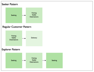
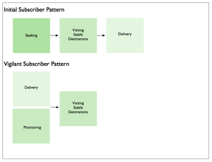
To make the patterns easier to understand, the illustrations and descriptions below show the different modes that make up each pattern.
Seeker, Regular Customer, Explorer Patterns

Seeker
The Seeker is looking for something. Once found, the Seeker goes elsewhere to accomplish other goals.

Regular Customer
The Regular Customer visits the same destination(s) consistently for the same reasons. Then the Regular Customer realizes they can save the time and effort of visiting, and switches modes to have the things they need delivered directly to them.

Explorer
The Explorer is learning about a new (or changed) environment; exploring it’s structure, contents, laws, etc. The Explorer may do this for their own purposes, or for others.

Initial Subscriber, Vigilant Subscriber Patterns

Initial Subscriber
The Initial Subscriber seeks what is needed, finds the things needed, goes to their location(s), and then chooses to have these things delivered to allow them to seek other things.

Vigilant Subscriber
The Vigilant Subscriber makes effective use of monitoring and delivery, followed up with visitation of destinations, to ensure they do not miss out on anything that might be useful to them within the environment.

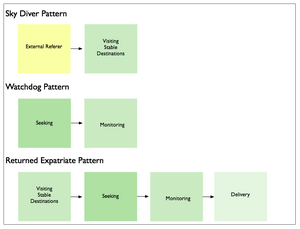
Skydiver, Watchdog, Returned Expatriate Patterns

Skydiver
The Skydiver makes a bold entrance from outside the environment, and lands precisely on target.

Watchdog
The Watchdog first finds things, and then places them under careful watch.

Returned Expatriate
The Returned Expatriate was away, and is back again. They begin by revisiting known places, then seek out what has changed, monitor changes for a while, and eventually begin to have valuable things delivered.

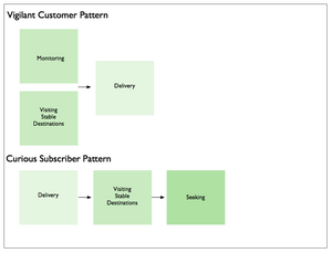
Vigilant Customer, Curious Subscriber Patterns

Vigilant Customer
The Vigilant Customer comes by often, but wants to be sure, and so monitors things from afar for a while before deciding delivery is more effective.

Curious Subscriber
The Curious Subscriber has things delivered regularly, but visits all the same to see what else may be available. And just to be sure, they seek out the things they suspect are here, but cannot see immediately.

Reusing Modes and Patterns
Reuse is rare in the realm of user experience and information architecture. The information retrieval modes we identified are independent of user role, persona, or user type. As a result, the patterns assembled from those modes are also independent of the same contextual factors. Since the modes and patterns are not tied to specific features, functionality, or information structures, this would seem to indicate that modes and patterns may resuable in different environments for user populations pursuing similar root goals.

I hope mode-based patterns like these offer some level of reusability. To that end, I am curious about where and how they help define information retrieval experiences for other types of users and other domains.

If you use them, send me a note about where, when, and how.

1 comment » | Information Architecture, Modeling, User Experience (UX)

Discovering User Goals / IR Goal Definitions

June 24th, 2006 — 12:00am

In an earlier post on creating Goal Based Information Retrieval Experiences, I offered a list of fundamental user goals that underlays needs and usage of four suggested information retrieval modes. In this post, I’ll share the approach employed to discover the fundamental goals of the users in our environment, with the aim of offering it as one way of understanding goals relevant for other types of environments and user experience architectures.

Since the root user goals we identified are potentially applicable to other environments and contexts, I’ll share the definitions behind the full set of root goals we discovered. Together, the approach and definitions should help demonstrate how capture a systematic and also holistic view of what users have need to accomplish when undertaking information retrieval tasks more complex than searching.

Finally, addressing the perspective of strategic design and user experience methodology, framing broad user goals well offers strong footing for addressing business perspectives, and engaging business audiences in productive discussions on the priority of capabilities and the functionality of the user experience.

Discovering Root Goals
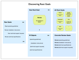
Beginning with raw goals gathered via a mixed palette of discovery and user research (interviews, task analysis, contextual inquiry, or other qualitative insight methods) incorporated into the project, we first called out the different types or objects of information users identified.

Our starting lists of raw user goals or needs looked something like this (though it was considerably larger, and more varied):

  • Read operating guidelines
  • Review installation instructions
  • Scan technical support requests
  • Review technical specifications

Identifying the objects in this set is not difficult: technical specifications, operating guidelines, installation instructions, and support requests. The activity verbs are also easy to spot:

  • read
  • scan
  • review

We then compared the activity verbs for similarity and differences, and refined these raw goals into a root goal of “review” that could apply to any of the objects users named.
Recombining the root goal with various objects yields a set of concrete goals:

  • Review operating guidelines
  • Review installation instructions
  • Review technical specifications
  • Review technical support requests

This approach is more art than science, but is systematic, and is independent of context and format.

Here’s an illustration of the process.

Discovering Root Goals

Final Root Goals For Our Environment
These are the definitions we established for the root goals we found for all our different types of users. [I haven’t included the objects of the goals, or the concrete goals.]

  • To Assess means to make a judgement or decision about, considering relevant factors
  • To Compare means to review the similarities and differences of two or more examples of the same type of thing by looking at them in detail
  • To Find means to learn the location and status of
  • To Identify means to distinguish by the use of specific criteria
  • To Locate means to become aware of where and how a thing may be found, and / or contacted. Locate and find are similar, so likely reflect differing but similar usages and contexts in the minds of users
  • To Monitor means to track the status and location of
  • To Obtain means to acquire and retain for other purposes
  • To Participate means to be present and recognized
  • To Review means to examine in detail
  • To Save means to store and keep
  • To See means to be presented with in a manner that makes assumed relationships or characteristics apparent
  • To Understand means to consider all available points of view or sources of information on a topic / item / situation, and formulate an opinion and frame of reference for one’s own purposes.

Some example concrete goals for an user experience that addresses travel planning could include:

  • Find hotels
  • Review hotel accommodations
  • Save travel itineraries
  • Compare vacation packages
  • See optional excursions offered by a hotel
  • Identify full-service or all-inclusive resorts
  • Locate the operators of scuba diving excursions
  • Monitor the price of airline tickets to Sardinia
  • Understand how to plan and purchase vacations
  • Assess the cost and value of a vacation package

Symmetry and Mental Models
We found the concept of a root goal insightful for helping to design user experience architectures because it is independent of particular user roles, information types, and usage contexts. Being root elements, they point at commonalities rather than differences, and so can help guide the definition of mental models that span user groups, or allow the reuse of an information architecture element such as a navigation component, task flow, or screen layout.

Building numerous concrete goals that are variations on a smaller set of common root goals allows the mental model for the environment to achieve a greater degree of consistency and predictability (we hope – we’ll see what the usability and evaluations bring back). This consistency helps further efforts toward symmetry throughout the information architecture. While most information architects unconsciously reach for symmetry in user experiences by designing repeated elements such as common labeling, rules for layout, and component systems of features and functionality – symmetry is something we should make more conscious efforts to encourage both within environments and across environments.

Speaking To the Business: Goal-based Prioritization of Capabilities and Functionality
With solid root goals and common information objects, it’s possible to build up a simple and consistent grammar that outlines the set of possible concrete goals across user types. This set of goals is a good basis for engaging business stakeholders in choosing the right set of priorities to guide design and build efforts. Systematically articulated goals allow business audiences a comfortable and neutral basis for prioritizing the capabilities the environment will offer users. Of course, choices of capability directly affect costs, effort levels, design and build timelines, and all the other tangible aspects of a user experience. Reference priorities can also help guide longer-term investment and strategy decisions.

Comment » | Information Architecture, User Experience (UX), User Research

Goal Based Information Retrieval Experiences

June 20th, 2006 — 12:00am

Though it’s common practice, thinking of information retrieval exclusively as ‘search’ is an arbitrarily narrow way of framing an area of capability with strong impact on overall perceptions of user experience quality and effectiveness. In the long term, it limits opportunities to offer customers more effective solutions to broader and more fully understood needs that involve information retrieval, but are motivated by other goals. This narrow view is especially limiting for the user experience architect, as it implies an immediate focus on the search aspects of information environments.
A better way of framing information retrieval is in terms of opportunities to meet genuine user goals and objectives by supporting more varied modes of activity. Users often have broad goals in mind while they pursue information retrieval activities; buying a car, making a good investment decision, or learning how to manage their health care plans. And yet the information architecture of many environments still overemphasizes searching as a way of accomplishing goals.
Addressing broader goals with an effective information retrieval experience will likely mean supporting modes of interaction beyond just searching. But providing these additional modes and user experience capabilities can open new opportunities for services, features, revenue, improving relationships, etc.
Even in situations where a wide range of users need to select very specific materials from a large archive or pool of content (the traditional library model), a search-centric information retrieval model that offers no/few other capabilities is reductive and overly simplistic.
Instead of immediately focusing on the scope or functionality of a search experience and system installation, look for the patterns in user goals and needs that imply common modes of interaction with information, and use them as a basis for defining capabilities the environment must offer.
Here’s a list of common types of user goals that involve information retrieval – think of them as root goals that take on different specialized forms in differing environments:

  • reviewing summaries of items
  • examining details
  • comparing multiples
  • understanding contexts and situations
  • learning about people in the environment
  • perceiving trends
  • predicting implications
  • monitoring status or activity
  • identifying by criteria
  • establishing similarity
  • obtaining information for reuse

None of these explicitly includes the activity of searching, though many do imply some level of finding.
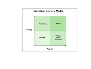
For a recent project, we defined four information retrieval or interaction modes that would meet the goals of our expected users:

  • seeking information
  • visiting stable destinations
  • monitoring notifications
  • receiving delivered assets

These modes range from more active seeking, to less active receiving delivery, and persistent settings (stable destinations) to fluid settings – monitoring or seeking. Together, they define possible kinds of information retrieval experiences and capabilities that will meet the varying needs and goals of users when properly combined.
Information Retrieval Modes

Seeking
The seeking mode focuses on traditional searching, but includes other activities such as narrowing sets using cumulative parameters, finding with/in faceted systems, and . A classic example of seeking mode is a user who poses an ad-hoc query via a search interface, and sorts through the list of search results returned in response. This list may incorporate many different kinds of items from many different sources, a combination that no other user ever encounters again.
From an information architecture perspective, the key characteristic of seeking mode is that, users bring the situations and contexts (like search results) they encounter into existence by seeking them out. When seeking, users encounter fluid destinations within the larger information environment based on what they are looking for, and how they are looking for it.
Another characteristic of the seeking mode is that users will not know in advance what they will encounter, even though they may have a very good idea of what they need to meet their goal. When seeking, users might be presented with a mixed set of conceptually related items of many different types, from unknown sources, with diverse contents / structure / composition.
Of course, users may not know what they need, or how to ask for it, as Donna Maurer’s 4 Modes of Seeking Information and How to Design for Them points out, but this was a less important factor in the way we framed seeking within our environment than whether users would know what to expect as a result of their seeking activities, and whether they could retrace their path to a particular step of their journey.
Visiting Stable Destinations
When visiting stable destinations, users encounter stable places within the information environment that exist regardless of the user’s activities. Where seeking invokes temporary contexts do not persist, a stable destination is persistent. Persistence could be conceptual only, reflected in navigation elements, or made part of the user experience via any number of mechanisms. All destinations have a focus of some kind, such as a topic, or product, or event, and may be defined by the intersection of several focuses, such as products or documents created by one person that are related to a topic or event.
Destinations could take the form of many kinds of pages – including the A-Z indexes Donna mentions – but could also consist of predetermined combinations of conditions and context that users can revisit without choosing them again. In an environment of known contents, destinations offer users a set of things they understand in advance and expect (after adequate opportunities for learning). Destinations will likely change based on business rules and user context, as well as changes in the items available within the environment.
A good example of a stable destination is the Arts page of the New York Time online; the articles and the art they concern change constantly, yet users know what to expect when they visit. The page is a visible part of the environment conceptually (as a category) and in terms of navigation, and is easily accessible directly from outside the environment.
Monitoring
The monitoring mode is a more fluid and less active information retrieval mode wherein the environment sends users notifications of events, activity, status, or changes taking place within it’s boundaries. The key characteristic of monitoring is that users can accomplish goals without entering the environment, or with only limited entry that takes them to a known setting.
Monitoring effectively extends the user experience and information retrieval capabilities beyond the boundaries of the originating environment, and allows users to know in advance what they will find or encounter when they enter the environment.
Monitoring naturally requires messages or communication tokens, commonly email, RSS, or SMS, but could take many other forms as well. A good example of monitoring is the configurable alerts that many travel services provide to indicate when prices for airline tickets to specific cities change, or match a price point.
Receiving Items via Delivery
Receiving delivered items is the least active mode we defined for users, allowing them to retrieve information without actively seeking, visiting a destination, or monitoring the environment. In this mode, users do not have to enter the environment at all to retrieve information, enabling them to further goals without increasing acquisition costs or effort.
Delivery implies mechanisms to manage the nature, rate, and format of the information to deliver, as well as the channel: email, attachments, RSS, podcasts, vlogs, etc.
Good examples of delivered information are the iconic stock ticker, RSS feeds for blog postings, and email publications.
Combining Modes: User Goals and Customer Lifecycles
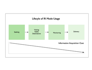
It’s natural that user goals will span modes, and that the preferred mode for accomplishing a goal may change over time to reflect shifting usage patterns and needs.
As an example, a single user might shift among different modes that reflect learning more about the structure and content of the environment. From initial seeking activity focused on searching for information related to a topic, a user may switch to visiting a known stable destination that addresses that topic, entering the environment from the outside without initial seeking.
This destination may include tools to establish monitoring for a specific type of item, which a user who understands the domain will appreciate and take advantage of as a way to reduce the number of required visits while remaining aware of activity or status. Eventually, this user might shift from monitoring to direct delivery of a few specific and very valuable information assets, through a channel and in a format of their choosing.
IR Mode Lifecycle

In the same way that patterns in goals allow experience architects to identify common modes of information retrieval, patterns of cross-mode usage will emerge in populations of users or customers. Once understood, these kinds of flows present opportunities on many levels; user experience, business model or process, and technical architecture.

Related posts:

Comment » | Information Architecture

Signs of Crisis and Decline In Organizations

April 21st, 2006 — 12:00am

A few months ago I came across a presentation titled Organizations in Crisis and Decline, by Randall Dunham. After giving examples of organizations in crisis and decline that include Kmart, General Motors, United Airlines, and Michael Jackson. (interesting example of an enterprise…), Dunham goes on to summarize typical symptoms of crisis, the strategic consequences of decline, and 10 behaviors of unhealthy organizations.

I came across this while doing some research on how the structures and cultures of organizations influence modes of thinking, resilience, and decision making, so this is related to some of my postings on enterprise software. It might be a while before I have the chance to write up all the ideas, so I’ll share Dunham’s material now.

Why is this of note to IAs? Quite a few Information architects (practitioners, not just those with the title…) are actively looking for effective tools and modes of understanding to help frame and manage enterprise problems.

Understanding the signs of decline and crisis in organizations can help information architects and other change agents understand the environmental context of a situation in the critical early stages of setting expectations and roles, and before it’s “too late”, when everyone at the management table has strong opinions they must defend. In other words, before making a leap is into an active project, a planning and budgeting cycle, a strategic vision session, etc.

I see (at least) two very important aspects of a situation that Dunham’s warning signs could help identify; how healthy an organization is, and what latitude for activity and change is available. Building on this, these criteria can help identify situations to avoid or be wary of. Of course, organizations in crisis and decline can present opportunities as well as risks, but sometimes the ship is going down no matter how much you try to patch the holes…

For those without powerpoint, I’m going to present some of the material here as text, with acknowledgment that I’m borrowing directly from Dunham, who himself credits this source: Mische, M.A. (2001). Ten warning signs of strategic Decline. In Strategic Renewal: Becoming a High-Performance Organization (pp. 25-30). Upper Saddle River, NJ: Prentice Hall.
Typical Symptoms of Crisis/Decline

  • Lower earnings & revenues
  • Increased employee turnover
  • Reduced market presence
  • Decrease in customer satisfaction & interest
  • Increasing costs & high structural costs

Strategic Consequences of Crisis/Decline

  • Lower market value
  • Inconsistent strategies
  • Misalignment of internal strategies & external goals
  • Diminished capacity to attract top talent
  • Increased vulnerability

10 Behaviors that Signal Decline

  • The organization exhibits a lack of understanding the environmental and economic realities confronting it, or is in denial
  • The management of the organization is arrogant with regard to its view of the world & assessment of its internal competencies. Ex: Icarus Paradox
  • The organization has lost perspective with respect to customers, products, suppliers, and competitors
  • Management and employees have an insular focus or preoccupation with internal processes, internal measurements, and politics
  • The organization has lost its sense of urgency and lacks an attitude of self-determination
  • The organization is relying on historical and poorly conceptualized or inappropriate business strategies and traditional management methods to address new & different challenges
  • The organization has the propensity to repeat mistakes and fails to learn from past experiences
  • The organization has low or slow innovation practices and is late to market with new products/services
  • The organization has a tendency to recycle marginally performing managers
  • The organization relies exclusively on internal talent as a source of leadership

Key Factors that Contribute to Decline

  • Age of the organization: Older, more established firms may rely on legacy practices
  • Size of the organization: Large firms with many vertical levels can have trouble adapting
  • Financial success and past performance: Past success can lead to desire to follow same path in hopes of future success
  • Ownership and equity structure: Is there accountability at all times to outside agents?
  • Environmental influences: External shocks
  • Ability to learn and discern patterns: Lack of learning organization culture
  • Certainty/uncertainty: Effectiveness of change management
  • Leadership: Young & inexperienced without desire to learn

Success Can Drive Crisis

  • The same processes that lead to success in an organization can also lead to failure
  • This is because success promotes rigidity, resistance to change, and habitual response
  • Biggest problem – people learn the ‘right’ way to solve a problem and do that over and over again, even if that way will no longer solve the problem

It’s true these are quite general. Naturally, the art is in knowing how to apply them as criteria, or interperet what you found. As a quick test of accuracy, I’ve used the behaviors and warning signs to retrospectively review several of the organizations I’ve seen from the inside. When those organizations showed several of the behaviors and warning signs at an aggregate level (not necessarily my group, but the whole enterprise) then the strategic consequence dunham mentioned were visible at the same time.

From a practical perspective, a rating scale or some indicators of relative degree would be very useful. In order to gauge whether to stay or go, you need to understand the intensity of the decline or crisis and what action you can take: for example, do you have time to go back to the cabin to save your handwritten screenplay before the ship sinks?

Comment » | Information Architecture

Scatterplots As Page Shapes?

March 1st, 2006 — 12:00am

The February edition of Usability News reports on a usability study (Where’s the Search? Re-examining User Expectations of Web Objects) of user expectations for Web page layouts that contains a surprising but interesting visualization of page shapes, based on quantitative user research. (Note: I found the study via the UI Design Newsletter, from HFI.)

The study looks at users” expectations for the location of common web page components, such as site search and advertising. The authors find that expectations for page layouts are largely the same now, as compared to those found in an earlier study, Developing Schemas for the Location of Common Web Objects, conducted in 2001.

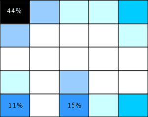
More interesting is the way the researchers report their results; visualizing them as heat map style grid plots for the expected location of each element vs. a blank grid. Here’s two examples, the first showing expected locations for ‘back to home’ links, the second for the ‘site search engine’.

Figure 1: Back to Home Link Location
backtohome.gif

Figure 2: Site Search Engine Location
sitesearch.gif

These heat maps look a lot like page shapes, expressed as scatterplots.

I like the combination of quantitative and qualitative perspectives at work in these page shapes rendered as scatterplots. I think it could allow for grounded discussion and interpretation of user feedback on design options, within a clear and simple structure that doesn’t require an HCI degree to appreciate. If I try it out, I’ll share the outcomes.

In a more traditional style of visualization, Eric Scheid found another another good example of page shapes a while back in Jonathon Boutelle’s posting on blog layouts called “Mullet”-style blog layout. Jonathon was advocating for a new default blog page shape that increases information density and scent, but hews closely to pre-existing expectations.

Figure 3: Typical Blog Page Shape
typical_small-thumb.jpg

Figure 4: Suggested Blog Page Shape
mullet_small.jpg
And that’s the last time I’m mentioning m.u.l.l.e.t.s this year, lest Google get the wrong idea about the subject matter of this blog :)

Comment » | Information Architecture, User Research

Starbucks and Stroopwafels

February 8th, 2006 — 12:00am

In two earlier posts about Starbucks and product metadata, I mentioned the strange sensation of a product experience overwhelmed by packaging – specifically the metadata aspects of the packaging. Now I’d like to share two more examples of packaging burdened with metadata cruft. The first shows an awkward translation that is an attempt to smooth a significant semantic transition or boundary, one created by a high degree of relative cultural and conceptual distance between Dutch and English food categories. The second shows a phenomenon I call brand subsumption. These examples of translation and brand subsumption broaden the original problem into one of inconsistency and misalignment with the overall experience. Starbucks has built an empire on the repeatable, predictable customer experience, and so this inconsistency impacts the Starbucks brand. [At least for those who read the packaging for their food…]

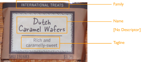
In the first example, Starbucks uses a marketing dictionary to transform stroopwafels into ‘Dutch Caramel Wafers’ that are ‘rich and caramelly-sweet’. I can understand the inclination to change the product name; stroopwafel is a Dutch word that’s likely outside the awareness of most Starbucks customers. And it’s certainly further away in terms of cultural distance than ‘madeleine’. But the resulting translation is awkward because it addresses a very narrow point of view: It’s only if you’ve forgotten the proper Dutch word while trying to explain the concept of a stroopwafel that you’ll need to fall back on a label that reads “Dutch caramel wafer”.

Caramel Wafers Label:
swaffles_annotated_1.jpg

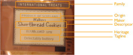
Example two is a branding mashup, involving Walkers Short Bread Cookies and Starbucks. In addition to the standard labeling from the madeleines, we’re now told the maker, the country of origin, and when the maker was established, for a total of six pieces of information. The new elements exactly match the standard branding of most Walkers merchandise. I call this phenomenon brand subsumption, when one brand subsumes another without breaking it down. The Walkers brand arguably has greater international recognition and a longer history than Starbucks, so I imagine the deal bringing their ‘delectably buttery’ cookies to Starbucks counters everywhere required this unusual compromise. The resulting experience is an uneven hybrid; not Walkers, not Starbucks.

Walkers Package Label:
walkers_annotated_1.jpg

Looking at all three products together, it’s clear the new product family attached to both packages, ‘International Treats’, contributes to the brand impact by introducing a puzzling inconsistency. Compare the original item that started us on this path – madeleines, designated ‘Traditional Favorites’ – with the Dutch and Scottish products labeled ‘International’. Labeling the madeleines French but not international makes no sense, until you turn over the packages: the stroopwafels are made in the Netherlands, the shortbread cookies are made in Scotland, and the madeleines are made in the US. The same product label on one package denotes a cultural category for food items, but on other packages defines the manufacturing location. The product family labels are used for different purposes, which belies their consistent presentation context across products, via similar style, layout, structure, colors, fonts, etc.

Altogether, the combination of metadata quantity, labeling inconsistency, and branding strategies of translation and subsumption, is unexpected from Starbucks – a company built on consistent customer experiences.

Comment » | Customer Experiences, Information Architecture, User Experience (UX)
The Continuing Death of Enterprise Software

January 6th, 2006 — 12:00am

Over at 37Signals, just before the new year started, David made the prediction that by the end of 2006, “Enterprise will follow legacy to become a common insult among software creators and users.”

I think this is already the case, unless the people you’re talking to earn their bread and butter by doing something related to enterprise software – but there’s interesting ground here that I’d like to explore for a bit. On the 37signals site there were some good comments to Dave’s posting – from developers, entrepreneurs, and quite a few other perspectives – but no one made the connection to Conway’s Law, from Melvin Conway’s “How Do Committees Invent?”, which I’ll quote here:
“…organizations which design systems… are constrained to produce designs which are copies of the communication structures of these organizations.”

A good example of Conway’s Law in action is PowerPoint. As Edward Tufte says in Metaphors For Presentations: Conway’s Law Meets PowerPoint,”The metaphor of PowerPoint is the software corporation itself.” [Aside: As a hard-working consultant who spends *waaaayyy* too much time creating presentations to use as discussion vehicles when instead a direct conversation between relevant parties is by far the best use of everyone’s time and money, I can’t say enough good things about Tufte’s campaign to remind the business world how to communicate clearly, by avoiding PowerPoint unless it’s appropriate…]

It’s no surprise then that ‘enterprise software’ as it is installed and configured in many large corporations is generally massive, anonymous, byzantine in structure and workings, indifferent or hostile to individual needs, offensively neutered in all aspects of it’s user experience, and often changed arbitrarily to align with a power calculus determined by a select few who operate at great remove from the majority of the people who use the environment on a daily basis. After all, that is the nature of communication in many large (and quite a few small and medium sized) corporations.

That enterprise software is bad – excruciatingly bad, if you’ve tried to enter expenses using a generic installation of PeopleSoft or Siebel – is hardly news. But it is interesting that David from 37Signals, Peter Merholz of Adaptive Path, Jared Spool of UIE, and many others who are less visible but still important in directing the evolution of the Internet, would all say in one form or another that they see enterprise software as on the outs.

It’s interesting because I think it highlights a shift in the realm in which the Web community sees itself as relevant. If there were ever a potential enterprise platform, it is the Web – the new Web, Web 2.0, whatever you want to call the emerging information environment that is global, ubiquitous, semantically integrated, socially informed and / or collaborative, architected to provide readily consumable services, etc. But aside from occasional bouts of megalomania, and potential success stories like Salesforce.com, the enterprise realm has been pro-forma outside the boundaries of the possible – until now…

Will enterprise software die? Not right away, and not totally. Remember, there’s A LOT of big iron happily humming away like WOPR in data centers all over the world that will run the enterprise apps we all know and detest for many years to come. More important, let’s keep in mind that enterprise software is really just one part (the installable and configurable software part) of what is easiest to describe as a way of doing things. It’s a reflection of a command and control, hierarchical viewpoint on how to achieve business goals through standardization. That way of doing things comes from a way of thinking. Which comes from a type of organization that will (of necessity?) be with us for a long time.

But the new stuff, the things that new school CIOs and CTOs will commit to, will likely be very different in origin, manner of working, user experience, fundamental assumptions, and capability. It will come from different kinds of organizations; leaner and more agile multi-disciplinary systems and environment design consortiums or aggregates, perhaps. This matches well with some of Jared Spool’s observations on the nature of organizations that create good designs, from his keynote address at UI 10 last fall.

Closing the circle, Conway confirms what these creators will look like; “Primarily, we have found a criterion for the structuring of design organizations: a design effort should be organized according to the need for communication.”

Comment » | Enterprise, Information Architecture, User Experience (UX)
Back to top