December 15th, 2005 — 12:00am
We rely on many ways of recognizing people, near at hand or from afar; faces, voices, walks, and even the scents from favorite colognes or perfumes help us greet friends, engage colleagues, and identify strangers.
I was in high school when I first noticed that everyone’s key chain made a distinct sound, one that served as a kind of audible calling card that could help recognize people. I started to try to guess who was walking to the front door by learning the unique combinations of sounds — clinking and tinkling from metal keys, rattling and rubbing from ceramic and plastic tokens, and a myriad of other noises from the incredible miscellany people attach to their key rings and carry around with them through life — that announced each of my visitors friends. With a little practice, I could pick out the ten or fifteen people I spent the most time with based on listening to the sounds of key chains. Everyone else was someone I didn’t see often, which was a fine distinction to draw between when gauging how to answer the door.
There are many other audible cues to identity — from the closing of a car door, to the sound of foot steps, or cell phone ring tones — but the key chain is unique because it includes so many different elements: the number and size and materials of the keys, or the layering of different key rings and souveniers people attach to them. A key chain is a sort of impromptu ensemble of found instruments playing little bursts of free jazz like personalized fanfares for modern living.
The sound of someone’s key chain also changes over time, as they add or remove things, or rearrange them. That sound can even change in step with the way your relationship to that person changes. For example, if they buy a souvenier with you and put it on their keychain; or if you give them keys to your apartment. Each of these changes reflects shared experiences, and you can hear the difference in sound from one day to the next if you listen carefully.
And like those other ways of recognizing people I mentioned earlier, which all reach the level of being called signatures when they become truly distinctive, the sound of someone’s key chain serves a sort of audible signature.
Until now, the sound of a keychain was perhaps the only truly unique audible signature that was not part of our person to begin with (like the voice). Now that Jason Freeman has created the iTunes Signature Maker, we may have an audible signaure suitable for the digital realm. The iTunes Signature Maker scans your iTunes library, taking one or two second snippets of many files, and mixing these found bits of sound together into a short audio signature. You choose from a few parameters such as play count, total number of songs, and whether to include videos, and the signature maker produces a .WAV file.
I made an iTunes signature using Jason’s tool a few days ago. I’ve listened to it a few times. It certainly includes quite a few songs I’ve listened to often and can recognize from just a one-second snippet. Calligraphers and graphologists make much of a few handwritten letters on a page: music can say a great deal about someone’s moods, outlook, tastes, or even what moves their soul. I listen to a lot of music via radio, CD’s and even live that isn’t included in this. I’m not sure it represents me. I think it’s up to everyone else to decide that.
But what can you do with one? It’s not practical yet to attach it to email messages, like a conventional .sig. It might be a good way to bookend the mixes I make for friends and family. I can see having a lot of fun listening to a bunch of anonymous iTunes signatures from your friends to try and guess which one belongs to whom. There’s real potential for a useful but non-exhaustive answer to the inevitable question, “What kind of music do you like?” when you meet someone new. Along those lines, Jason may have kicked off a new fad in Internet dating; this is the perfect example of a unique token that can compress a great deal of meaning into a small (digital) package that doesn’t require meeting or talking to exchange. I can see the iTunes signature becoming a speed-dating requisite; bring your iTunes signature file with you on a flash drive or iPod shuffle, and listen or exchange as necessary.
At least the name is easy: what else would you call this besides a “musig”. Maybe an “iSig” or a “tunesig”.
Unique ring tones, door chimes, and start-up sounds are only the beginning. Combine musigs with the music genome project, and you could upload your signature to a clearinghouse online, and have it automatically compared for matches against other people’s musigs based on patterns and preferences. Have it find someone who likes reggae-influenced waltzes, or fado, or who listens to at least ten of the same artists you enjoy. Build a catalog of one musig every month for a year, and ask the engine to describe the change in your tastes. Add a musig to your Amazon wishlists for gift-giving, or even ask it to predict what you might like based on the songs in the file.
You can download my musig / iSig / tunesig / iTunes signature here; note that it’s nearly 8mb.
I’ll think I’ll try it again in a few months, to see how it changes.
No related posts.
Comment » | The Media Environment
December 8th, 2005 — 12:00am
Katrina’s ill winds are bringing some good, in the form of increased awareness of and willingness to consider New Urban architecture and urban planning options for the rebuilding Gulf Coast towns.
I first encountered New Urbanism while reading William Kunstler’s The Geography of Nowhere. Kunstler has written several additional books exploring the creation and evolution of the modern American suburbanscape since The Geography of Nowhere, all of them making reference to New Urbanism. It’s recently popped up in two articles the NY Times. The first, Out of the Muddy Rubble, a Vision for Gulf Coast Towns, by Bradford McKee, recounts the efforts of architects and planners from a variety of perspectives, including members of the Congress for the New Urbanism, to put forth a viable plan for the healthy redevelopment of damaged Gulf Coast towns.
If you’ve not heard yet, New Urbanism advocates the creation of walkable, human scale communities emphasizing mixed use envionments with patterns and structure that allow people to meet daily needs without reliance on automobiles. In short, New Urbanism is an architecture and planning framework that actively opposes sprawl.
Sprawl benefits the short term at the expense of the long term. Critics of New Urbanism often choose to interperet it as a school that restricts the rights of individual property owners, rather than as a series of positive guidelines for how to design communities that are healthy in the long run. But of course that’s always been the short-term view of the long-term greater good…
The dramaticly differing points of view in favor of and opposed to New Urbanist approaches come through very clearly in this exchange:
»
The Miami architect Andres Duany, a principal figure in the New Urbanism movement, urged the casino owners to integrate the casinos more seamlessly among new clusters of retail stores and restaurants rather than as isolated establishments.
Describing his vision, Mr. Duany said, “You step out onto a beautiful avenue, where you can get a chance to look at the water and the marvelous sunsets and the shops, and walk up and down to restaurants and easily find taxis to other places.“
But Mr. Duany’s design sharply clashed with the casino owners’ main priority.
“A casino owner wants people to stay on the property,” said Bernie Burkholder, president and chief executive of the Treasure Bay Casino, in Biloxi.
“As running-dog capitalist casino owners, we need to understand that the community fits together,” he added, “but we need an economic unit that will hold the customer.“
»
The second: Gulf Planning Roils Residents also by Bradford McKee, published a few days after the first on December 8, 2005, captures some of the reactions to the plans from Gulf Coast residents. Naturally, the reactions are mixed.
But it’s important to remember that sprawl is a very temporary and surreal status quo, one that created the utterly improbably ecological niche of the personal riding mower. If that’s not a hot-house flower, then what is?
Some links to resources about New Urbanism:
Newurbanism.org
transitorienteddevelopment.org
Conscious Choice
New Urban Timelines
New Urban News
Congress For the New Urbanism
No related posts.
Comment » | Architecture, Civil Society
December 2nd, 2005 — 12:00am
Update: Version 1.1 of the Intranet Review Toolkit is available as of 03/20/2006, and now includes a summary spreadsheet.
Thanks go to James Robertson for very gently reminding me that the licensing arrangements for the Intranet Review Toolkit preclude republishing it as a summarized form, such as the spreadsheet I posted earlier today. In my enthusiasm to share a tool with the rest of the community, I didn’t work through the full licensing implications…
Accordingly, I’ll be removing the spreadsheet from harms way immediately, while hoping it’s possible to make it available in a more legally acceptable form.
Apologies to James and the rest of the Toolkit team for any unintended harm from my oversight.
Related posts:
Comment » | Information Architecture, Intranets, Tools
November 18th, 2005 — 12:00am
In the overview of the new “results oriented” UI planned for MS Office 12, our friends in Redmond offer:
“The overriding design goal for the new UI is to deliver a user interface that enables users to be more successful finding and using the advanced features of Microsoft Office. An additional important design goal was to preserve an uncluttered workspace that reduces distraction for users so that they can spend more time and energy focused on their work.”
Let me get that straight. Your first goal is to make it easier for me to find and use advanced features that the vast majority of people employ rarely if ever, and didn’t need in the first place?
And something else that was also important – but not as important as access to all those shiny advanced features – was to make the workspace uncluttered and allow me to focus on my work?
Isn’t that… backwards?
Related posts:
Comment » | User Experience (UX)
November 17th, 2005 — 12:00am
I got caught in an on-line opinion survey trap last week. The setup: In exchange for 10% off my next purchase, a Banana Republic cashier told me, I had to answer a few questions about my shopping experience. Retailers often solicit opinions from customers in return for a variety of rewards. It’s common enough that there’s an understanding on the amount of information requested, in exchange for the expected reward. So I thought I was safe…
Twenty screens later, after answering more than fifty questions and with no end in sight, I was feeling a little cranky. Even my wife was irritated; I was holding up grocery shopping for dinner guests. Very quickly, the reward for my time shifted from a coupon, to using Banana Republic as an example of an on-line survey experience that undermines your brand.
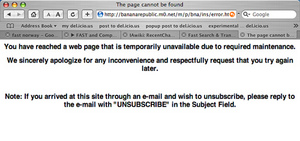
The full survey ran more than thirty five screens, and ended with an error message. Very professional.
Thumbnails of the whole survey:
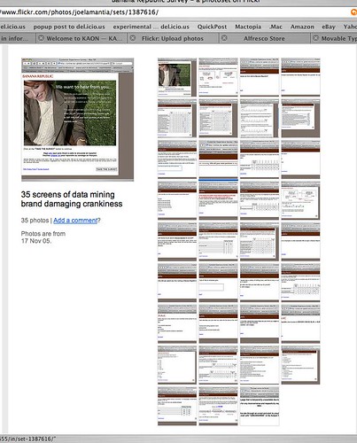
For kicks, I posted the screenshots to Flickr. If you run the slideshow, you can see where I became frustrated and started to give spoiler answers – like wearing a size 98, or spending $10 / year on clothing.
Why was the survey experience bad?
1. They didn’t make clear how much time they were asking for. The opening screen said 10 minutes, this is misleading for a 100 question survey. If you’re asking for my time, respect me enough to be honest about what’s required.
2. They didn’t make the real purpose of the survey clear. From the shopping experience itself, the questions quickly shifted to my age, income, marital status, and education level. This is a transparent attempt to feed data mining and demographic needs that relied on an amateur segue to turn the conversation around and ask for personal information.
3. They contradicted the experience I had in their store. The store staff were nice enough to keep track of the umbrella I left in a fitting room, and return it before I left, which was thoughtful. Consistency is the core of a successful brand, but the survey experience was inconsistent.
How does this damage Banana Republic’s brand?
1. Banana Republic left me with a series of negative impressions that work against their brand values: I now feel I was chosen to participate in a survey under false pretenses, a survey that offers me little value in return for important personal information that is inappropriate to ask for in the first place.
2. Banana Republic closed a growing channel for conducting business with a customer. I may purchase more from their stores — if I have no other retailer at hand, and I need business clothes to meet with a client CEO the next morning once again — but I’m certainly not willing to engage with them online.
Merchants in all areas of retailing work very hard to encourage customers to form positive associations with their brands. Fashion retailers work especially hard at encouraging customers to associate values, such as trust and respect, with a brand because these values serve as the foundation for longer term and more lucrative relationships with customers than single purchases. Every experience a customer has with your brand — every touch point — influences this network of associations, reinforcing or weakening the link between a brand and the feelings that customers have about the products and the company behind it. A simple test any retailer should use when considering bringing an experience to customers is wether the experience will reinforce the right brand associations.
Loyalty programs, and their offspring the online opinion survey, are good examples of the intersections of customer interests and retailer interests in an experience that can reinforce a customer’s perceptions of the brand and the values associated with it. Many retailers manage these kinds of programs well.
Just not Banana Republic.
The error message at the end.
Error Message:
I wear size 98:
Size 98:

Related posts:
Comment » | User Experience (UX)
November 17th, 2005 — 12:00am
At least according to the Boston Globe article titled Don’t underestimate the value of social skills, in which Penelope Trunk quotes an HBS faculty member as follows:
’In fact, across the board, in a wide variety of businesses, people would rather work with someone who is likable and incompetent than with someone who is skilled and obnoxious, said Tiziana Casciaro, a professor at Harvard Business School. “How we value competence changes depending on whether we like someone or not,” she says.‘
I guess this explains how we ended up with George W. Bush as President…
No related posts.
Comment » | The Working Life
November 4th, 2005 — 12:00am
A few months ago, I put up a posting on Mental Models Lotus Notes, and Resililence. It focused on my chronic inability to learn how not to send email with Lous Notes. I posted about Notes, but what led me to explore resilience in the context of mental models was the surprising lack of acknowledgement of the scale of hurricane Katrina I came across at the time. For example, the day the levees failed, the front page of the New York Times digital edition carried a gigantic headline saying ‘Levees Fail! New Orleans floods!’. And yet no one in the office at the time even mentioned what happened.
My conclusion was that people were simply unable to accept the idea that a major metropolitan area in the U.S. could possibly be the setting for such a tragedy, and so they refused to absorb it – because it didn’t fit in with their mental models for how the world works. Today, I came across a Resilience Science posting titled New Orleans and Disaster Sociology that supports this line of thinking, while it discusses some of the interesting ways that semantics and mental models come into play in relation to disasters.
Quoting extensively from an article in The Chronicle of Higher Education titled Disaster Sociologists Study What Went Wrong in the Response to the Hurricanes, but Will Policy Makers Listen? the posting calls out how narrow slices of media coverage driven by blurred semantic and contextual understandings, inaccurately frame social responses to disaster situations in terms of group panic and the implied breakdown of order and society.
“The false idea of postdisaster panic grows partly from simple semantic confusion, said Michael K. Lindell, a psychologist who directs the Hazard Reduction and Recovery Center at Texas A&M University at College Station. ‘A reporter will stick a microphone in someone’s face and ask, ‘Well, what did you do when the explosion went off?’ And the person will answer, ‘I panicked.’ And then they’ll proceed to describe a very logical, rational action in which they protected themselves and looked out for people around them. What they mean by ‘panic’ is just ‘I got very frightened.’ But when you say ‘I panicked,’ it reinforces this idea that there’s a thin veneer of civilization, which vanishes after a disaster, and that you need outside authorities and the military to restore order. But really, people usually do very well for themselves, thank you.’
Mental models come into play when the article goes on to talk about the ways that the emergency management agencies are organized and structured, and how they approach and understand situations by default. With the new Homeland Security paradigm, all incidents require command and control approaches that assume a dedicated and intelligent enemy – obviously not the way to manage a hurricane response.
“Mr. Lindell, of Texas A&M, agreed, saying he feared that policy makers in Washington had taken the wrong lessons from Katrina. The employees of the Department of Homeland Security, he said, ‘are mostly drawn from the Department of Defense, the Department of Justice, and from police departments. They’re firmly committed to a command-and-control model.’ (Just a few days ago, President Bush may have pushed the process one step further: He suggested that the Department of Defense take control of relief efforts after major natural disasters.)
“The habits of mind cultivated by military and law-enforcement personnel have their virtues, Mr. Lindell said, but they don’t always fit disaster situations. ‘They come from organizations where they’re dealing with an intelligent adversary. So they want to keep information secret; ‘it’s only shared on a need-to-know basis. But emergency managers and medical personnel want information shared as widely as possible because they have to rely on persuasion to get people to cooperate. The problem with putting FEMA into the Department of Homeland Security is that it’s like an organ transplant. What we’ve seen over the past four years is basically organ rejection.’
If I read this correctly, misaligned organizational cultures lie at the bottom of the whole problem. I’m still curious about the connections between an organization’s culture, and the mental models that individuals use. Can a group have a collective mental model?
Accoridng to Collective Mental State and Individual Agency: Qualitative Factors in Social Science Explanation it’s possible, and in fact the whole idea of this collective mental state is a black hole as far as qualitative social research and understanding are concerned.
Related posts:
Comment » | Modeling, The Media Environment
November 3rd, 2005 — 12:00am
Apparently, if you wait long enough, all circles close themselves. Case in point: I’ve always thought Golding’s Lord of the Flies nicely captures several of the less appetizing aspects of the typical american junior high school experience.
And I’ve always thought that much of the reality television programming that was all the rage for a while and now seems to be passing like a Japanese fad, is simply a chance for people on all sides of the screen to revisit their own junior high school experiences once again — albeit with a full complement of adult secondary sexual characteristics. When I do channel surf past the latest incarnation of the primal vote-the-jerk-off-the-island epic, Golding’s book always comes to mind.
Then a friend recommended Koushun Takami’s Battle Royale as recreational reading. Battle Royale is, as Tom Waits says, ‘big in Japan’ – it being a Japanese treatment of some of the same themes that drive Lord of the Flies.
The editorial review from Amazon reads:
“As part of a ruthless program by the totalitarian government, ninth-grade students are taken to a small isolated island with a map, food, and various weapons. Forced to wear special collars that explode when they break a rule, they must fight each other for three days until only one “winner” remains. The elimination contest becomes the ultimate in must-see reality television.”
And so the circle closes…
Related posts:
Comment » | Reading Room, The Media Environment
October 28th, 2005 — 12:00am
I can’t take credit for writing this parable about the relationship of information architecture and interaction design — that goes to another member of the IAI — but I can help share it.
»»
A scorpion who was an Information Architect and a frog who was an Interaction Designer were standing on the bank of a raging river of information.
“Let’s define the problem” said the IA. “I can’t swim, but I need to get across that river.“
“Well — I can swim” said the ID “I could take you across, but I’m afraid that when we get halfway, you might pull out a Venn Diagram and hit me over the head with it.“
“Never!” cried the IA. “Let us brave the river of information together!“
And so they dived in.
When they were halfway across the river, the IA took a out a wireframe and stabbed the ID in the back with it.
As they both slowly sank beneath the waves, the ID cried “Why did you do that? Now we’ll both drown!“
Replied the Information Architect: “Because I was defined that way.“
»»>
I think the message is clear: What truly matters is getting across the river. But that can be very hard to see, if your perspective doesn’t allow it.
Case in point: Spring of 2001, literally a week after the bubble burst, I was in Vegas with the rest of the Experience Design Group from Zefer. We were in the middle of one of those impossible to imagine now but completely sensible at the time 150 person design group summit meetings about the company’s design methodology, practice, group structure, etc.
Our IPO had just gone south, very permanently, but that wouldn’t by clear for several months. After a mini-rebellion at which we the assembled design consultants voted to skip the summit’s officially sanctioned training and discussion activities in favor of lots of self-organized cross-practice something or other sessions, I ended up sitting in a room with the rest of the Usability and IA folks from the other offices.
Who promptly decided to define all the other design specialities in detail, because doing so was the key to understanding our own roles. From here we were to move on to itemize all the tasks and design documentation associated with each discipline, and then define the implicit and explicit connections to the specific IA deliverables. In alphabetical order. Using flip charts, white boards, stickies, and notepads.
After five minutes, I went and to see what the Visual Designers were doing. They were sitting in a circle in a large and quiet room, discussing their favorite examples of good design in products, experiences, typography, interfaces; their goal was to help show the value of design practices to clients. Some of them were also practicing yoga, though I’m not sure that was related. The overall experience was quite a bit more — engaging. And useful / effective / relevant, especially outside the boundaries of the group. The visual designers wanted to get across the river, while the IA’s were taken over by the complusion to be diligent information architects.
Maybe it’s a perspective difference?
No related posts.
Comment » | Information Architecture
October 25th, 2005 — 12:00am
Getting coffee this afternoon, I saw several packages of tasy looking madeleines sitting in front of the register at Starbucks. For the not small number of people who don’t know that shell shaped pastries made with butter are called madeleines – not everyone has seen The Transporter yet – the package was helpfully labeled “Madeleines”.
Proving that tagging as a practice has gone too far, right below the word madeleines, the label offered the words “tasty French pastry”.
Just in case the customers looking at the clear plastic package aren’t capable of correctly identifying a pastry?
Or to support the large population who can’t decide for themselves what qualifies as tasty?
Comment » | Architecture, Information Architecture