September 24th, 2005 — 12:00am
User Research can be so relentlessly earnest and purposeful that it gets to be a bit stifling. After a few dozen well-crafted personas work their way purposefully through a set of mildly challenging but inevitably successful scenarios for the tenth time in one week, a diligent user researcher is likely to be hungering for something a bit more satisfying; something akin to the persona, but more fully-rounded; something that conveys the ambiguous complexity of human character with honesty; something not only insightful, but consistently forthright across a multiplicity of aspects. Perhaps even something that is genuinely malapert.
Food Court Druids, Cherohonkees, And Other Creatures Unique to the Republic is that something. Written by Robert Lanham, it’s a hilarious collection of idiotypes – stereotypes outside the design world, personas within – couched as the outcome of serious scientific inquiry whose method is called idiosyncrology.
I advise reading with humility close at hand, since it’s likely you’ll find yourself inside, and it’s only fair to laugh at everyone if you’re included…

Here’s the description:
Lanham, author of The Hipster Handbook and creator and editor of the Web site www.freewilliamsburg.com, extends his anthropological examination of Americans beyond trendy Brooklyn neighborhoods to the entire country, where Yanknecks (“rebel-flag-waving rednecks who live outside the South”), Sigmund Fruits (“people who insist on telling you about their dreams”) and others have existed thus far without being formally studied by “idiosyncrologists” like Lanham and his team. Presented with the authoritative tone of a serious anthropological study, complete with an Idio Rank Scale that assesses the weirdness of each type, many of Lanham’s profiles are hilariously accurate descriptions of co-workers, family members, friends and other acquaintances that almost every American has encountered at some point in their lives. There are the Cornered Rabid Office Workers (CROWs), who “claim to be poets or playwrights” when discussing their work with strangers, “even if they just spent the last nine hours doing data entry on the McFlannery acquisition,” and Hexpatriates, Americans who decry everything about America yet never actually leave the country (and who “refer to the Loews multiplex at the mall as ‘the cinema’ and the Motel Six by Hardees as ‘the pensione”). Illustrations by Jeff Bechtel, depicting the fashion sense of Holidorks (people who wear holiday-themed clothing) and Skants (women with shapely butts who always wear spandex pants), enhance Lanham’s characterizations.
Related posts:
Comment » | Reading Room, User Research
September 23rd, 2005 — 12:00am
But not the new features list for the next release. In a previous post Lotus Notes UI = Disease, I cited a SearchDomino.com article in which Ken Bisconti, IBM Lotus vice president of Workplace, portal and collaboration products, is quoted as saying “Through improvements such as contextual collaboration and support for composite apps, we’ve gone *above and beyond simple UI enhancement*”. [Emphasis mine.] Above and beyond? I think UI enhancement – which is often far from simple, especially when the existing user experience is fundamentally flawed – is exactly what Notes needs.
After watching software development first hand, I know that many Product Managers understand the importance of quality, design, and meeting users’ needs, but do not feel empowered to work against the pervasive featuritis that leads to unusable bloatware. Good product managers and designers often work for organizations or managers who remain blinded by standard practices and marketing driven perceptions of priority, and thus feel it’s impossible to step off the new functionality treadmill.
That is, unless they are armed with information that indicates to the contrary.
The article in Ken’s statement appears, Beyond Notes 7.0: IBM Lotus sketches ‘Hannover’ user experience, is dated June 14, 2005. Yet when digging it bit more, I discovered an earlier piece from May 9, 2005, titled Better UI tops Notes users’ wish list, in which the same author, Peter Blochner, reports on the results of an open request for Lotus Notes features made by Ed Brill(Brill heads the worldwide sales group for Notes, according to Blochner). In his review of user responses to Brill’s question, Blochner says, “the most requested feature was for an improved user interface for Notes.”
Simple UI enhancement is all that the users want, and they’ve said it themselves. Yet Notes is going way beyond this? Despite repeated and public requests for this from committed users (Ed Brill’s blog is a predominantly Notes-friendly forum) in their own voices, and in response to questions from your own team. Why not listen to them?
For reference, Blochner’s article is reproduced below:
By Peter Bochner
09 May 2005 | SearchDomino.com
IBM is already working on plans for the next major releases of Lotus Notes beyond 7.0. Last week, on May 3, visitors to the blog site of Ed Brill, who heads up worldwide sales for Lotus Notes and Domino, were asked, “If you could add one feature to Lotus Notes 7.x, what would it be?”
As of May 9, his question has garnered 184 comments, although many respondents circumvented the question’s one-feature limit by submitting multiple posts.
To kick off the thread, Brill provided his own request – multi-level undo – and that was reiterated by seven posters. However, the most requested feature was for an improved user interface for Notes. “It’s time to give the Notes client UI a much-needed facelift,” wrote one respondent. When people say Exchange is better than Notes, said another, “What they are saying is that the Outlook interface is . . .nicer than the [Notes] mail template. A top UI for the next release would top off a lot of end-user complaints.”
Only a handful of responses mentioned specific suggestions for improving the UI. One asked for “a first-class, richly configurable Welcome Panel that resembles a Web portal.” Another suggested UI improvements such as “more user-selectable columns in folders/views, having preferences all in one place, or rules that can act on documents already in the mail file.” Still another requested “a sexy modern mail template with a single UI in Notes and on the Web.”
Finally, one user said, “What would it be worth if every part of the Notes mail experience, which …is the Notes interface for the majority of users, from the toolbars to the icons to interaction and behavior, was consistent, modern, clean and inviting? There is no point in having the superior everything if it’s not appealing to look at.”
P.S. Brill has requested a moratorium on suggestions, because the thread is now so long it has become unwieldy.
Related posts:
Comment » | User Experience (UX), User Research
September 22nd, 2005 — 12:00am
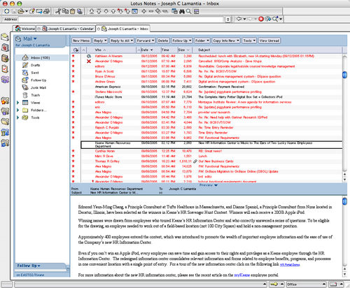
Lotus Notes has one of the most unpleasant and unwelcoming User Experiences this side of a medium-security prison where the warden has aspirations towards interior design and art instruction. One of the most painful aspects of the Notes experience is the default settings for font size and color in the email window. The default font size (for Macs) is on the order of 7 point type, and the default color for unread messages is — ironically — red. The combination yields a user experience that resembles a bad skin rash.
I call it “angry red microNotes” disease, and it looks like this:

Overall, it has an unhealthy affect on one’s state of mind. The undertones of hostility and resentment running throughout are manifold. And naturally, it is impossible to change the default font size and color for the email reader. This is further confirmation for my theory that Notes has yet to escape it’s roots as a thick client for series of unconnected databases.
After three weeks of suffering from angry red microNotes, I realized I was literally going blind from squinting at the tiny type, and went to Google for relief. I found niniX 1.7, a utility that allows Mac based Lotus Notes users the ability to edit the binary format Notes preferences file, and change the font size of the email client. I share it in the hopes that others may break the chains that blind them. This will only solve half the problem — if someone can figure out how to change the default color for unread messages to something besides skin rash red, I will happily share with the rest of the suffering masses (and apparently there are on the order of 118 million of us out there).
But will it always be this (horrible) way?
In Beyond Notes 7.0: IBM Lotus sketches ‘Hannover’ user experience Peter Bochner of SearchDomino.com says this of the next Notes release, “Notes has often been criticized for its somewhat staid user interface. According to IBM’s Bisconti, in creating Hannover, IBM paid attention “to not just the user interface, but the user experience.“
Okay… So does that mean I’ll have my choice of diseases as themes for the user experience of my collaboration environment?
According to Ken Bisconti, IBM Lotus vice president of Workplace, portal and collaboration products, “Through improvements such as contextual collaboration and support for composite apps, we’ve gone above and beyond simple UI enhancement”.
I think simple UI enhancement is exactly what Ken and his team should focus on for the next several years, since they have so much opportunity for improvement.
Comment » | Enterprise, Tools, User Experience (UX)
September 17th, 2005 — 12:00am
A tip o’ the hat to Richard Boakes for foiling a second-rate spammer by buying up the domain they were promoting with comment spam before they did.
Related posts:
Comment » | The Media Environment
September 15th, 2005 — 12:00am
JP Morgenthal of DMReview.com offers a snapshot of the process for defining enterprise semantics in Enterprise Architecture: The Holistic View: The Role of Semantics in Business.
Morgenthal says, “When you understand the terms that your business uses to conduct business and you understand how those terms impact your business, you can see clearly how to support and maintain the processes that use those terms with minimal effort.”
Not a surprise, but how to make it happen, and how to explain that to the business?
Related posts:
Comment » | Architecture, Information Architecture
September 14th, 2005 — 12:00am
In the same way that information architecture helps take users’ understandings of the structure, meaning, and organization of information into account at the level of domain-specific user experiences, information spaces, and systems, the complex semantic boundaries and relationships that define and link enterprise-level domains is a natural area of activity for enterprise information architecture.
Looking for some technically oriented materials related to this level of IA – what I call enterprise semantic frameworks – I came across a solid article titled Enterprise Semantics: Aligning Service-Oriented Architecture with the Business in the Web Services Journal.
The authors – Joram Borenstein and Joshua Fox – take a web-services perspective on the business benefits of enterprise-level semantic efforts, but they do a good job of laying out the case for the importance of semantic concepts, understanding, and alignment at the enterprise level.
From the article abtract:
“Enterprises need transparency, a clear view of what is happening in the organization. They also need agility, which is the ability to respond quickly to changes in the internal and external environments. Finally, organizations require integration: the smooth interoperation of applications across organizational boundaries. Encoding business concepts in a formal semantic model helps to achieve these goals and also results in additional corollary benefits. This semantic model serves as a focal point and enables automated discovery and transformation services in an organization.”
They also offer some references at the conclusion of the article:
- Borenstein, J. and , J. (2003). “Semantic Discovery for Web Services.” Web Services Journal. SYS-CON Publications, Inc. Vol. 3, issue 4. www.sys-con.com/webservices/articleprint.cfm?id=507
- Cowles, P. (2005). “Web Service API and the Semantic Web.” Web Services Journal. SYS-CON Publications, Inc. Vol. 5, issue 2. www.sys-con.com/story/?storyid=39631&DE=1
- Genovese, Y., Hayword, S., and Comport, J. (2004). “SOA Will Demand Re-engineering of Business Applications.” Gartner. October 8.
- Linthicum, D. (2005). “When Building Your SOA…Service Descriptions Are Key.” WebServices.Org. March 2005. www.webservices.org/ws/content/view/full/56944
- Schulte, R.W., Valdes, R., and Andrews, W. (2004). “SOA and Web Services Offer Little Vendor Independence.” Gartner. April 8.
- W3C Web Services Architecture Working Group: www.w3.org/2002/ws/arch/
Related posts:
Comment » | Architecture, Information Architecture, Modeling
September 7th, 2005 — 12:00am
Comment » | Information Architecture
September 6th, 2005 — 12:00am
Some additional reading on mental models, courtesy of the Interaction Design Encyclopedia.
Related posts:
Comment » | Modeling
September 6th, 2005 — 12:00am
From the “House Committee on Democratic Reform Fact Sheet: Estimated Tax Savings of Bush Cabinet if the Repeal of the Estate Tax Is Made Permanent”:
The estate tax, the most progressive American tax, is paid only by the very wealthy. The top 5% of taxpayers pay almost 99% of estate taxes, and the top tenth of 1% of taxpayers pay more than 33%.3 The vast majority of Americans are already exempt from the estate tax. As a result, they will receive no benefit at all from making the repeal permanent.
Those with much to gain from the repeal include the President and his Cabinet. Based on estimates of the net worth of President Bush, Vice President Cheney, and each of the Cabinet members, the President, Vice President, and the Cabinet are estimated to receive a total tax benefit of between $91 million and $344 million if the estate tax repeal is made permanent. The President himself is estimated to save between $787,000 and $6.2 million, while Vice President Cheney is estimated to save between $12.6 million and $60.7 million.
The complete Factsheet is available from Congress.
No related posts.
Comment » | Civil Society
September 5th, 2005 — 12:00am
Several very unpleasant experiences I’ve had with the Lotus Notes webmail client during the past few weeks have brought up some questions about mental models; specifically how users respond to challenges to their mental models, and how resilience plays a part in how changes to mental models occur.
The IAWiki defines a mental model as, “a mental model is how the user thinks the product works.” This is a simplified definition, but it’s adequate for the moment. For a deeper exploration, try Martina Angela Sasse’s thesis
Eliciting and Describing Users’ Models of Computer Systems.
In this case, the model and the challenge are straightforward. My mental model of the Notes webmail client includes the understanding that it can send email messages. The challenge: the Lotus webmail client cannot send email messages – at least not as I experience it.
Here’s what happens my mental model and my reality don’t match:
- I log in to my email client via Firefox – the only browser on the Mac that renders the Notes webmail client vaguely correctly – (I’m using webmail because the full Notes client requires VPN, meaning I’m unable to access anything on my local network, or the internet, which, incidentally, makes it difficult to seem like a credible internet consultant.) again, because it’s frozen and crashed my browser in the past ten minutes.
- I realize I need to respond to an email
- I do not remember that the Notes webmail client is incapable of sending out email messages
- I open a new message window, and compose a chunk of semi-grammatical techno-corporate non-speak to communicate a few simple points in blame-retardant consultantese
- I attempt to send this email
- I am confronted with a cryptic error message via javascript prompt, saying something like “We’re really sorry, but Domino sucks, so you can’t send out any messages using your email client.”
- Over the span of .376 seconds, I move through successive states of surprise, confusion, comprehension, frustration, anger, resentment, resignation, and malaise (actually, mailaise is more accurate.)
- I swear: silently if clients are within earshot, out loud if not
- I switch to gmail, create a new message, copy the text of my message from the Notes webmail window to Gmail, and send the message to some eagerly waiting recipient
- I close the Notes webmail client, and return to business as usual.
- I forget that the Notes webmail client cannot send email messages.
Despite following this same path three times per day, five days each week, for the past five weeks, (for a total of ~75 clear examples), I am always surprised when I can’t send a message. I’m no expert on Learning theory but neither lack of attention nor stubbornness explain why seventy-five examples aren’t enough to change my model of how Notes works.
Disciplines including systems theory, biology, and sociology use a concept called resilience. In any stable system, “Resilience generally means the ability to recover from some shock, insult, or disturbance.” From an ecological perspective, resilience “is a measure of the amount of change or disruption that is required to transform a system.” The psychological view emphasizes “the ability of people to cope with stress and catastrophe.”
Apparently, the resilience of my model for email clients is high enough to withstand considerable stress, since – in addition to the initial catastrophe of using Notes itself – seventy-five consecutive examples of failure to work as expected do not equal enough shock, insult, and disturbance to my model to lead to a change my in understanding.
Notice that I’m using a work-around – switching to Gmail – to achieve my goal and send email. In
Resilience Management in Social-ecological Systems: a Working Hypothesis for a Participatory Approach , Brian Walker and several others refine the meaning of resilience to include, “The degree to which the system expresses capacity for learning and adaptation.” This accounts nicely for the Gmail work-around.
I also noticed that I’m relying on a series of assumptions – email clients can send messages; Notes is an email client; therefore, Notes can send messages – that make it logical to use a well established model for email clients in general to anticipate the workings of Notes webmail in particular. In new contexts, it’s easier to borrow an existing model than develop a new one. In short order, I expect I’ll change one of the assumptions, or build a model for Notes webmail.
Here’s a few questions that come to mind:
- What factors determine the resilience of a mental model?
- How to measure resiliency in mental models?
- What’s the threshold of recovery for a mental model?
- Put another way, what’s required to change a mental model?
Based on a quick review of the concept of resilience from several perspectives, I’m comfortable saying it’s a valuable way of looking at mental models, with practical implications for information architects.
Some of those implications are:
- Understand the relevance of existing mental models when designing new systems
- Anticipate and plan the ways that users will form a mental model of the system
- Use design at multiple levels to further the formation of mental models
- Understand thresholds and resilience factors when challenging existing mental models
From a broader view, I think it’s safe to say the application of systems theory to information architecture constitutes an important area for exploration, one containing challenges and opportunities for user experience practitioners in general, and information architects in particular.
Time to close this post before it gets too long.
Further reading:
Bio of Ludwig Bertalanffy, important contributor to General System Theory.
Doug Cocks Resilience Alliance
Garry Peterson’s blog Resilience Science
Related posts:
Comment » | Modeling, User Experience (UX)

