10 Best Practices For Displaying Tag Clouds
This is a short list of best practices for rendering and displaying tag clouds that I originally circulated on the IXDG mailing list, and am now posting in response to several requests. These best practices are not in order of priority – they’re simple enumerated.
- Use a single color for the tags in the rendered cloud: this will allow visitors to identify finer distinctions in the size differences. Employ more than one color with discretion. If using more than one color, offer the capability to switch between single color and multiple color views of the cloud.
- Use a single sans serif font family: this will improve the overall readability of the rendered cloud.
- If accurate comparison of relative weight (seeing the size differences amongst tags) is more important than overall readability, use a monospace font.
- If comprehension of tags and understanding the meaning is more important, use a variably spaced font that is easy to read.
- Use consistent and proportional spacing to separate the tags in the rendered tag cloud. Proportional means that the spacing between tags varies based on their size; typically more space is used for larger sizes. Consistent means that for each tag of a certain size, the spacing remains the same. In html, spacing is often determined by setting style parameters like padding or margins for the individual tags.
- Avoid separator characters between tags: they can be confused for small tags.
- Carefully consider rendering in flash, or another vector-based method, if your users will experience the cloud largely through older browsers / agents: the font rendering in older browsers is not always good or consistent, but it is important that the cloud offer text that is readily digestible by search and indexing engines, both locally and publicly
- If rendering the cloud in html, set the font size of rendered tags using whole percentages, rather than pixel sizes or decimals: this gives the display agent more freedom to adjust its final rendering.
- Do not insert line breaks: this allows the rendering agent to adjust the placement of line breaks to suit the rendering context.
- Offer the ability to change the order between at least two options — alphabetical, and one variable dimension (overall weight, frequency, recency, etc.)
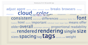
For fun, I’ve run these 10 best practices through Tagcrowd. The major concepts show up well – font, color, and size are prominent – but obviously the specifics of the things discussed remain opaque.
Category: Tag Clouds | Tags: tagclouds, tagging, visualization 12 comments » Comment »
