Last year, I had the pleasure of collaborating on a paper with Tony Russell-Rose and Stephann Makri that builds on and extends our work to understand and articulate a framework for discovery needs and activities – what we refer to as the Language of Discovery – showing examples of concrete application and use.
It’s been a while in coming, but I’m happy to say the complete paper ‘Defining and Applying a Language for Discovery’ – is available now.
I’ve reproduced the complete text of the paper below, and there’s also a pdf for download.
Abstract
In order to design better search experiences, we need to understand the complexities of human information-seeking behaviour. In this paper, we propose a model of information behaviour based on the needs of users across a range of search and discovery scenarios. The model consists of a set of modes that users employ to satisfy their information goals.
We discuss how these modes relate to existing models of human information seeking behaviour, and identify areas where they differ. We then examine how they can be applied in the design of interactive systems, and present examples where individual modes have been implemented in interesting or novel ways. Finally, we consider the ways in which modes combine to form distinct chains or patterns of behaviour, and explore the use of such patterns both as an analytical tool for understanding information behaviour and as a generative tool for designing search and discovery experiences.
1 Introduction
Classic IR (information retrieval) is predicated on the notion of users searching for information in order to satisfy a particular ‘information need’. However, much of what we recognize as search behaviour is often not informational per se. For example, Broder [2] has shown that the need underlying a given web search could in fact be navigational (e.g. to find a particular site) or transactional (e.g. through online shopping, social media, etc.). Similarly, Rose & Levinson [12] have identified the consumption of online resources as a further common category of search behaviour.
In this paper, we examine the behaviour of individuals across a range of search scenarios. These are based on an analysis of user needs derived from a series of customer engagements involving the development of customised search applications.
The model consists of a set of ‘search modes’ that users employ to satisfy their information search and discovery goals. It extends the IR concept of information-seeking to embrace a broader notion of discovery-oriented problem solving, addressing a wider range of information interaction and information use behaviours. The overall structure reflects Marchionini’s framework [8], consisting of three ‘lookup’ modes (locate, verify, monitor), three ‘learn’ modes (compare, comprehend, evaluate) and three ‘investigate’ modes (explore, analyze, synthesize).
The paper is structured as follows. In Section 2 we discuss the modes in detail and their relationship to existing models of information seeking behaviour. Section 3 describes the data acquisition and the analysis process by which the modes were derived. In Section 4 we investigate the degree to which the model scales to accommodate diverse search contexts (e.g. from consumer-oriented websites to enterprise applications) and discuss some of the ways in which user needs vary by domain. In addition, we explore the ways in which modes combine to form distinct chains or patterns, and reflect on the value this offers as a framework for expressing complex patterns of information seeking behaviour.
In Section 5 we examine the practical implications of the model, discussing how it can be applied in the design of interactive applications, at both the level of individual modes and as composite structures. Finally, in Section 6 we reflect on the general utility of such models and frameworks, and explore briefly the qualities that might facilitate their increased adoption by the wider user experience design community.
2 Models of Information Seeking
The framework proposed in this study is influenced by a number of previous models. For example, Bates [1] identifies a set of 29 search ‘tactics’ which she organised into four broad categories, including monitoring (“to keep a search on track”). Likewise, O’Day & Jeffries [11] examined the use of information search results by clients of professional information intermediaries and identified three categories of behaviour, including monitoring a known topic or set of variables over time and exploring a topic in an undirected fashion. They also observed that a given search scenario would often evolve into a series of interconnected searches, delimited by triggers and stop conditions that signalled transitions between modes within an overall scenario.
Cool & Belkin [3] proposed a classification of interaction with information which included evaluate and comprehend. They also proposed create and modify, which together reflect aspects of our synthesize mode.
Ellis and his colleagues [4, 5, 6] developed a model consisting of a number of broad information seeking behaviours, including monitoring and verifying(“checking the information and sources found for accuracy and errors”). In addition, his browsing mode (“semi-directed searching in an area of potential interest”) aligns with our definition of explore. He also noted that it is possible to display more than one behaviour at any given time. In revisiting Ellis’s findings among social scientists, Meho and Tibbo [10] identified analysing (although they did not elaborate on it in detail). More recently, Makri et al [8] proposed searching(“formulating a query in order to locate information”), which reflects to our own definition of locate.
In addition to the research-oriented models outlined above, we should also consider practitioner-oriented frameworks. Spencer [14] suggests four modes of information seeking, including known-item (a subset of our locate mode) andexploratory (which mirrors our definition of explore). Lamantia [7] also identifies four modes, including monitoring.
In this paper, we use the characteristics of the models above as a lens to interpret the behaviours expressed in a new source of empirical data. We also examine the combinatorial nature of the modes, extending Ellis’s [5] concept of mode co-occurrence to identify and define common patterns and sequences of information seeking behaviour.
3 Studying Search Behaviour
3.1 Data Acquisition
The primary source of data in this study is a set of 381 information needs captured during client engagements involving the development of a number of custom search applications. These information needs take the form of ‘micro-scenarios’, i.e. a brief narrative that illustrates the end user’s goal and the primary task or action they take to achieve it, for example:
- Find best offers before the others do so I can have a high margin.
- Get help and guidance on how to sell my car safely so that I can achieve a good price.
- Understand what is selling by area/region so I can source the correct stock.
- Understand a portfolio’s exposures to assess investment mix
- Understand the performance of a part in the field so that I can determine if I should replace it
The scenarios were collected as part of a series of requirements workshops involving stakeholders and customer-facing staff from various client organisations. A proportion of these engagements focused on consumer-oriented site search applications (resulting in 277 scenarios) and the remainder on enterprise search applications (104 scenarios).
The scenarios were generated by participants in breakout sessions and subsequently moderated by the workshop facilitator in a group session to maximise consistency and minimise redundancy or ambiguity. They were also prioritised by the group to identify those that represented the highest value both to the end user and to the client organisation.
This data possesses a number of unique properties. In previous studies of information seeking behaviour (e.g. [5], [10]), the primary source of data has traditionally been interview transcripts that provide an indirect, verbal account of end user information behaviours. By contrast, the current data source represents a self-reported account of information needs, generated directly by end users (although a proportion were captured via proxy, e.g. through customer facing staff speaking on behalf of the end users). This change of perspective means that instead of using information behaviours to infer information needs and design insights, we can adopt the converse approach and use the stated needs to infer information behaviours and the interactions required to support them.
Moreover, the scope and focus of these scenarios represents a further point of differentiation. In previous studies, (e.g. [8]), measures have been taken to address the limitations of using interview data by combining it with direct observation of information seeking behaviour in naturalistic settings. However, the behaviours that this approach reveals are still bounded by the functionality currently offered by existing systems and working practices, and as such do not reflect the full range of aspirational or unmet user needs encompassed by the data in this study.
Finally, the data is unique in that is constitutes a genuine practitioner-oriented deliverable, generated expressly for the purpose of designing and delivering commercial search applications. As such, it reflects a degree of realism and authenticity that interview data or other research-based interventions might struggle to replicate.
3.2 Data Analysis
These scenarios were manually analyzed to identify themes or modes that appeared consistently throughout the set, using a number of iterations of a ‘propose-classify-refine’ cycle based on that of Rose & Levinson [14]. Inevitably, this process was somewhat subjective, echoing the observations made by Bates [1] in her work on search tactics:
“While our goal over the long term may be a parsimonious few, highly effective tactics, our goal in the short term should be to uncover as many as we can, as being of potential assistance. Then we can test the tactics and select the good ones. If we go for closure too soon, i.e., seek that parsimonious few prematurely, then we may miss some valuable tactics.”
In this respect, the process was partially deductive, in applying the insights from existing models to classify the data in a top-down manner. But it was also partially inductive, applying a bottom-up, grounded analysis to identify new types of behaviour not present in the original models or to suggest revised definitions of existing behaviours.
A number of the scenarios focused on needs that did not involve any explicit information seeking or use behaviour, e.g. “Achieve a good price for my current car”. These were excluded from the analysis. A further number were incomplete or ambiguous, or were essentially feature requests (e.g. “Have flexible navigation within the page”), and were also excluded.
The process resulted in the identification of nine primary search modes, which are defined below along with an example scenario (from the domain of consumer-oriented search):
1. Locate: To find a specific (possibly known) item, e.g. “Find my reading list items quickly”. This mode encapsulates the stereotypical ‘findability’ task that is so commonly associated with site search. It is consistent with (but a superset of) Spencer’s [14] known item search mode. This was the most frequent mode in the site search scenarios (120 instances, which contrasts with just 2 for enterprise search).
2. Verify: To confirm that an item meets some specific, objective criterion, e.g. “See the correct price for singles and deals”. Often found in combination with locating, this mode is concerned with validating the accuracy of some data item, comparable to that proposed by Ellis et al. [5] (39 site search instances, 4 for enterprise search).
3. Monitor: Maintain awareness of the status of an item for purposes of management or control, e.g. “Alert me to new resources in my area”. This activity focuses on the state of asynchronous responsiveness and is consistent with that of Bates [1], O’Day and Jeffries [11], Ellis [4], and Lamantia [7] (13 site search instances, 17 for enterprise search).
4. Compare: To identify similarities & differences within a set of items, e.g. “Compare cars that are my possible candidates in detail”. This mode has not featured prominently in most of the previous models (with the possible exception of Marchionini’s), but accounted for a significant proportion of enterprise search behaviour [13]. Although a common feature on many ecommerce sites, it occurred relatively infrequently in the site search data (2 site search instances, 16 for enterprise search).
5. Comprehend: To generate independent insight by interpreting patterns within a data set, e.g. “Understand what my competitors are selling”. This activity focuses on the creation of knowledge or understanding and is consistent with that of Cool & Belkin [3] and Marchionini [9] (50 site search instances, 12 for enterprise search).
6. Evaluate: To use judgement to determine the value of an item with respect to a specific goal, e.g. “I want to know whether my agency is delivering best value”. This mode is similar in spirit to verify, in that it is concerned with validation of the data. However, while verify focuses on simple, objective fact checking, our conception of evaluate involves more subjective, knowledge-based judgement, similar to that proposed by Cool & Belkin [3] (61 site search instances, 78 for enterprise search).
7. Explore: To investigate an item or data set for the purpose of knowledge discovery, e.g. “Find useful stuff on my subject topic”. In some ways the boundaries of this mode are less prescribed than the others, but what the instances share is the characteristic of open ended, opportunistic search and browsing in the spirit of O’Day and Jeffries [11] exploring a topic in an undirected fashion and Spencer’s [14] exploratory (110 site search instances, 16 for enterprise search).
8. Analyze: To examine an item or data set to identify patterns & relationships,e.g. Analyze the market so I know where my strengths and weaknesses are”. This mode features less prominently in previous models, appearing as a sub-component of the processing stage in Meho & Tibbo’s [10] model, and overlapping somewhat with Cool & Belkin’s [3] organize. This definition is also consistent with that of Makri et al. [8], who identified analysing as an important aspect of lawyers’ interactive information behaviour and defined it as “examining in detail the elements or structure of the content found during information-seeking.” (p. 630). This was the most common element of the enterprise search scenarios (58 site search instances, 84 for enterprise search).
9. Synthesize: To create a novel or composite artefact from diverse inputs, e.g. “I need to create a reading list on celebrity sponsorship”. This mode also appears as a sub-component of the processing stage in Meho & Tibbo’s [10] model, and involves elements of Cool & Belkin’s [3] create and use. Of all the modes, this one is the most commonly associated with information use in its broadest sense (as opposed to information seeking). It was relatively rare within site search (5 site search instances, 15 for enterprise search).
Although the modes were generated from an independent data source and analysis process, we have retrospectively explored the degree to which they align with existing frameworks, e.g. Marchionini’s [8]. In this context, locate, verify, andmonitor could be described as lower-level ‘lookup’ modes, compare, comprehend, and evaluate as ‘learn’ modes and explore, analyze, and synthesize as higher-level ‘investigate’ modes.
4 Mode Sequences and Patterns
The modes defined above provide an insight into the needs of users of site search and enterprise search applications and a framework for understanding human information seeking behaviour. But their real value lies not so much in their occurrence as individual instances but in the patterns of co-occurrence they reveal. In most scenarios, modes combine to form distinct chains and patterns, echoing the transitions observed by O’Day and Jeffries [11] and the combinatorial behaviour alluded to by Ellis [5], who suggested that information behaviours can often be nested or displayed in parallel.
Typically these patterns consist of chains of length two or three, often with one particular mode playing a dominant role. Site search, for example, was characterized by the following patterns:
By contrast, enterprise search was characterized by a larger number of more diverse sequences, such as:
A further insight into these patterns can be obtained by presenting them in diagrammatic form. Figure 1 illustrates sequences 1-3 above plus other commonly found site search patterns as a network (with sequence numbers shown on the arrows). It shows how certain modes tend to function as “terminal” nodes, i.e. entry points or exit points for a given scenario. For example, Explore typically functions as an opening, while Comprehend and Evaluate function in closing a scenario. Analyze typically appears as a bridge between an opening and closing mode. The shading indicates the mode ‘level’ alluded to earlier: light tones indicate ‘lookup’ modes, mid tones are the ‘learn’ modes, and dark tones are the ‘investigate’ modes.
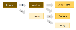 Fig. 1. Mode network for site search
Figure 2 illustrates sequences 4-8 above plus other commonly found patterns in the enterprise search data.
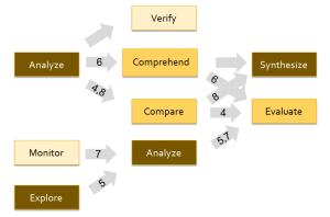 Fig. 2. Mode network for enterprise search
The patterns described above allow us to reflect on some of the differences between the needs of site search users and those of enterprise search. Site search, for example, is characterized by an emphasis on simpler “lookup” behaviours such as Locate and Verify (120 and 39 instances respectively); modes which were relatively rare in enterprise search (2 and 4 instances respectively). By contrast, enterprise search is characterized by higher-level “learn” and “investigate” behaviours such as Analyze and Evaluate (84 and 78 instances respectively, compared to 58 and 61 for site search). Interestingly, in neither case was the stereotype of ‘search equals findability’ borne out: even in site search (whereLocate was the most common mode), known-item search was accountable for no more than a quarter of all instances.
But perhaps the biggest difference is in the composition of the chains: enterprise search is characterised by a wide variety of heterogeneous chains, while site searched focuses on a small number of common trigrams and bigrams. Moreover, the enterprise search chains often displayed a fractal nature, in which certain chains were embedded within or triggered by others, to create larger, more complex sequences of behaviour.
5 Design Implications
Although the model offers a useful framework for understanding human information seeking behaviour, its real value lies in its use as a practical design resource. As such, it can provide guidance on issues such as:
- the features and functionality that should be available at specific points within a system;
- the interaction design of individual functions or components;
- the design cues used to guide users toward specific areas of task interface.
Moreover, the model also has significant implications for the broader aspects of user experience design, such as the alignment between the overall structure or concept model of a system and its users’ mental models, and the task workflows for various users and contexts. This broader perspective addresses architectural questions such as the nature of the workspaces required by a given application, or the paths that users will take when navigating within a system’s structure. In this way, the modes also act as a generative tool for larger, composite design issues and structures.
5.1 Individual modes
On their own, each of the modes describes a type of behaviour that may need to be supported by a given information system’s design. For example, an online retail site should support locating and comparing specific products, and ideally alsocomprehending differences and evaluating tradeoffs between them. Likewise, an enterprise application for electronic component selection should support monitoringand verifying the suitability of particular parts, and ideally also analyzing andcomprehending any relevant patterns and trends in their lifecycle. By understanding the anticipated search modes for a given system, we can optimize the design to support specific user behaviours. In the following section we consider individual instances of search modes and explore some of their design implications.
Locate
This mode encapsulates the stereotypical ‘findability’ task that is so commonly associated with site search. But support for this mode can go far beyond simple keyword entry. For example, by allowing the user to choose from a list of candidates, auto-complete transforms the query formulation problem from one of recall into one of recognition (Figure 3).
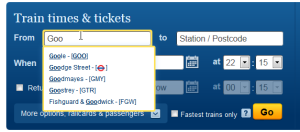 Fig. 3. Auto-complete supports locating
Likewise, Amazon’s partial match strategy deals with potentially failed queries by identifying the keyword permutations that are likely to produce useful results. Moreover, by rendering the non-matching keywords in strikethrough text, it facilitates a more informed approach to query reformulation (Figure 4).
 Fig 4: Partial matches support Locating
Verify
In this mode, the user is inspecting a particular item and wishing to confirm that it meets some specific criterion. Google’s image results page provides a good example of this (see Figure 5).
 Fig 5: Search result previews support verification
On mouseover, the image is zoomed in to show a magnified version along with key metadata, such as filename, image size, caption, and source. This allows the user to verify the suitability of a specific result in the context of its alternatives. Likewise, there may be cases where the user needs to verify a particular query rather than a particular result. In providing real-time feedback after every key press, Google Instant supports verification by previewing the results that will be returned for a given query (Figure 6). If the results seem unexpected, the user can check the query for errors or try alternative spellings or keyword combinations.
 Fig 6: Instant results supports verification of queries
Compare
The Compare mode is fundamental to online retail, where users need to identify the best option from the choices available. A common technique is to provide a custom view in which details of each item are shown in separate columns, enabling rapid comparison of product attributes. Best Buy, for example, supports comparison by organising the attributes into logical groups and automatically highlighting the differences (Figure 7).
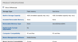 Fig 7: Separate views support product comparison
But comparison is not restricted to qualitative attributes. In financial services, for example, it is vital to compare stock performance and other financial instruments with industry benchmarks. Google Finance supports the comparison of securities through a common charting component (Figure 8).
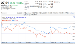 Fig 8: Common charts allow comparison of quantitative data
Explore
A key principle in exploring is differentiating between where you are going andwhere you have already been. In fact, this distinction is so important that it has been woven into the fabric of the web itself; with unexplored hyperlinks rendered in blue by default, and visited hyperlinks shown in magenta. Amazon takes this principle a step further, through components such as a ‘Recent Searches’ panel showing the previous queries issued in the current session, and a ‘Recent History’ panel showing the items recently viewed (Figure 9).
 Fig 9: Recent history supports exploration
Another simple technique for encouraging exploration is through the use of “see also” panels. Online retailers commonly use these to promote related products such as accessories and other items to complement an intended purchase. An example of this can be seen at Food Network, in which featured videos and products are shown alongside the primary search results (Figure 10).
 Fig 10: ‘See Also’ panels support exploration
A further technique for supporting exploration is through the use of auto-suggest. While auto-complete helps users get an idea out of their heads and into the search box, auto-suggest throws new ideas into the mix. In this respect, it helps users explore by formulating more useful queries than they might otherwise have thought of on their own. Home Depot, for example, provides a particularly extensive auto-suggest function consisting of product categories, buying guides, project guides and more, encouraging the discovery of new product ideas and content (Figure 11).
 Fig 11: Auto-suggest supports exploratory search
Analyze
In modes such as exploring, the user’s primary concern is in understanding theoverall information space and identifying areas to analyze in further detail. Analysis, in this sense, goes hand in hand with exploring, as together they present complementary modes that allow search to progress beyond the traditional confines of information retrieval or ‘findability’.
A simple example of this could be found at Google patents (Figure 12). The alternate views (Cover View and List View) allow the user to switch between rapid exploration (scanning titles, browsing thumbnails, looking for information scent) and a more detailed analysis of each record and its metadata.
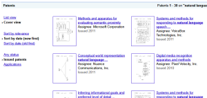 Fig 12: Alternate views support mode switching between exploration and analysis
In the above example the analysis focuses on qualitative information derived from predominantly textual sources. Other applications focus on quantitative data in the form of aggregate patterns across collections of records. NewsSift, for example, provided a set of data visualizations which allowed the user to analyze results for a given news topic at the aggregate level, gaining an insight that could not be obtained from examining individual records alone (Figure 13).
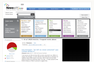 Fig 13: Visualizations support analysis of quantitative information
5.2 Composite patterns
The examples above represent instances of individual modes, showing various ways they can be supported by one or more aspects of a system’s design. However, a key feature of the model is its emphasis on the combinatorial nature of modes and the patterns of co-occurrence this reveals [12]. In this respect, its true value is in helping designers to address more holistic, larger scale concerns such as the appropriate structure, concept model, and organizing principles of a system, as well as the functional and informational content of its major components and connections between them.
Design at this level relies on translating composite modes and chains that represent sense-making activities – often articulated as user journeys through a task and information space – into interaction components that represent meaningful combinations of information and discovery capabilities [13]. These components serve as ‘building blocks’ that designers can assemble into larger composite structures to create a user experience that supports the anticipated user journeys and aligns with their users’ mental models [14].
The popular micro-blogging service twitter.com provides a number of examples of the correspondence between composite modes and interaction components assembled at various levels to provide a coherent user experience architecture.
Header Bar
The header bar at the top of most pages of twitter.com combines several informational and functional elements together in a single component that supports a number of modes and mode chains (Figure 14). It includes four dynamic status indicators that address key aspects of twitter’s concept model and the users’ mental models:
- the presence of new tweets by people the user follows
- interactions with other twitter users such as following them or mentioning them in a tweet
- activity related to the user’s profile, such as their latest tweets and shared media
- people, topics, or items of interest suggested by the systems recommender functions
These status indicator icons update automatically and provide links to specific pages in the twitter.com application architecture that provide further detail on each area of focus. The header bar thus enables Monitoring of a user’s activity within the full scope of the twitter.com network; i.e. its content, members, their activities, etc. The header bar also enables Monitoring activity within almost all the workspaces that users encounter in the course of their primary journeys throughtwitter.com.
 Fig. 14. twitter.com Header Bar
The Strategic Oversight chain (Monitor – Analyze – Evaluate) is a fundamental sequence for twitter users, repeated frequently with different aspects of the user’s profile. The header bar supports the first step of this chain, in which users Monitor the network for content and activity of interest to them, and then transition to Analysis and Evaluation of that activity by navigating to destination pages for further detail.
The header bar also includes a search box featuring auto-complete and auto-suggest functionality, which provides support for the Qualified Search mode chain (Locate – Verify). The search box also enables users to initiate many other mode chains by supporting the Explore mode. These include Exploratory Search (Explore – Analyze – Evaluate), Insight-driven Search (Explore – Analyze – Comprehend), and Opportunity-driven Search (Explore – Locate – Evaluate). All these mode chains overlap by sharing a common starting point. This is one of the most readily recognizable kinds of composition, and often corresponds to a single instance of a particular interaction component.
The header bar includes support for posting or Synthesizing new tweets, reflecting the fact that the creation of new content is probably the second most important individual mode (after Monitoring). A menu of links to administrative pages and functions for managing one’s twitter account completes the content of the header bar.
Individual Tweets
The individual tweets and activity updates that make up the stream at the heart of the primary workspace are the most important interaction components of the twitter experience, and their design shows a direct correspondence to many composite modes and chains (Figure 15). Individual items provide the content of a tweet along with the author’s public name, their twitter username, profile image, and the time elapsed since the tweet’s creation. Together, these details allow users to Compare and Comprehend the content and significance of tweets in their own stream. As users read more tweets and begin to recognize authors and topics, they can Compare, Analyze, and Evaluate them. The indicators of origin and activity allow users to Compare and Comprehend the topics and interests of other twitter users.
 Fig. 15. Individual Tweet
Options to invoke a number of functions that correspond to other discovery modes are embedded within the individual items in the stream. For example, if an update was retweeted, it is marked as such with the original author indicated and their profile page linked. It also shows the number of times the tweet has been retweeted and favorited, with links that open modal previews of the list of users who did so. This supports Monitoring, Exploration and Comprehension of the significance and attention an individual tweet has received, while the links support Location, Verification and Monitoring of the other users who retweeted or favorited it.
Public profile names and usernames are linked to pages which summarize the activities and relationships of the author of a tweet, enabling users to Locate and Verify authors, then transition to Monitoring, Exploring and Comprehending their activities, interests, and how they are connected to the rest of the twitter network.
Hashtags are presented with distinct visual treatment. When users click on one, it initiates a search using the hashtag, allowing users to Locate, Explore, Comprehend, and Analyze the topic referred to, any conversations in which the tag is mentioned, and the users who employ the tag.
 Fig. 16. Expanded Tweet
Longer tweets are truncated, offering an ‘Expand’ link which opens a panel displaying the number of retweets and favourites and the images of the users who did so, along with the date and time of authoring and a link to a ‘details’ page for a permanent URL that other users and external services can reference (Figure 16). This sort of truncation enables users to more easily Explore the full set of tweets in a stream and Locate individual items of interest. Conversely, the ‘Expand’ panel allows the user to more easily Explore and Comprehend individual items.
Tweets that contain links to other tweets offer a ‘View tweet’ link, which opens a panel displaying the full contents of the original tweet, the date and time of posting, the number of retweets and favorites and a preview list of the users who did so. The ‘View tweet’ link thus supports the Locate, Explore, and Comprehend modes for individual updates.
Tweets that contain links to digital assets such as photos, videos, songs, presentations, and documents, offer users the ability to preview these assets directly within an expanded display panel, providing support for the Locate, Explore, and Comprehend modes. These previews link to the source of the assets, enabling users to Locate them. Users can also ‘flag’ media for review by twitter (e.g. due to violation of policies about sensitive or illegal imagery) – which is a very specific form of Evaluation.
 Fig. 17. Tweet Displaying a Photo
Tweets that contain links to items such as articles published by newspapers, magazines, and journals, or recognized destinations such as Foursquare and Google + pages, offer a ‘Summary’ link (Figure 17). This link opens a panel that presents the first paragraph of the article or destination URL, an image from the original publisher, and a list of users who have retweeted or favorited it, thus supporting Location, Exploration and Verification of the linked item.
A text input field seeded with the author’s username allows users to reply to specific tweets directly from an individual update. Users can also ‘retweet’ items directly from the list. Both functions are forms of Synthesis, and encourage users to create further content and relationships within the network.
Users can mark tweets as ‘favorites’ to indicate the importance or value of these tweets to others; a clear example of the Evaluation mode. Favorites also allow users to build a collection of tweets curated for retrieval and interpretation, enabling the Locate, Compare, Comprehend, and Analyze modes for tweets as individual items or as groups.
A ‘More’ link opens a menu offering ‘Email Tweet’ and ‘Embed Tweet’ options, allowing users to initiate tasks that take tweets outside the twitter environment. These two functions support information usage modes, rather than search anddiscovery modes, so their distinct treatment – invoked via a different interaction than the other functions – is consistent with the great emphasis the twitter experience places on discovery and sense making activities.
If the tweet is part of a conversation, a ‘View this conversation’ link allows readers to open a panel that presents related tweets and user activity as a single thread, accompanied by a reply field. This provides support for the Locate, Explore, Comprehend, Analyze, Evaluate and Synthesize modes (Figure 18).
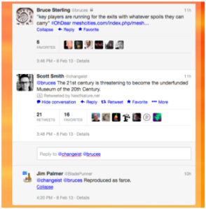 Fig. 18. Tweet Showing a Conversation
The informational and functional content presented by individual items in their various forms enables a number of mode chains. These include Strategic Oversight, in which users maintain awareness of conversations, topics, other users, and activities; Strategic Insight, wherein users focus on and derive insight into conversations, topics, and other users; and Comparative Synthesis, in which users realize new insights and create new content through direct engagement with conversations, topics, and other users.
In a manner similar to the search box, this interaction component serves as an initiation point for a number of mode chains, including Exploratory Search, Insight-driven Search, and Opportunity-driven Search. Individual tweets thus combine support for many important modes and mode chains into a single interaction component. As a consequence, they need to be relatively rich and ‘dense’, compacting much functionality into a single interaction component, but this reflects their crucial role in the user journeys that characterize the twitter experience.
Primary Workspaces and Pages
In the previous section we reviewed the correspondence between groups of modes and the interaction components of a user experience. In this section, we review the ways in which modes and chains impact the composition and presentation of the next level of UX structure within the system: work spaces.
The primary workspaces of twitter.com all emphasize interaction with a stream of individual updates, but the focus and content vary depending on the context. On the Home page, for example, the central stream consists of tweets from people the user follows, while on the ‘Me’ page the stream consists of the tweets created by the user (Figure 19). However, the layout of these pages remains consistent: the workspace is dominated by a single central stream of individual updates. The primary interaction mode for this stream is Monitoring, evident from the count of new items added to the network since the last page refresh.
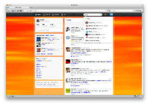 Fig. 19. twitter.com Home Workspace
The placement of the header bar at the top of all of the primary workspaces is a design decision that reflects the primacy of Monitoring as a mode of engagement with the twitter service; supporting its role as a persistent ‘background’ mode of discovery independent of the user’s current point in a task or journey, and its role as a common entry point to the other mode chains and user journeys.
The consistent placement of the ‘Compose new Tweet’ control in upper right corner of the workspace reflects known interaction design principles (corners are the second most easily engaged areas of a screen, after the centre) and the understanding that Synthesis is the second most important single mode for the twitter service.
The content of the individual updates attracts and retains users’ attention very effectively: the majority of the actions a user may want to take in regard to a tweet (or any of the related constructs in twitter’s concept model such as conversations, hash tags, profiles, linked media, etc.) are directly available from the interaction component. In some cases, these actions are presented via modal or lightbox preview, wherein the user’s focus is ‘forced’ onto a single element – thus maintaining the primacy of the stream. In others, links lead to destination pages that switch the user’s focus to a different subject – another user’s profile, for example – but in most of these cases the structure of the workspace remains consistent: a two column body surmounted by the ubiquitous header bar. There is little need to look elsewhere in the workspace, unless the user needs to check the status of one of the broader aspects of their account, at which point the header bar provides appropriate functionality as discussed above.
The absence of a page footer – scrolling is ‘infinite’ on the primary pages oftwitter.com – reflects the conscious decision to convey updates as an endless, dynamic stream. This encourages users to continue scrolling, increasing Exploration activity, and enhancing users’ Comprehension of additional updates – which benefits twitter’s business by increasing the attention users direct toward the service.
Although the two-tier, stream-centred structure of twitter’s primary workspaces remains consistent, there are variations in the composition of the left column (Figure 20). On the Home page, for example, the left column offers four separate components. The first is a summary of the user’s profile, including a profile image, a link to their profile page, counts of their tweets, followers, and the people they follow, and a ‘compose new tweet’ box. This is another example of a component supporting a composite of modes.
 Fig. 20. Twitter Home Page – Left Column
The core purpose is to enable users to Monitor the most important aspects of their own account via the counts. The links provide direct Locate functionality for followers, tweets, and accounts the user follows; and also serve as a point of departure for the same mode chains that can be initiated from the header bar. The ‘compose new tweet’ function encourages users to create updates, underlining the importance of Synthesis as the source of new content within the twitter network.
User Experience Architecture
The twitter.com experience is intended to support a set of user journeys consisting largely of search and discovery tasks which correspond with specific monitoring and search-related mode chains. Further, we can see that patterns of recurrence, intersection, overlap, and sequencing in the aggregate set of search and discovery modes are substantially reflected in twitter’s user experience architecture.
From a structural design perspective, the core [16] of the twitter.com user experience architecture is a set of four interaction consoles, each of which focuses on monitoring a distinct stream of updates around the most important facets of thetwitter.com concept model: the content and activities of people in the user’s personal network (Home); interactions with other users (Interactions); the user’s profile (@Me); and a digest of content from all users in the twitter.com network (Discover) (Figure 21).
The core monitoring consoles are supported by screens that assist and encourage users to expand their personal networks through location and exploration tools; these include ‘Find friends’, ‘Who to follow’ ‘Browse categories’, and the search results page.
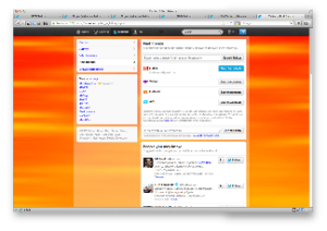 Fig. 21. Twitter.com Discover Workspace
Specific landing pages provide monitoring and curation tools for the different types of relationships users can establish in the social graph: follow and un-follow, followers and following, public and private accounts, list memberships, etc. A small set of screens provides functionality for administering the user’s account, such as ‘Settings’.
Underlying this user experience architecture is a concept model consisting primarily of a small set of social objects – tweets, conversations, profiles, shared digital assets, and lists thereof – linked together by search and discovery verbs. A relatively simple information architecture establishes the set of categories used to identify these objects by topic, similarity, and content (Figure 22).
In its holistic and granular aspects, the twitter user experience architecture aligns well with users’ mental models for building a profile and participating in an ongoing stream of conversations. However, what emerges quite quickly from analysis of the twitter concept model and user experience architecture is the role of search and discovery modes in both atomic and composite forms at every level of twitter’s design. Rather than merely subsuming modes as part of some larger activity, many of the most common actions users can take with twitter’s core interaction objects correspond directly to modes themselves.
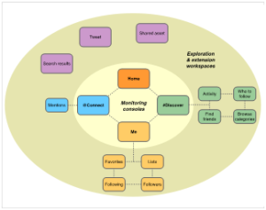 Fig. 22. Twitter.com User Experience Architecture
The individual tweet component is a prime example: the summaries of author profiles and their recent activity are a composite of the Locate, Explore and Comprehend modes (Figure 23). Evidently, the presentation, labelling, and interaction design may reflect adaptations specific to the language and mental model of the twitter environment, but the activities are clearly recognizable. The ‘Show conversation’ function discussed above also reflects direct support to Locate, Explore and Comprehend a conversation object as a single interaction.
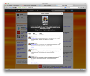 Fig. 23. Twitter Profile Summary
Because the twitter.com experience is so strongly centred on sense-making, search and discovery modes often directly constitute the activity paths connecting one object to another within the user experience architecture. In this sense, the modes and chains could be said to act as a ‘skeleton’ for twitter.com, and are directly visible to an unprecedented degree in the interaction design built on that skeleton.
6 Discussion
The model described in this paper encompasses a range of information seeking behaviours, from elementary lookup tasks through to more complex problem-solving activities. However, the model could also be framed as part of a broader set of information behaviours, extending from ‘acquisition’ oriented tasks at one end of the spectrum to ‘usage’ oriented activities at the other (Figure 24). In this context, modes can span more than one phase. For example, Explore entails a degree ofinteraction coupled with the anticipation of further discovery, i.e. acquisition. Likewise, Evaluate implies a degree of interaction in the pursuit of some higher goal or purpose to which the output will be put, i.e. usage.
It would appear that with the possible exception of synthesize, there are no exclusively usage-oriented behaviours in the model. This may suggest that the model is in some senses incomplete, or may simply reflect the context in which the data was acquired and the IR-centric processes by which it was analysed.
Reducing the ‘scope’ of the model such that modes serve only as descriptors of distilled sense-making activity independent of context (such as the user’s overall goal and the nature of the information assets involved) may help clarify the relationship between acquisition, interaction and usage phases. In this perspective, there appears to be a form of ‘parallelism’ in effect; with users simultaneously undertaking activities focused on an overall goal, such as Evaluating the quality of a financial instrument, while also performing activities focused on narrower information-centred objectives such as Locating and Verifying the utility of the information assets necessary for them to complete the Evaluation. These ‘parallel’ sets of activities – one focused on information assets in service to a larger goal, and the other focused on the goal itself – can be usefully described in terms of modes, and what is more important, seem intertwined in the minds of users as they articulate their discovery needs.
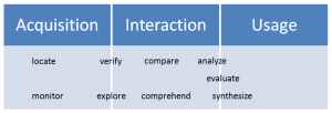 Fig. 24. From information acquisition to information use
A key feature of the current model is its emphasis on the combinatorial nature of search modes, and the value this offers as a framework for expressing complex patterns of behaviour. Evidently, such an approach is not unique: Makri (2008), for example, has also previously explored the concept of mode chains to describe information seeking behaviours observed in naturalistic settings. However, his approach was based on the analysis of complex tasks observed in real time, and as such was less effective in revealing consistent patterns of atomic behaviour such as those found in the current study.
Conversely, this virtue can also be a shortcoming: the fact that simple repeating patterns can be extracted from the data may be as much an artefact of the medium as it is of the information needs it contains. These scenarios were expressly designed to be a concise, self-contained deliverable in their own right, and applied as a simple but effective tool in the planning and prioritisation of software development activities. This places a limit on the length and sophistication of the information needs they encapsulate, and a natural boundary on the scope and extent of the patterns they represent. Their format also allows a researcher to apply perhaps an unrealistic degree of top-down judgement and iteration in aligning the relative granularity of the information needs to existing modes; a benefit that is less readily available to those whose approach involves real-time, observational data.
A further caveat is that in order to progress from understanding an information need to identifying the information behaviours required to satisfy those needs, it is necessary to speculate on the behaviours that a user might perform when undertaking a task to satisfy the need. It may transpire that users actually perform different behaviours which achieve the same end, or perform the expected behaviour but through a combination of other nested behaviours, or may simply satisfy the need in a way that had not been envisaged at all.
Evidently, the process of inferring information behaviour from self-reported needs can never be wholly deterministic, regardless of the consistency measures discussed in Section 3.1. In this respect, further steps should be taken to operationalize the process and develop some independent measure of stability or objectivity in its usage, so that its value and insights can extend reliably to the wider research community.
The compositional behaviour of the modes suggests further open questions and avenues for research. One of these is the nature of compositionality itself: one the one hand it could be thought of as a pseudo-linguistic grammar, with bigrams and trigrams of modes that combine in turn to form larger sequences, analogous to coherent “sentences”. In this context, the modes act as verbs, while the associated objects (users, information assets, processes etc.) become the nouns. The occurrence of distinct ‘opening’ and ‘closing’ modes in the scenarios would seem to further support this view. However, in some scenarios the transitions between the modes are far less apparent, and instead they could be seen as applying in parallel, like notes combining in harmony to form a musical chord. In both cases, the degree and nature of any such compositional rules needs further empirical investigation. This may reveal other dependencies yet to be observed, such as the possibility alluded to earlier of higher-level behaviours requiring the completion of certain lower level modes before they themselves can terminate.
The process of mapping from modes to design interventions also reveals further observations on the utility of information models in general. Despite their evident value as analytical frameworks and their popularity among researchers (Bates’ Berrypicking model has been cited over 1,000 times, for example), few have gained significant traction within the design community, and fewer still are adopted as part of the mainstream working practices of system design practitioners.
In part, this may be simply a reflection of imperfect channels of communication between the research and design communities. However, it may also reflect a growing conceptual gap between research insights on the one hand and corresponding design interventions on the other. It is likely that the most valuable theoretical models will need to strike a balance between flexibility (the ability to address a variety of domains and problems), generative power (the ability to express complex patterns of behaviour) and an appropriate level of abstraction (such that design insights are readily available; or may be inferred with minimal speculation).
7 Conclusions
In this paper, we have examined the needs and behaviours of individuals across a wide range of search and discovery scenarios. We have proposed a model of information seeking behaviour which has at its core a set of modes that people regularly employ to satisfy their information needs. In so doing, we explored a novel, goal-driven approach to eliciting user needs, and identified some key differences in user behaviour between site search and enterprise search.
In addition, we have demonstrated the value of the model as a framework for expressing complex patterns of search behaviour, extending the IR concept of information-seeking to embrace a broader range of information interaction and use behaviours. We propose that our approach can be adopted by other researchers who want to adopt a ‘needs first’ perspective to understanding information behaviour.
By illustrating ways in which individual modes are supported in existing search applications, we have made a practical contribution that helps bridge the gap between investigating search behaviour and designing applications to support such behaviour. In particular, we have demonstrated how modes can serve as an effective design tool across varied levels of system design: concept model, UX architecture, interaction design, and visual design.
References
- Bates, Marcia J. 1979. Information Search Tactics. Journal of the American Society for Information Science 30, 205-214.
- Cool, C. & Belkin, N. 2002. A classification of interactions with information. In H. Bruce (Ed.), Emerging Frameworks and Methods: CoLIS4: proceedings of the 4th International Conference on Conceptions of Library and Information Science, Seattle, WA, USA, July 21-25, 1-15.
- Ellis, D. 1989. A Behavioural Approach to Information Retrieval System Design. Journal of Documentation, 45(3), 171-212.
- Ellis, D., Cox, D. & Hall, K. 1993. A Comparison of the Information-seeking Patterns of Researchers in the Physical and Social Sciences. Journal of Documentation 49(4), 356-369.
- Ellis, D. & Haugan, M. 1997. Modelling the Information-seeking Patterns of Engineers and Research Scientists in an Industrial Environment. Journal of Documentation 53(4), pp. 384-403.
- Hobbs, J. (2005) An introduction to user journeys. Boxes & Arrows. [Available: http://www.boxesandarrows.com/an-introduction-to-user-journeys/
- Kalbach, J. (2012). Designing Screens Using Cores and Paths. Boxes & Arrows. [Available:http://www.boxesandarrows.com/designing-screens-using-cores-and-paths/
- Lamantia, J. 2006. 10 Information Retrieval PatternsJoeLamantia.com. [Available:http://www.joelamantia.com/information-architecture/10-information-retrieval-patterns.
- Lamantia, J. (2009). Creating Successful Portals with a Design Framework. International Journal of Web Portals (IJWP), 1(4), 63-75. doi:10.4018/jwp.2009071305
- Makri, S., Blandford, A. & Cox, A.L. 2008. Investigating the Information-Seeking Behaviour of Academic Lawyers: From Ellis’s Model to Design. Information Processing and Management 44(2), 613-634.
- Marchionini, G. 2006. Exploratory search: from finding to understanding. Communications of the ACM 49(4), 41-46.
- Meho, L. & Tibbo, H. 2003. Modeling the Information-seeking Behavior of Social Scientists: Ellis’s Study Revisited. Journal of the American Society for Information Science and Technology 54(6), 570-587.
- O’Day, V. & Jeffries, R. 1993. Orienteering in an Information Landscape: How Information Seekers get from Here to There.INTERCHI 1993, 438-445.
- Rose, D. and Levinson, D. 2004. Understanding user goals in web search, Proceedings of the 13th international conference on World Wide Web, New York, NY, USA
- Russell-Rose, T., Lamantia, J. and Burrell, M. 2011. A Taxonomy of Enterprise Search and Discovery. Proceedings of HCIR 2011,California, USA.
- Russell-Rose, T. and Makri, S. (2012). A Model of Consumer Search Behavior. Proceedings of EuroHCIR 2012, Nijmegen, Netherlands.
- Spencer, D. 2006. Four Modes of Seeking Information and How to Design for Them. Boxes & Arrows. [Available:www.boxesandarrows.com/view/four_modes_of_seeking_information_and_how_to_design_for_them
